This post was originally published in 2013
The tips and techniques explained may be outdated.
Sometimes it’s fun to create a logo design for a fictional client. Just pick a design style and play around with a concept of your choice without the hassle of the client approval process. This also gives you the chance to experiment with styles and trends you’ve seen around but never had the opportunity to try yourself. In this tutorial we’re going to create a logo design for a classic barber shop using the popular vintage theme. Follow the step by step guide to see how each individual element is crafted in Adobe Illustrator.
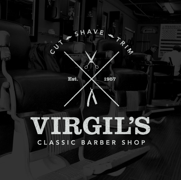
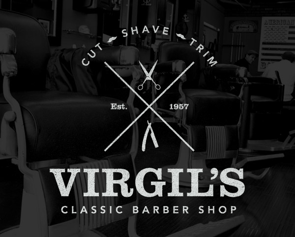
Here’s the logo we’ll be constructing for “Virgil’s Classic Barber Shop”. It makes use of the popular vintage style cross layout with small icon style graphics representing the nature of the business. We’ll construct all the individual elements and compose the logo’s layout, then add some roughening effects to give the design an aged, printed appearance.
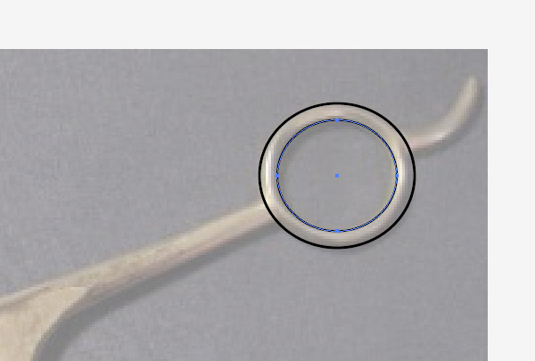
We’ll begin by creating the small icon graphics. Copy a picture of some old barber scissors from Google Images and begin tracing the outline. Use the Ellipse tool to outline the hole of the handle.
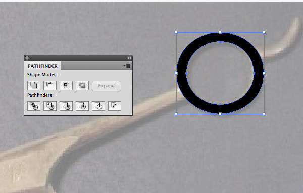
Select the two ellipses and hit the Subtract option from the Pathfinder palette to punch out the inner shape from the outer, leaving a solid ring. Switch the black stroke for a black fill.
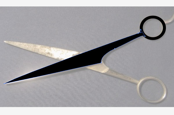
Continue tracing the rest of the scissor blade with the Pen tool. Overlap the circular handle slightly to form a solid outline with no gaps.
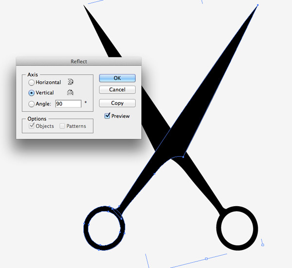
Remove the reference photograph then go to Object > Transform > Reflect. Hit the Copy button to create a duplicate then rotate it to form a complete scissors icon.
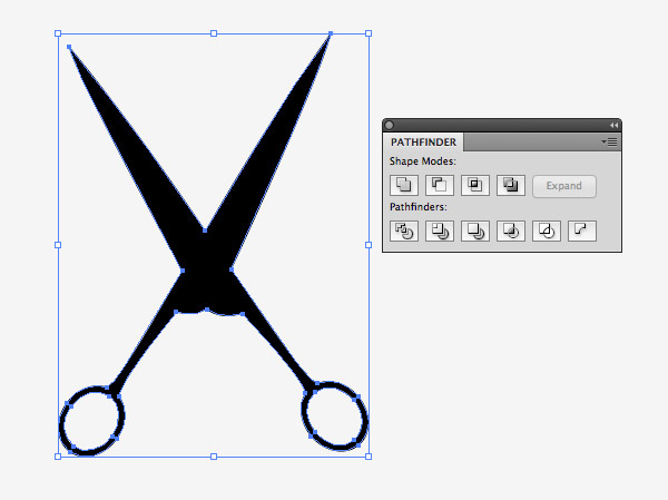
Draw a selection around the four individual objects then hit the Merge option from the Pathfinder palette to blend them all into one single shapes.
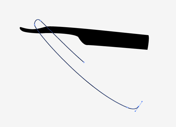
Repeat the tracing process but this time with a razor. Use the Pen tool to click and drag an outline around a reference photograph.
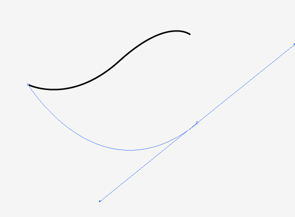
We can create a stylised moustache icon by hand. Click and drag four points with the Pen tool to form a smooth flowing curved teardrop shape.
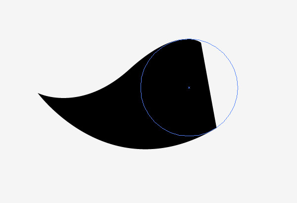
Close the path with a harsh straight line, then accurately align a perfect circle to provide a smooth curved edge.
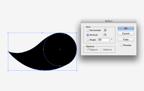
Select the two elements then flip a duplicate across the Vertical axis.
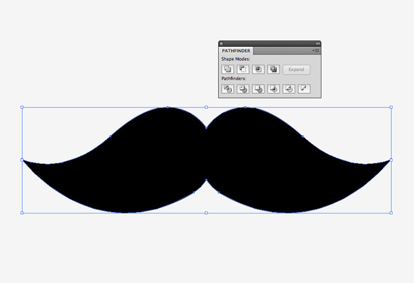
Move the duplicate over to the right, leaving a slight overlap, then Merge the two halves together with the Pathfinder tool.

Elsewhere on the artboard use the rectangle tool to draw a long thin line. Rotate it by 45° while holding Shift then Copy (CMD+C) and Paste in Front (CMD+F) a duplicate and rotate it the opposite way to form a cross.

Scale and position the small graphics within the cross element then add a typical Established date to fill the empty spaces.
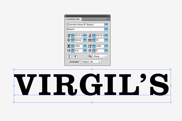
I chose the classic Clarendon font for the main headline of the logo. Type out the name of the business and alter the tracking to add a little spacing between the letters.
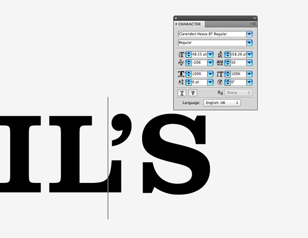
Make any minor spacing adjustments to each letter by moving the type cursor into place then nudging with the Alt key and cursor keys. I closed up the gap between the apostrophe to align it to the leg of the letter L.
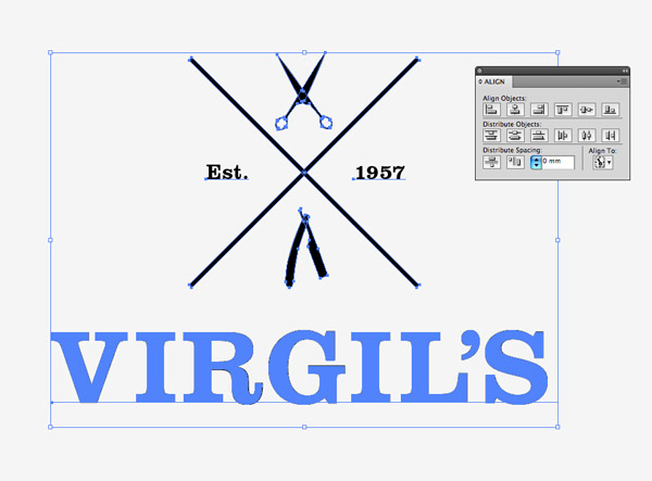
Combine the type with the layout of elements and align the two along the Y axis using the Align palette.
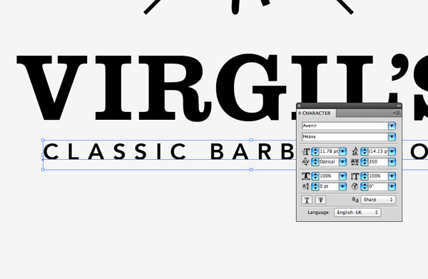
Choose a contrasting font such as the sans-serif Avenir for the logo’s tagline. Dramatically increase the tracking to around 350 and scale the text down to fit under the main heading.
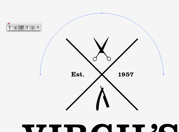
Hold Alt and Shift to drag a circle out from the centre of the cross using the Ellipse tool. Delete the lowermost point with the Direct Selection tool then click somewhere along the semi-circle path with the Text On a Path Tool.
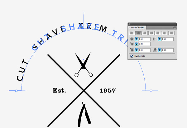
Use the same tagline font to type a short list of services, then drag the handles of the Text On a Path tool to the edges of the path using the Direct Selection Tool. Change the text alignment to Center to align it perfectly central around the curve.
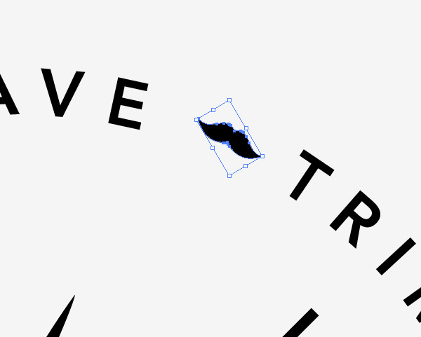
Increase the gap between each word with a couple of extra spaces then scale and rotate small moustache icons to break up the three words.
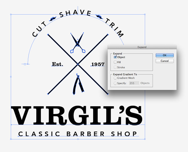
Once the logo layout is complete, draw a selection around all the elements and go to Object > Expand. Select just the Object option to make all the edits permanent.
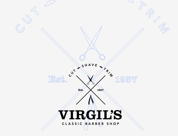
To really give the logo that old style distressed appearance we can rough up the sharp edges to give the impression of a stamped or printed mark. Drastically scale the logo up to fill the screen.
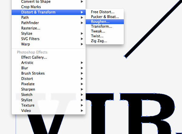
Go to Effect > Distort & Transform > Roughen. By scaling up the logo we can apply the effect in more detail, which will then provide just a subtle distressed effect when the logo is scaled back down.
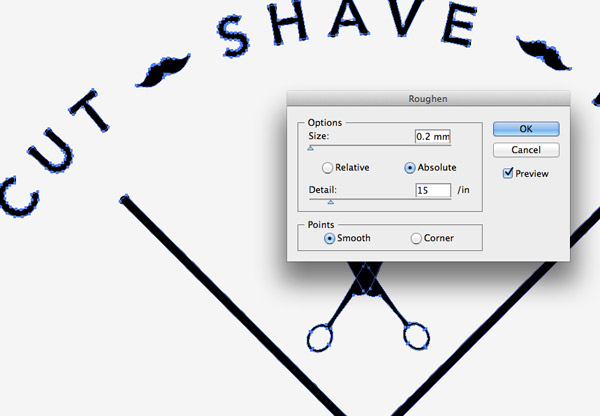
Alter the settings to around 0.2mm Size, Absolute, 15/in Detail, Smooth. Preview the distortion but make sure the smaller letters aren’t warped out of shape.
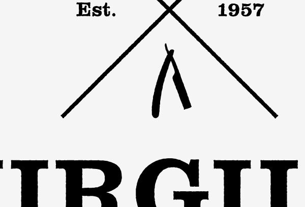
The subtle roughen effect adds irregular edges to all the elements to match the fuzzy appearance of bleeding ink common in traditional printing methods.
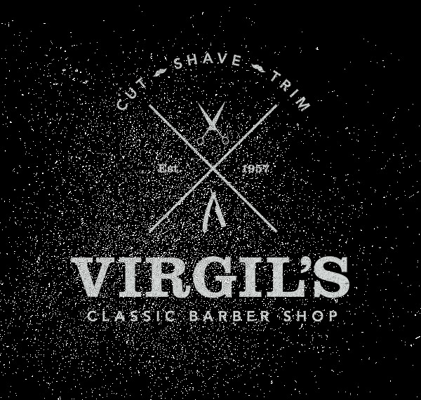
To mock the logo up and really give it that aged vintage appearance copy it over to Photoshop and dab it over with a subtle grunge brush.

The final logo might only be for a fictional client but it gave us the chance to play around with the popular vintage theme. Who knows, adding this popular style of design to your portfolio might lead to similar work from live clients.


another great tutorial!
will give this a go!
always learn so much about illustrator from your tuts :)
You always share such great technique, which is what I really enjoy with your tutorials, Chris! Great work as always – keep it up! :)
I’m embarrassingly bad at Illustrator but your tutorials are teaching me so many new tricks. Thank you very much for explaining the steps in such detail, it really makes learning a lot easier. :)
Nice logo Chris and great tutorial.
Hi, this is again a great tutorial. I have got to learn many things from your blog. If it weren’t for you, I would still be sitting on my computer with Illustrator and Photoshop lying rusting in it. But the simplicity with which you explain is amazing. Thank You
thank you this is nice blog
Hi Chris,
Of course it is a nice tut on Illustrator. I think mustache-symbol should be slightly bigger than existing other than it is wonderful.
Thanks!
Detailed and good visuals for each step.
A detailed and amazing tutorial. I rarely face any trouble while following the instructions. A great thank you.
Nice tut. Chris, very cool vintage style.
amazing detailed tutorial. Truly vintage style :)
Another awesome tuts from Chris!! Cheers! :)
As usual great tutorial!
very technical post regarding logo designing specially designing a logo for barber shop. it is really helpful for the designer who just start their career in the field of logo designing.
Great design tutorial
Awesome! Thanks for this tutorial Chris!
Hi Chris, this is a genuine vintage desing, very nice. But can you please make one, or can you tell me about the effect/effects used in image preview?
Thanks in advance!