
I recently posted an article over on my Line25 blog giving some handy tips on Twitter background design, so I thought it was about time I updated my own profile with a fresh new background. In this post I share my step by step design process and explain how I went about creating the background and Twitter header designs to revamp my profile.
I’ve had a fair few backgrounds over the years, back in 2009 one of my most popular posts was Twitter Background Design How-To and Best Practices. In this post I gave a thorough overview of the techniques used back in the day and shared my process for creating a cool background design.
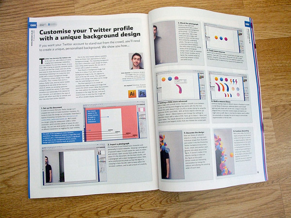
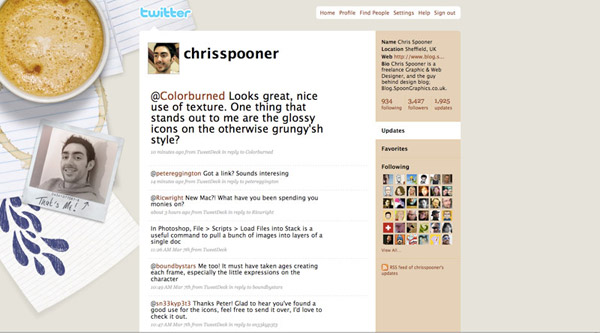
In 2010 I was invited to create a tutorial for MacUser magazine, which led to my more recent Twitter background design. I briefly updated this design in 2011 with the “older and slightly fatter Chris Spooner” in 2011, but after 3 years of service it was due for a change.
I recently overhauled my blog design with a fresh look so I wanted to continue the vintage style and use my new logo in my Twitter profile. This gave me the basic theme for the new design.
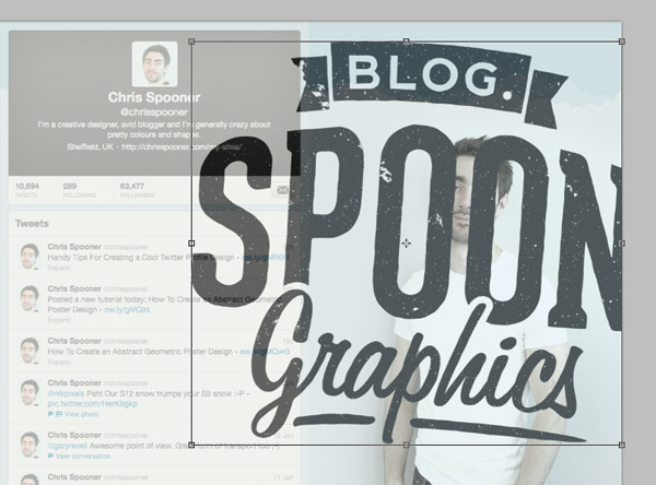
I’ve released a couple of Twitter background templates in the past, but with Twitter’s layout constantly changing I find the quickest solution is to just paste in a screenshot of your Twitter profile and use it as a guide by reducing its transparency. Remember when designing your Twitter profile that the amount of background visible will change depending on the user’s resolution, so don’t create anything too large otherwise it will be lost on smaller monitors. If in doubt, take a screenshot of around 1280×1024 or 1440×900 to gain an idea of how your design will look on an average sized screen.
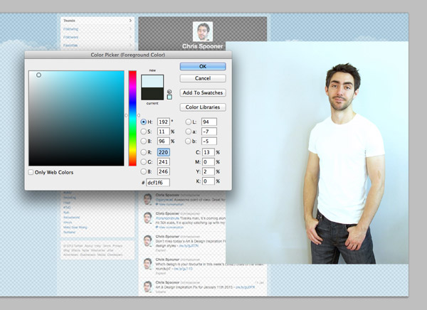
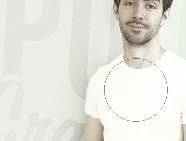
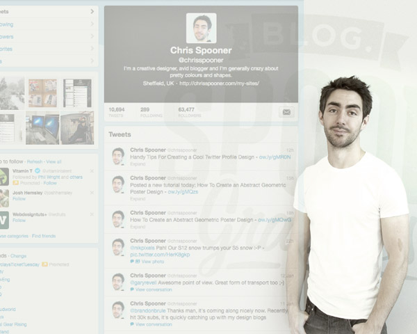
I have a nice collection of photos of myself from a DIY home studio setup a couple of years ago. I picked out a trendy/cool/poser shot and placed it into the Photoshop document. These photos have a plain background so a colour sample can be picked out in order to fill the document background and extend the image.
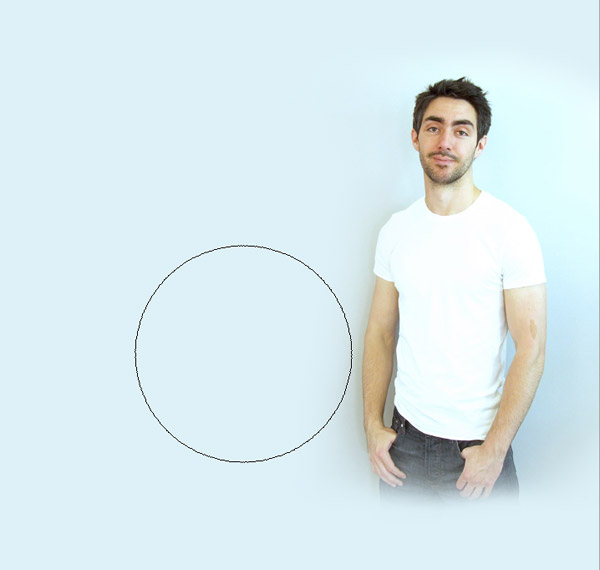
The tones of the photo alter due to natural lighting and shadows so a layer mask is used to blend the photo seamlessly into the solid background colour. My legs are also faded out so the image isn’t left with a hard crop line on larger resolutions.
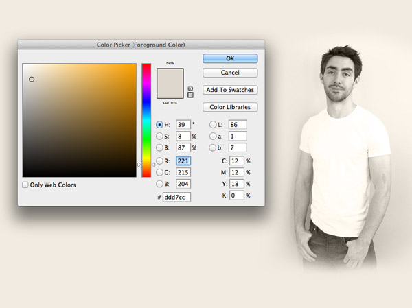
To tie the colours into my blog design and overall brand I filled a new layer with a beigey brown and changed its blending mode to Color to replace the blueish background and create a vintage sepia effect.
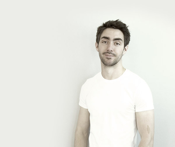
The opacity of the beige overlay was reduced just enough to bring out some tones from my skin and hair, without allowing too much of the blue background through.
I decided to use my new logo to fill out some of the white space in the background. With this element not being a crucial part of the design it can overlap the main Twitter content area. This will be hidden on smaller screens but will fill out some empty space when viewed on a large resolution.
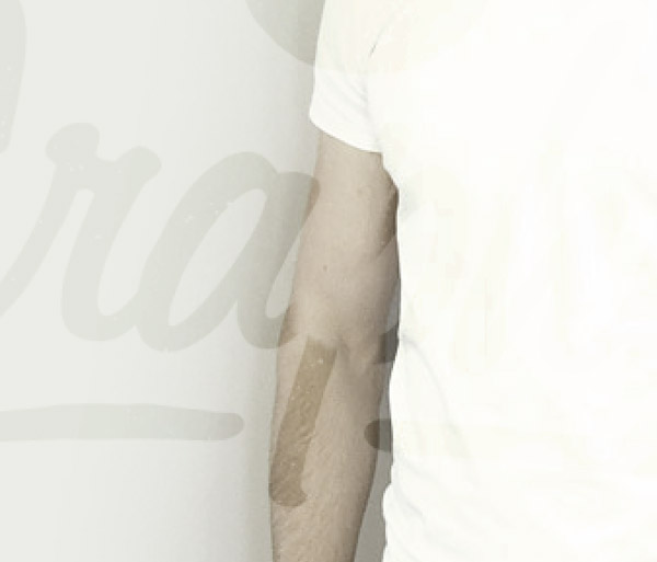
The logo was changed to Soft Light at 70% so the colour interacted with the background tones to create a subtle watermark effect. A layer mask was used with a small soft brush to erase out the areas over my figure to give the impression that the logo is part of the background.
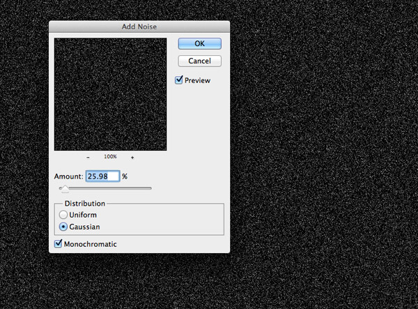
To add a touch of detail a new layer was filled with black and a speckling of noise was added with the Noise filter. This layer was set to Screen at 50% to add a grainy overlay to the image.
The grain effect needed to fade out to the solid background colour and wasn’t really desired over my figure so a layer mask and a large soft brush was used to erase out the unwanted areas.
Moving the Twitter profile screenshot left and right will give a good indication of how the design will scale across multiple resolutions. As long as the main facial features aren’t lost too early the design should work pretty well.
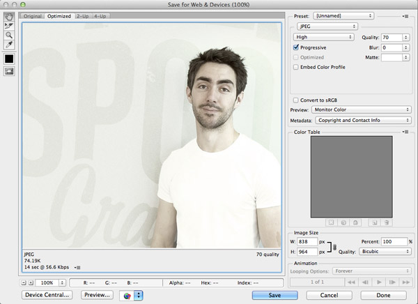
The screenshot layer was turned off, then the design was cropped to size wherever it faded out to the solid background colour. This portion of the design is what is exported as a JPG and uploaded to Twitter.
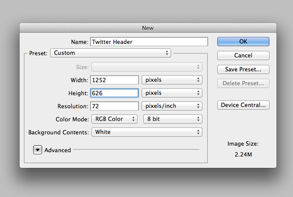
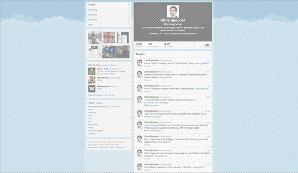
One of the main reasons I wanted to revamp my profile was to properly make use of Twitter’s new header feature. Twitter recommends the dimensions of 1252x626px for a header design, even though it only appears at around 500px on their website.
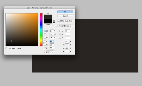
The vintage effect on my background image created a cool colour on my jeans, so I wanted to try and replicate this for the header area. I took a colour picking from the background and filled the header document with this hue.
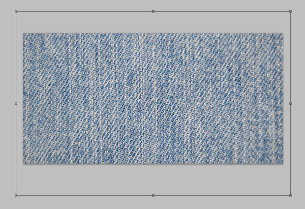
Six Revisions has a nice collection of free denim textures for download, so I picked out a similar pattern to my jeans and pasted it into the document.
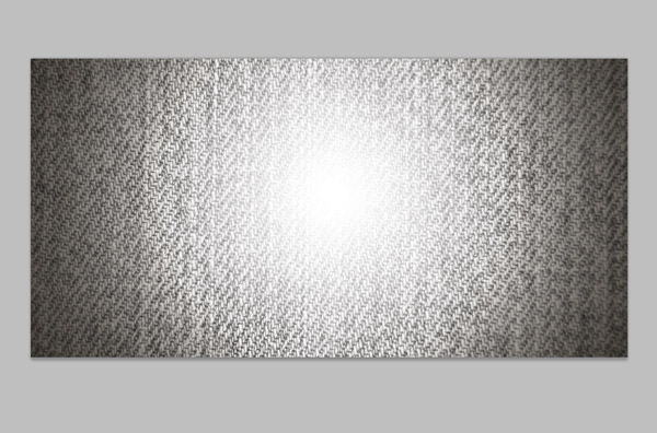
The denim texture was desaturated and changed to Overlay to allow the pattern to interact with the background colour, then a spot of white was added to the centre to create a highlight. The highlight was changed to Screen at 15% to create a subtle change of tone.
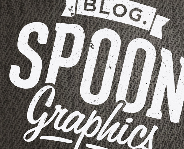
Another copy of my new logo was pasted in and scaled to span across the left side of the header. This was then changed to Overlay to give the impression that the logo is printed on the denim by allowing the denim pattern to show through.
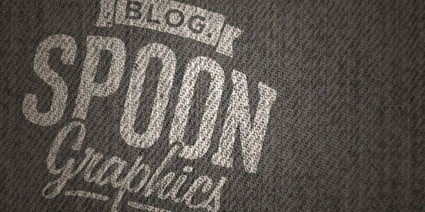
The final header design was exported as another JPG, leaving the two images ready to upload directly to Twitter. Compared to some of the clever tricks employed by other Twitter users my header is pretty simple. For some cool header ideas don’t miss my recent post on Line25.
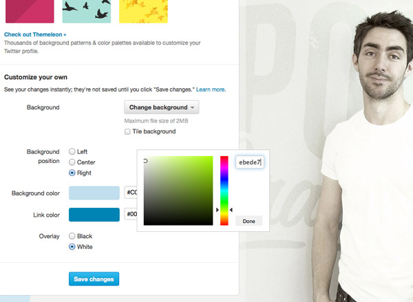
To get the full background design working some options have to be set within Twitter itself. Once the background is uploaded the colour of the solid background is added so the image fades out seamlessly. Twitter also allows the background to be set to the left, center or right, so the correct orientation is set for my particular design.
Have a peek at my live Twitter profile to see the design in action. I imagine this design will be active for at least a couple of years, probably until I get myself some posh new profile photos!
wow thanks for the tips, i want to redesign my twitter profile now :)
Hey, you’re cute! I don’t know why, I had never looked into it, but I always thought you were in your mid 40s, passing around your expertise after a lifetime of professional success :pp
Great !!! this is the right moment to start doing a background for my profile… thank you Chris
Hi!
Chris Spooner,
I Have To Say Only One Word ‘Divine’.
It’s funny to see how far Twitter has come looking through your first post. Love the new background and look!
Thank you Chris. This tip is pretty awesome. Am going to use it.
Cheers?
Awesome, timely tutorial. Organic design. Love you work!
Thank you so much for sharing these cool tips!
It’s great that you have put so much effort into creating a Twitter background – most people just don’t bother. It’s worth the trouble though as it looks so much better.
Nice post. I always think it’s funny how many designers leave the default, or some lame Twitter-provided image. Aren’t we supposed to be designers?
Wow, i love your design and style, let sharing with everybody!
Thanks for the tutorial. I was just searching for the appropriate size for the background, but you post gave me some additional ideas on making it more than just a basic image.
Absolutely you are passionate about designing creativity …Good One
i want create my photo in new styles.
Yeah ! Nice one. I have an ugly background on twitter, so this tutoriel is helpful :) but firstly, I need a good photo :D
Thanks man for sharing
Great job man!
Dude you are really tallented. I know that I tried to do this twitter background once but the result was … yach. But you made it look so easy. I will give it another try.
Great tips dude! Have to try it!
thanks for sharing good design