This post was originally published in 2012
The tips and techniques explained may be outdated.
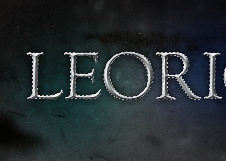
Follow this step by step tutorial to create a realistic pewter style metal text effect in Photoshop. The best part is it’s really easy! Just a couple of Photoshop layer styles is all it takes to create the basic effect, with a subtle tweak or two to perfect the lighting to maximise the realism.
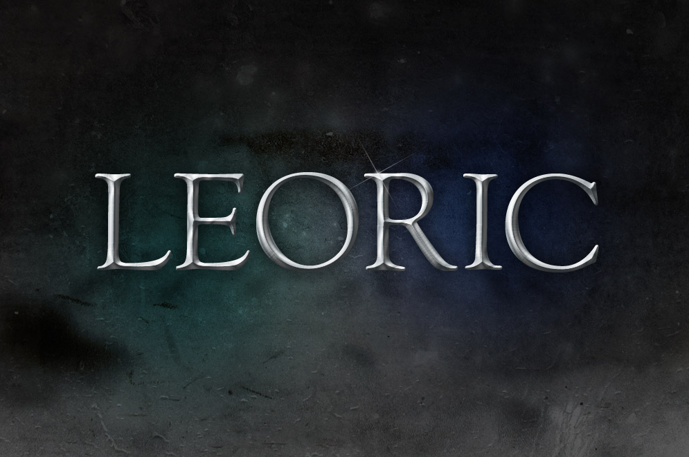
This style of embossed text is similar to old pewter badges and emblems, which makes it perfect for any kind of old-world medieval design. In Photoshop the effect is created just using the Bevel & Emboss and Satin features, but we’ll be creating this exact design as part of the complete tutorial.
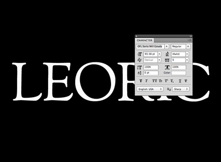
Open up Photoshop and create a document with a black background. Enter your wording of choice using a suitable font. Here I’m going with the old-world theme with the cool free font named Sorts Mill Goudy.
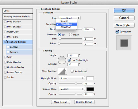
Double click the text layer in the layers palette to open up the Layer Style window. The main metal effect is created using the Bevel & Emboss feature. Change the Technique to Chisel Hard to begin.
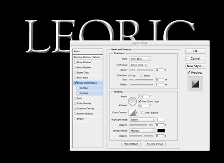
Adjust the sliders for the Size and Depth to max out the bevel effect. The actual figures required will depend on the size of your document, but make adjustments while the Preview option is checked. Reduce the highlights and shadows at the bottom of the window to 60-80% opacity.
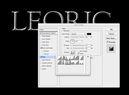
The effect looks somewhat realistic with just a Bevel & Emboss effect, but an addition of a Satin overlay really helps add extra realism with more highlights/shadows. Change the colour to a dark grey then adjust the angle to 27 degrees. Move the Distance and Size sliders to 12px and 24px, then change the Contour preset to the thumbnail with two peaks. Head back to the Opacity slider to tone down the effect until it blends nicely, 60% should do!
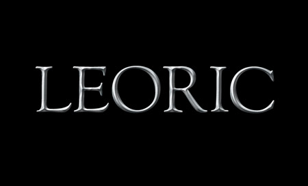
That’s the basic pewter style metal text effect complete. This tutorial would be a little short if I stopped here, so let’s finish off the overall design with some cool textures and lighting effects.
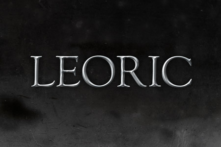
Open up a subtle grunge texture from LostandTaken.com and paste it into the document. Press CMD+I to invert the image then reduce the opacity to 70%.
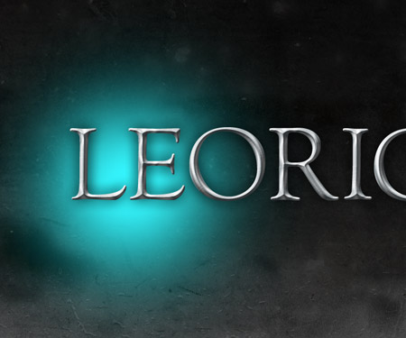
On a new layer dab a spot of light blue using a large soft brush. Change this layer’s blending mode to Overlay and set the opacity to 50%.

Repeat the process, but with a darker blue and a white spot on two more layers. Change these layers to Soft Light at 50% and 100% respectively.
CMD-Click the thumbnail of the original text layer to load its selection, then fill this selection with black on a new layer.
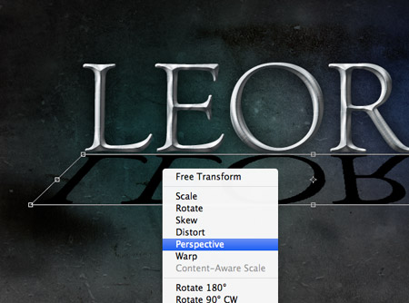
Press CMD+T to Transform and squash the black filled text from the top until it appears reflected on the underside of the metal text. Right click and select Perspective then pull out a side handle to flare out the shape.
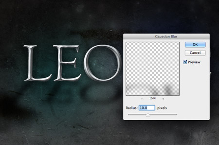
Go to Filter > Blur > Gaussian Blur and give the black text layer blurring of 10px to give the impression of a shadow.
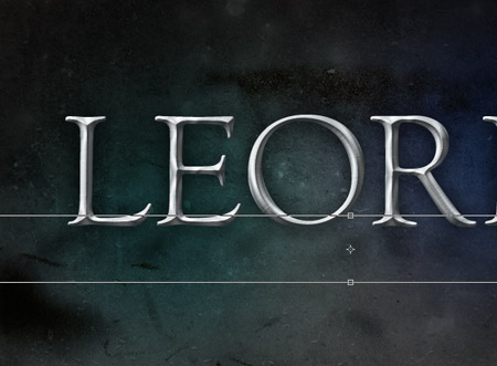
Make any final alignments and adjustments to the shadow then drop its opacity to around 50%.
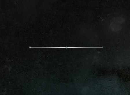
Elsewhere on the document add a spot of white using a small soft brush, then transform and squash the shape down to just 1px in height.
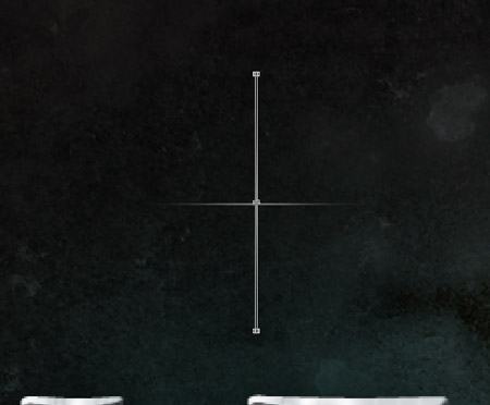
Hold ALT and press the up cursor key to make a copy, then CMD+T and rotate by 90 degrees.
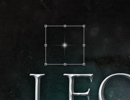
Finish off this little specular highlight flare with another small white spot in the centre and merge all the layers together.
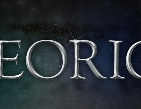
Rotate and position the highlight over the text to finish off the shiny pewter style metal text effect.

Nice, Quick, Easy :D !
I was searching for this tutorial from a long time
Thanks for sharing this with us Chris :)
Having gone to design school and worked as a graphic designer for 4+ years, I am still astonished by the many techniques and tricks that I have never tried. Your blog is a lifesaver! Thank you and keep up the great work :)
Its not clear enough for me .. I don’t came further at Step 4…
Hi Chris,
you’re doing fantastic work! I’m working with Illustrator about 3 months now and learned nearly all i can now (not as bad as all :) form your and vectortuts tutorials. I’m happy to see you are combining Illustrator and Photoshop in most of your tuts so I can develop some skill for both great programs.
Keep on being that cool… xD
o man you’re a rock I’ve learned so much thanks to you I owe you a lot of my knowledge about design because I didn’t know anything about it keep on like this
superbly explaines! awesome tut, thanks for sharing mate :)
simple and cool results article for style metal text effect in photoshop~ thanks for your sharing~
Hi Chris I am just wondering if I could do the same effect using Fireworks Version 8. Honestly, I don’t even have any idea for CS5. A friend of mine suggested to use fireworks to start my little interest in photo editing. I saw some of your works here and I think they are really beautiful.
~Ashley
You make it look so easy!
Nice tutorial. :) I suppose this font ‘Sorts Mill Goudy’ looks nice only it there are affects used similar to these ones.
Helmuts
Great tutorial. Very easy and effective. Thanks!