This post was originally published in 2016
The tips and techniques explained may be outdated.
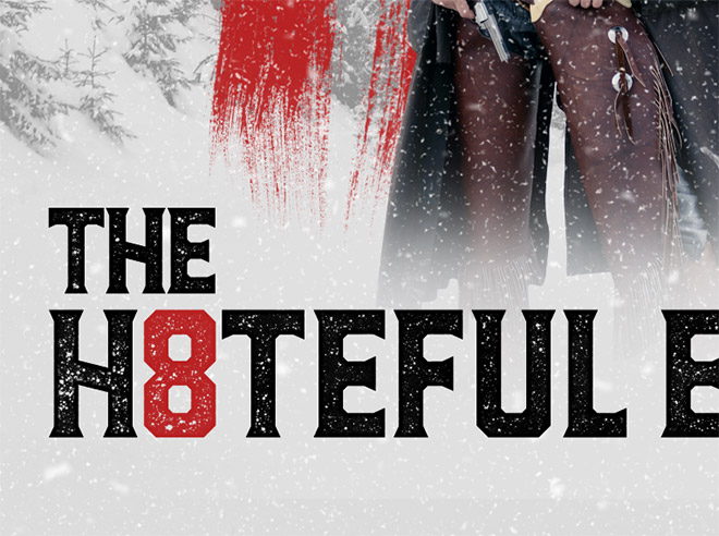
Quentin Tarantino’s latest movie The Hateful Eight has been highly anticipated by film fans. During the build up to its launch a series of movie posters were released that were made using one of the design resources from Spoon Graphics, hat tip to James White for the spot! Given that we have the exact Photoshop Brushes that were used to create the official designs available to us to download, I figured it would be fun to show how you can use them, along with some other techniques to create your own Hateful Eight inspired movie poster design.
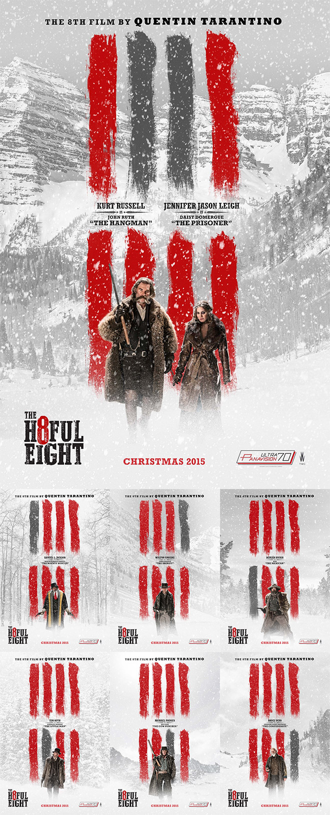
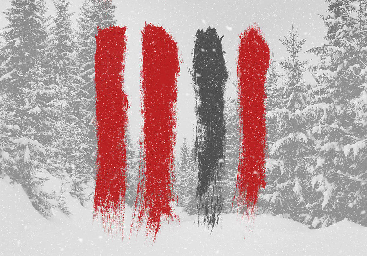
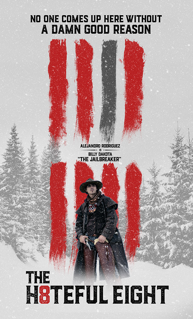
The official movie posters for The Hateful Eight use the Spoon Graphics Rough & Grungy Photoshop Brushes to represent the eight characters from the film. All the designs combine a faded snowy background with portraits of the characters which correspond to the highlighted brush strokes.

In this tutorial I’ll take you through the process of recreating the Hateful Eight movie poster design. We’ll use a series of stock photos to mimic the characters and background, then download my Photoshop Brushes to replicate the brush strokes that are a key part of the design. To finish the posters off, we’ll use a clever Photoshop trick to produce a heavy snow blizzard, then use some custom typography to create our own parody/tribute posters.
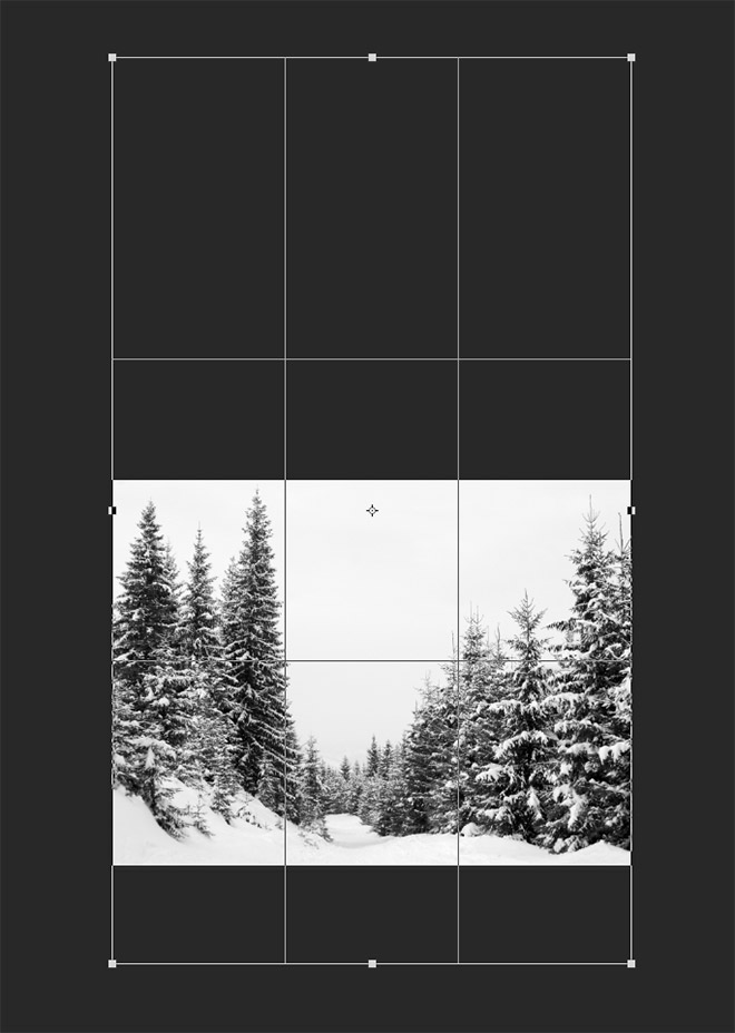
To begin, we need to source a landscape scene of a snowy wilderness. I’m using this stock photograph of snow covered fir trees in mountains from Shutterstock. Open the image in Photoshop and use the Crop tool to extend the canvas into a portrait poster layout.
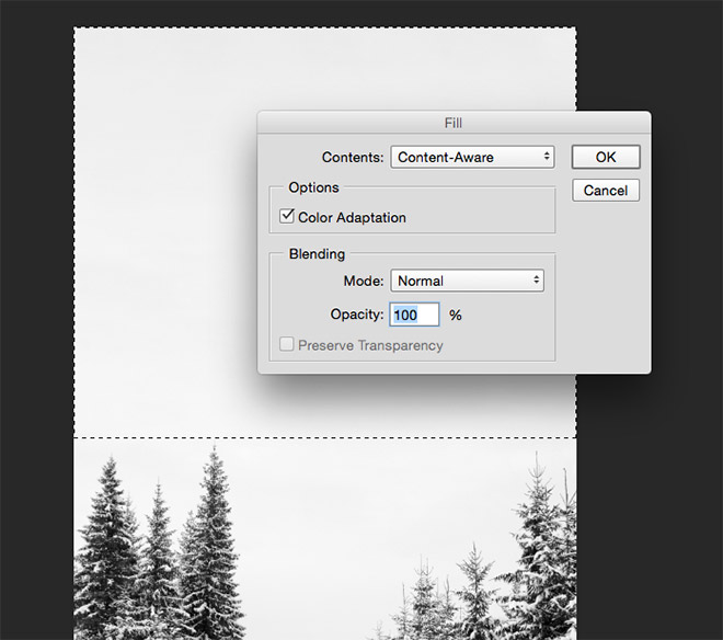
Draw a marquee selection around the empty areas of the image and go to Edit > Fill. Choose Content Aware to allow Photoshop to generate a background that perfectly matches the tones of the original photograph.
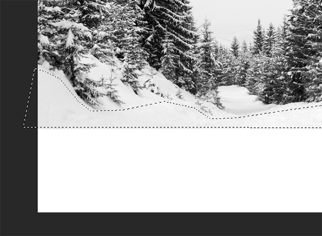
If the Content Aware fill duplicates unwanted areas of the image, draw a polygonal selection around the area you want to sample and paste it onto a new layer. Apply the Content Aware fill to this layer so the process only has these specific tones to work with.
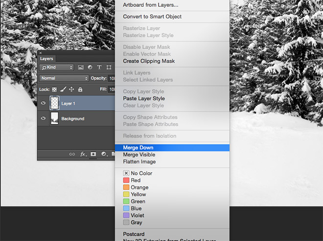
Merge the Content Aware fill layer back into the background layer with the CMD+E shortcut, or the Merge Down option from the right click menu within the Layers panel.
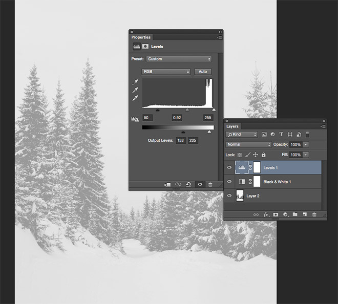
Add a Black and White adjustment layer to remove any colour from the photograph, then add a Levels Adjustment layer. Move the shadows handle from the Output Levels slider inwards to wash out the image, then move the white point inwards slightly to add a light grey colour cast. Adjust the sliders in the main histogram to alter the overall contrast of the image.
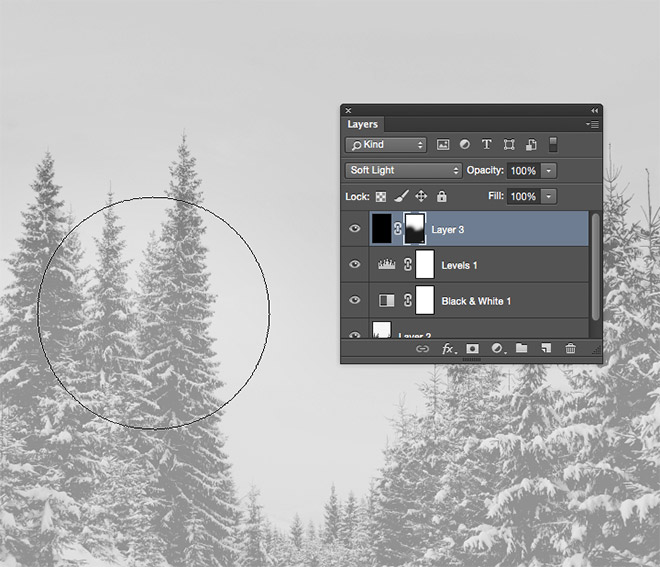
Fill a new layer with black and change its blending mode to Soft Light to add a grey overlay to the image so the snow effect we create later will show up against the darker background. Add a layer mask and erase the grey overlay from around the main landscape area, to allow the grey to fade in over the sky.
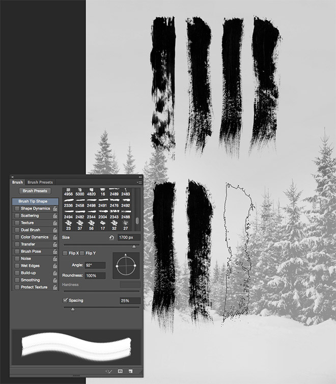
The key feature of the design is the series of eight brush strokes. Download and install my rough & grungy Photoshop Brushes, then match the layout of the brushes with the original poster design. Use the Brush panel to alter the angle so the brush orients vertically. Apply each brush stroke on its own layer so they can be individually moved and edited.
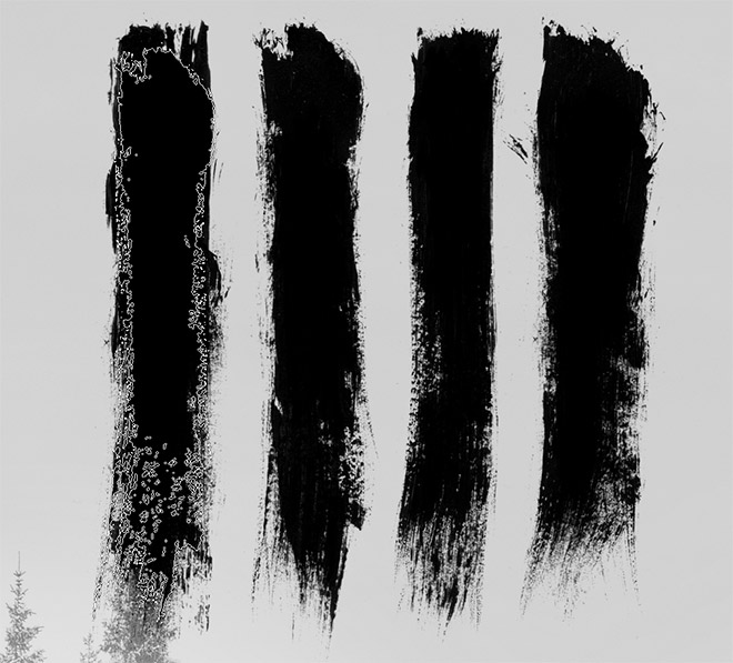
The original Hateful Eight posters have thicker and more solid strokes than each original brush. Use the other brushes in the set at a slightly smaller size to fill in the wispy inner areas.
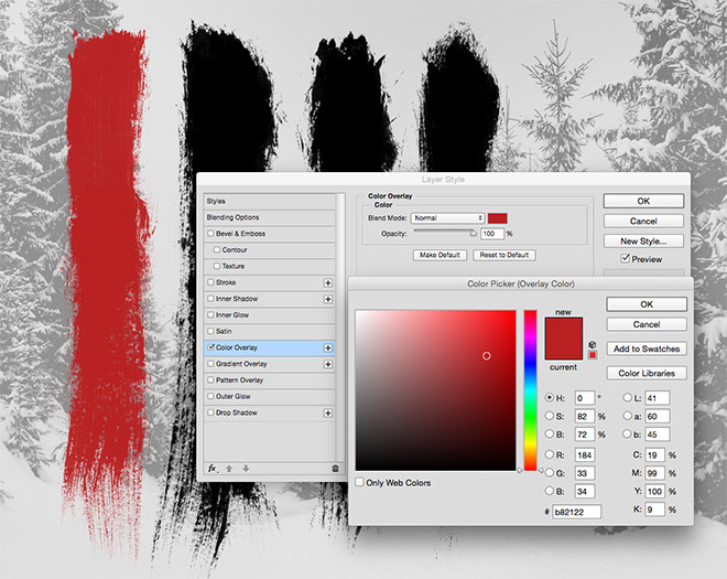
Add a Color Overlay layer style to one of the brush stroke layers. Choose a mid red such as #b82122. Copy and paste this layer style onto the other brush stroke layers.
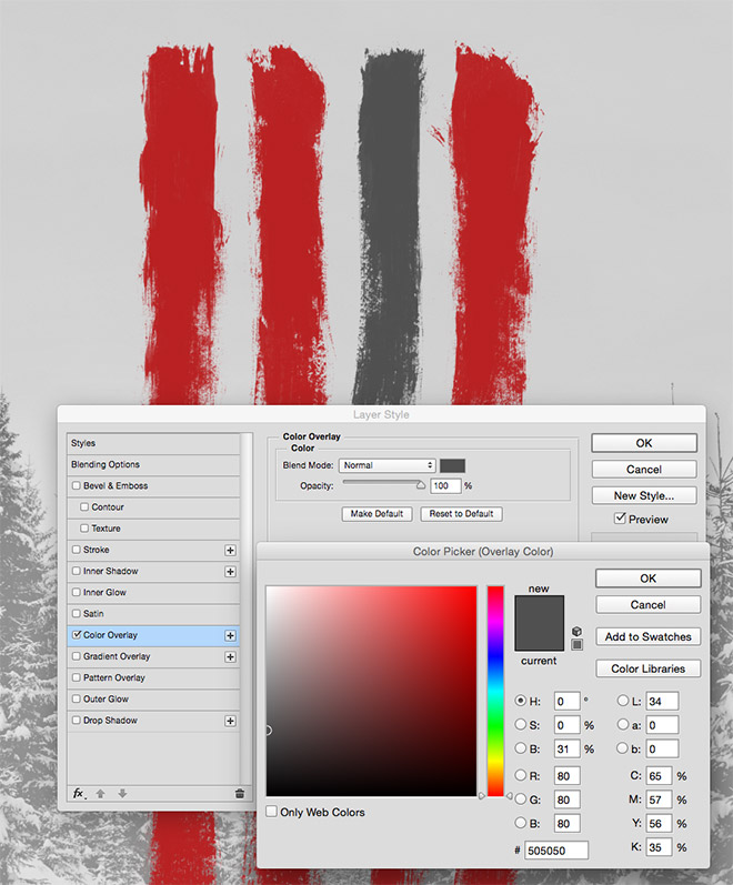
Choose one of the brush strokes and alter the Color Overlay setting to #505050 to give it a grey appearance to correspond to a particular character.
Stock images of cowboys are the most difficult resources to find for this poster project, but I managed to find some good premium images from Shutterstock. In my designs I used the following images: “Handsome man in cowboy clothes”; “Retro afro american western cowboy man with moustache”; “Old rough western cowboy with gray beard and brown hat”; and “Gun shooting vintage crook with long beard”.
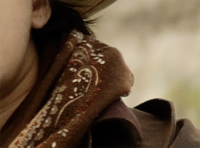
Open the images in Photoshop and use the Pen tool to trace the outline of the subject, keeping within a few pixels from the edge to avoid capturing any slithers of background in the cut out.
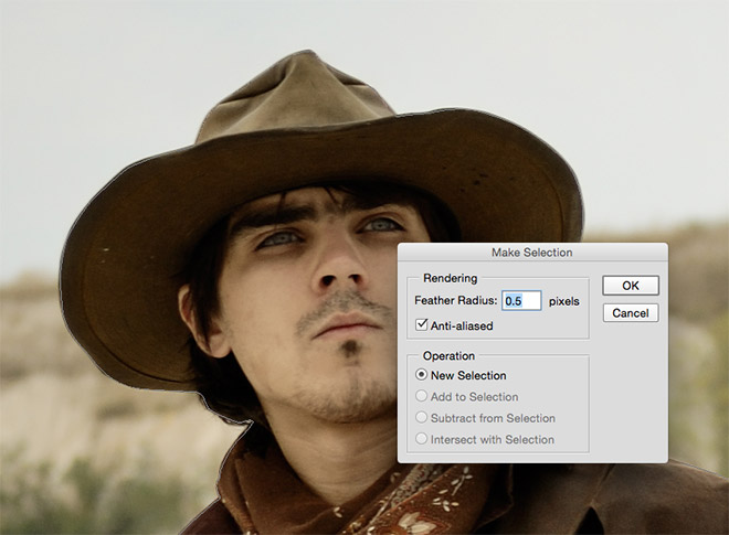
Once the subject has been traced and the path closed back at the start, right click and choose Make Selection. Add some feathering to help eliminate the hard edge around the cutout. My example uses 0.5px, but around 2px+ would have provided a better result.
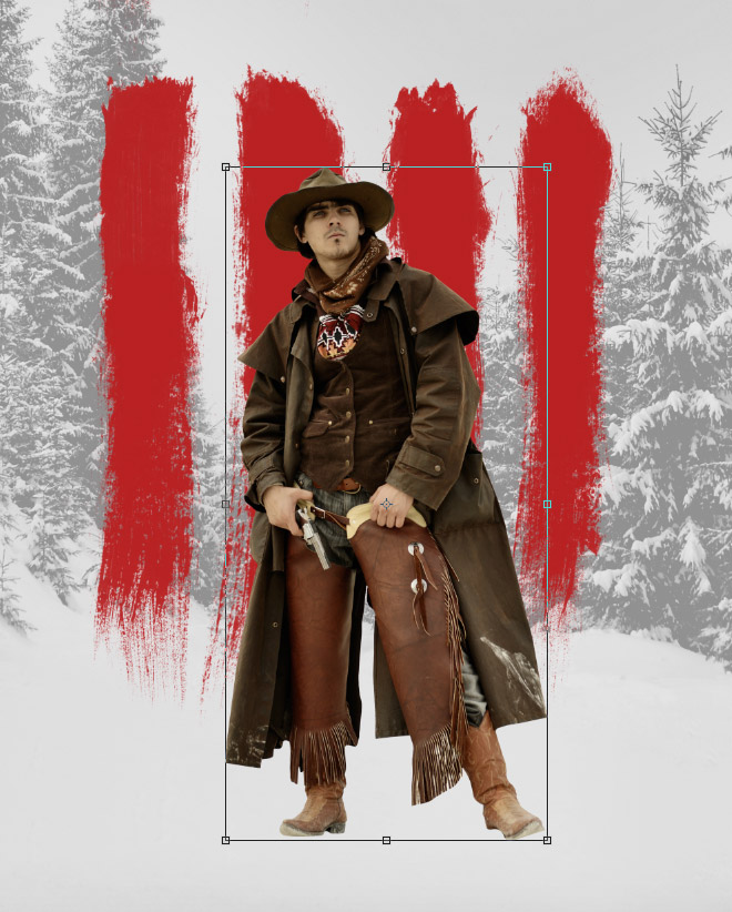
Paste the character cut out into the main poster document and scale it to size using the CMT+T shortcut for Transform. Hold Shift to retain the proportions of the image.
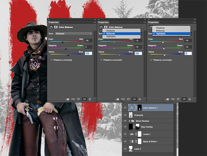
CMD+Click the thumbnail of the character layer to loads its selection, then add a Color Balance adjustment layer. The selection will be automatically used to apply a layer mask so the adjustments only affect this part of the design. Change the tones between Shadows, Midtones and Highlights and move the sliders back and forth to give the image a cooler blue appearance to match with the cold snowy environment.
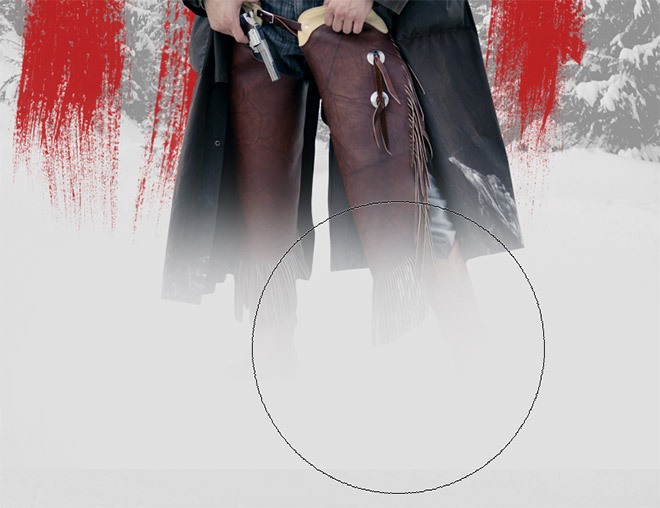
Create a new layer, then colour pick the grey tone from the background. Use a soft brush to paint over the feet of the character so it fades in from the bottom.
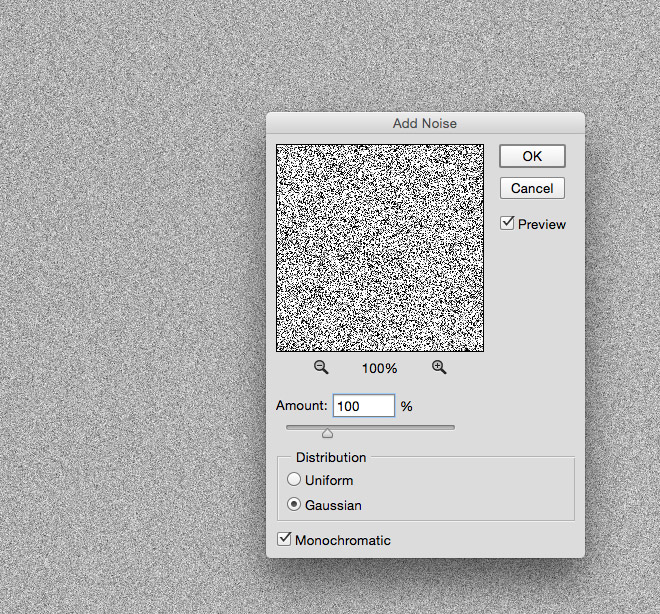
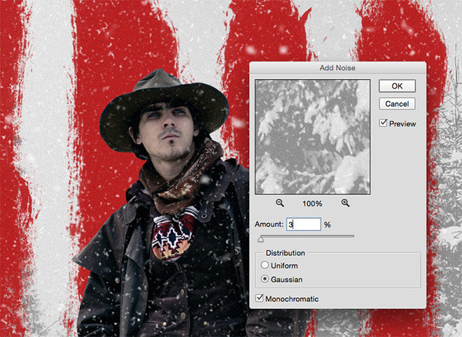
Our scene needs an intense blizzard to reinforce the snowy environment. There’s a clever Photoshop trick that can produce a realistic snow effect. Create a new layer, then fill it with white. Go to Filter > Noise > Add Noise and enter 100%, Gaussian, Monochromatic.
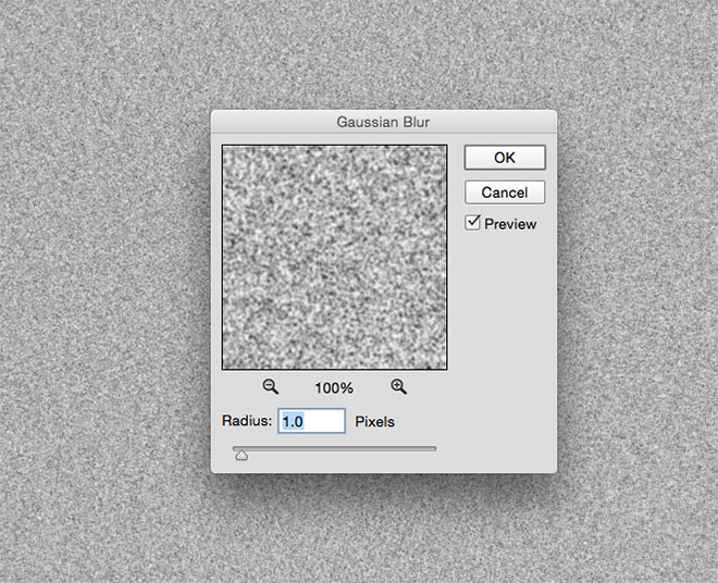
Next, go to Filter > Blur > Gaussian Blur and enter 1px to soften the noise effect.
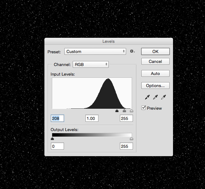
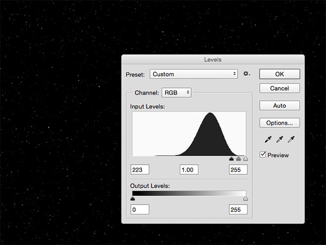
Press CMD+L, or go to Image > Adjustments > Levels, then move the shadows slider all the way to the right, until the noise is reduced to a scattering of white flakes.
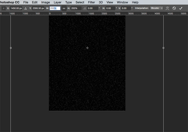
Currently the snow is too fine, so press CMD+T to Transform, then scale the layer up by 200%. Upscaling raster content causes it to become fuzzy, but that’s actually the effect we want when trying to replicate snow flakes.
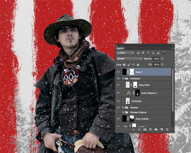
Change the blending mode of the snow layer to Screen to render the black area transparent, then add a Layer Mask in order to erase any flakes from the facial area using a soft brush.
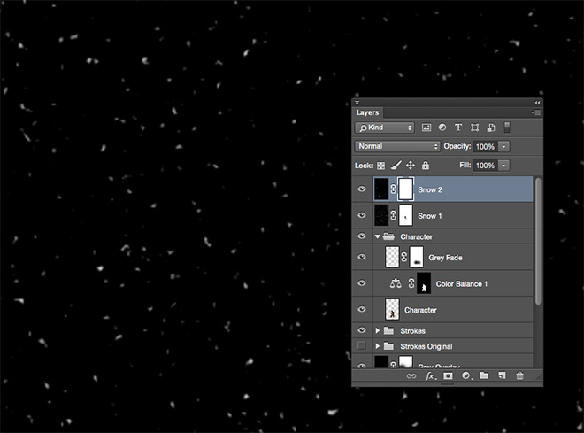
Add a new layer and repeat the process of adding noise, blurring and adjusting the levels to create more snow. This time increase the scale by 400% to produce a series of larger flakes.
Create a third snow layer and follow the previous steps. This time move the black levels slider further towards the right to produce less flakes. Scale this layer up to 1000% to create a series of extra large snowflakes that appear closer to the camera.
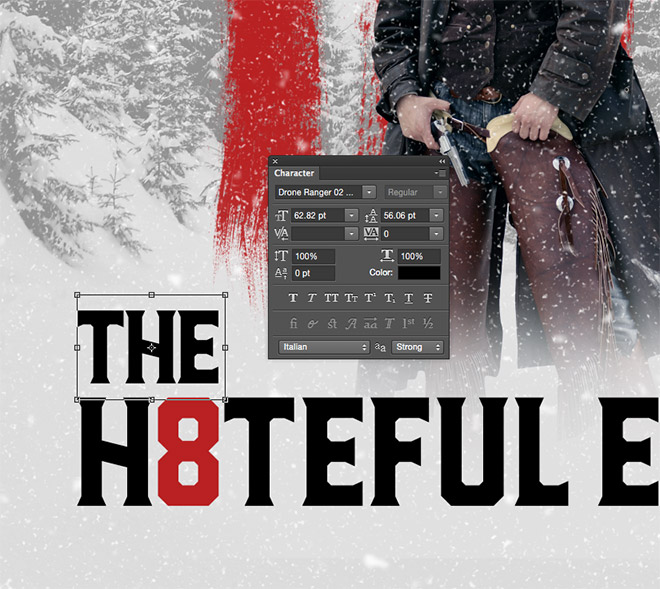
Use the Type tool to add some typography to your design. I’m using the awesome Drone Ranger font, which has a fitting western style. Centre the text and tweak the size to adjust the visual hierarchy.
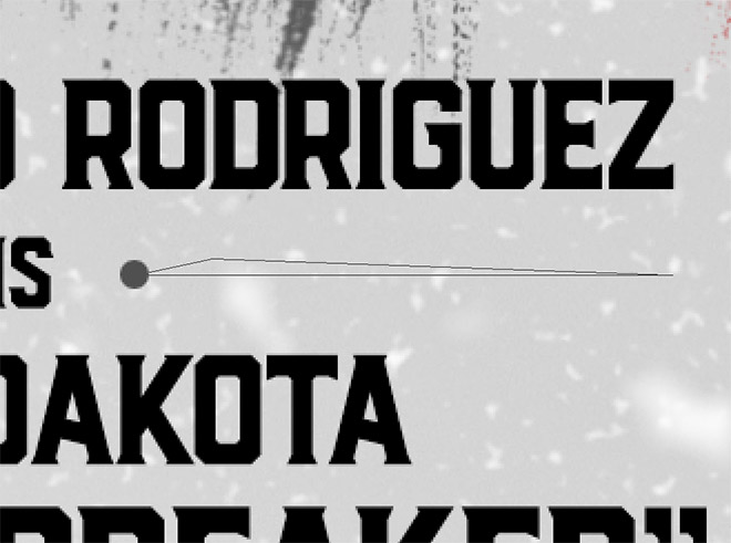
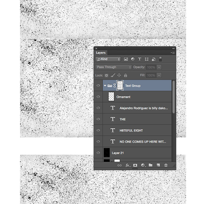
The character introduction text in the centre uses some ornamental graphics. These can be drawn with the marquee and lasso tools and filled with grey on their respective layers.
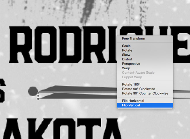
Draw just one half of the horizontal shape, then make a duplicate and flip it vertically to make the other half.
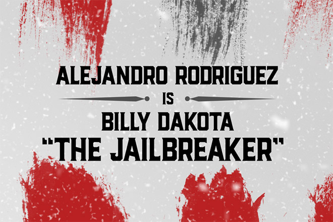
Merge the layers together and duplicate the graphic for the other side, centralising it within the text elements.
To add a weathered, distressed effect to the text, group all the elements, then add a layer mask. ALT+Click the mask to enter into mask mode, then paste in a few copies of a texture, like this one I’m using from TextureFabrik. Cover the document roughly where the text elements appear.
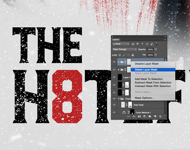
To enhance the texturing effect, duplicate the entire group, then right click on the layer mask and delete it.
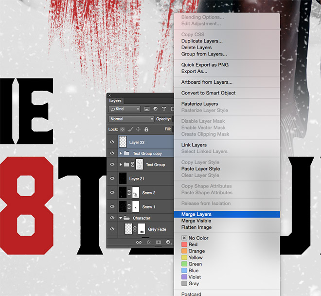
Create a temporary layer and merge it with the duplicated group to render the text as a basic raster layer.
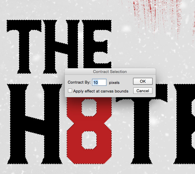
CMD+Click the duplicated text layer’s thumbnail to load the selection, then go to Select > Modify > Contract and enter 10 pixels. Head back to the Select > Modify > Feather menu and enter 5px in the settings.
Delete this selection from the text layer to leave a stamp like outline effect that masks some of the texturing.
The original posters have a cool grainy look about them, so all that’s left is to hit CMD+A to Select All, followed by CMD+Shift+C to Copy Merged. Paste this clipping onto a new layer at the top of the stack, then go to Filter > Noise > Add Noise and enter around 3px.
The final design makes a great tribute to the original Hateful Eight posters, especially since we can use the exact brushes that the professional used to try out the techniques for ourselves.
Introducing The Fateful Four!
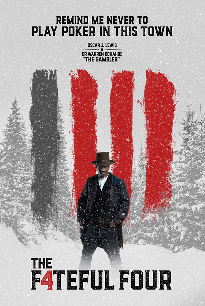
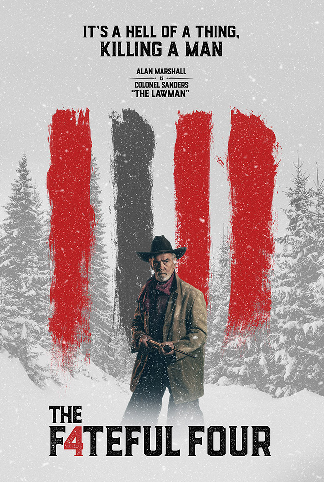
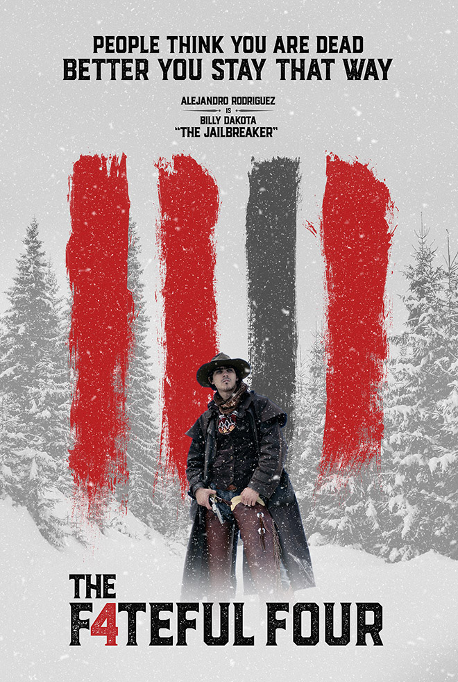

I had some fun creating my own series of parody posters using this art style. Forget Tarantino’s The Hateful Eight, watch out for The Fateful Four!

Awesome tut Chris. Got some snowed pine pics of my own that I can’t wait to use, maybe with pictures of my kids. :-)
That sounds lovely! It would be hilarious to include nicknames for them too :-)
Hello Chris
Your tutorial is as like actual poster design. Obviously it helpful tutorial. Thanks for sharing with us.
Thanks Salim, I’m glad to hear you enjoyed it
Hey, this tutorial looks awesome but i never used brush.. Can you help me? Or maybe link me a video tutorial ! :)
Sorry for my poor english, i’m french
Nice tutorial! Thanks
Awesome that they used your brushes … but they could have at least let you know lol …. great tutorial as always :)
Great tutorial Chris. I need to start going through your tutorials again to up my Photoshop and Illustrator skills. You explain everything so well. Thanks.
Awesome work. Thanks for Sharing with us. Expecting more such informative posts from you!
Thanks for this awesome article, This is my first visit on your blog and I really like it. I will try it for sure. Looking forward to read more articles on your helpful website.
Beautiful work!! How about a tutorial on how to create the Superman vs Batman posters — http://blogs-images.forbes.com/markhughes/files/2015/04/Batman-v-Superman-poster-3-1940×1383.jpg
Thank you!
Thanks I want tutorial for make a banner website
How easy you’ve shown there…! I think this is an inspirational post for graphic designer and movie lover :) . I love your Gaussian Blur to Snow making portion. It is excellent. Thanks Chris..
Hey, congrats! That is a cool poster to begin with. It looks like fun, too! Thank you very much! I plan to give it a go!
Su
Losing my mind here. Suddenly the levels adjustment to the noise layer does virtually nothing. I’ve done this before with no problem. Suddenly it simply will not work – don’t you HATE that? At first I was seeing what I wanted in the preview window, and when I hit OK it would revert – but I wasn’t viewing at 100%. At full size I see that it’s just slightly darkening the pixels. NO idea why this won’t work and it’s driving me CRAZY! A quick Google search found a few other idiots having the same issue, but nobody had any real answers for them.