This post was originally published in 2008
The tips and techniques explained may be outdated.
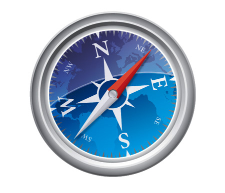
The Safari browser from Apple has a great little icon that works well in small formats while also displaying quite a lot of intricate details when viewed in large format. Navigate through this Adobe Illustrator tutorial to draw up your own vector Safari inspired compass in Adobe Illustrator.
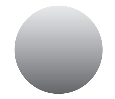
As usual start with a new document in Adobe Illustrator, draw a circle on the artboard whilst holding SHIFT to produce a perfect shape. Fill the shape with a grey to white vertical gradient.
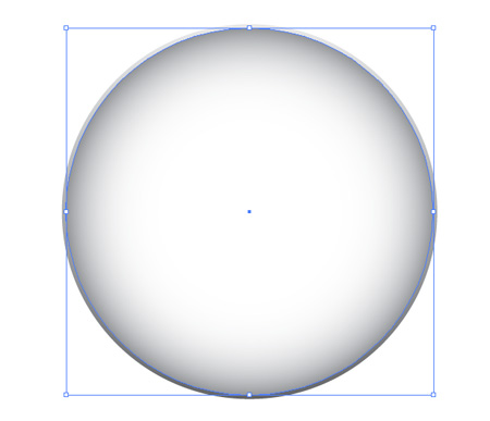
Copy and Paste in Front (CTRL/CMD + F) a new version of the circle and add a lighter grey to white gradient, this time in radial format. Scale down the circle slightly.
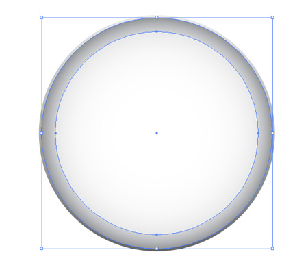
Paste in a third circle, fill with a very faint grey and scale down leaving a fair amount of the previous shape visible.
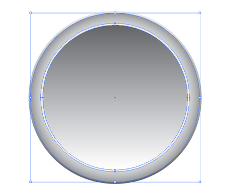
Paste in yet another circle, this time with a linear grey to white gradient and scaled very slightly smaller.
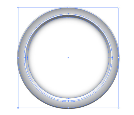
Once again paste in another circle using the radial gradient. This method of laying up varied gradients gives a great impression of a contoured and reflective metal frame.
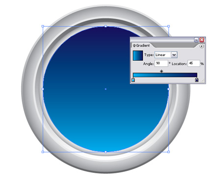
Paste in the final circle but this time fill with a gradient of blues to represent the background of the compass face.
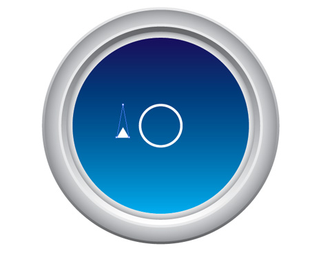
Begin drawing the decals with a stroked circle and star tool, while dragging the star shape press the arrow cursor keys to alter the number of points right down to one. Use the Direct Selection Tool (White Arrow) to drag the upper most point further upwards to give a longer triangle.
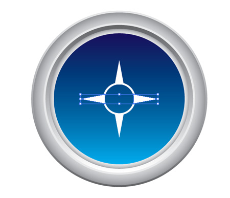
Duplicate the triangles and place in 90 degree positions around the circle. Using the Align to Artboard feature within the Align Palette makes work much easier.

Recreate the triangles and scale slightly to create the diagonal pointers.

Use more small triangles to mark the points of North, East, South and West. Adding a stroke to the blue background can help blend the triangles in with the frame.
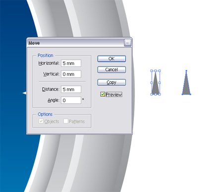
Around the original Safari icon are incremental triangles indicating the degrees around the circumference of the compass. To recreate this pattern begin with a triangle, duplicate and move a fixed distance to the side.
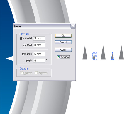
Repeat the process with a slightly smaller triangle, producing an alternating pattern between large and small shapes.
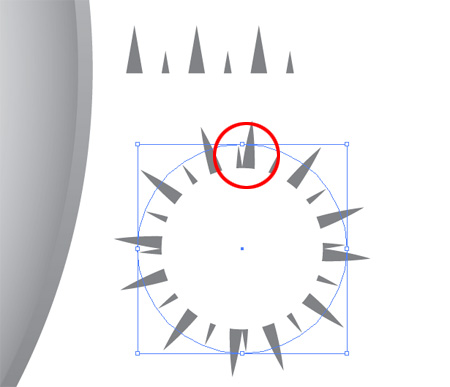
During my creation of the Safari icon for this tutorial I made a slight mistake but thought it would be great to include it nevertheless and show a simple workaround that can be used.
Notice in the example the brush pattern that we will create doesn't match up correctly giving unequal distances between the triangles…
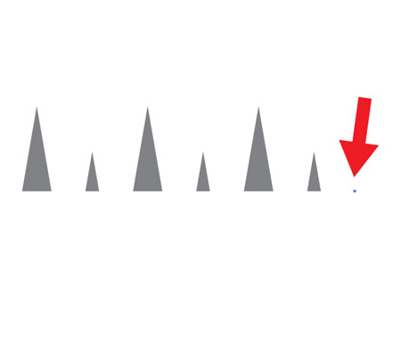
…A simple fix is to add a single point on the end of the pattern, offsetting it the same distance as used previously. This point will not be visible but will add an extra section to the pattern area.
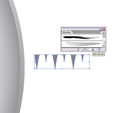
Now, onto creating the pattern, select the group of triangles and rotate the so that they point downwards. Then click the New Brush icon from the Brushes Palette.
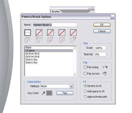
Select New Pattern Brush from the list and Ok and options in the dialog box.
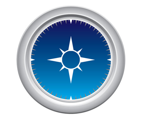
Copy and Paste in Front the blue background circle, clear out the fill and add the newly created brush, scale the circle as appropriate to fit within the compass area.
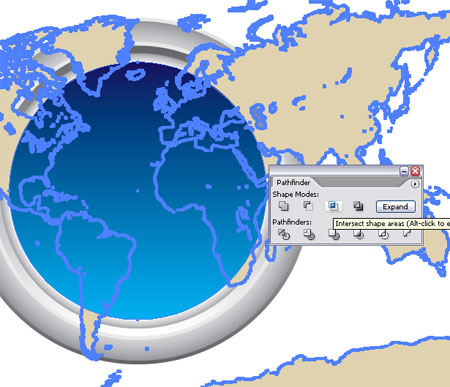
Grab a free vector map from a recent post, open up in Illustrator and paste into your document. Use a copy of the blue circle along with the Intersect From Shape Area option from the Pathfinder tool to chop out the excess.
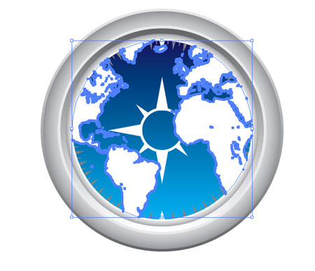
Fill the remaining map area with white and set the Transparency to Overlay or Soft Light, adjust the Opacity as you see fit.
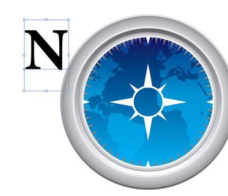
Use the Type Tool to draw in the N, E, S and W initials. The font used here is a sweet serif typeface called Minion Pro.
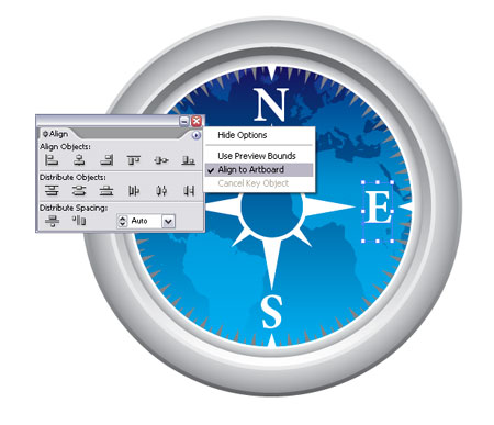
Rotate and position the initials into place on the compass, use the align palette to match them up exactly.
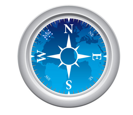
Repeat the process with the smaller North West etc initials, set these at a lower opacity of 80%.
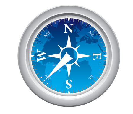
Use another triangle to draw half of the compass needle, move the end point with the Direct Selection Tool as necessary to give a long point.

Copy and Paste a duplicate of the compass needle and move one of the bottom points inwards halfway. Fill the new version with a light grey.

Duplicate the compass needle and position in the opposite direction, this time fill the two halves with shades of red.
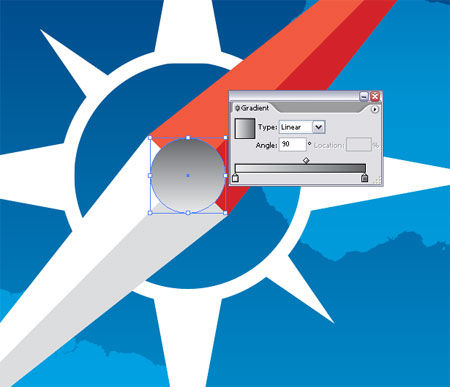
Zoom in and draw a circle as the needle mounting pin, use a grey linear gradient as the fill.

Paste in another circle, scale down slightly and fill with another gradient to give the impression of a reflective surface.
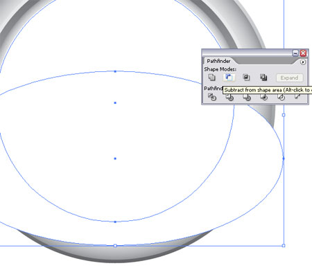
An Apple product wouldn't be complete without it's reflection. Paste in a white circle over the compass face, draw in an additional shape to use along with the Subtract From Shape Area option in the Pathfinder Tool.

Drop the opacity of the reflection to give a soft light cast across the glass screen of the compass.
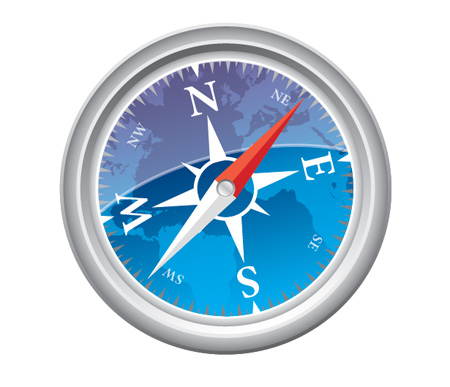
Finalise the vector compass with any little tweaks and additions. Here I adjusted the size of the frame in comparison with the compass face, made some minor colour changes and rotated the whole unit slightly.
But wait! There's more…
After completing a vector illustration it's always good to open up the file in Adobe Photoshop to add some final tweaks to really bring out the detail and colours.
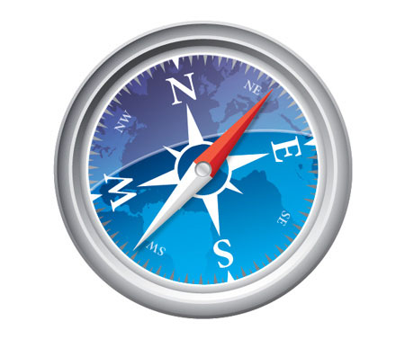
Use the brush tool to gently paint in a faint shadow under the compass needle to lift it from the face slightly. Also, drag a black to white gradient across the compass and set the blending mode to Overlay at 65%.

On a new layer, paint in some rough blobs with the paintbrush tool, aiming at random areas around the metal frame. Draw in circular masks to delete out the excess around the edge of the compass and any overlap on the face.
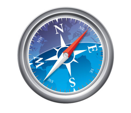
Set this layer to Soft Light at 50% to add some shading to the metal casing.
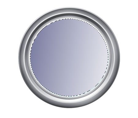
Draw a blue to white gradient across the face of the compass and set this layer to Linear Burn at 35%, this helps pop out the colours of the compass background.

If it was crucial that your illustration remains entirely vector similar adjustments could be done right within Illustrator, however I feel Photoshop gives better control over these small tonal adjustments. Before the image looked fairly plain and flat, but now with these final tweaks the compass has a good range of tone resulting in a slightly more realistic illustration.


very nice tutorial Chris! good job
Thx for the fantastic tutorial… keep it up!
wow – very detailed tutorial thanks!
Brilliant Tutorial! I thought it would be difficult to create such a detailed image, but you workflow techniques complete the task so efficiently, thanks for all the tips.
awesome tutorial with great details! Thanks
dude, you should totally do a tut for vectortuts.com
Easy to follow and detailed as always.
Great blog, subscribed to your rss feed. Thanks.
WOw easy to follow and such detailed tutorial . i would very much like to feature this on my Website >> with your permission ofcourse
Brilliant – this is going to go great with a poster I’m working on. Thanks!
Great techniques! Thanks.
really good finition/// merci beaucoup
Great illustrator tutorial Chris!
Fantastic, thanks.
Great illustrator tutorial thanks
Awesome and stunning….Ha ha I made one. Thaaaaank you.
great tutorial! thank you for your effort for this cool stuff.
Thanks! Good illustrator tutorial. Thanks
a lot
@Everyone: Many thanks to all commentors, glad to hear the techniques proved useful.
@Dan: I’d like to produce something for VectorTuts, it’s a site close to my interests but at the moment I struggle to find time to write tutorials Blog.SpoonGraphics – maybe one day!
@Asmaa: I’m a bit late in replying but please feel free to include the tut on your site.
Wow this is an amazing guide ! i just love it
Great! very useful
Wow!!! Fantastic! Thanks.
Hiya,
Just wanted to say that this is a really fantastic tutorial, well done. Perhaps though the reflection should go above the pointers though as wouldn’t they usually be beneath the glass?
Fantastic tutorial though. Keep up the great work.
Best wishes,
Mark
All except for the map (can’t seem to find it), and my inability to comprehend basic math (measure arrows), this is a very well made tutorial for people like me that have no idea how to use Illustrator.
I’m still figuring out the photoshop part, but that’s my own noobiness :).
realy cool tut!
thanks!
Hey, great tut.
Im kind a new to Ai so i don’t understand how you get from step 19 to 20, when i in step 19 use “intersect shape..” it delete all out of the cirle, and leave the cirle colored, and then i can’t get rid of the remaning part of the map in step 20 :/
can you give a hint ;)?
Thank you very much
thank you really
owh.. my GOD.. i love it, i already try.. its simple.. thankyou very much…
wow…!!!!
helpfull tutorial
thx so much…..
Not to be a complete jerkoff, but the shading in the end is perfectly doable in Illustrator using the mesh tool and its built-in blending options for shapes. There’s also a “drop shadow” option in the Effect -> Stylize menu. Other than that, it’s excellent. :3
another fantastic tutorial !
easy to understand. thanks alot
thank you.
nice job.