This post was originally published in 2011
The tips and techniques explained may be outdated.
Business card tutorials always seem to go down well with my Blog.SpoonGraphics readers, so I figured it was about time for another one! Follow this step by step guide to create a sophisticated business card design with a beautiful mix of coloured stripes. Learn how to set up your design file, create the card design and export a print ready document.
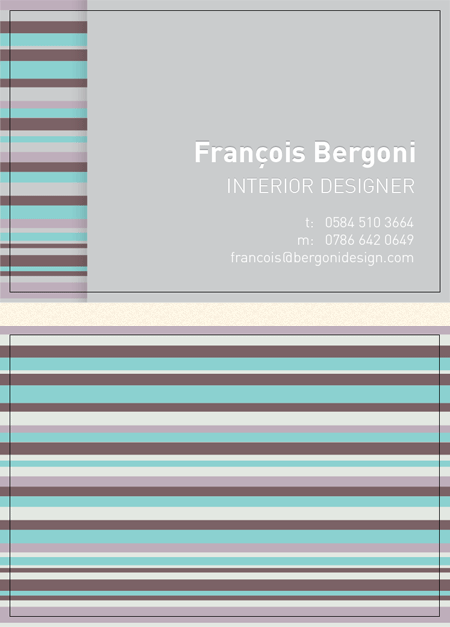
The card we’ll be designing is for a fictional interior designer. We’ll be using a beautiful colour scheme to create a decorative striped design that flows from the rear of the card to the front.
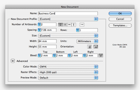
Open up Adobe Illustrator and create a new document. In the options box we need to set up the correct print settings. With this design being two sided we first need to set the number of artboard to 2. Then adjust the dimensions of the final card, we’ll be using Moo.com‘s figures of 84x55mm with 2mm bleed. Also make sure your colour mode is set to CMYK and raster effects at at 300ppi (even though we won’t be using any raster effect, it’s good practice to set this option).
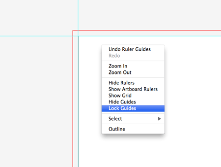
Press CMD+R to show the document rulers, then drag out guides against the black outline of the artboard. Right click and uncheck the Lock Guides option, then draw a selection around the left and bottom guides.
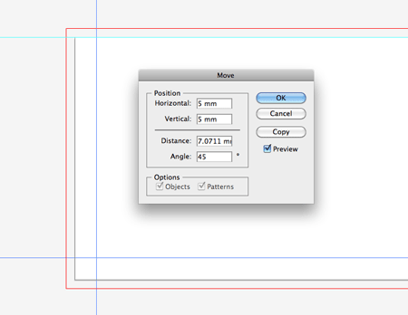
Hit Enter to bring up the Move options box and enter 5mm in both the Horizontal and Vertical options.
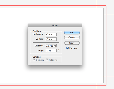
Next, select the top and right guides and hit Enter once again. This time enter -5mm in the options. These guides will indicate the safe zone for our design. Important elements such as text shouldn’t go beyond these guides so they aren’t chopped off or unbalance the design.
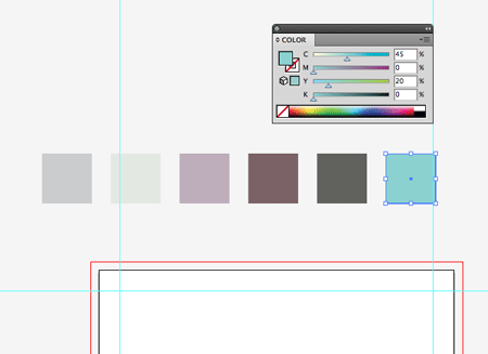
Draw some coloured blocks on your document to lay out a simple colour scheme for the design. This particular scheme is courtesy of ColourLovers.com.
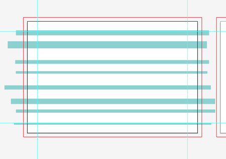
Select the first colour from the scheme and begin drawing a series of randomly sized rectangles across the first artboard.
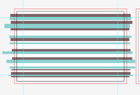
Continue drawing rectangles with the next colour. Make sure every shape extends beyond the red bleed outline.
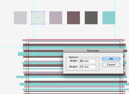
Once you’ve gone through the whole series of colours. Select a lightly toned colour to be used as a background. With the Rectangle tool active, click on the artboard and enter specific dimensions of 88x59mm to draw a rectangle the exact size of the card.
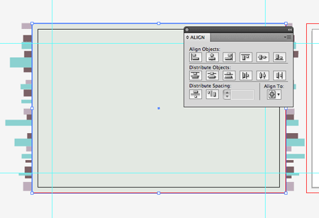
Use the Align palette to centre up the rectangle on the artboard (toggle the Align to Artboard option from the Align To menu). Press CMD+Shift+[ to send this item to the bottom of the layer stack.

Clear out the fill colour from the toolbar, then click another rectangle onto the artboard using the same 88x59mm options. Centre it up with the Align palette.
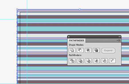
Draw a selection across the overlapping coloured stripes and group them all together, then hold Shift and select the clear rectangle. Choose the Crop option from the Pathfinder palette to trim the stripes down to size.
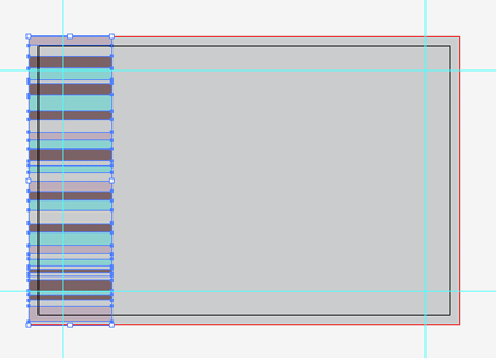
Now let’s move onto the other side of the card. Copy across the series of stripes and squash them down so they only take up a small amount of space on the left of the card.
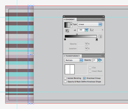
Draw a thing rectangle the height of the card and align it with the edge of the striped area. Give this rectangle a black to transparent Gradient fill and adjust the opacity to tone down the shadow effect.
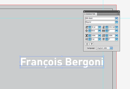
Type out the name of the card owner in a font of your choice. Here I’m using my old favourite DIN for its modern shapes and lines.
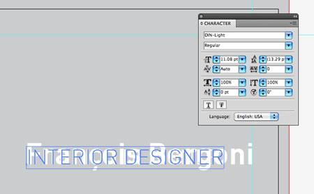
Set out the job title in a lighter font weight and scale the cap-height to the x-height of the letters that make up the name.
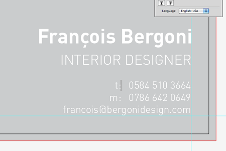
Next we can lay out the contact methods in the lighter font at a smaller size. Adjust the spacing between the letters to line everything up using the ALT key and the left/right cursor keys.

To style up the text with a pseudo letterpress effect we can copy and paste behind (CMD+B), nudge the text upwards very slightly then give it a darker grey fill.

The card is now ready to export for print. First delete out your colour scheme blocks from the artboard and convert all the text to outlines (CMD+Shift+O). Then go to File > Print. Change the drop down to Adobe PDF then head over to the Marks and Bleed section. If you’re having your design printed at Moo.com, you don’t necessarily need to add any print marks, but for those printers that require them, check the relevant boxes.
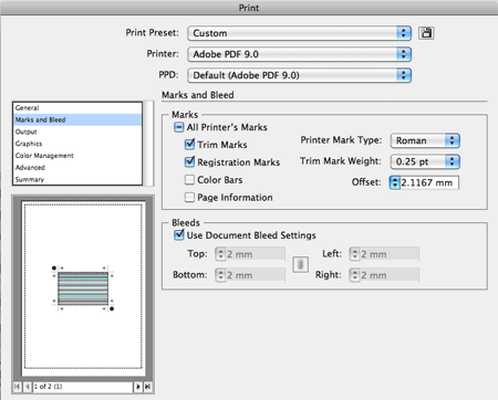
Switch back to the General section and change the Size to Custom, this will clear out the excess white space from around the document preview. Now save the file as a PDF.
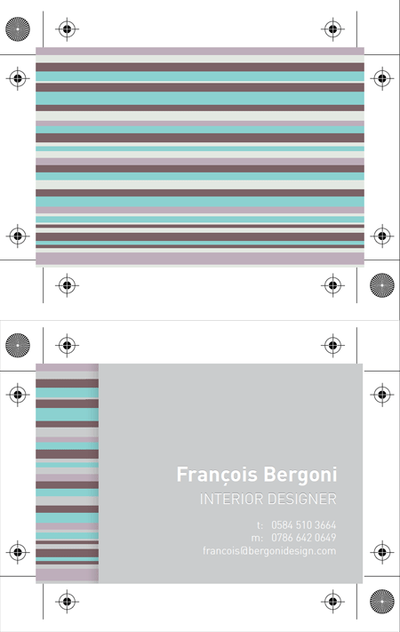
Open up your PDF in Adobe Acrobat to double check your final artwork. You’ll notice both artboards have been compiled into one file complete with trim and registration marks. The next job is to send it off to your printer!



So goood, really need to touch up on my illustrator knowledge, been spending to much time in Photoshop at the moment!
Really useful, thank you for sharing with us.
You really do love your stripes, don’t you? :)
i was thinking the same thing!!
Though I did use his letterhead stripe design for a great poster :)
minimalism gives nice and clean outcome…
Very nice tutorial! Thanks for posting.
That’s not sophisticated at all! :))
Love how the stripes at the left look as if they are going under the grey main body area.
Ace. Nice one
design is ok. I like the faint pseudo letterpress effect very though. Nice touch.
Thanks Chris, this business card tuts is really cool.
Haha, this looks almost exactly as a buzzcard I designed for a client, .. way back!
One big difference, I used real PMS colors in illustrator, not hex. colors? Thanks for sharing, Cheers & Ciao ..
nice tutorial……
Simple yet beautiful business card design, loved it!
Thankyou for the tutorials
thanks for sharing this really useful way to desing bro!
Is simple the best!
Looks awesome Your choice of colors are great.
Thanks
Cool tut. Very clean and clear outcome, thanks for sharing :)
Thanks for the kind comments everyone. In response to a couple of questions:
@Ash – Definitely! I love making pretty stuff out of simple shapes. Stripes do this perfectly!
@Gonzo – I’ve only used regular printing on all my cards so only simple CMYK colours were needed. Pantone colours are great for matching an exact colour without the dither you get from mixing CMYK but it comes at an extra cost.
Hi Chris,
thanks for your reply! Now I understand why you use simple CMYK and no PMS colors, .. makes sense if you use regular printing!
I always use PMS when it concerns a total branding project where the colors MUST have the same ‘look & feel’ on all of the marketing-tools (buzzcard, stationary, brochures, etc.), and when using offset printing (of course).
When doing a full-color offset print, I still make the corporate colors in PMS (and add them as spot-colors), so they run the offset prints several times on the print-material to get it right.
Once again, thanks for your reply and keep up the good work here, I’m a big fan! Cheers & Ciao ..
Thanks Chris! This is going to be quite helpful when I finally get around to making my own business cards. Do you use moo.com to print your own business cards? If so, is there any particular reason you use them over anyone else?
alert(“test”)
how to print in pdf
i have illustrator cs5 and don’t show me this option
sorry for my bad english i’m from mexico
@Jason – I’ve used a couple of companies, the lastest cards I have are from Moo and I must say the quality is great.
@Daniel – Try selecting Postscript file from the print options instead, then convert the .ps file with Adobe Distiller. If you search for one of my older business card tuts there’s a step by step of this method.
Can you please create video tutorials?
Pretty nice narration.. Love it..
As always Chris, showing us how it’s done! Nice =D
Chris, absolutly amazing. Thanks a lot four every tips you give to us.
Thanks for the post I’ve been making my own cards this way for a year now, and it for sure beats using a design service. If you can find the right codes, you can get vistaprint to make 500 of these with double gloss for like $20.
Chris, I love the look of this. Simplistic yet professional and stylish. I haven’t used Illustrator in a few years now so I should really give this a go!
Very nice! Love the clean, sleek design. Thanks for sharing!
I have to say this guide helped me a Hell of a lot well planned and easy to follow, i commend you :)
Simple and very nice inspiration !
Hi Chris! I recently find your site. Your tuts are very much helping to me in my work. I have a question for you. You are setting crop marks for single card. But I have to make crop marks for about 30 cards in a 19″ X 13″ big sheet. We are using Corel DRAW for our job works. I have interest in Illustrator. So kindly explain the needed settings for the above in Illustrator. I am using Illustrator CS3.