This post was originally published in 2010
The tips and techniques explained may be outdated.
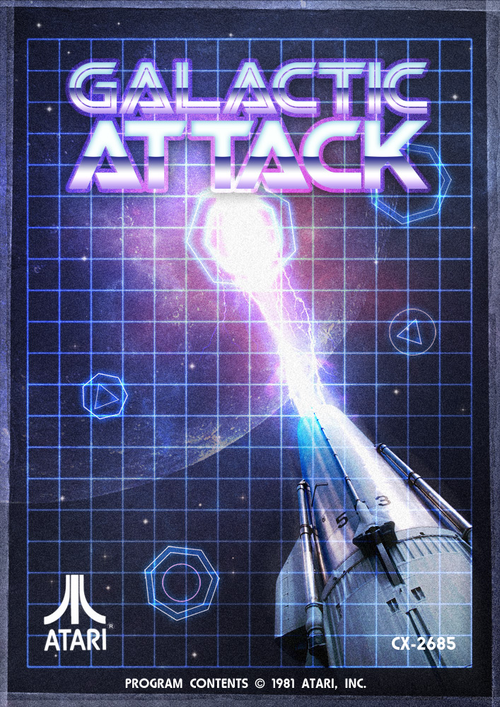
Combine stock photos and design resources to create an awesome retro sci-fi themed game poster that takes inspiration from Atari games of the 80s. By mixing up bright and vibrant cosmic designs with old, distressed and grungey textures we’ll create a retro futuristic poster design for ‘Galactic Attack’.
Research and inspiration
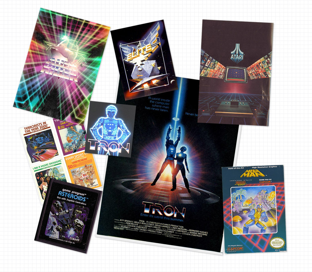
I knew from the start what theme and style of poster I wanted to create, but to further develop my ideas I took to the web to research my chosen theme in order to pick out common design elements which would help tailor my design to the style I was after. A quick search for Atari games and retro sci-fi movies soon brought up plenty of creative ideas to start with. Here’s a quick mood board I put together for the theme of retro sci-fi.
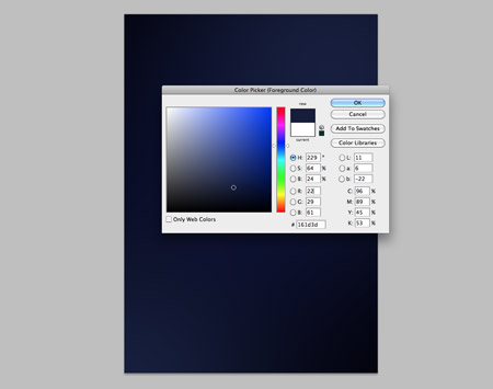
Open up Adobe Photoshop and create a document at your desired poster dimensions. Remember to use a high DPI (150-300) if you’re looking at having your design printed. Fill the background with black, then dab a couple of spots of dark blue in opposite corners.
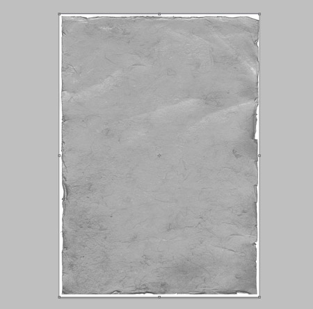
Find an old paper scan, such as this one from SXC. Paste it into the document and desaturate. Run a quick Sharpen (Filter > Sharpen) command to give more definition to the texture. Change the blending mode to Soft Light at 50%.
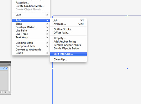
Switch over to Illustrator to create a vector resource. Draw a rectangle onto the artboard at the same dimensions as your poster, then go to Object > Path > Split into Grid.
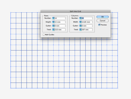
Change the gutter setting to zero, then adjust the number of rows and columns until the grid squares are equal in size.
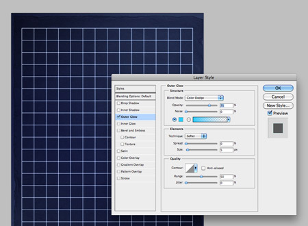
Change the black stroke to white, then paste the grid into Photoshop. Add an Outer Glow of a bright Cyan, with the blending mode Color Dodge.
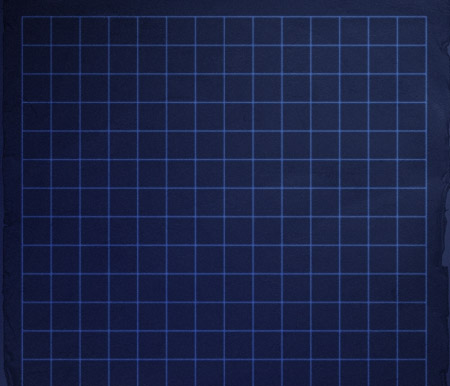
Give the layer of the grid a blending mode of Soft Light to allow the colours to interact with the blue tints in the background.
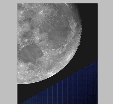
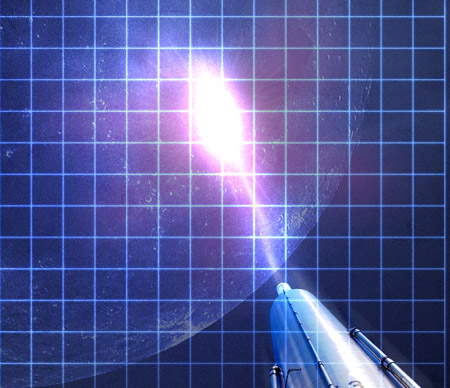
Open up a photograph of the moon and paste it into the document. Change the blending mode to Color Dodge, then lower the opacity to 20%.
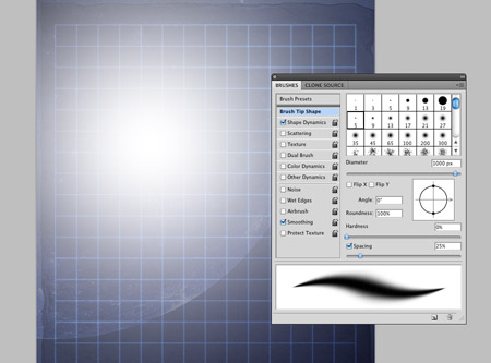
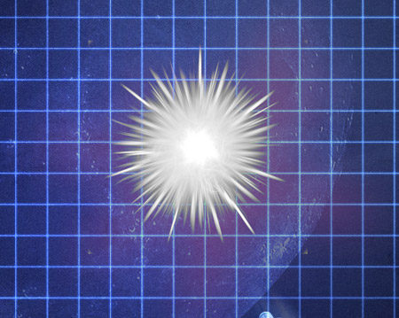
Use the Brush tool to dab a large spot of white over the planet. Change this layer’s blending mode to Overlay to give a vibrant lighting effect.
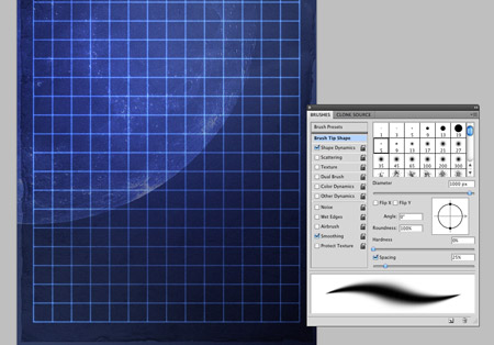
Duplicate the grid layer, then add a layer mask to the new copy. Use a large soft brush to erase out areas of the duplicated grid to give varying levels of vibrance across the poster.
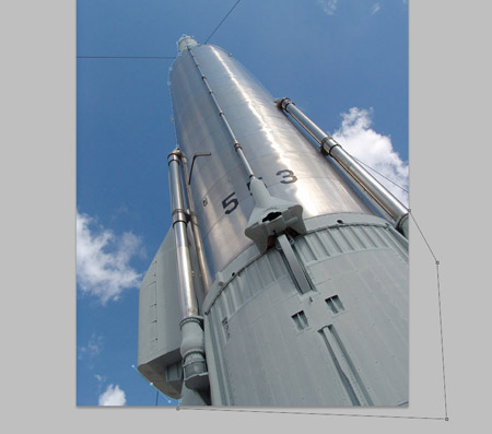
This handy photograph of a rocket engine will fit perfectly as our sci-fi cannon. Open up the shot in a new document and clip out the object with the Pen Tool.
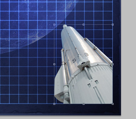
Paste the cannon into the document and scale into place. Position it in the bottom right corner, so it fits within the grid area.
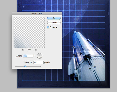
Change the blending mode to Linear Light, then duplicate the layer. On the duplicate, go to Filter > Blur > Motion Blur. Adjust the angle to follow the direction of the cannon and adjust the amount to around 100px. Drop the opacity of this layer to 50%.
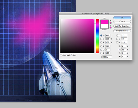
Use a soft brush to roughly draw a bright pink explosion. Change the blending mode to Exclusion at 50% to allow the pink to recolour the underlying artwork.
Download a simple explosion graphic and open it up in Photoshop. Desaturate the graphic, then change the blending mode to Lighten at 5%. This will add a subtle texture and impression of exploding motion.
On a new layer, use the Brush tool to draw a laser trial and start of the explosion. Change the layer’s blending mode to Color Dodge to allow the colours to interact.
Add a large spot of white to the end of the cannon, change the blending mode to Overlay.
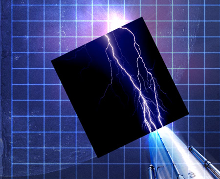
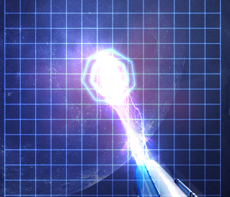
Find a photograph of some lightning. Paste the shot into Photoshop then scale and rotate to follow the line of the laser shot. Change the blending mode to Color Dodge, then add a layer mask to erase out any hard edges or corners from the photograph.
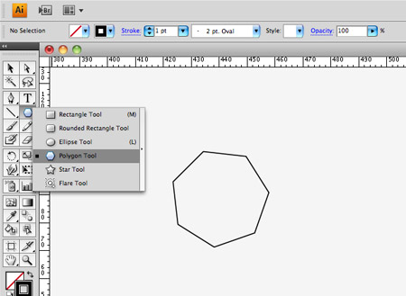
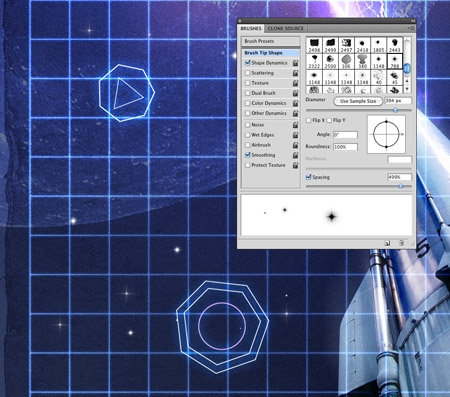
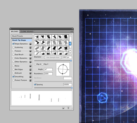
Switch back to Illustrator and quickly draw a Heptagon with the Polygon Tool. Give it a white stroke then paste into Photoshop.
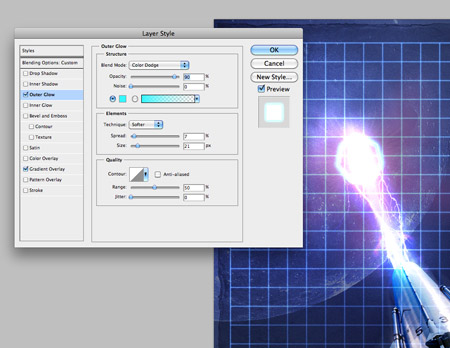
Position the Heptagon into place as a target marker, then double click the layer to add an Outer Glow style. Use a bright Cyan with the Color Dodge blending mode to create the feel of a sci-fi computer display or HUD.
Paste in another Heptagon, this time scale it so it’s slightly larger than the original. Rotate it slightly to give the impression of a radial movement.
Continue creating and pasting various geometric shapes into the document. Give each one the same layer style by right clicking the original target layer and selecting Copy Layer Style, then Paste Layer Style on the following shapes. Mix in a couple of triangles and circles to add variety.
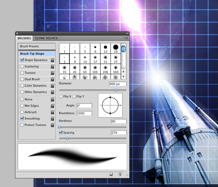
Use some star brushes to paint in a cosmic background. Adjust the brush settings to that the brush scatters and varies in size. Change the blending mode to Soft Light.
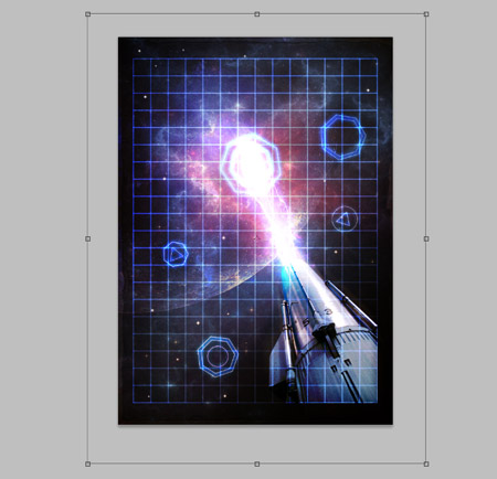
Download a detailed cosmic photograph, then paste it into the document. Change the blending mode to Overlay at 50% to allow the textures and colours to interact with the design.
Add a grungey border to the design with some tape brushes. Adjust the angle from the Brushes palette, then paint over the edges of the document.
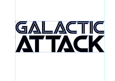
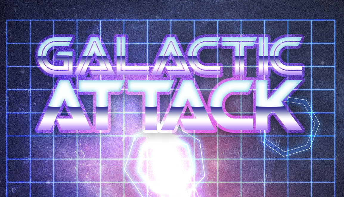
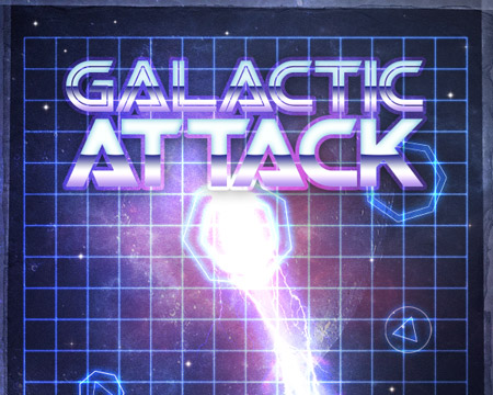
Open up Illustrator once again and create a title logo for our retro game. Galactic Attack sounds like a typical Atari game from the 80s! A sci-fi font such as Viper Squadron makes a fitting design.
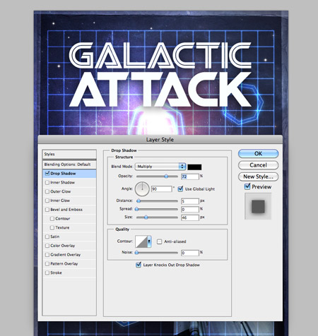
Paste the logo into the document, then add a Drop Shadow to allow the title to pop.
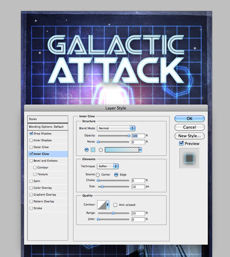
Next, add a bright blue Inner Glow. Change the settings to Normal at around 20px.
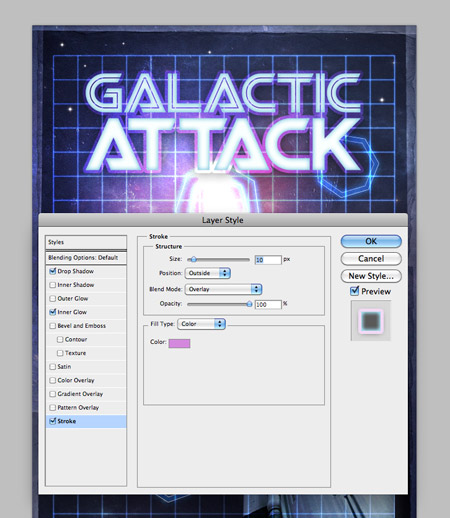
Finally, a large pink stroke with the blending mode of Overlay gives an outline that interacts and blends with the underlying design.
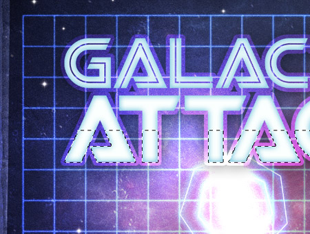
Hold CMD and click the layer thumbnail of the logo, then Hold the ALT key while dragging with the layer mask to remove a portion of the selection.
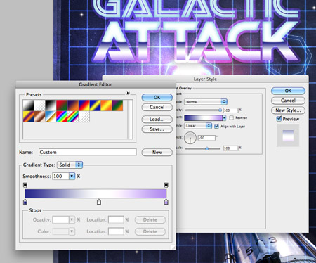
On a new layer fill the selection with a gradient. We’re aiming for that retro chrome look that’s typical to the 80s, so use samples of purple from the design.
Repeat the process for the first word to finish off the logo.
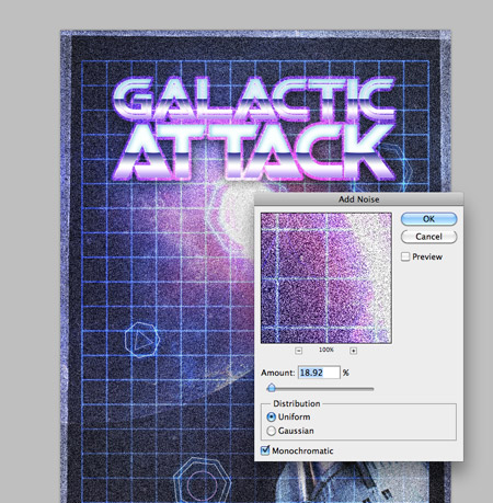
Press CMD+A to select all, then Copy Merged (CMD+Shift+C). Paste the clipping onto a new layer, then go to Filter > Noise > Add Noise. Enter around 20%, and change the blending mode to Screen at 30%. This step helps add that detailed texture often associated with old prints.
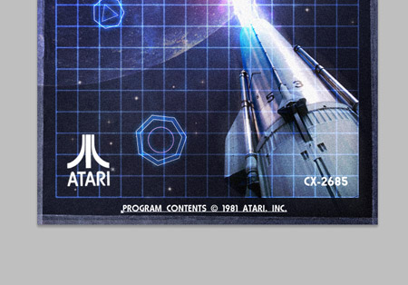
Finish off the design with some typical game branding. I’m taking inspiration from my old Atari 2600 games from my childhood.
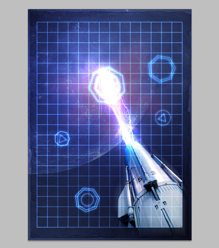
The final poster design fits right in as a retro sci-fi game. The bright and vibrant colours help give that futuristic space theme, while the various textures and outdated design styles send it right back to the 80s era.

Awesome – I’m sure Ive played this game!
Very good tutorial, final visual looks very retro.
This is invigorating. Atari posters are really a great source of inspiration for some retro-futuristic graphics. You’ve done your homework really good (i mean the research and stuff) :P
A few lens flares on the typo would have added a bit more feel. Its awesome nonetheless. I loved creating this.
Thanks Chris :)
Ah the good old lens flare, should have remembered that!
Interesting with your research part! Thanks Chris!
Very Inspiring!
Thanks Chris!
Very nice effect. Some very good techniques used here, thanks for sharing them.
Awesome Tutorial Chris – Very Inspiring!
really beautiful poster with easy tutorial with some useful techniques.
cool! nice one!
Pretty awesome, I really should try some photo manipulation like this sometime!
Nice poster. Great attention to detail. Makes me want to play this game. Thanks.
jawdropping!
I’ll try it out and post my results
thanks for the tutorial
Awesome tutorial Chris! I love the fact you used the Battlestar Galactica font :) one of the best Sci-Fi shows … ever! (both the original and remake)
If I’m honest I never realised it was! It was simply a good match I found, called Viper Squadron from Dafont.com
I absolutely love this! I had this same exact idea when I came across some of Sakke Soini’s work and some Atari Covers I found on ffffound last year http://www.behance.net/Gallery/Space-Girl-World/244102
Nice work by Sakke, I’ve definitely seen that particular design doing the rounds across the net.
Wow. Thanks for the great tutorial! Cool!
Nice post, love the retro look.
Great tutorial!
I’m I fan of sci-fi art and your result is really nice!
Classic! Brings me back to my ol’ Atari 2600 days!
Great work! Thanks for sharing!
Wow…Great result…..and true to the style. Well done.
Awesome results! It actually looks real rather than trying to look real.
Pretty good post. I just came by your blog and wanted to say that I’ve really enjoyed reading your blog posts. In any case I’ll be subscribing to your feed and I hope you write again soon!
Thanks for the kind comments everyone, glad to hear you enjoyed the tutorial
Pretty cool. However, I think it would of looked just as good without the grid.
nice tutorial….loved it
Hey Chris, could you check this out http://flic.kr/p/7V3sZH, I used some techniques from this tutorial. I tried the noise thing you suggest towards the end, but the effect is not as pronounced. Is it because I’m working on a light background, opposed to a dark one?
Nice work Simon. The noise effect will work no matter whether it’s a light or dark background. Have you tried adding more noise percentage, then toning the layer back with by lowering the opacity?
No, but I’ll sure do for the next one :-) Thanks for the feedback.
Nice one Chris!
this is great – I really dig this kind of atari style retro future design not sure why perhaps cos Im from the 80’s – arent most of us ?
you really nailed the retro futuristic look here Chris –
nice technique, nice work! will have to bookmark this for future use.
wow, I was looking tutorial like this for hours, and finally found it :D thank you so much, this was awsome
Hi.. Why are u adding a noise to the picture? u add it every time..
Looks awesome, nice and great.
Want to follow it after follow your Illustrator tutorial about RSS feed icon, but I’m too sleepy now :lol:
nice tutorial
thanks
Thanks! The 80s make me laugh. I took this tut and put a bit of a spin on it, which made for a fun, vaguely political commentary about the moon.
Just subscribed to yr rss. You got some good work here on your site. Cheers jake
amazing tutorial… love it
Thanks, this tut gives really nice and vintage look
I must be missing something here, I’m at the second step (total noob) and when I change the paper layer’s blending mode to soft light it pretty much ceases to exist. I see nothing but the black background.
I love asteroids! made an asteroids animation in flash when i was learning.. :)
great tutorial!
when are you posting the tutorial about hemoroids? ;)
I was totally with you until you referred to the moon as a planet.
Cool tutorial though, very fun and retro.
Fun tutorial. Very nice work.
Great tutorial, thanks for sharing!
Fantastic! I was looking for a tute like this for my latest electro (80’s style) mixtape but ended up going the James White route.
Whats the name of the font you have used for the text at the bottom (that reads “Program contents…”)?
Cheers!
Congratulations for this achievement, great looking game poster.
A great tutorial, with a really nice end result… and inspiration from one of my favourite films, TRON.
Thanks for sharing this poster design tutorial.
am not that much into sci-fi art but the tutorial is great and I really like the poster.
Nice work and great tutorial.
Thank you again
Interesting the tutorial, my like the Fantasy.
WOW…truly amazing…You definitely inspire me to work harder to create great works!
Now I have to go watch “the last starfighter”…retro look got me in the mood!