This post was originally published in 2011
The tips and techniques explained may be outdated.
The retro style badge/emblem of logos is a hot trend at the moment, and it’s no surprise why – They’re super cool! We’ve already looked at a showcase of retro and vintage style logos based on circular motifs, now let’s build our own. We’ll put the basic structure together in Illustrator, then give it that aged vintage appearance with some finishing touches in Photoshop.
![]()
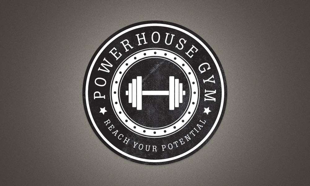
The logo we’ll be creating is for the totally fictional Powerhouse Gym (although I wouldn’t be surprised if there was a gym somewhere with this name!). It combines many of the typical traits of this retro/vintage theme with alternating rings of black and white as well as fine details such as the stars and dots. The text and tagline follow the circumference of the circle while the icon sits bang in the centre and gives visual feedback as to what the logo is promoting.
View the retro/vintage logo design
![]()
Be sure to check out the showcase of retro badge/emblem logos, then when you have plenty of ideas open up Adobe Illustrator and create a large circle. Copy (CMD+C) and Paste in Front (CMD+F) a duplicate, scale it down slightly while holding ALT and Shift, then switch the fill for a white stroke.
![]()
Press CMD+F to paste in another duplicate, scale down and change the fill to white. Paste in another, scale it down a little further to give the impression of a thick ring.
![]()
Paste a couple more circles and scale them appropriately to add a couple of thin strokes on the inside and outside of the white ring.
![]()
Position another circle exactly in the centre of the white ring, then adjust the stroke settings to 4pt Weight, Round Cap, Bevel Join, Dashed Line, 0pt Dash and 17pt Gap. For the gap setting in particular, use the cursor keys to nudge the number up and down until the circles are spaced evenly.
![]()
Elsewhere on the artboard, draw a series of weight plates with the rounded rectangle tool. Scale and position each larger plate with the same distance between them.
![]()
Use the rectangle tool to add a handle, then copy, paste and rotate the series of plates to finish off a simple dumbbell icon.
![]()
Switch the fill of all the shapes that make up the dumbbell to white, group them together and position the graphic in the centre of the logo.
![]()
Copy and paste one of the circles from the logo and clear out the fill and stroke. In the Text tool menu select the Type on Path option and click on the circle.
![]()
Enter the words Powerhouse Gym then select an appropriate font. Slab-Serif fonts typically have a strong and masculine feel, so I’ve picked out Boton for use in this logo.
![]()
Instead of adjusting the tracking of the letters, go to Type > Type on a Path > Type on a Path Options and adjust the spacing here. This setting will generate more even gaps where the tracking would bunch letters together as they flow around the curve.
![]()
Use the Direct Selection Tool to carefully adjust the little handle to centre up the text. Use a guide to make sure the wording starts and ends at the same angle.
![]()
Copy and Paste the circular text shape and replace the wording with the tagline ‘Reach your potential’. Use the little handle to adjust the text to sit on the outside of the circle and towards the bottom of the logo.
![]()
In the Type on a Path settings, adjust the Align to Path option to Ascender, then make another subtle tweaks to the size to make sure the text fits perfectly to the centre of the black ring.
![]()
A couple of stars finish off the text by separating the two sets of words. Scale and position one into place, copy and paste in front a duplicate and move this duplicate horizontally while holding Shift.
![]()
The vector version of our logo is complete. Illustrator’s tools made it easy to create the overall structure while keeping everything scalable and editable.
![]()
Let’s finish off the logo with some cool textures in Photoshop. We could import a texture, live trace and punch out some distressed marks with the Pathfinder, but you just don’t get the same effect as real textures in Photoshop.
![]()
Paste in the logo from Illustrator into a temporary Photoshop document and scale into place.
![]()
Use the super handy Subtle Grunge brushes from WeFunction to add grungy spots of white on a layer above the logo.
![]()
CMD+Click the logo layer’s thumbnail, press CMD+Shift+I to invert the selection and delete out the excess.
![]()
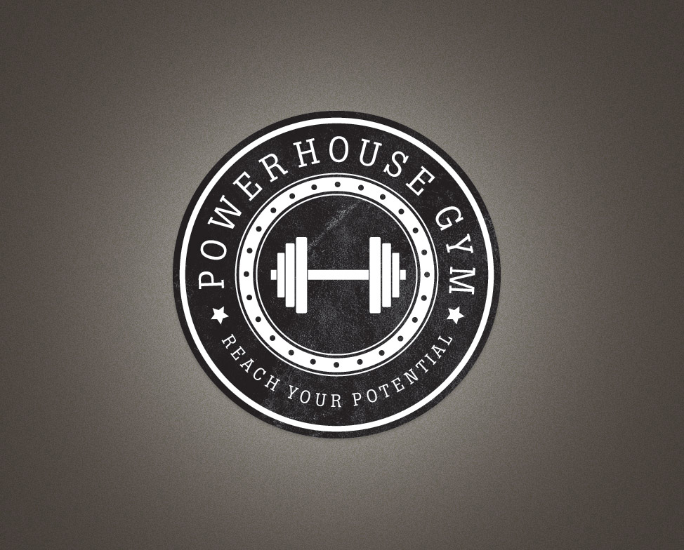
Tune the grungy effect by adjusting the opacity of the layer. This simple touch gives the logo that old, worn and distressed appearance of a genuine badge, sticker or emblem.
The texture really completes the badge!
Retro is always a winner, I love it!
I always loved these! Thanks for the tut, will try it later :)
Gosh this looks gorgeous! I love your tutorials Cahris!
Very cool!
I <3 You Chris !!!! my man out there ! ;)
Thank God! Smoenoe with brains speaks!
Nice tip on the dots, I would have done them manually.
I would have flipped one of the stars tho ;)
LOL Yes me too, I would of probably used the transform option.
I did not think about using stroke options. Nice tip
Looks good!
Didnt know the forum rules allowed such birllaint posts.
Yet another great tutorial from Chris Spooner.. :)
Just awesome! Absolutely love retro… thanks for the quick tutorial!
Awesome tutorial Thanks :-) The Grunge effect at the end makes the logo so much better!
hey nice idea, an as usual simple and easy !
Very Nice! Technically you could create the exact image in Photoshop alone, couldn’t you? Is it just easier to use Illustrator for the shapes, etc?
Have just learnt some nice touches that will work nicely with my logo. Thanks bro.
love the retro look! you rock chris!
You inspired me! i made myself one! a bit more grungy tho, Brilliant tutorial, thanks!
Cool Chris.
Very nice. i love it.
wow your website veri nice :D
Just came along at the best time. Created a logo for a sports massage and coaching but was missing that something. Cant wait to give this tutorial a try.
thx for the tutorial here is my result, based on a cars 2 (pixar) logo: http://bit.ly/g3mLXb
Love it. I was able to come very close using inkscape. The only thing I couldn’t do were the dots on the inner ring. Using similar steps in inkscape created rounded dashes.
I hate to design logos, simply because i’m bad in it nor i dislike. With your tutorial i’m sure i will do just fine to learn something from great designer.
thanks for the cool tutorial, Chris.
nice work here.
gr8 tutorial…! Thanks
Awful. 1st year Design Student rubbish.
How is this a tutorial? A monkey playing around with a vector program could come up with this sort of poor Graphics. I’m embarrassed looking at that logo and the ppl that think it is cool.
Another fantastic tutorial!
I have to tell you, “Type > Type on a Path > Type on a Path Options” will come in handy in the future. I’ve run into problems trying to adjust tracking on paths using the type palette. Too bad I didn’t know about this about 2 weeks ago.
Nice! thx
I always wanted some new tutorials, that involved making the textures, and this seemed to give me some idea. Will try it soon when I am back to windows. This will be really fun.
Thank for your tutorials …
It help me a lot …
Will try it soon when I am back to windows. This will be really fun.
Hey Chris,
They actually is a PowerHouse Gym where I live and the logo is kind of quite similar. It is a local company though here in hawaii
The texture really completes the badge!
Retro is always a winner, I love it!
This forum needed saknhig up and youve just done that. Great post!
What a great tutorial. I have to be honest when I say this is the first tutorial that was extremely well thought out and planned. I would like to say 9/10 tutorials that I try to use eventually the author gets lazy and starts to leave out important details, assuming we magically know what that person meant. This tutorial did not leave out any details and I always knew where to go or what to do. Extremely well written tutorial, bravo, golf clap.
Nice tutorial Chris, I really need to get into using Illustrator more, bookmarked for future practice.
Thanks, just had to do a similar thing
It looks like an university logo or like a security agency logo.
Great! easy to follow and amazing tutorial.
tnx!.
Chris, I have similar kind of tutorial to make a Widget – I am looking to post on blog like yours ?
Your demonstration for badge was awersome, masterpiece. Let me know on my email, if I contribute something for your users.
You were right, there are gyms with that name ;)
http://www.powerhousegym.com/
Nice tutorial!