This post was originally published in 2014
The tips and techniques explained may be outdated.
In today’s Photoshop tutorial we’re going to play around with various image adjustments to recreate the emotive style of high fashion black and white photography. Typically these photographs feature many of the characteristics of old school 35mm film, such as heavy film grain and low contrast. Follow this step by step guide to quickly transform your own photos into artistic black and white pieces of art.
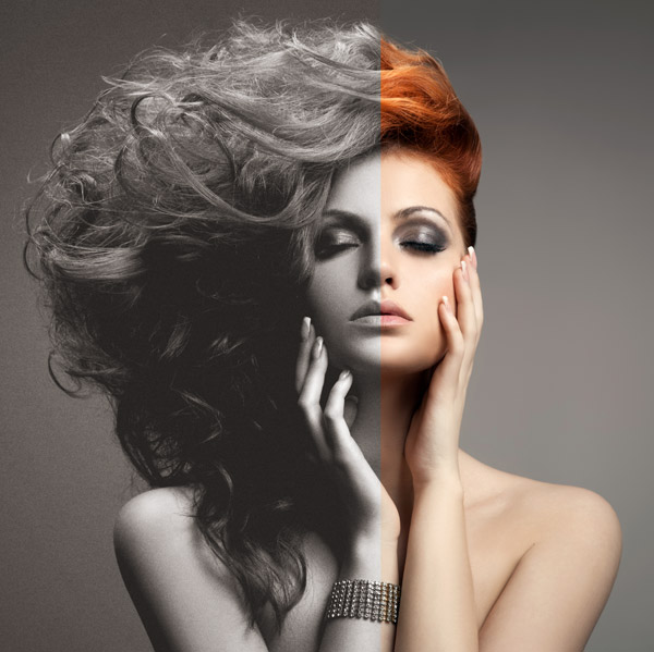
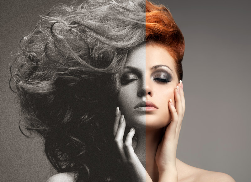
The photo effect we’ll be producing is inspired by traditional high fashion photography, as seen in this set of B&W High Fashion Photography on Pinterest. The most obvious characteristic of these photographs is that they’re all black and white, but look closely and you’ll notice that many have low contrast with the blacks not being entirely black (more of a dark grey). These black and white images don’t completely lack colour either, there will often be a very subtle warm or cool tone that adds to the feeling and mood of the shot. We’ll take these common characteristics and replicate them on our modern digital photographs to create a high fasion inspired effect imitating 35mm film.
Grainy B&W High Fashion Photo Effect
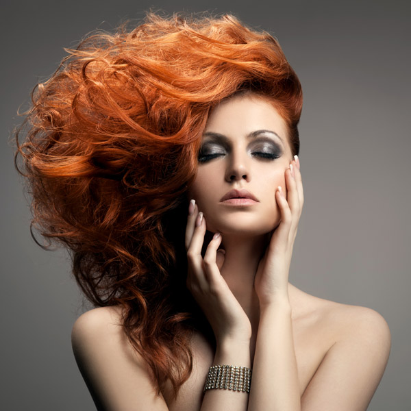
We’ll first need an image to edit. A portrait of some kind will work best, but go for something a little conceptual for that abstract high fashion style. This particular image is a beauty portrait from Shutterstock.
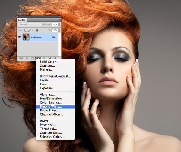
The first step towards the black and white high fashion effect is to convert the colour image to monotone. The best way to do this in Photoshop is to use the Black & White adjustment layer to avoid any kind of destructible editing.
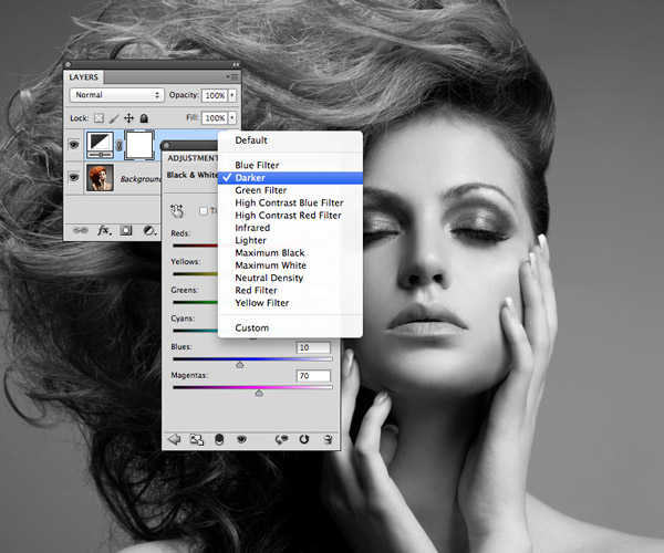
The Black & White adjustment layer retains the contrast of the image, unlike a basic desaturation filter. You can also make some adjustments to fine tune the tonal balance. The Default settings may be satisfactory, but presets such as Darker might help create a moodier image.
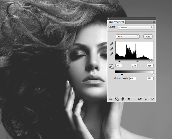
One of the key characteristics of those high fashion images was the low contrast. Add a Levels adjustment layer in Photoshop then move the black handle from the overall output level inwards to clip the shadows. The whole image will become brighter because the darkest areas are being lost, so use the usual Levels adjustments below the histogram to darken the shadows, brighten the highlights and adjust the midtones to find a balanced range of tones.
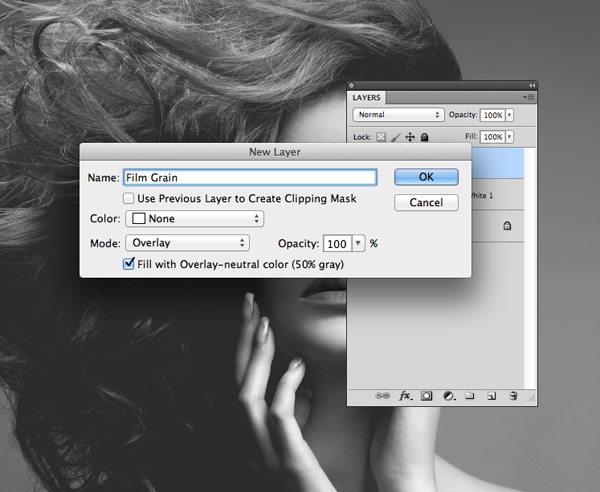
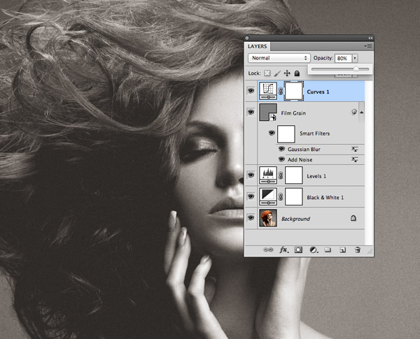
Select New Layer from the fly-out menu at the top corner of the Layers palette. Name the new layer Film Grain and set the Mode to Overlay. Check the option to fill the layer with 50% gray.
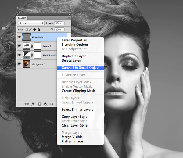
We’ve used non-destructive adjustment layers so far, let’s make sure that our film grain effects can also be edited or removed later. Right click and convert this Film Grain layer into a Smart Object.
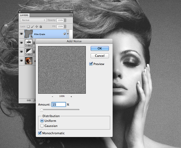
Go to Filter > Noise > Add Noise to add some grain to the image. Change the settings to Monochromatic, Uniform and alter the amount to between 10-15%.
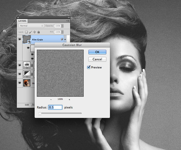
Photoshop noise looks a little fake with it being so perfectly crisp, so add a very subtle 0.5px Gaussian Blur to take the edge off the noise and create a slightly more realistic film grain effect.
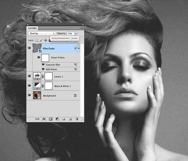
Alter the opacity of the Film Grain layer to fine tune the impact of the noise. It should add to the mood of the image but not be too intrusive.
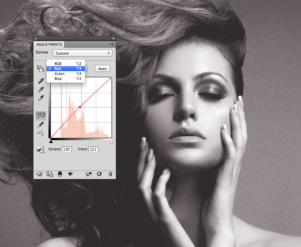
Add a Curves adjustment layer and change the channel selection to Red. Drag the curve line to add a slight positive bend to increase the warmth of the image.
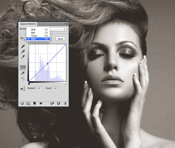
Change the channel selection to Blue and drag the curve in the opposite direction to produce a negative bend, resulting in sepia style tones.
Adjust the opacity of the Curves layer to reduce the impact of the colour adjustment just enough so the image still seems black and white, but the warmth of the sepia tones make a subtle difference.
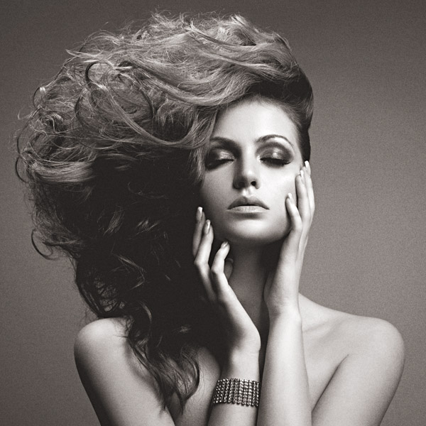
The final photo effect definitely has more emotion and mood than the original colour photograph, all thanks to the black and white contrast, film grain effect and subtle sepia tones. All the image needs is the addition of a logo for a top perfume, jewellery or fashion brand to make it the perfect full page magazine ad!
Awesome! Thanks as always for your content :)
Simple and effective. thank you
Awesome.
Always love step by step photo finishing tutorials for different common “looks.”
I would stop at the 50% Gray layer, or add some color selective/curve adjustment levels.
This is just because there are thousands of ways to go A–>B in Photoshop and I’m not a fan at all of using the super-fake “noise” effect, even if it’s blurred. As always, keep up the good work, you’re great :-)
Thank you so much for your guidance and time. I have learned so much from your post and I can’t tell you how much I appreciate you…..God Bless
Great tutorial, thanks for sharing!
I think I prefer the original photo, but this tutorial can still be usefull.
Thanks from france… This is good for my next design. Simple to set up, perfect for me
really cool technique! thanks!
I love blk & wht photography, and your right to mention the portrait should be something conceptual, otherwise it’s just another black & white photo.
Man you are awesome. The final touch of image looks fantastic.
awsm tutorial.. Very nice..
Just love it! Thank you for this tutorial.
thank for this post i like this
This is amazing tutorial; i wondered if you can have a video transcript for this tutorial.
I try to change the background color of my website: http://www.whatsappforpcxp.com but I’m lost on the third step. May be the version of Adobe that you use is different of mine.