This post was originally published in 2011
The tips and techniques explained may be outdated.
Follow this logo design process walkthrough to see the making of a cubist style logo design made up of lots of detailed vector facets. Not only will we be creating the actual design in Adobe Illustrator, but I’ll also be describing the whole logo design process in this tutorial, from the initial sketches right through to finishing off the final design.
![]()
The logo we’re creating as part of this tutorial is a trendy “Cubist” style logo made up of lots of detailed elements to form an larger object. The design is based on a fictional brand or company named Raven, but the whole process is the same for a live client (just without the infinite cycle of changes and revisions!). We’ll first create the full colour logo in all its glory with gradients and effects, then tone back the logo to create flat and mono versions to provide a versatile design for use in any situation.
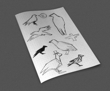
It’s worth starting any logo design project with a sketch. Our fictional brand of raven is simply going to be based on the Raven breed of bird, but for live projects you may need to brainstorm ideas on how to visually represent a company’s values. Sketch out a some basic raven poses to find a typical profile that would be easily recognisable at small scales.
Curved lines can lead to the profile being mistaken for a seagull or a pigeon, so stick to sharp lines to relate to that predator nature of ravens and crows.
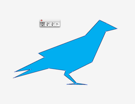
Once you’re happy with your overall silhouette or profile open up Adobe Illustrator and draw your outline with the pen tool using simply clicks. Trace a stock photograph to ensure you capture all the necessary proportions.
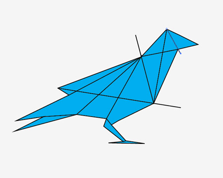
The design we’re creating is based on the cubist style to spice up the design with some fancy effects. Draw intersecting lines between each corner point of the outline.
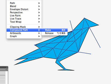
Add a range of intersecting lines until the design is made up of plenty of facets. Don’t go too far though as any tiny facets will be lost at small scales, which is generally how logos are used. Select all the intersecting lines and press CMD+8 to create a Compound Path.
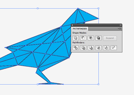
Select both the compound path lines and the overall outline and hit the Divide option from the Pathfinder palette. Right click and Ungroup the objects.
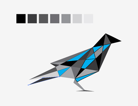
Set up a series of colour blocks to form a simple palette, then fill the individual shapes of your cubist design with these colours.
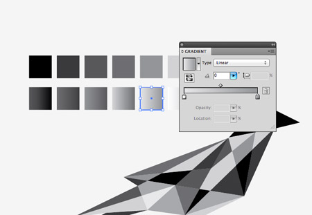
Once all the segments have been filled make a duplicate of the design. We’ll package up this flat colour version of the logo with the final files. Make a copy of the swatches and replace the fills of each block with subtle gradients.
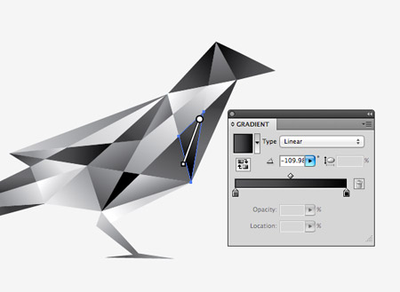
Replace all the flat colour segments with their gradient counterpart, then go through each individual shape with the Gradient tool to adjust the direction of the gradient flow.
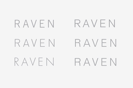
The main logo symbol is complete, so we can now move onto the type. A series of sans-serif contestants were laid out to compare their overall form. The more realist styles with the straight leg of the letter R seem to have a more modern and stylish appearance that suits the straight lines of the logo symbol.
One clear winner out of all the fonts is the Futura typeface. Its sharp points relate well to the clean lines used in the creation of the raven symbol.
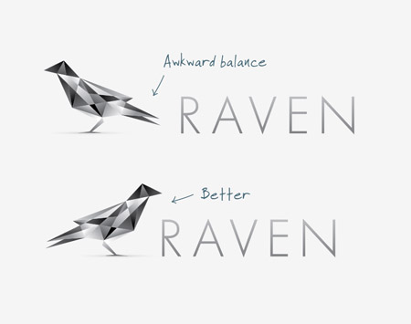
Next it’s time to combine both the type and the logo. Positioning the raven symbol facing away from the type leaves an awkward space between the two elements, whereas the breast and head naturally surround the first letter when it’s faced in the opposite direction.
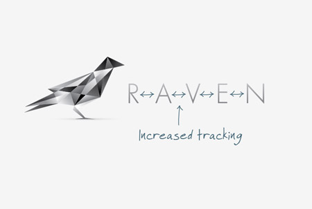
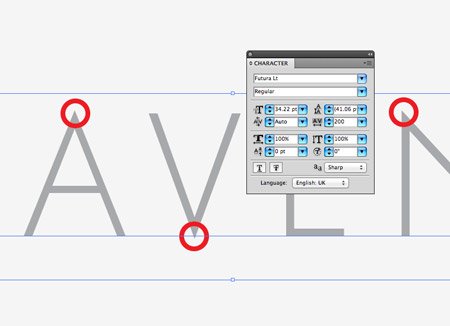
Finally the type and symbol are balanced in size by scaling the type to 1/3 of the overall size of the symbol. The tracking is also increased to increase the spacing between each letter to match the whitespace between the two objects.

The full colour logo will be the primary design used in most situations, but it’s always worth creating flat and mono versions for ultra small sizes or when inverted on a black background.
![]()
All the designs can then be exported and compiled into a complete package and handed over to the client. The final layout shows the full colour primary logo, the flat and mono versions and the cubist style pattern, which could be used in any additional branding, such as the website design, business cards or stationery.

Very very lovely. Classic Spooner Pattern as well!
Awesome
:)
Classy logo!
Nice work, Mr. Spooner!
Awesome tut, really digging that cubist style!
Nice one Chris.
Very nice!! the right level/amount of gradient use and nice balance of text versus image…
Clean and simple, brilliant!
nice work Chris. also – you should show your audience how you would save it for client (use). I seen several tutorials of how the design concept started and finish but never the third act “the prestige” when its ready for delivery to client.
I would also love to see how to would be handling the delivery stage. Curious.
I am actually going to break from battlefield to make one. It’s just awesome
thanks so much for this great tutorial, it’s easy to understand and super-professional and pretty looking yet again. FAB! (: oh, btw, i was really proud because i thought the futura would work very well with this logo before i read about your choice, hehe.
Awesome. I love to see what the creative process looks like.
Did you know you wanted to go the cubist route before you started sketching or was that decision made after you decided on the bird to use (obviously the silhouette) ?
Thank you so much for this tutorial dude. I was trying really hard to get this effect but failed and went ahead and handed over a logo I wasnt happy with. Since viewing this tutorial Ive updated the logo. It suits the project so well now. Again, thank you!
Here’s a link to the project artwork http://www.behance.net/gallery/Black-Ice-Productions/2588673
The tutorial very details.
Thank you so much, I love your Blog.
Appreciate it a whole lot due to this course boy. When i seemed to be hoping really challenging for getting that consequence although was unable in addition to journeyed onward in addition to handed over some sort of brand When i wasn’t very happy with. Due to the fact observing that course Ive kept up to date this brand. The item meets this challenge and so very well at this point. All over again, appreciate it!
Inspired by this, Chris?
http://www.underconsideration.com/brandnew/archives/a_hummingbird_with_bite.php
The humming bird in your link is a rip off of the freelancer.com logo.
great work…its really helpful..
thank you :-)
wow thanks a lot for this tut! always wondered about the technique used! will try this def :)
Great tutorial. The shape of the bird is just perfect. Keep it up!
Another great tutorial Chris. All ideas clearly and succinctly explains. Love your work and you sharing it with us. Inspiring!
Cool technique Chris! Will try that today and see what I came up with.
Great tutorial.. nice inspiration!! Tnx
lovely dimensional view as i’m getting result of this creative tutorial. thanks
Very nice. I like this
Those colors, along with the minimalistic look make that logo a perfect example of clean and simple design. Thanks and keep making more of these :)
Nice work and the tutorial very detailed.
Thanks
Nice tut. I am officially inspired.
nice!, as always :-)
Very useful and informative article. Thank you for sharing it with us.
Fun! Just made a robin in nice wintery colours, so pretty! Thanks for that, can’t wait for the next one!
Its awesome. Simple and smooth technique with a great impact.
This is an excellent tutorial and gives great tips on balance.
LIKE IT
wow, sometimes i think its difficult omake a cubist logo
its done now ! thanks chris :D
great tutorial, simple but very useful!!
Hi,
Tried to get the zip file and even signed up but it says there is an error.
Muy interesante, voy a linkarlo!
Simply awesome Chris! Thanks!
Thank you very much!
Very nice tutorial.
That`s nice.
Thanks for the tutorial
it’s great…thank you!!
this is awesome! :) Chris
I love this origami style bird logo. I will try my best to learn maximum from this post.