This post was originally published in 2011
The tips and techniques explained may be outdated.
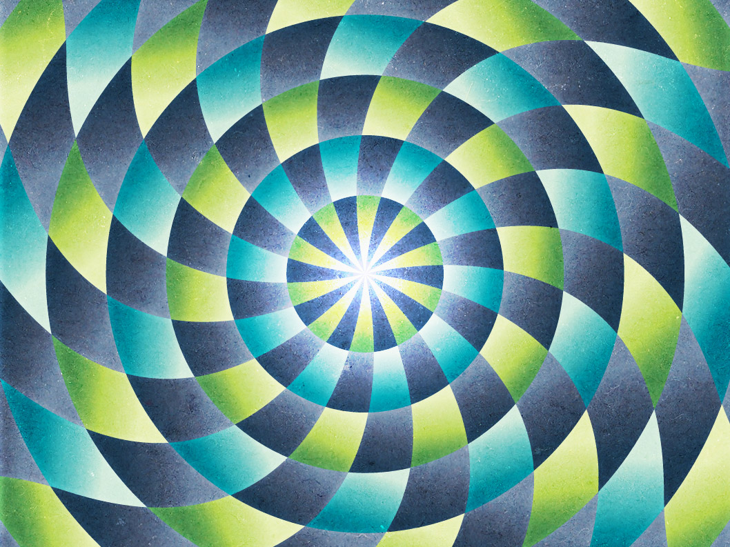
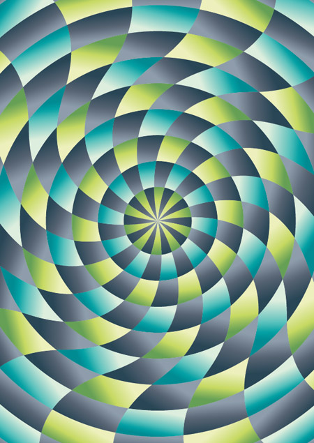
Whenever I’m stuck for tutorial ideas I always seem to be able to fall back on my typical ‘Chris Spooner’ style of cool abstract patterns people seem to enjoy. We’ve used similar techniques on the 3 poster a couple of years ago and more recently on a colourful abstract poster. Follow this latest step by step guide to create a cool abstract design complete with radial pattern and alternating colours.
The design we’ll be creating this time makes use of a radial pattern that draws in the viewer to the centre. Alternating colours give the design a cool and funky feel and textures add a touch of authenticity to the artwork.
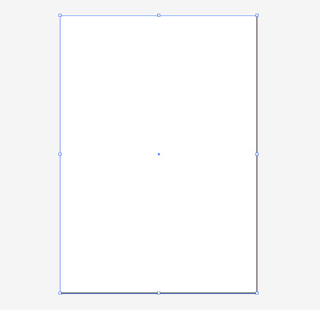
Create a new document in Adobe Illustrator at the dimensions of your preference and draw a rectangle across the whole artboard.
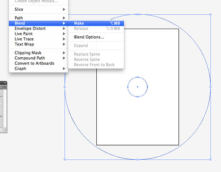
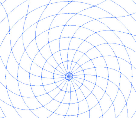
Toggle on Smart Guides (CMD+U) and draw a small circle from the centre of the rectangle. Copy and paste this circle and scale it larger than the artboard itself. With both selected go to Object > Blend > Make.
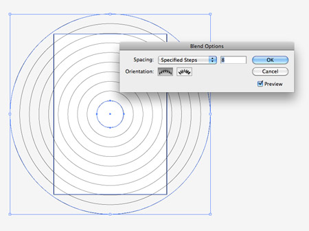
Go back to Object > Blend > Blend Options and adjust the settings to Specified Steps with a count of 8.
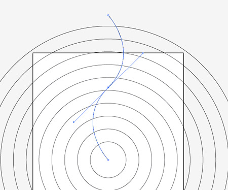
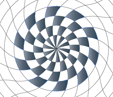
Draw a line from the centre of the document, then with the Pen tool add a point at the halfway point. Use the Convert Anchor Point tool to drag bezier handles from the point to give a smooth curve.
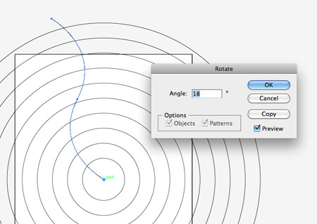
Select the Rotate tool and ALT-click a pivot point in the centre of the document. In the options box enter 18 degrees and press the Copy button.
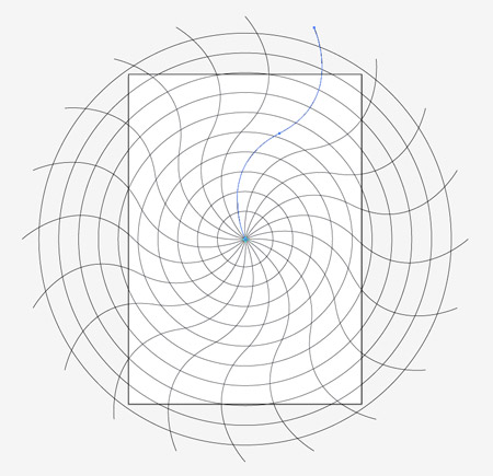
Repeatedly press the shortcut CMD+D to repeat the transformation until you have a series of 20 lines spaced evenly around the circle.
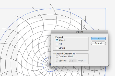
Select the concentric circles and go to Object > Expand. Select the Object checkbox to convert this blend into editable paths.
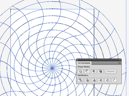
Draw a selection across all objects, then Shift-click the background rectangle to deselect it. Create a Compound Path (CMD+8) then with both the compound path and background rectangle selected, click the Divide option from the Pathfinder palette.
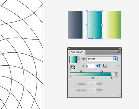
Right click and Ungroup, then delete out the excess linework beyond the edges of the artboard. Elsewhere on the document set up some gradient colour swatches for use in your design. Here I’m using grey, blue and green each with changes in tone from light to dark.
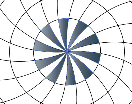
Hold Shift while selecting alternating shapes in the inner portion of the radial pattern. Give these shapes the grey gradient fill with the eyedropper tool.
On the next and subsequent rows select alternating shapes to create a chequerboard style pattern. Continue until you’ve filled the whole design.
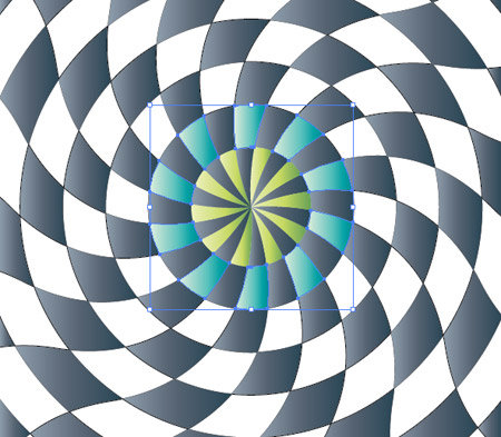
Use the green gradient to fill the leftover shapes in the centre area of the pattern, then switch to blue for the next row.
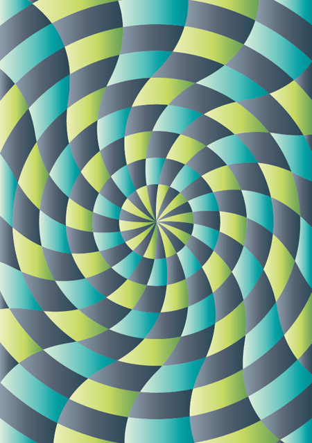
Alternate between blue and green fills until the whole design is filled with gradient colours.
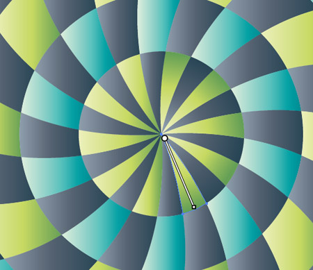
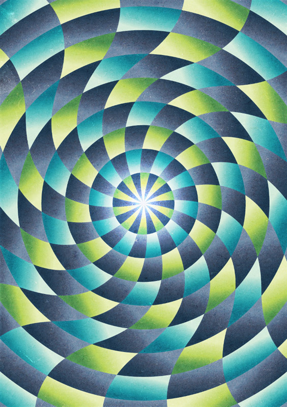
Currently all the gradients are flowing in the same direction. Manually select each shape in turn and adjust the gradient angle with the Gradient tool.
After a lot of clicking and dragging all the gradients will follow the same radial path, which gives the design a much more dynamic feeling.
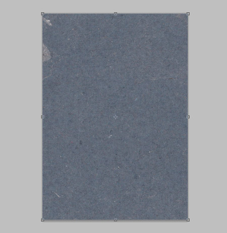
The vector work is complete, but let’s switch over to Photoshop to give the design a more tactile feel. Paste the design into a large PSD, then import a cool grunge texture.
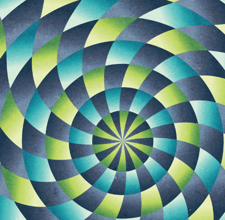
Change the blending mode of the texture to Overlay to allow the texture and colours to interact with the vector pattern.
Switch back to Illustrator and clear out the fills from all the objects, then add a white stroke. Copy and paste this graphic into the Photoshop document.
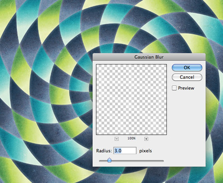
Go to Filter > Blur > Gaussian Blur and enter around 3px to take the harsh edge off the white strokes.
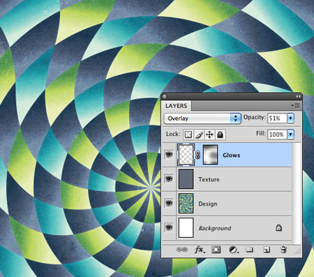
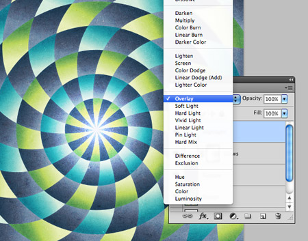
Change the blending mode to Overlay at 50%, then dab a few spots of black with a large soft brush on a layer mask to adjust the impact of these glowing lines.
Add a soft spot of white in the centre of the design and change the blending mode to Overlay to finish off the design with a vibrant highlight.
Our cool abstract radial pattern design is complete and ready for printing as a large format poster. The Photoshop steps really transform the lifeless and flat vectors into a tactile and authentic feeling design while the radial pattern draws you into the centre.

Sweet result!
awesome, love the combo colors
I love the colours and the texture! Another amazing tutorial, I will be downloading this one for sure!!!
honestly i thought it was gonna be boring but learning a few tricks there made me love it! thank you dear sir!
I love the texture and the design outcome. thanks for the tutorials
Love it chris. very good job.
Don’t know why, but when I try to make the compound path my lines from the center become odd (grey spaces occur here and there) and when I divide something strange happens, as if the line becomes a closed object forming new lines where they shouldn’t be. I’m probably doing some super n00b mistakes, but would be glad to know what they are :-)
I’m having the exact same problem and I can’t seem to see anywhere that I’ve made a mistake, has this tutorial worked for anyone?
Lovely!
Absolutely amazing. It’s like hand drawing…. Love it!!!! :-)
Fantastic!! Thanks for share!!
thanks Chris! I’ll have to try that : – )
nice piece man :D
Nice one Chris this looks great!
The texture and the colors used are excellent. The overall effect is outstanding. The mesmerizing and kaleidoscopic effects of some of the images are worth mentioning. My daughter will love to see this site. She is a graphics designer.
Great tutorial, love the use of textures on this one. -D-
quality stuff.. thanks a lot….
Chris, you’re so clever! Thank you, another superb tutorial :)
This is sooo amazing. The millions of stuff you can do with computer made me switch to CAD illustrations from manual! You’re now my hero, Chris. Fierce work.
This is sooo amazing. The millions of stuff you can do with computer made me switch to CAD illustrations from manual! You’re now my hero, Chris. Fierce work!
Thanks for tutorial. Its a very beautiful work i like it, you deserve appreciation.
Really awesome :)
good stuff!
hi i apreciate the job from your web side and the software
Very nice tutorial!!
Great Job!! I wonder all this tut´s!! There are a good help to work! Thank´s from Spain!!
Great! Was in need of some inspiration I was doing for a current website I’m working on! Another great post!
This is a really good tutorial. Keep up the good work.
The problem I’m having is that not all of my shapes are selectable. I get, eg, black, white, black, white, etc, then the next shape just won’t select. Have tried using the direct selection tool and also trying every line around the shape but have still got some obstinate bits just refusing to let me select and fill them! Gnnii! Any ideas what’s happening? Love the toot though and dying to get it working. Thank you
Hel
I was a bit of a spanner! Sorted! I filled the whole lot with white (any colour would do though) then was able to click anywhere in the shapes and fill with gradients. Love, love love it!
This is photoshop or illustrator? Because i haven’t seen the interface :(
Awesome :)
BTW Just curious, you could have done it in photoshop alone?
Nice design and breakdown Chris!
Although similar to what ‘Design Kanya’ was wondering crossed my mind – since the most part is done in Illustrator and not everyone will have both Illustrator and Photoshop – it could also be done 100% in Illustrator.
From a more professional (no offense intended to anyone – ‘professional’ as in ‘able to earn enough money with it to buy the software you need’) I understand that you use both Ps & Ai together because that’s their real strength – that’s what I do too.
But I think for this tutorial with things that could be as easily done all in Ai without Ps could be preference for your (broad) audience.
Again, just some upbuilding remarks.
Cheers