This post was originally published in 2015
The tips and techniques explained may be outdated.
I’ve been getting really into Photoshop’s 3D tools recently. They’re fantastic for creating simple 3D models with ultra realistic lighting and materials like metals, plastic and wood. Chrome is one effect that is often mimicked in Photoshop with various gradients and layer styles, but the 3D feature in versions CS6 and CC allow you to achieve results that surpass the traditional techniques. In today’s tutorial we’ll use Adobe Illustrator to design a cool badge or emblem design, then we’ll take it into Photoshop to turn it into 3D with a rad shiny and chrome finish.
The artwork we’ll be creating is this chrome car badge for ‘RocketEagle’, a fictional brand with art deco inspired wings and patterns. We’ll make use of Illustrator’s powerful shape tools to construct the flat design, then transfer the graphic over to Photoshop to model the emblem in 3D with multiple extrusions. Then comes the exciting part where we set up the lighting and materials to produce a stunning chrome effect.
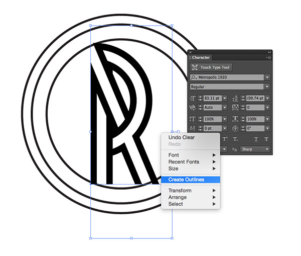
The basic badge design could certainly be made in Photoshop, but I find Illustrator’s vector tools are much easier to use when constructing logos. Draw a circle then make a couple of duplicates and scale then down towards the centre. Add the initial(s) of your brand in the centre. I’m using a cool art deco style font named Metropolis 1920. Convert the text into a shape by right clicking and selecting Create Outlines.
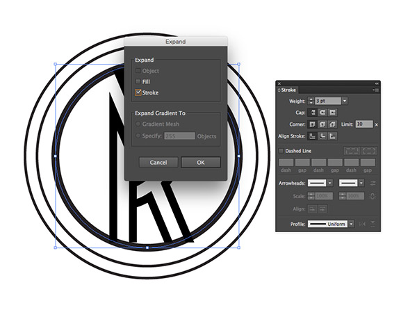
Scale and align the text with one of the circles, then increase the circle’s stroke weight so the line widths are similar. Go to Object > Expand and select the Stroke option to outline this stroked circular path into a ring shape.
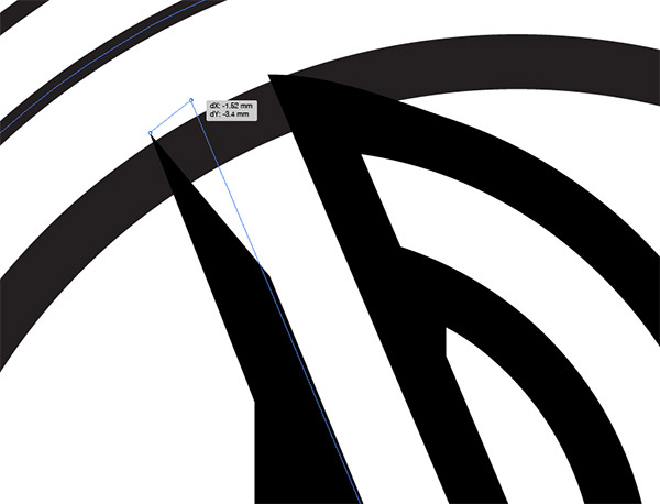
Use the Direct Selection tool to extend the portions of the text that overlap up to the circle. In some areas extra anchor points may be required to retain the original shape of the letters.
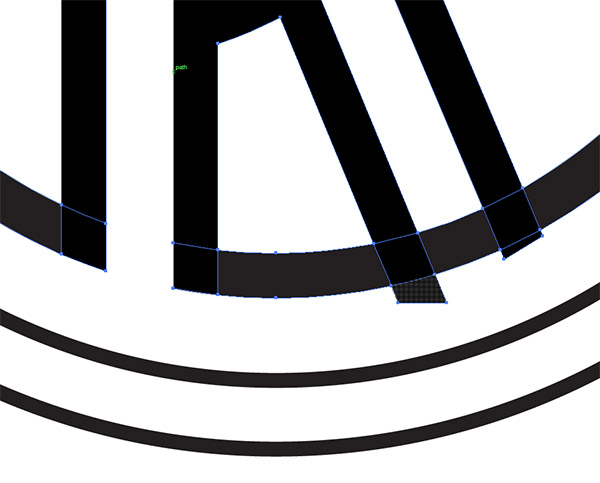
Make sure the extended portions of the text go beyond the circle outline, then with both shapes selected, use the Shape Builder tool to trim away portions to produce a continuous line between the circle and text.
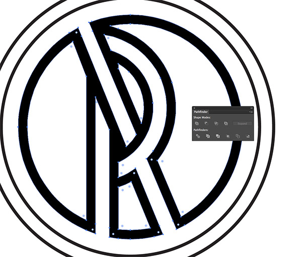
Use the Unite option from the Pathfinder panel to blend what remains of the two separate elements into one shape.
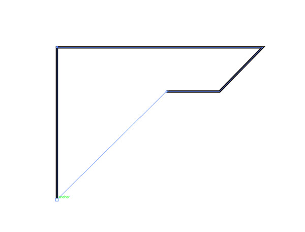
Elsewhere on the artboard use the Pen tool to create a blocky outline with 45° angled lines. This will form the inner part of the wing.
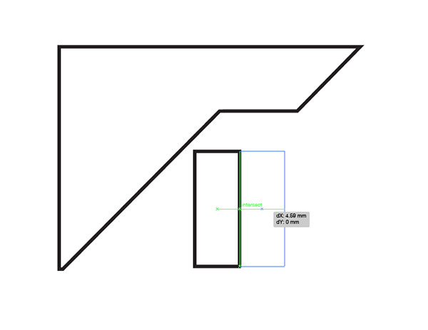
Turn on Smart Guides (View > Smart Guides), then draw a small rectangle. Hold the ALT key while dragging a duplicate and use the green smart guides to align it perfectly. Press the shortcut CMD+D a few times to repeat the transformation.
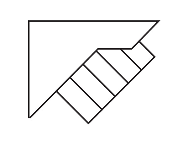
Group the series of rectangles then rotate them by 45°. Place them over the inner wing shape and use the CMD+Shift+[ shortcut to send them to the bottom of the stack.
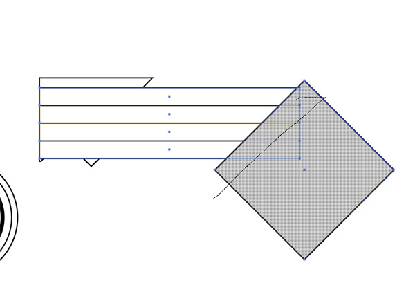
Using the same duplication technique, draw a series of long horizontal rectangles as the main wing feathers. Draw a temporary square and rotate it by 45°, then position it over the tips of the wings. Select this shape along with all the wing rectangles and hold the ALT key while dragging with the Shape Builder to trim the ends.
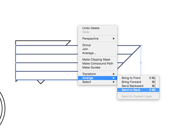
Group the wing feathers, then use the shortcut CMD+Shift+[ or right click and select Arrange > Send to Back to place these feathers underneath the other shapes.
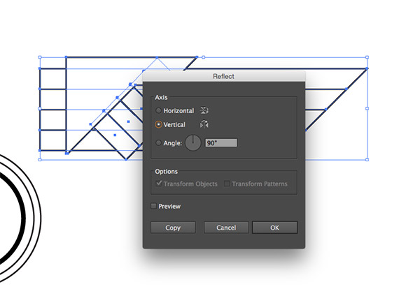
Select and group the entire wing, then go to Object > Transform > Reflect. Check the Vertical option then hit Copy. Hold Shift while moving the wing into place on the opposite side.
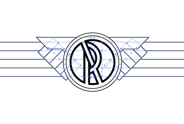
Move the wings into place underneath the central emblem to hide the unsightly shapes where the wings overlap in the middle.
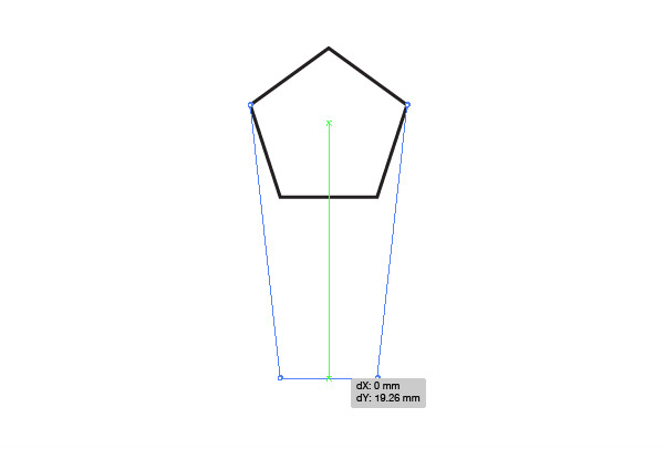
While dragging a shape with the Polygon tool, use the cursor keys to reduce the number of sides to 5. Move the lower edge downwards with the Direct Selection tool while holding Shift to extend the shape.
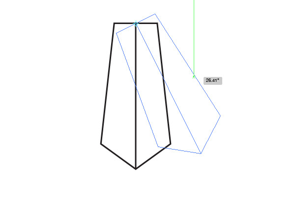
Draw an extra line running down its centre, using the Smart Guides to snap and align the path. Rotate the shape by 180° so it can be used as a tail feather. Select the Rotate tool and click to place the pivot point at the centre of the straight edge. Hold Alt while dragging the shape to make an angled copy.
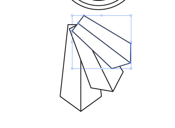
With the new shape still selected, press CMD+D to repeat the transformation and position another tail feather shape. Scale down the middle shape a little, then use the CMD+D shortcut to repeat this scaling on the last shape twice so the shapes gradually reduce in size.
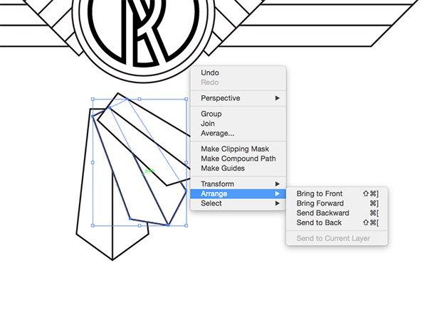
Send the middle shape to the bottom of the stack, then do the same with the last shape so they overlap in order.
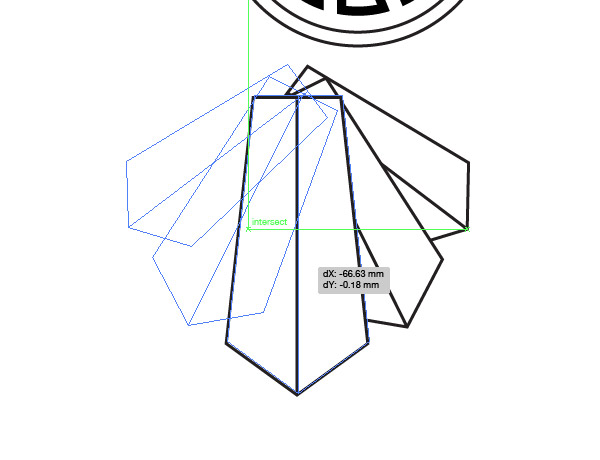
Select all three shapes and reflect a copy for the other side. Use the large middle shape to align the two halves perfectly, then delete the duplicate.
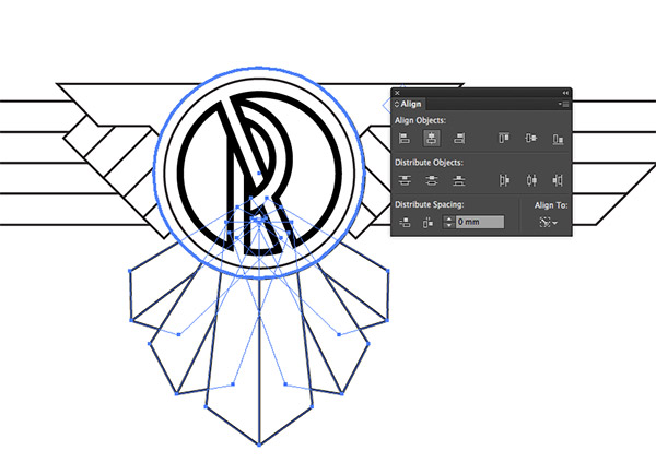
Group and position the tail feathers onto the main emblem, remembering to alter the stacking order so they sit underneath the other shapes. Use the Align Panel to line them up centrally. Give one of the circles an extra click to make it the key object so it doesn’t move out of place.
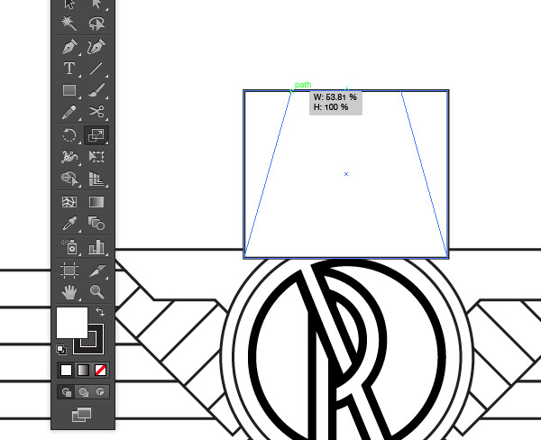
Draw a square above the emblem layout. Select the top two points with the Direct Selection tool and move them towards the centre with the Scale tool.
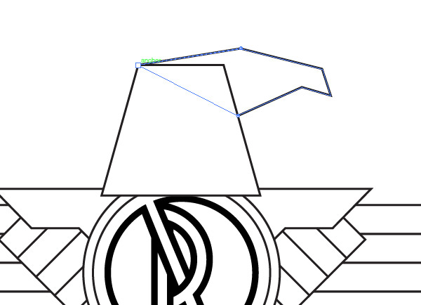
Draw the outline of the eagle’s head using the pen tool, making single clicks with no bezier handles so it’s made of straight lines. Merge these two shapes with the Shape Builder or Pathfinder tools.
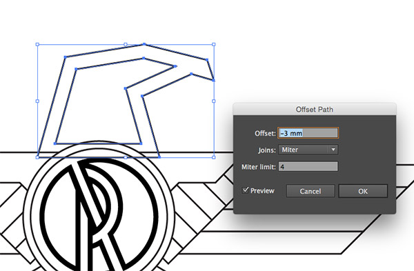
With the head selected, go to Object > Path > Offset Path and enter -4mm.
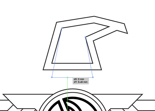
Drag the bottom edge of the inset path down with the Direct Selection tool so it protrudes beyond the original shape.
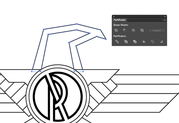
Use the Minus Front option from the Pathfinder to trim this inner shape from the original, then position the head centrally on the emblem. This element will just need lining up by eye due to its asymmetrical shape.
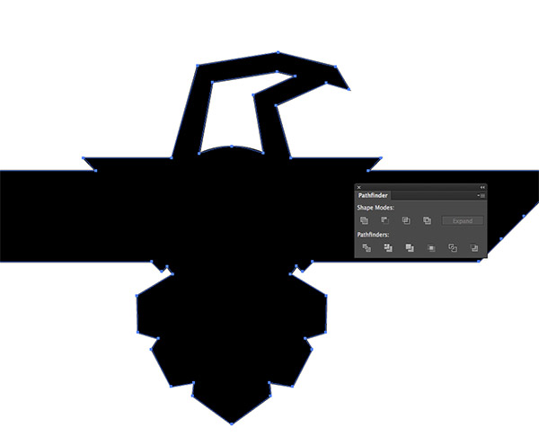
Draw a selection around all the shapes that make up the emblem and press the Unite button from the Pathfinder panel. Delete the small inner shape with the Direct Selection tool to make a solid silhouette of the entire design.
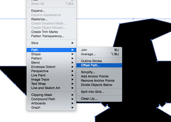
Go to Object > Path > Offset Path and enter 3mm to create an additional outline. Apply the default white fill/black stroke styling and send the shape to the bottom of the stack.
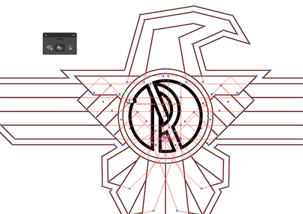
Select all the shapes of the emblem except the central initial design (Shift click to remove this item from the selection), then click with the Live Paint tool to create a Live Paint Group.
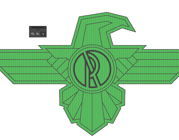
Switch over to the Live Paint Selection tool and draw a selection around all the objects. Apply a random colour to all the objects.
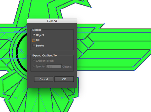
Go to Object > Expand and select just the Object option to permanently apply the Live Paint effect.
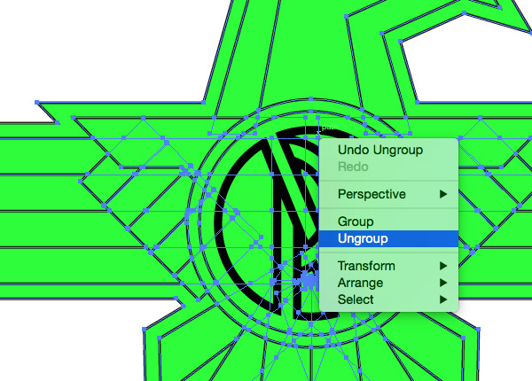
Repeatedly right click and select Ungroup until the option is no longer available to completely break the items apart.
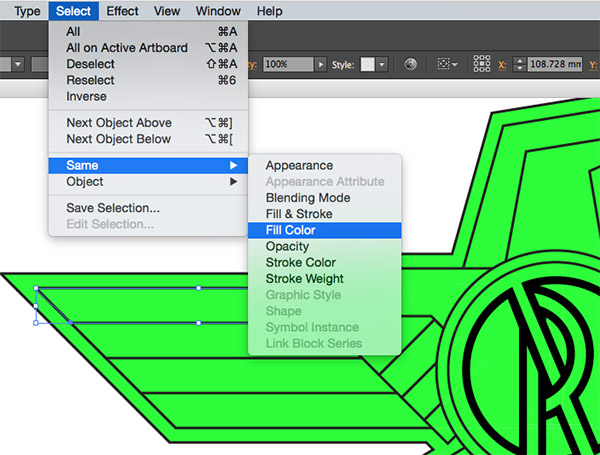
Select one of the shapes, then go to Select > Same > Fill Color. Merge all the shapes into one by clicking the Unite option from the Pathfinder panel.
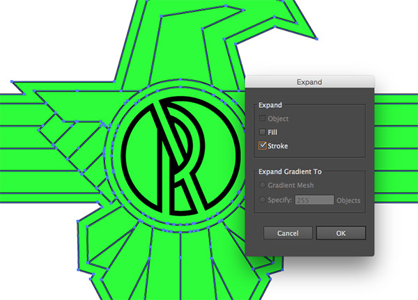
Select one of the stroked paths from the design and go to Select > Same > Stroke Color. Head to Object > Expand but this time select just the Stroke option to turn these strokes into shapes.
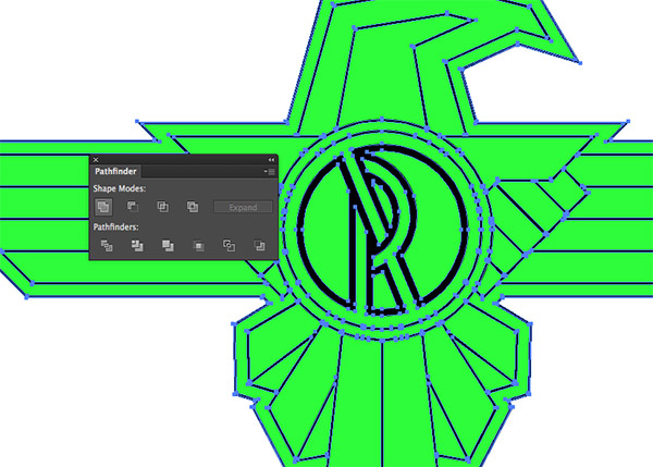
Click the Unite option from the Pathfinder to merge all the tiny outline segments into one continuous shape.
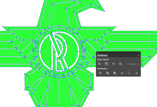
Add the coloured shapes to the selection, then click the Minus Front button from the Pathfinder to punch out the outlines.
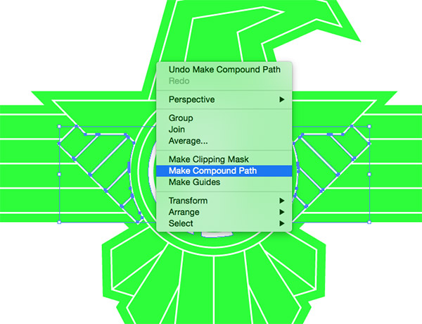
Select any similar items that make up the various portions of the design and choose Make Compound Path from the right click menu. These groups of shapes include the three different wing sections, each half of the three layers of tail feathers, the small pieces that make up the central logo initial, etc. These are all groups of shapes that you will want to extrude at the same depth when we manipulate the 3D settings later.
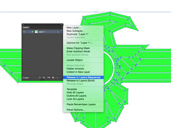
Once the pieces are contained into separate compound path groups, select the Release to Layers (Sequence) option from the Layers panel’s menu.
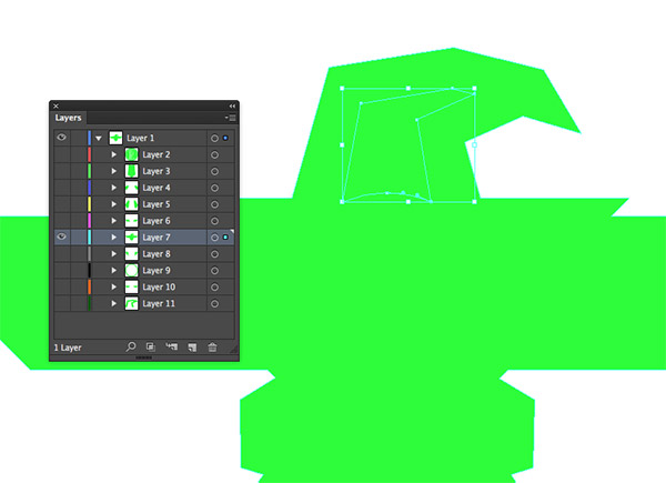
Find the main outline shape from within the layers, then use the Direct Selection tool to delete the inner portions to leave a solid shape. It will no longer be possible to visibly see the design because all the shapes are the same colour, but we know the other shapes are there. This step ensures that our 3D emblem will have a solid base.
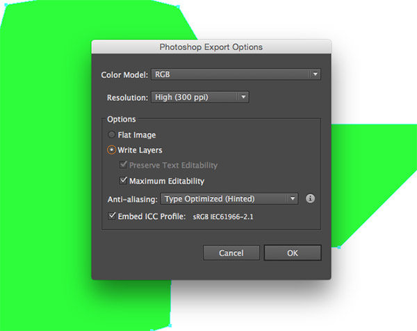
Go to File > Export and save the document as a Photoshop PSD. In the following options box, make sure the Write Layers option is checked.
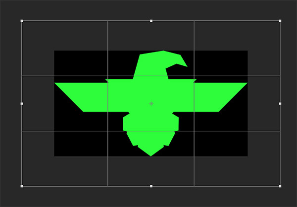
Open the exported PSD in Photoshop and notice how all the shape groups have been placed on separate layers. Enlarge the document with the Crop tool and place a new layer at the bottom of the panel to fill as a temporary background.
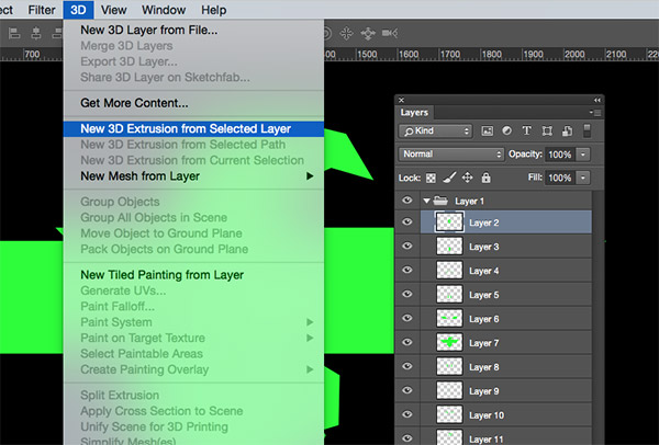
Select each layer in turn and choose the New 3D Extrusion from Selected Layer option from the 3D menu.
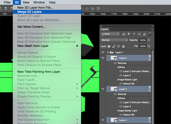
When all layers have been converted to 3D objects, go to 3D > Merge 3D Layers so all the objects can be accessible in one 3D scene.
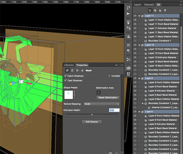
Under the 3D panel, select the scene from the list of items and use the navigation tools in the top Photoshop toolbar to rotate the environment so you can see the depth of the 3D objects. Shift+Click between the top and bottom layers in the 3D panel to select them all, then edit the Extrusion Depth to 5px in the Properties panel.
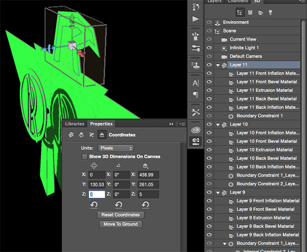
The various pieces will be positioned all over the place, so select each layer in turn and change the Z position coordinate to zero.
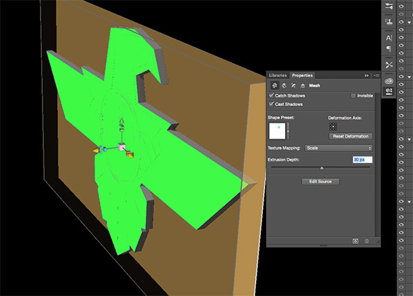
Next, select each layer individually and alter the Extrude Depth to convert each piece into a 3D shape of a certain thickness. The largest outline shape is a good place to start to provide a base for the emblem.
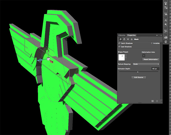
Extrude the rest of the shapes by various amounts to add depth to the model. Since we want to keep the design facing the right way, a negative figure is required to extrude backwards, as opposed to forwards.
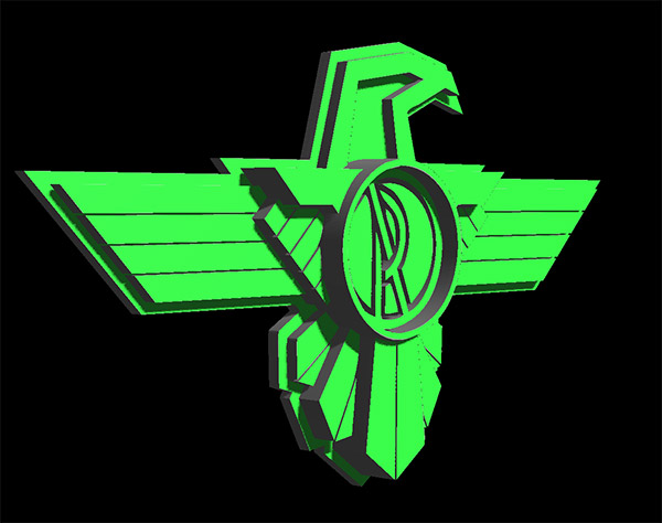
When all the shapes have been extruded the design starts to look really cool in three dimensions. The art deco theme starts to come to life as the pieces protrude gradually.
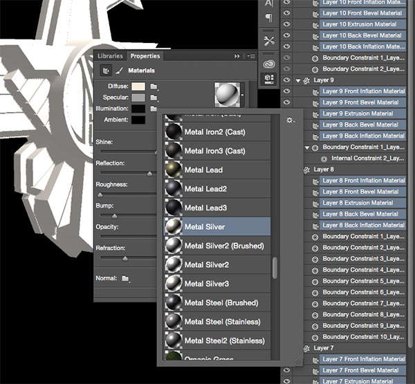
The design doesn’t look very cool in that random colour! Shift+Click from the first Material layer right down to the last Material layer to select every single one, then apply a metal material from the Properties panel. The default selection is pretty limited, but you can download loads more from Adobe’s Downloadable 3D Content. Whatever material you choose won’t look great until the lighting has been adjusted.
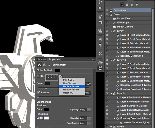
Image Based Lights (IBL) provide the most realistic lighting effects. Select the Environment from the 3D panel, then select Replace Texture under the IBL settings in the Properties panel. Choose a photograph with some cool lighting like a sunset. I’m using this image from Unsplash. Ideally, the image will be a scene that the final 3D model will be placed within so the lighting and reflections match perfectly with its surroundings. Reduce the Intensity of the light to around 45%.
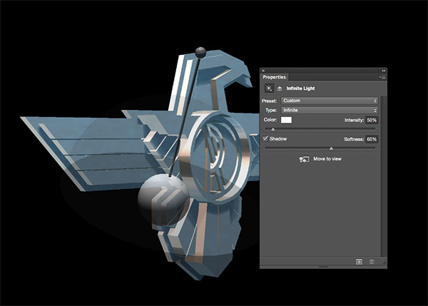
Select the Infinite Light from the 3D panel and move the handle around to alter the direction of the light. Pointing it downwards at a high angle will avoid any bright reflections and produce some nice shading. Reduce the Intensity of this light to around 50% and soften the shadows to 60%.
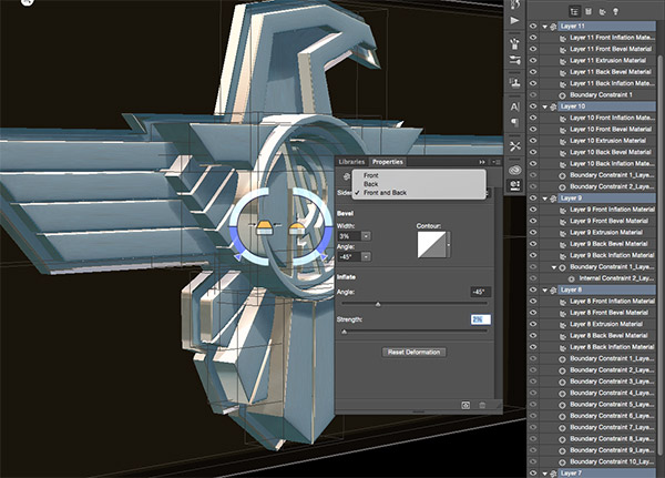
Shift+Click all the layers in the 3D panel again to select them all. Under the Cap settings, change the dropdown to Front and Back, then change the settings to 3% Bevel Width, -45° Bevel Angle, -45° Inflate Angle and 2% Inflate Strength. This will add some subtle chamfering of the edges and softly round the face of the 3D pieces, which helps generate more reflections for the chrome effect.
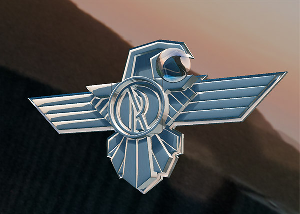
You can fine tune what part of the IBL is being reflected by selecting the Environment from the 3D panel. With the Selection tool active, click and drag the 3D world around until you find a nice portion that is being reflected back from the shiny surfaces.
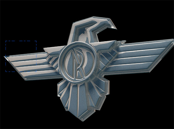
Select the Scene from the 3D panel and rotate the view around to frame the final image using the 3D tools in the top toolbar, then go to 3D > Render. I’d recommend leaving this running overnight as it can take many hours to complete. You can tweak the render settings under Preferences > 3D to adjust the final quality.
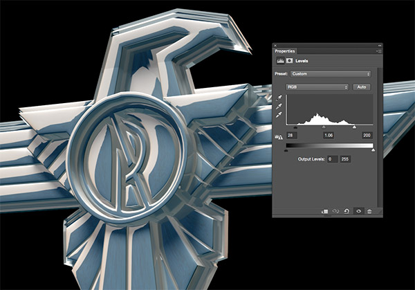
Once the rendering has completed, a few post processing adjustments such as Levels can really boost the impact of the chrome by brightening the highlights and darkening the shadows.
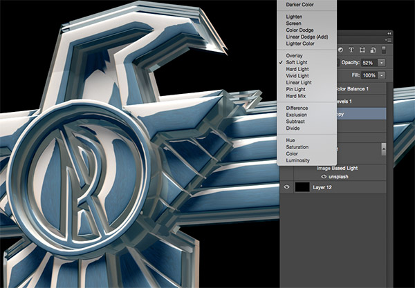
Copying the rendered image onto a new layer and changing the blending mode to Soft Light can also help improve the contrast. Reduce the opacity of this layer to tone down the effect.
I quickly mocked up my 3D model in a document using the sky from the same photo I used for the IBL to match the colours, along with a copy of the logo we originally made in Illustrator. The 3D render has produced in a brilliant chrome effect that’s miles better than the alternative layer style techniques. Another useful feature of Photoshop’s 3D mode is the model can be rotated and positioned to suit any application, such as the hood of a car. Just make sure it’s lined up perfectly before hitting that render button!




Hats off for this well define tutorial chris!
Thanks Kristina!
Wow, this is a crazily detailed guide to making great use of the Photoshop 3D tool! I’m eager to experiment with this technique, and probably will try it with some other materials. I think the 3D function will use much more resources of your PC. Perhaps I’ll need a more decent computer to try it out!
It does get pretty CPU intensive, especially during the render. 3D is fun to play with for effects like this. It’s not quite as powerful as dedicated 3D software, but it’s handy being built right in!
Once again, Thanks for the detailed tutorial. I learn something new every time. Keep it up.
That’s great to hear, thanks Steven!
And once again Chris Spooner has blown my mind. Thank you soooooo much for this. It’s just what I need.
awsome! congratulations!!!
Although I’m not familiar with Photoshop’s 3D features, I’m an experienced Illustrator and Photoshop user. Yet I was not able to follow this tutorial, especially the part about using 3D — I couldn’t find some of the settings.
It would be super helpful to have a video of these instructions.
Make sure the 3D and Properties panels are open from the Window menu. Pretty much all the settings can be found under the various sections of those two panels.
If you look in the top right corner of Photoshop you’ll also see a dropdown that allows you to change the workspace from Essentials to 3D, etc to lay out all the tools you might need.
Cool, gonna try this out soon. Great timing!
wow. so detail. thanks,bro.
I’m running into problems with the Live Paint tool – once I’ve applied Live Paint, none of the steps that you specify seem to work – I can select the Live Paint object and change its color, but then all the expand options are greyed out in all the different menus. Any suggestions?
That was some pretty awesome shapes work in Photoshop as well!
Awesome PSD Designs which gives very creativity and elegant look of that badge or we can say logo. You can also use it in PSD web design that gives very attractive look of your web site.
Ive Done a few 3D things in photoshop but this is just madness will sit and follow this and get it right. brilliant work Chris keep it up.i love it.
awsome! congratulations Chris
Thank you so much! I really appreciate your tutorials and freebies.
That’s what i like about Photoshop, it is the most complete software and you are PRO in it! Thanks for share such great knowledge!
That’s incredible. Thank you so much for shareing this tutorials with us. I’ve learn a lot fom you, you are one of my greatest teachers!
Thank you very much for your explanations
Great work, thank you
Nice job
waw, is so amazing
make a 3D graphic in illustrator .
greatjob brother
This is super super awesome, the detail is striking.
Great job