This post was originally published in 2010
The tips and techniques explained may be outdated.
Follow this step by step Adobe Illustrator tutorial to create a stylized vector owl illustration with simple shapes and patterns. We’ll start by building the basic owl character with various vector shapes, then begin bringing it to life with colour, shading and pattern fills.
The owl character we’ll be creating is built from a range of basic shapes to create a simple and elegant style. The illustration is brought to life with shading effects which add depth, and a range of pattern fills to give a feathered impression. To finish off the design it’s brought into Photoshop for some grungy textures to rough up the clean vectors to give a cool tactile feel.
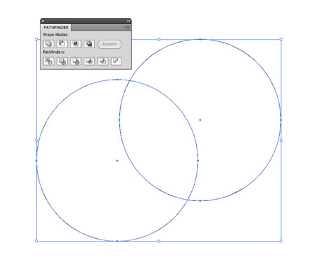
Open up Adobe Illustrator and draw a large circle on the artboard. Hold ALT and drag the circle to one side to make a duplicate, then use the Subtract option from the Pathfinder palette to punch out the circle from the original.
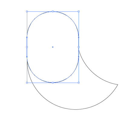
Draw a Rounded Rectangle with max corner radius (press the right cursor key) and carefully align it to the width of the crescent shape. Toggle outline mode (CMD+Y) to ensure everything lines up. Merge these two shapes with the Pathfinder palette.
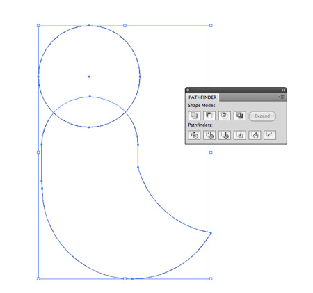
Draw another circle, this time overlap it across the top edge of the owl body. Use the Subtract option from the Pathfinder to create a couple of simple ears on the head.
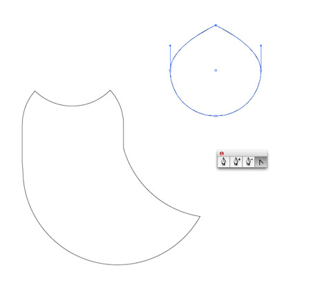
Elsewhere on the artboard draw a circle, then with the Convert Anchor Point tool remove the bezier handles from the upper and lower points. Use the Direct Selection Tool to drag these points upwards and downwards respectively to lengthen this shapes to produce a simple wing.
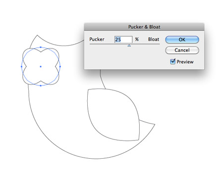
Rotate and move the wing into place on the body of the owl. Draw another circle as move into place as an eye. Use the Pucker and Bloat effect to convert the shape.
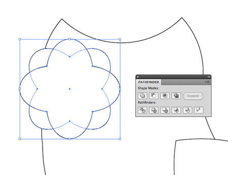
Copy the shape then paste in front (CMD+F). Hold Shift while rotating to limit the angle to 45 degrees, then go to Object > Expand Appearance to convert the effect into solid shapes then merge the two with the Pathfinder.
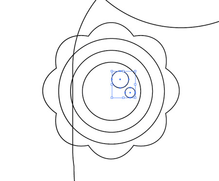
Add a few more circles aligned to the centre of this shape. Paste each new circle then scale it while holding Shift and Alt. Finish the eye with a couple of smaller circular highlights.
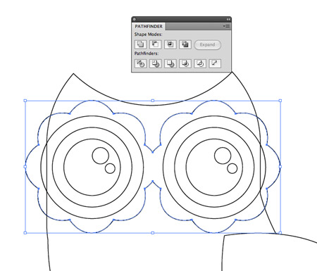
Duplicate all the shapes that make up the eye and move them to the opposite side. Merge the surrounding shapes to blend them together where the two overlap.
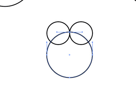
Create the basics of what will be the owl’s beak using three circles – Two small circles placed side by side, then a larger one at the exact with of the two smaller circles. Use the Direct Selection Tool to select and delete the upper most point from the larger circle.
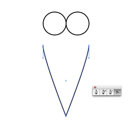
Drag the lower most point downwards vertically (hold Shift) and remove the bezier curves with the Convert Anchor Point tool.
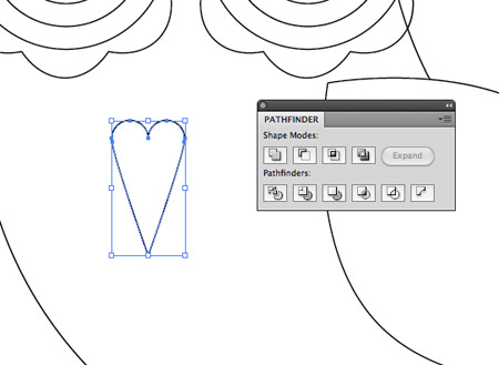
Overlap the shapes then use the Merge option from the Pathfinder to blend them together. Move the beak into place between the eyes.
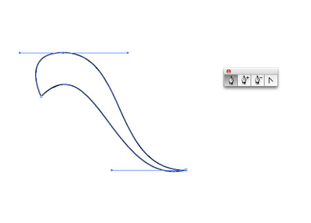
Use the Pen tool while holding Shift to draw a flowing shape. Keeping the bezier curves on strict angles should help keep the curves flowing smoothly.
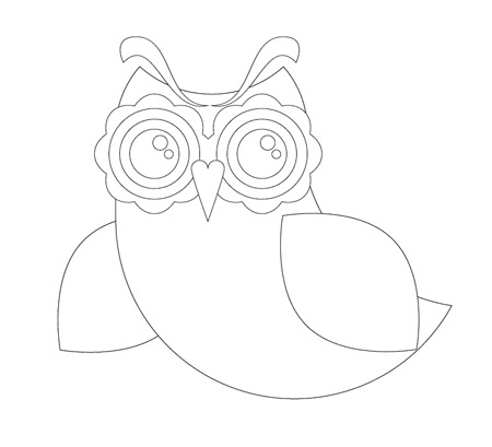
Move all the shapes into their final positions to create the basic structure and outline of the owl character.
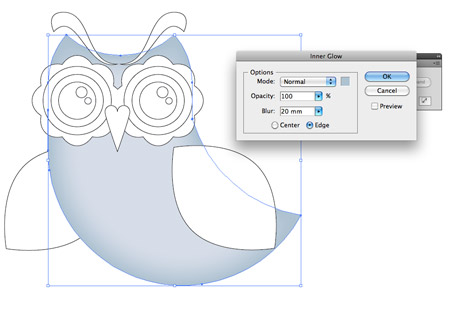
Add a basic blue fill to the body of the owl, then head to Effect > Stylize > Inner Glow. Select a darker tone of blue and adjust the blur so the glow subtly flows in from the edges. Add the same fill and Glow settings to the wings.
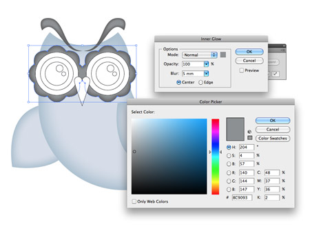
Use similar Inner Glow styling, but this time with grey tones on the ‘eyebrows’ and shapes that surround the eyes.
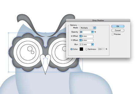
To make the eyes stand out that little more, add a Drop Shadow. Adjust the options so there’s no offset and the Opacity is around 40%.
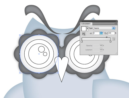
Add a grey to white radial fill to the outer circles that make up the complete eye. Move the gradient slider so the grey only creeps in slightly from the edge.
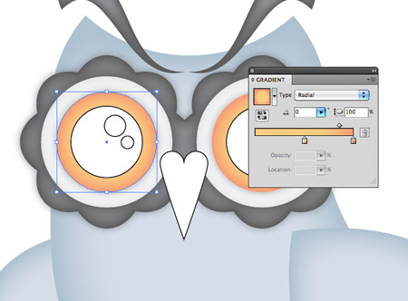
Give the next circle an orange/yellow radial fill to create a bright iris colour, and add another subtle Drop Shadow.
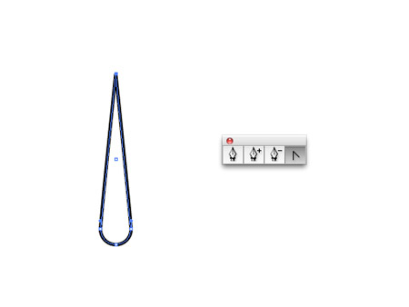
Elsewhere in the document draw a small circle. Drag the upper most point upwards with the Direct Selection Tool then remove the bezier curves with the Convert Anchor Point tool.
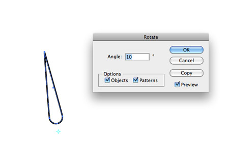
Select the Rotate Tool then Alt-Click just underneath the shape. In the subsequent options box enter 10 degrees and hit the Copy button.
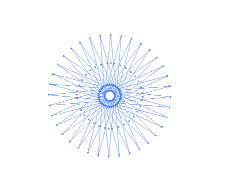
Repeatedly press the shortcut CMD+D to generate a complete circle of radial shapes. Remove the black stroke and group them all together (CMD+G).
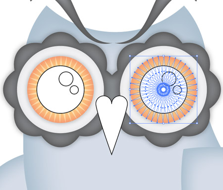
Move the radial shapes into place over the iris. Use the shortcut CMD+[ to alter the stacking order so it sits under the pupil of the eye.
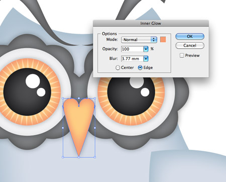
Finish off the eye with a black to grey gradient on the pupil and leave the highlights with just a white fill. Use the same colours from iris to colour the beak with a fill and Inner Glow. Don’t forget a good old Drop Shadow to list the objects from the screen.
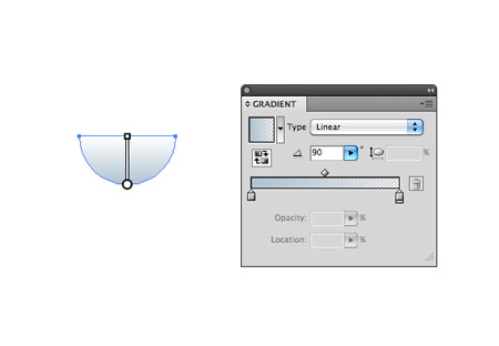
Draw another small circle elsewhere on the artboard. Delete the upper most point to leave a semi-circle. Give this semi-circle a vertical gradient fill from the darker blue tone used on the body to transparent.
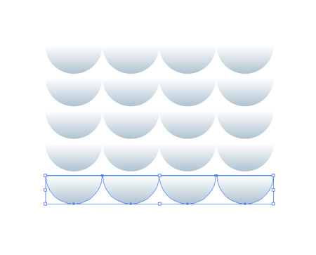
Hold ALT and Shift while dragging the shape to one side to align multiple circles side by side, then select and drag this row downwards to duplicate a series of further rows.
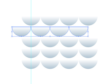
Align a guide to the centre of the first circle, then move the second row until the edge of the circles aligns with this guide. Repeat the movement on each alternating row using the shortcut CMD+D then group them all together.
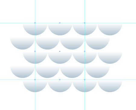
Use three more guides to carefully outline a repeating area within the series of rows. Zoom right in to ensure the guides sit perfectly against the centre points and outlines of the circles. Draw a blank square inside these guides.
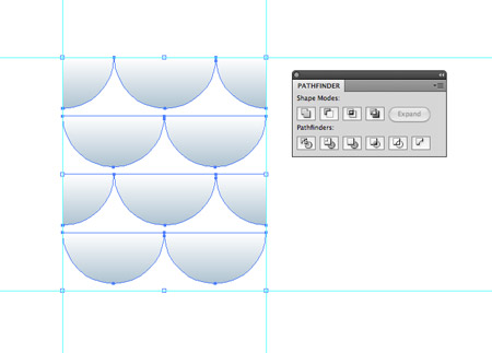
Select both the group of circles and the blank square and click the Crop option from the bottom row of the Pathfinder to trim the pattern down to size. Drag this graphic into the Swatches palette.
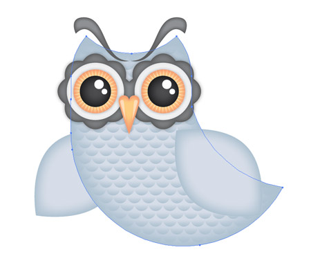
Copy the main body shape and press CMD+F to paste it in front. Delete the Inner Glow from the appearances palette then replace the fill with the newly created pattern swatch. Change the blending mode to Color Burn.
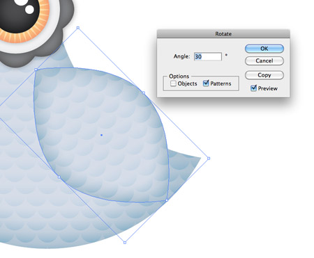
Repeat the process on the wings, but also go to Object > Transform > Rotate. Select just the Patterns checkbox and enter 30 degrees into the Angle to rotate the pattern to match the orientation of the wing.
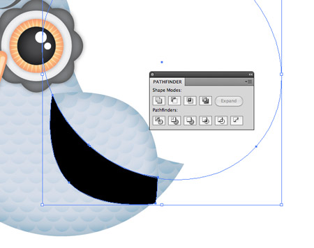
Make another duplicate of the wing and give it a black fill. Use a large temporary circle with the Pathfinder to clip the shape down.
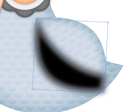
Add a large Gaussian Blur (Effect > Blur > Gaussian Blur) of around 40px.
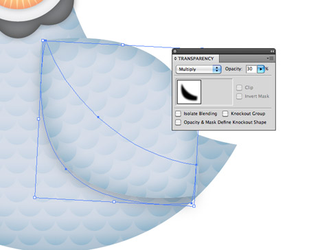
Press CMD-[ to send the black shape underneath the main wing, then rotate it slightly so the blur creeps out slightly further from the lower edge. Change the blending mode to Multiply at 30%.
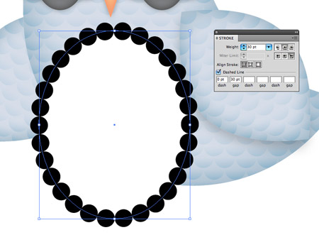
Draw a large oval over the chest area of the owl. Adjust the Stroke options to 30pt Weight with Round Cap and Bevel Join, check the Dashed Line option and change the dash to 0 and gap to match the stroke weight of 30pt.
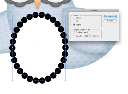
Go to Object > Expand and select just the Stroke option to convert the stroke into basic shapes. Right click and Ungroup, then merge everything together with the Pathfinder.
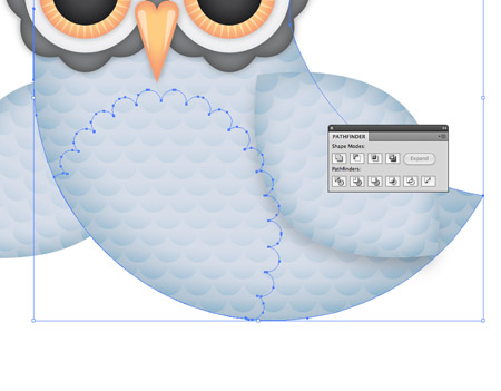
Use a duplicate of the main body shape as a tool along with the Intersect option from the Pathfinder to trim the chest shape down to size.
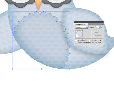
Give it a basic blue fill then set it to Multiply at 40%.
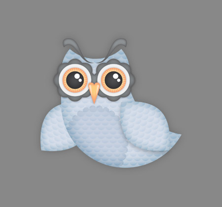
To finish off the design with some rough textures, paste it into a large Photoshop document with a grey background.
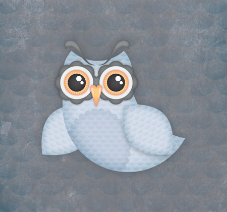
Paste a copy of the body pattern fill from Illustrator and scale it up to fill the whole document. Set this to Color Burn, then add a rough texture and set it to Color Dodge at 80%.
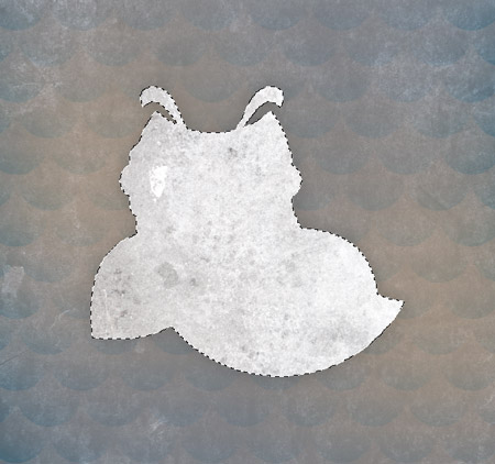
Import another texture file then load the selection of the owl illustration by clicking the layer thumbnail while holding the CMD key. Inverse the selection (CMD+Shift+I) then clear out the excess.
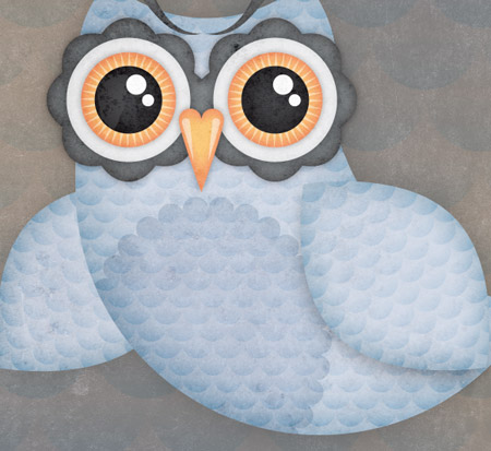
Set this new texture overlay to Color Burn at 70% opacity to finish off the illustration with some dirty distressed marks.
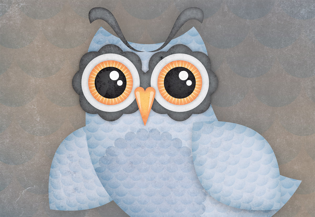
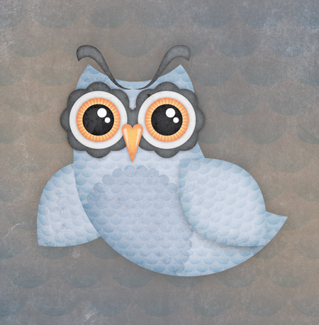
There we have one complete owl illustration. The basic vector shapes help build a simple and stylized illustration while the subtle shading effects add depth and dimension to the design. None of my designs are complete without a dirty texture to rough things up, which in turn give the clean vectors a more tactile feel.


Love this!
Thanks for share!
Hi, Im a subscriber to your blog and just want to say a huge thankyou for all the stuff you share with your readers. Lots of people would charge bucketloads for some of the advice to give out so freely so im just letting you know some of us are truly grateful :)
I’m too lazy to type it out, but I completely agree.
Thanks! It’s my pleasure. It’s always great to hear that people are enjoying the stuff I post out.
great work
really i will try to apply this lesson
So cuti owl
this one is gorgeous! thanks for the tutorial.
Great tut !
inspired by http://owltastic.com/ ?
Love it Chris! I never knew how to use Illustrator until I found ur tuts. Thanks!
On Form Mr Spooner cheers for the tutorial although I am a little bit surprised at the lack of owl puns, so i’ll go for one;
“Hey Chris this tutorial was a hoot :)”
This looks amazing, I will try this when at home (right now at the office) but for sure I know that Chris’s tutorials rock the world. :D
Love this!
Thanks for the tutorial
i love it :D great tutorial, but the second step where you create the basic outline of the owl coudlve been more detailed, or maybe it’s just because im a newbie to illustrator :D
Awesome tut chris! Didn’t take long at all to do, and it turned out rather nice :)
Looks very nice.. Thx for this work.
So cute :D
Thanks for posting, very simple and easy to follow instructions.
Great tut !
EPIC Tutorial.
Looks great! Congrats on the 50,000! :)
Thanks Chris for sharing this.
First time I tried to follow an Illustrator tutorial.
Hope you like it! My outcome: http://macxim.posterous.com/hoot
Don’t hesitate in letting me know what you think.
Thanks.
Thank you for sharing the above information useful and beneficial
Fabulouos tut! I work every day for many years in Illustrator and “every day you lear something new” we said often in argentina, an this confirm that’s words.
Thanks!
Really great and useful tutorial, thanks for sharing!
Very nice. Just love it. Thanks for sharing such a nice tutorial.
Excellent – however struggling with the eyebrows. Maybe it’s just me but the pen tool is hard work.
Stuck with it and done them.
I’m finding the eyebrows just as hard, how do you get the lower curve to work!
OK – anyone know how you make the feather gradient colour go from the solid colour to transparent? I’m using CS3.
Can’t be done in CS3, doesn’t have the option.
Thanks! That is one of the firsts tutorial I have done. There is the result http://b4.s3.quickshareit.com/owlbluea4900.png
This is really gr8 tuts to explain :) thanks you very much
It’s like the cutest and coolest owl I’ve ever seen! Thanks heaps Chris for this great tut! Gotta try it tomorrow!
It so cute!!! Thanks for sharing. It’s really great tutorial. The pattern and the color is so gorgeous! XD
Cute Like you :D
With a bit of extra work this tutorial can help to make a cute Twitter bird too. Great post, thank you for sharing!