
This post was originally published in 2008
The tips and techniques explained may be outdated.
Taking a closer look into the world of web design this tutorial will cover the process of designing a vibrant and colourful modern blog layout in Adobe Photoshop. Beginning with a blank canvas we’ll go through the process of creating the entire structure and effects from scratch.
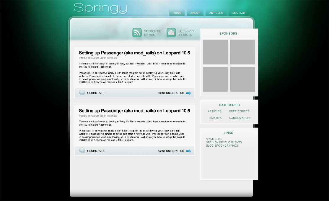
This particular design is one I'm currently producing as a WordPress theme for Springy Developments, in the future we'll take a look at the coding process and see how the site is pulled together into the final product.
Bear in mind that during the original creating of the concept, the process was much less clear cut that the following tutorial steps. Plenty of experimentation was conducted and elements were often recreated to test out what worked the best. However this walkthrough will hopefully give a good understanding of what tools and techniques are used during the creation of this chosen layout from scratch.
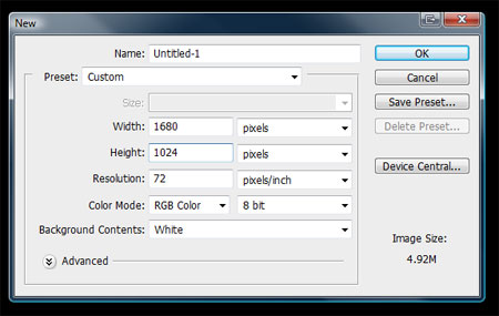
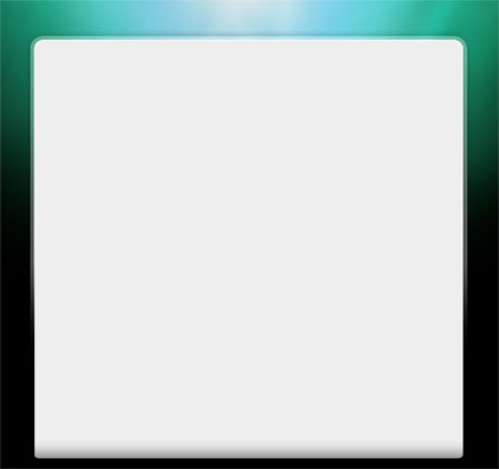
Open up Adobe Photoshop and create a New Document. I like to work on a large document that reflects the larger widescreen resolutions. Remember to use the RGB color mode with the site being viewed only on screen, and a resolution of 72dpi.
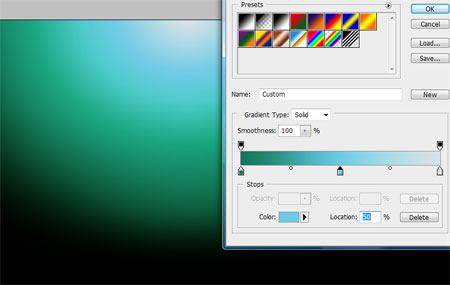
The first area I tend to work on is the page background, this is where a little interest can be introduced which fills out the space for those on higher resolutions. Choose a solid colour for the background, then drag out a radial gradient from the top centre. Obviously the choice colour palette is down to you, but here I'm using a mix of green and cyan.
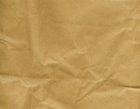
Open up a brown paper resource from a recent post, this will be used to add some interest in the form of texture to the background.
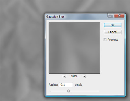
Desaturate (CTRL+SHIFT+U) the texture, then add quite a broad Gaussian Blur to remove much of the finer detail.
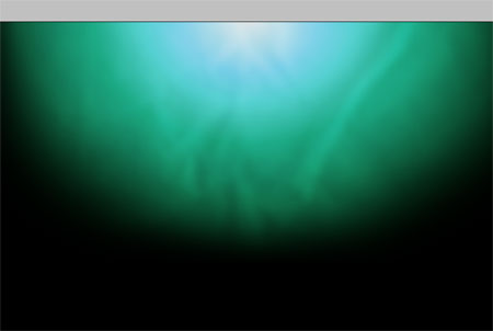
Position the texture over the gradient and change the blending mode to Overlay. Alter the opacity to 90%.
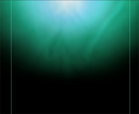
When working in website design the range of user monitors plays a large part in the layout of a site. Unless otherwise required, I will accommodate resolutions down to 1024×768, therefore guides are drawn in to represent a 960px width in the centre of the document, this gives an approx 40px space at either side as a little padding before elements run beyond the confines of the screen.
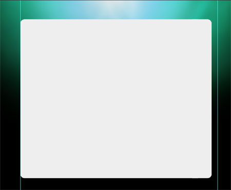
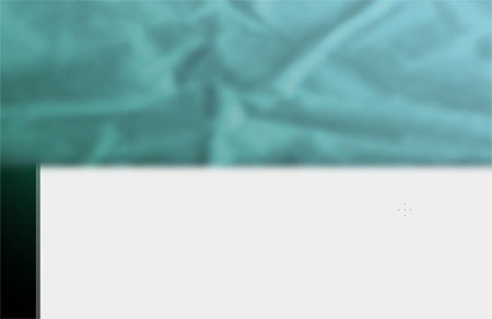
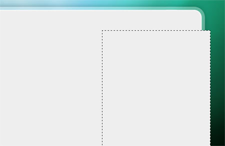
Using the Rounded Rectangle Tool draw in a content area filled with light grey (#eeeeee) with 20px corner radius. Notice in this case the rectangle doesn't span across both margins, this is to allow for a little design touch later down the line.
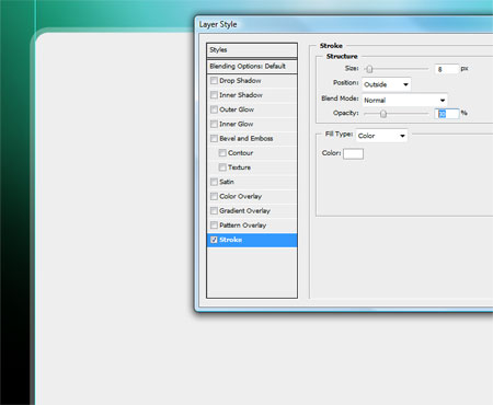
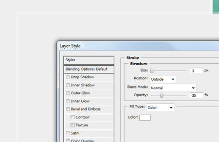
Double click on the rectangle's layer and add an 8px white stroke. Change the Blend Mode to Overlay and drop the opacity to 30% to give a cool transparent effect.
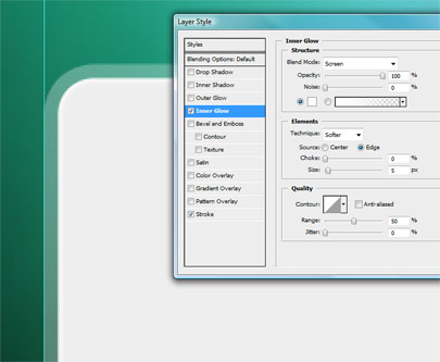
Add a slight Inner Glow to the rectangle, using white at 5px in size to give a very slight bevelled edge effect.
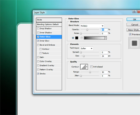
Finally add a subtle Outer Glow using black at 15% opacity to give a slight shadow to the content area.
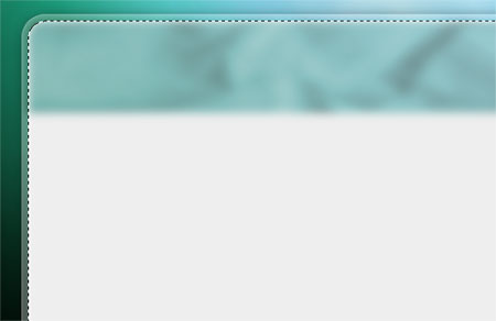
On a new layer, draw another rounded rectangle, this time with 10px corners at the same width as the original. Add a little gradient fading to grey at the bottom.
Right click on the Effects of the grey content panel and select Create Layers. On the newly created layer that consists of the stroke, use the eraser to fade out the stroke halfway down the document.
Add a little extra touch to the stroke by drawing a 1px line with the Pencil Tool vertically up the entire edge. Hold Shift to constrain the axis to give a crisp straight edge.
Fade out this line using the eraser to match how the rest of the border fades away into black.
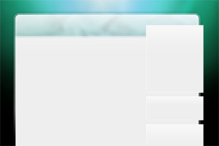
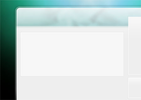
The content area so far has a large flat area of grey, that gets slightly darker at the bottom. The top corners are a larger radius than those at the bottom and the border has a transparency that shows the underlying background and fades out towards the middle.
Position a copy of the paper texture of the top half of the content area. Use the Hue/Saturation Tool (CTRL+U) to give a blue/green colouring.
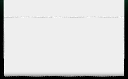
Press CTRL and click the thumbnail of the content layer to create a selection, inverse the selection (CTRL+SHIFT+I) and delete out the excess. Also use the erase to slightly fade out the texture leaving a strip across the top.
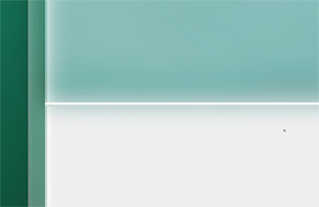
Use the Pencil Tool to add a horizontal 1px white line under the heading.
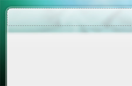
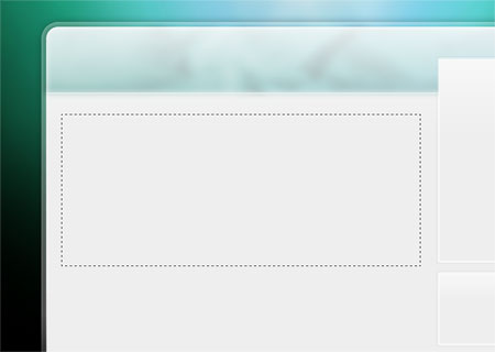
Create a selection from the content area again, then press ALT while dragging the Rectangular Marquee across the document to exclude the majority of the selection. On a new layer draw a white to transparent gradient downwards and adjust the opacity to 90% add a glossy highlight across the header.
Use the Rectangular Marquee Tool to draw in a sidebar that extends past the main content area. Fill this with the grey background colour (#eeeeee).
Add a transparent border effect to the sidebar using the stroke option from the Layer Style window.
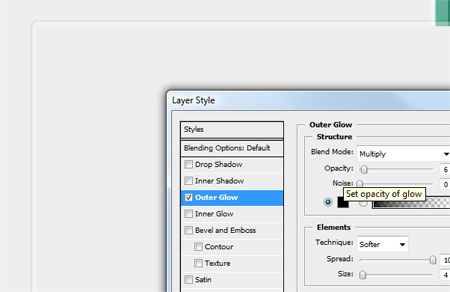
Use the Outer Glow option to add a very slight grey border, adjusting the Spread to the max will turn the default glow into a solid strip of colour which helps add this double stroke effect.
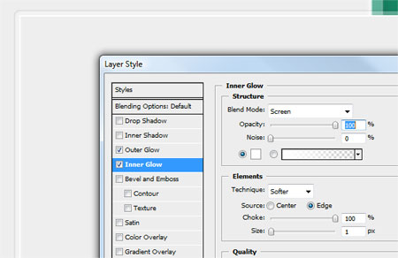
Use the Inner Glow option in a similar manner to add a thin white stroke effect to the inside of the sidebar. The Choke option set to max also makes the glow appear as a solid block.
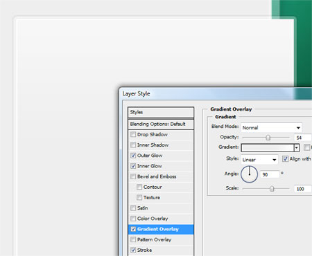
Finally add a gradient to the sidebar spanning from white to the light grey background to add a little interest and dimension.
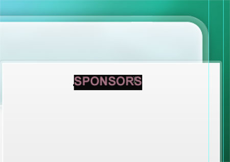
Split the sidebar into individual sections, the plan is to have separate sections for each set of menu items.
A similar approach will be used on the post area of the blog design, each post will be enclosed in its own container. Draw a rectangular selection to simulate one of these containers.
Fill the area with white, right click on the sidebar and copy the layer style. Paste this layer style onto the container to quickly add the same border effects.
With the structure of the layout almost complete, mockup the textual elements of the page to test out colours and sizes.
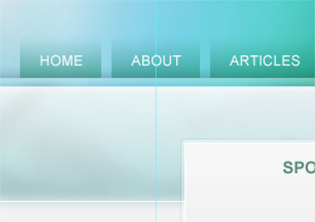
Create a navigation area by creating smaller selections and adding a fading gradient above the header. Type in the links with the Text Tool.
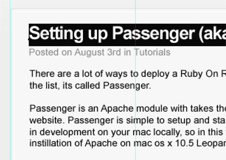
Taking the content of an upcoming blog post, paste in the information and adjust the colour and sizing of the text to give the appropriate hierarchy. The title is the most important element therefore must be large in size and bold in colour. Whereas the meta information isn't so important, so it can be smaller in size and lighter in colour.
Draw a rectangle with a subtle blue gradient at the bottom of the post container.
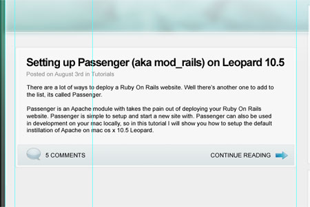
Using the fantastic icon set from Function, add secondary information such as the comment count and a link to read the whole article. Highlighting these in their own strip separates them from the content but gives useful information to the viewer.
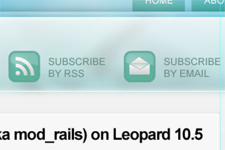
Finally add other page elements such as subscription options. The RSS icon here can be found in the form of a tutorial or as part of a free icon set.
With a good selection of information presented on the page it gives a clear picture of what the overall website will look like. In a future post we'll look at exporting elements of this design and coding up the layout into a real webpage.

Nice work dude. I like it. But the texture you are used is not good. That is making an extra bump for Background.
Could you make a tutorial about the slicing process of this web design?
Thanks!
Great job
Love the colour scheme! It looks nice and clean.
Looks great man, I’d like to see a larger preview if possible. Thanks, and cheers for including the function icon set :)
Muy bueno gran ayuda!!!!!
Cool. good luck
artnneslie desing
Marvelous !
Really Incredible. I am wondering if you will do a slicing tutorial as well. Even though you are in my rss reader, I actually came here because I saw a screenshot of your main site on Flickr. I never realized you had the main site, just the blog. Really nice.
Brilliant Chris!!! Teach us more :D
Looking good! I will have to start putting some content on it now!!
Awesome!! Thanks!!
Thanks for the post. Will you be doing a follow up on slicing and building it out for WordPress? Thanks…
Thanks everyone, I hope to continue the tutorial into coding into xhtml and css in a future post!
Yeah I’d love to see a tutorial of this being sliced out for the web.
There just simply aren’t enough of those out here.
It is a very elegant design. However, do you intend for the entire background to be loaded as a single image? Seems like it would be a rather large jpg and slow the initial loading to a crawl.
Nice & easy !!
Light steps for anyone to understand with nice writing.
I am interested in how you are going to do with the background when coding it. I know you can make it to an image, but it would be slow to load?
thanx for that i might use it
Great tut! CAN”T WAIT to see the coding tutorial! Thanks!
Hi! Excellent tut and blog! I am really looking forward to the coding into xhtml and css tut. Thanks!
Great tut! Nice design.
Nice work Chris, looking forward to the coding stage, no pressure :)
Very good tutorial showing those all those simple techniques..:)Nice result, indeed!
cool..
This is a great tutorial, I have actually applied it to creating custom backgrounds for blogspot.com. Visit http://tasteeblog.com and use any of my free blog resources.
wow i will make one like that and i will name it Vista template ;)
you are rock my Friend thank you
it’s great, i’ll wait for the slice, xhtml and css.
What a great tutorial, providing a great insight into your web development process.
I, like many can’t wait to see how you slice, XHTML and CSS this Photoshop design.
Thanks for all your hard work!
Nice Layout , Clean and elegant.
This looks cool, i could use this for my Blogspot templates, thanks
How I get 100s of NEW MYSPACE friends a day
here: http://tinyurl.com/5g97ua
Where can I go to encode my blog once I make it in photoshop?
it’s great tutorial.
would love to see further how the design takes up the shape to fully coded php template !
Very nice! thanks.
hey, what is the general font being used on the blog post? Anybody know offhand?
Awesome! Stumlbed, dugged, bookmarked
its really great tut thank you so much
Nice design… Thanks..
great work! continue inspiring other with your work sir.
The effect ok. But tutorial… you can do this better.
Great tutorial.
However, I have a question/req. Can you please explain how/why to use guides in more detail? I am really confused on how and why we use the guides. I tried to do some research after reading this tut. but couldn’t find any useful tutorial on guides. I make web-designs without the use of guide…never coded. But I wish to learn now.
Thank you
muy bueno, gracias!
Great job, thanks for an awesome tutorial.
Very simple and elegant design with nice color combination….
Great man……go on with more tutorials….