This post was originally published in 2012
The tips and techniques explained may be outdated.
My absolute favourite style of motorcycle is the custom “bobber”. I love the stripped down appearance and the raw vintage styling. It’s my plan to chop up a bike of my own one day, but for now I have to settle with designing custom motorcycle posters instead. Follow this step by step Photoshop and Illustrator tutorial to combine photography and typography and create a dark vintage style motorcycle poster design.
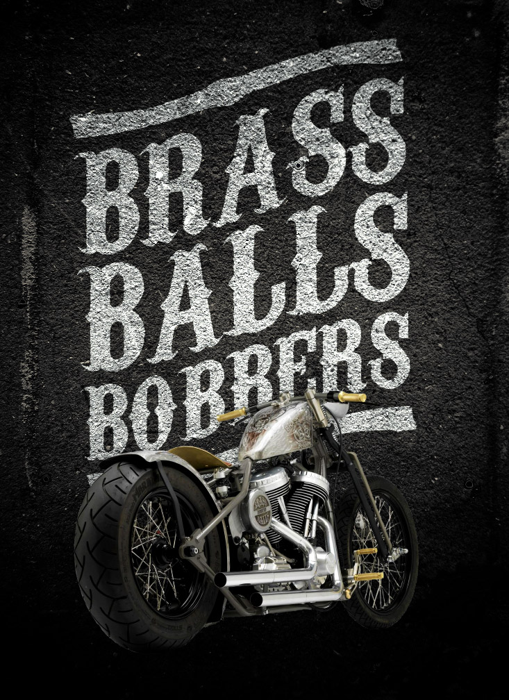
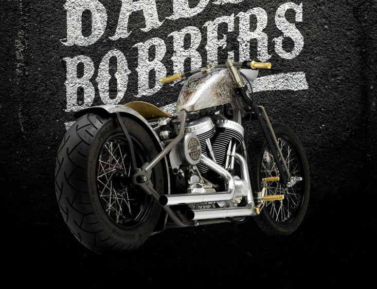
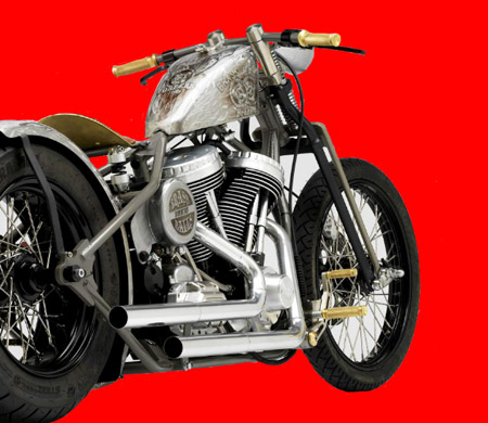
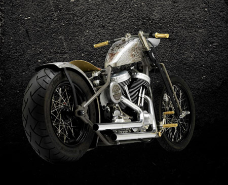
The final poster design is based on custom motorcycle shop Brass Balls Bobber’s award winning “Tattoo” bike, thanks to a Creative Commons photo by Brett Jordan. The poster combines the motorcycle photography with some vintage style typography and grungy asphalt textures to relate to the hardcore characteristics of the custom motorcycle scene.
View the dark vintage motorcycle poster design
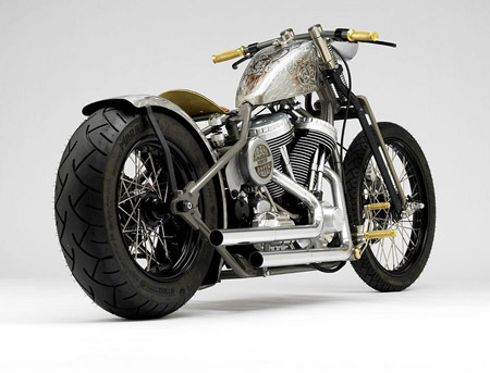
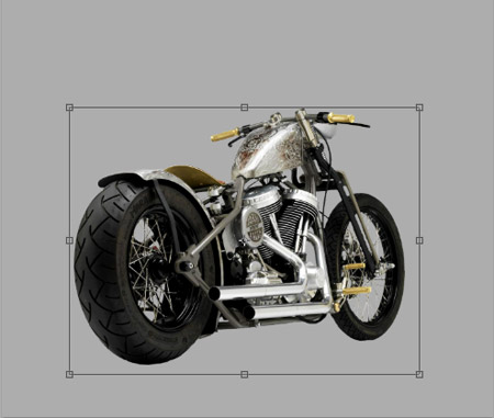
The basis of our motorcycle poster is this fantastic photograph by Brett Jordan. Brett has generously licensed this shot under Creative Commons on his Flickr profile, which allows us to create our own derivative works based on a professional quality image. On first impressions it looks like an easy photo to clip out seeing as the bike is set on a clean background, but unfortunately many of the silver and chrome areas blend in with the grey background, which makes the use of the Magic Wand or the Channels method difficult. An alternative would be to manually trace the bike with the Pen tool, but that would soon become tedious especially around the spokes. Instead we’ll put our Wacom tablets to use and use the best method for this kind of scenario…
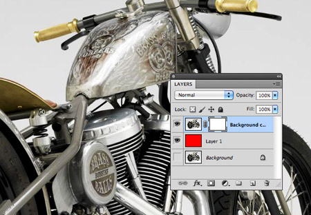
Duplicate the background layer and add a Layer Mask, then add a red filled layer underneath it. The best clipping technique for intricate images or those with no hard edges is to paint out the unwanted areas with the brush tool. This is much like using the Eraser except the Layer Mask keeps the technique non-destructive, where you can simply paint back areas if you make a mistake.
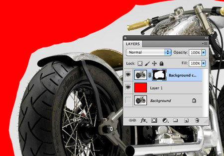
Begin by selecting the layer mask and roughly painting away the surrounding area with a large black brush. When working with masks, black will erase areas, whereas painting with white will bring them back.
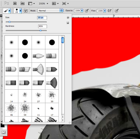
Set up your brush at around 20px in size with a Hardness of 85%. This will allow enough definition to erase the intricate areas while allowing enough softness to avoid any harsh edges.
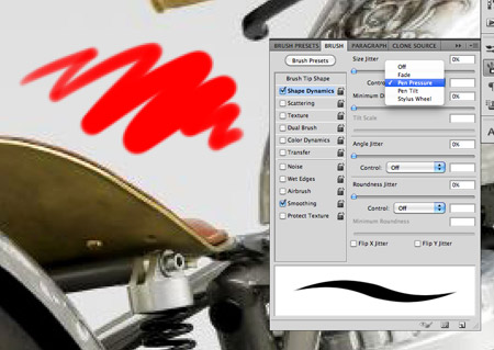
Grab your pen and Wacom tablet then set up the Shape Dynamics of your brush to correspond to Pen Pressure. This will make it super easy to paint in those tight areas by simply using less pressure.
Using these new brush settings, begin tracing the outline of the bike. Make the most of Photoshop’s zoom settings to paint away each unwanted pixel.
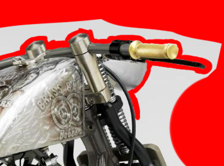
Use the bracket keys to make the tip size smaller or larger according to the amount of detail around the image.
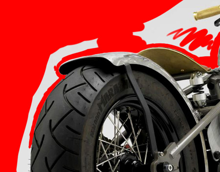
Once the outline of the bike has been painted away it’s time to tackle the finer details around the frame and wheels.
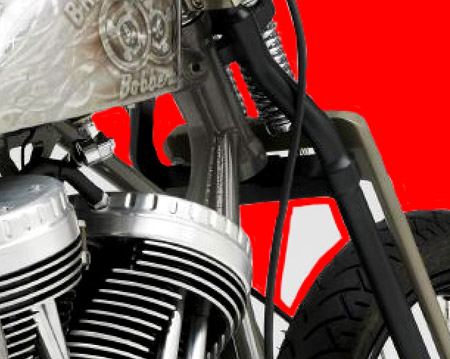
I prefer to outline a specific area, then fill in the centre, just like colouring in with crayons.
The areas around the spokes will require the most attention, but don’t forget you can roughly paint in the wheel area then switch to white and paint the spoke back in.
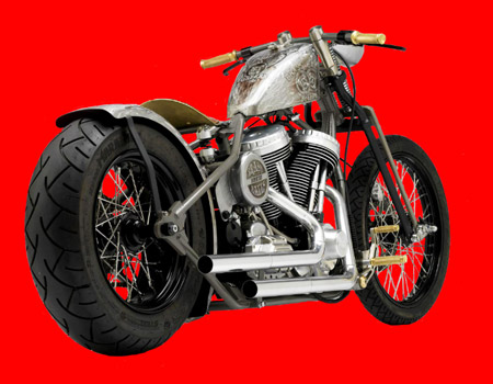
Once the bike is completely masked out it can be copied into a new Photoshop document at the correct poster dimensions.
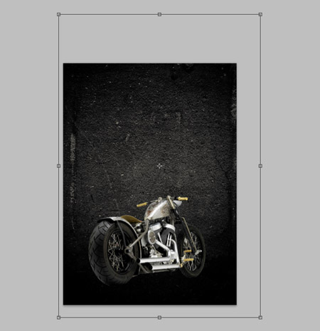
Search online for an asphalt texture and paste it into the background. The grungy texture of asphalt fits in perfectly with the motorcycle theme while adding to the dark raw theme.
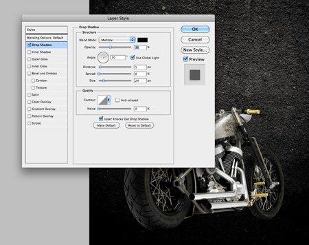
Add a subtle Drop Shadow to the bike layer to help it blend with the background a little better. Adjust the Size so there’s no definite outline then drop the opacity until the shadow is barely noticeable.
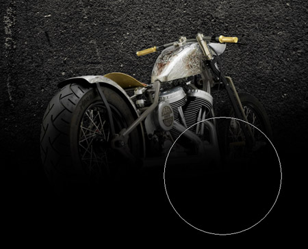
Paint a line of black using a soft brush on a new layer over where the asphalt texture fades out.
Change the blending mode to Soft Light to darken the lower areas of the motorcycle. Adjust the opacity so the effect just allows the black of the tyres to merge with the black background.
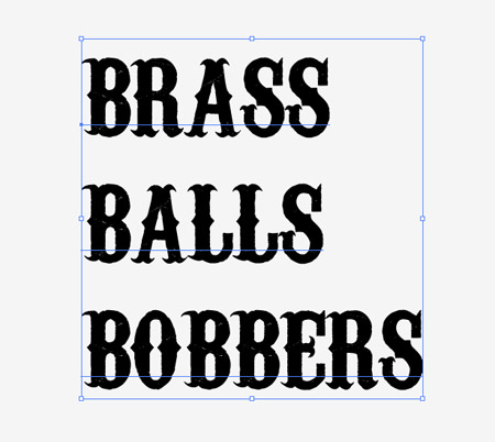
Switch over to Adobe Illustrator to create the typographic element. The free Carnevalee Freakshow font has a pretty cool styling that fits well with the vintage theme.
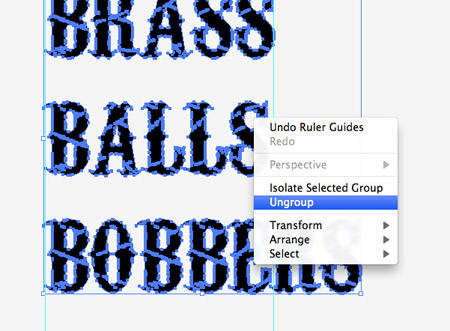
Convert the text to outlines to allow for manipulation then right click and select Ungroup.
Use guides to mark the width of the first word, then select the letters of each subsequent word and scale them to match while holding the Shift key.
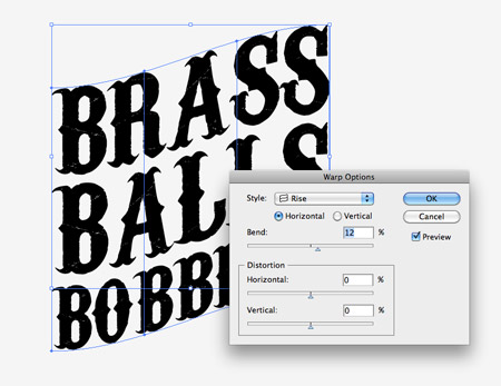
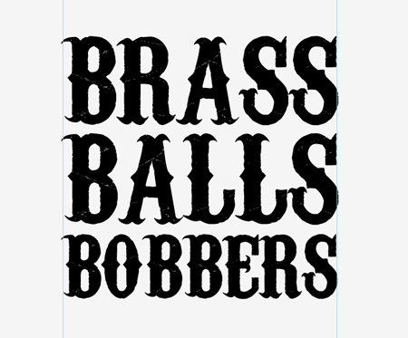
With all three words selected head to Object > Envelope Distort > Make with Warp. In the options select the Rise style at around 12%.
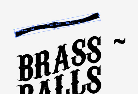
Use the Type tool to add a tilde symbol on the artboard, then convert it to outlines and stretch it into position as a border above the text.
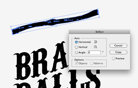
The flow of the border is the wrong way when compared to the flow of the text, so use the Reflect option (Object > Transform > Reflect) to flip it.

Duplicate the border and position it on the lower edge to finish off the typographic element.
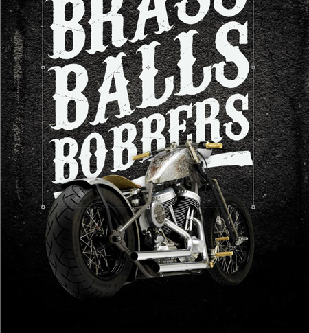
Paste the text into the Photoshop document and hit CMD+I to invert it to white. Scale and position the text into place so it sits behind the bike and forms a nice vertical composition.
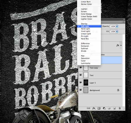
Change the blending mode of the text layer to Overlay to allow the texture to show through, then duplicate the layer a couple of times to make the text more legible. Change the top layer to Soft Light to tone down the texturing to leave the text much more readable.
This leaves our dark vintage style motorcycle poster complete. The combination of asphalt texture, vintage style typography and the awesome bobber motorcycle all fit together perfectly to relate to that biker’s lifestyle.

Wow! I was actually looking for a tutorial on how to “warp” text like that when a tweet popped containing a link to this wonderful post! haha I can surely use this for my current project. Thanks a lot Chris! Your tuts rock! :)
I still prefer the pentool over the “drawing the mask” method. I really enjoy my intuos 4 and sometimes its the better option … and most of the time a combination is perfect.
Have you ever done a tutorial highlighting the proper using of Blending Modes? I’ve tried a number of times to get text to adopt the texture of the background image and sometimes it works, sometimes it doesn’t. I’ve used Overlay more often than anything else, but I just have never really understood what a lot of those functions do. Might be something to consider doing in the future.
WOW , this cool design. and wonderful sharing !
hot sales
Cool & Simple. Thanks a lot Chris!
Brass? More like Badass xD
Very good tutorial, thanks for sharing. Nice, detailed and clean.
Looks Awesome!!! Nice work ….
Awesome design in Photoshop. Nice looking and helpful, user friendly tutorial. Thanks for share it.
Thank you for all of your tutorial. You are awesome n appreciate your effort .
Hi~~my friends,It is very glad to know you.I am from China,I just have a little English. I have a website http://www.fashion-caps.com saling new era caps,I am doing SEO now,Please introduce your friends to vist my website and make the website known by more people.increase website IP,we will give you big discount Thanks you.
A really cool concept, but I’m going to bring a bit of a discenting opinion here because that type needs some serious kerning. The execution of the photoshop work is top notch, but typography trumps all.
Sweet post! That bike is badass.
I nevertheless favor the pentool over the “drawing the masks method. I really enjoy my intuos 4 and also occasionally its the better option … as well as nearly all of the time a combination is perfect.