An ampersand is the figure used to represent the word ‘and’, it is widely recognised by the symbol; &. The symbol originates from the combination of the letter E and T, from the Latin word ‘et’. Over time the symbol has evolved from displaying these two letters quite evidently, to the shape we use today in everday writing.
Looking through large collections of typefaces highlights some real creative representations of the ampersand, many of which revert back to the traditional method of displaying the word ‘et’, others head for a more abstract approach. Here is a collection of possibly the funkiest ampersands you have ever seen!
“After the advent of printing in Europe in 1455, printers made extensive use of both the italic and Roman ampersands. Every new typeface and font has included its own style of &. Since the ampersand’s roots go back to Roman times, many languages that use a variation of the Latin alphabet make use of it.”
Source; Wikipedia
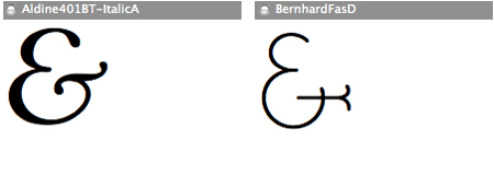
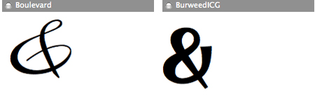
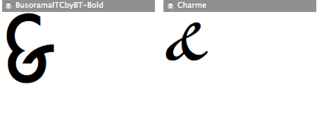
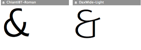
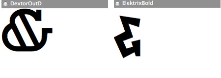
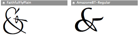
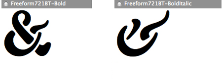
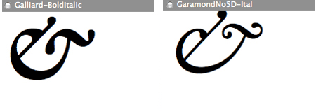
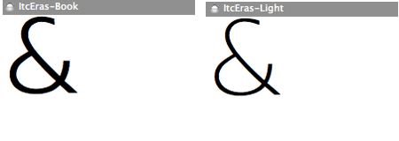
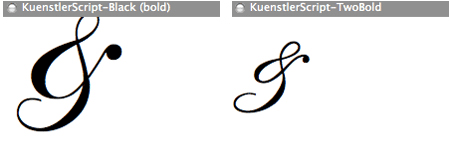
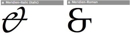
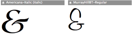
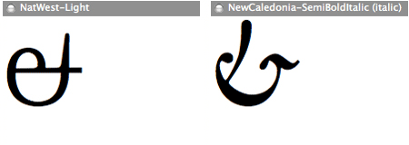
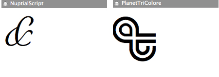
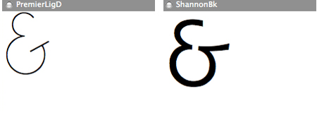
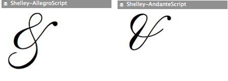
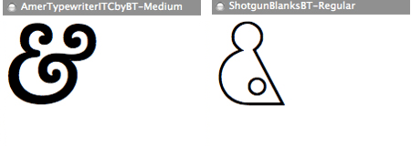
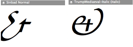
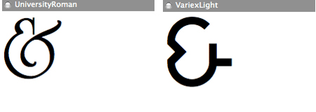
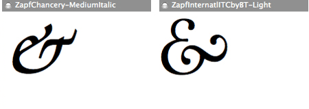
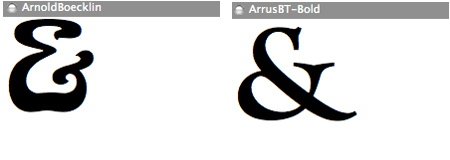
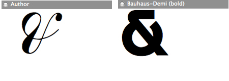
Have you come across any particularly strange amperand symbols?



That shotgun blanks one (6th from bottom on the right) is awesome! Going to check out that font now!
Wow, what an interesting and original post!
I never knew the & symbol was a latin symbol from the word ‘et’ that’s very cool!
Inspiration in you!
My work – it’s good ?
Meu trabalho inspirado em você
veja si esta bom
http://i142.photobucket.com/albums/r91/buscadoresdedeus
http://www.georgedesign.wordpress.com
Salvador – Bahia – Brazil
If you wanted to use these in an actual web design, one cool technique is to wrap your ampersands in a span:
<span class=”amp”>&</span>
Then you could like like your ten favorite in a row in the CSS, before you list more default stuff like Helvetica, sans-serif.
.amp {
font-family: “Bauhaus-Demi Bold”, “Sinbad Normal”, etc, etc, etc, Helvetia, sans-serif;
}
great post! very original.
i would’ve loved some links for each font; i’d love to see how they fit in with the rest of the character set, and to possibly grab the font.
my favs are ItcEras and PlanetTriColore.
I love the post, really inspiring. Thnx alot.
Found this article @ smashing magazine.
You have quite interesting collection of ampersands.
Cheers.
NatWest and Arrus are pretty cool. None of these beat a bold Fontin Sans & though.
Or Monotype Corsiva.
Or Diavlo.
@Chris:
That requires that the visitor has the font installed in their computer (which is dangerous to assume with any font other than the Web Core ones).
You could, though, use *your* favourite ampersand by wrapping them like that (manually or using some DOM-fu) and using a CSS image replacement technique (still with some limitations, like font size).
is it wrong to want a massive tattoo of a funky ampersand? because i do.
Check this font out. Aprox 15 sec into the clip…
http://youtube.com/watch?v=ouw1CPJZ3ZQ
@João Craveiro: That’s why I suggested listing like 10 of them. Chances are, they won’t have most of them, but they MIGHT have one of the 10. If not, it’ll just use a regular one.
please never use the word funky ever again
Man, I love the AmazoneBT-Regular and Freeform721BT-Bold. Sweeeet.
there is an «esperluette» what I could add to your magnificent list: American Typewriter (ITC)…
best regards
peter
Well.. you learn something new everyday! This is a great post, and some of them are indeed very cool.
http://melsbrushes.wordpress.com
Excellent!!!!
Great list!
Did not see the bickham & there.. I’ve used that one several times in graphic design. Gotta love that &.
that blank shotgun one kinda reminds me of the oakley push process ads. Good stuff.
so, you should cancel my previous comment. Just confirmed too fast :-D
I would like focus everybody on an «esperluette», one of the most beautiful of all typefaces of the world: the Palatino Italic by Hermann Zapf. It is delicate, perfect mix of cutting and calligraphy.