Look at the best sellers on the big font shops and you’ll see the same names sitting proudly in top spot. Proxima Nova, DIN, Futura and Brandon Grotesque in particular are extremely sought after typefaces that are commonly used in web design, branding and print. It can be pretty expensive to acquire these fonts, which means it’s often beyond the budget of most designers. Thankfully there’s some free typefaces we can rely on that actually match up fairly well. In today’s post I round up 10 of the most popular fonts and give my recommendations of the closest alternatives that can be used with Google Fonts or downloaded for free.
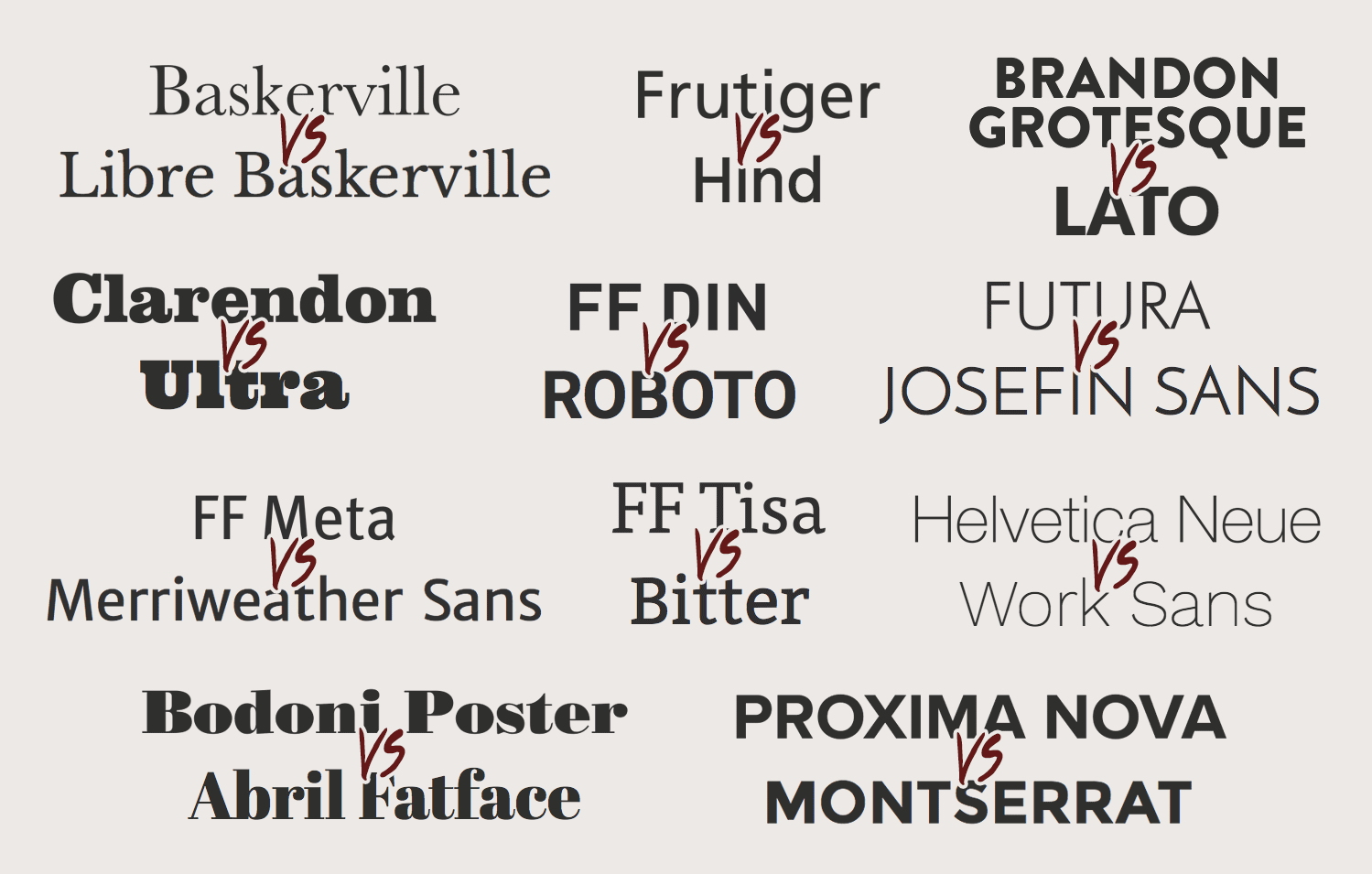
Proxima Nova vs Montserrat
Since its release just 10 years ago Proxima Nova has pushed aside all the classics and claimed top spot in the best sellers lists. For those of use who aren’t lucky enough to have Proxima Nova (or the similarly cool Gotham font), Monterserrat is a beatiful pseudo geometric typeface with very similar characteristics. These fonts look great in uppercase with wide tracking.
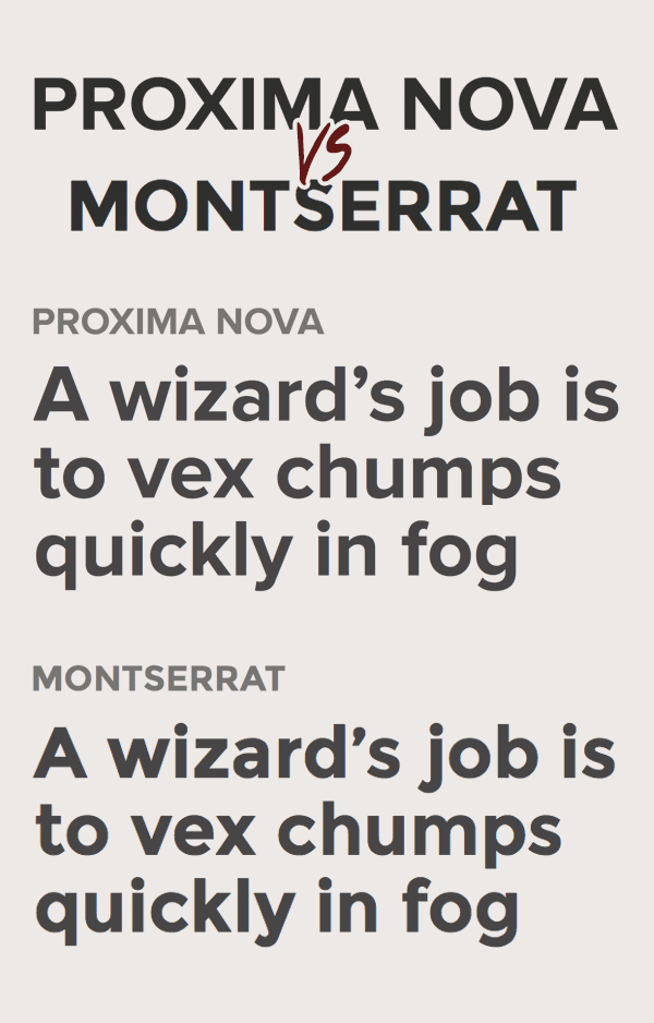
Futura vs Josefin Sans
Futura is everyone’s favourite geometric typeface with those iconic sharp corners. If you’re in need of a free alternative, look no further than Josefin Sans. Also being a pure geometric font means the letters that are made from basic shapes are almost identical, but Josefin does have some unusual characters that break the match. Thankfully most of those characters are lowercase and this style of typeface always looks much nicer in all caps!
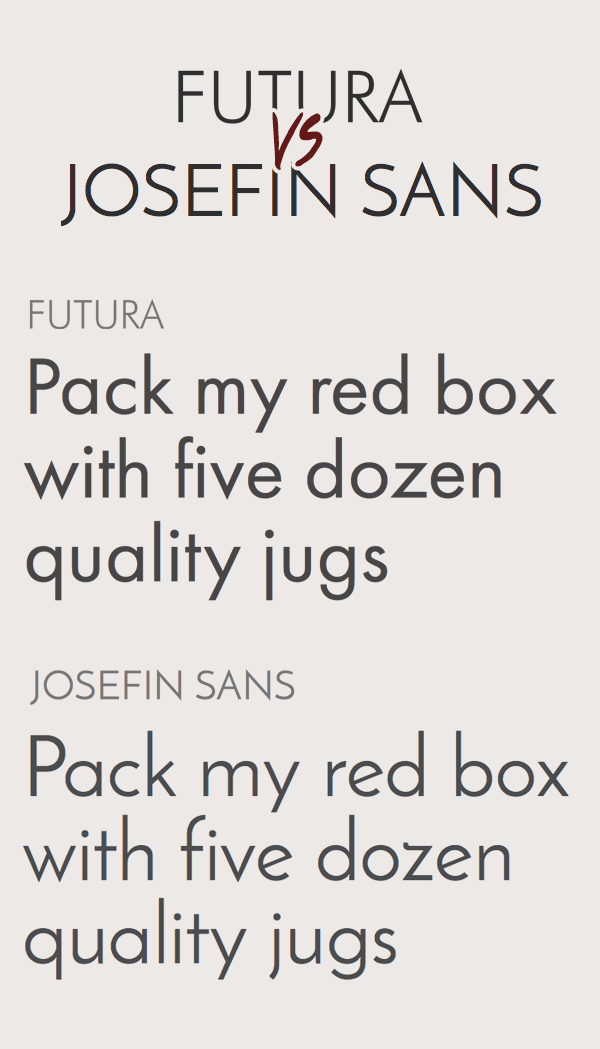
FF DIN vs Roboto
Roboto is the best contender to the ever so popular FF DIN. Not only does Roboto match up characters like the uppercase ‘R’, lowercase ‘j’ and straight tail on the letter ‘y’, it also comes in a range of styles which means you can use this font as an alternative to all the variants of FF DIN from light to black.
FF Tisa vs Bitter
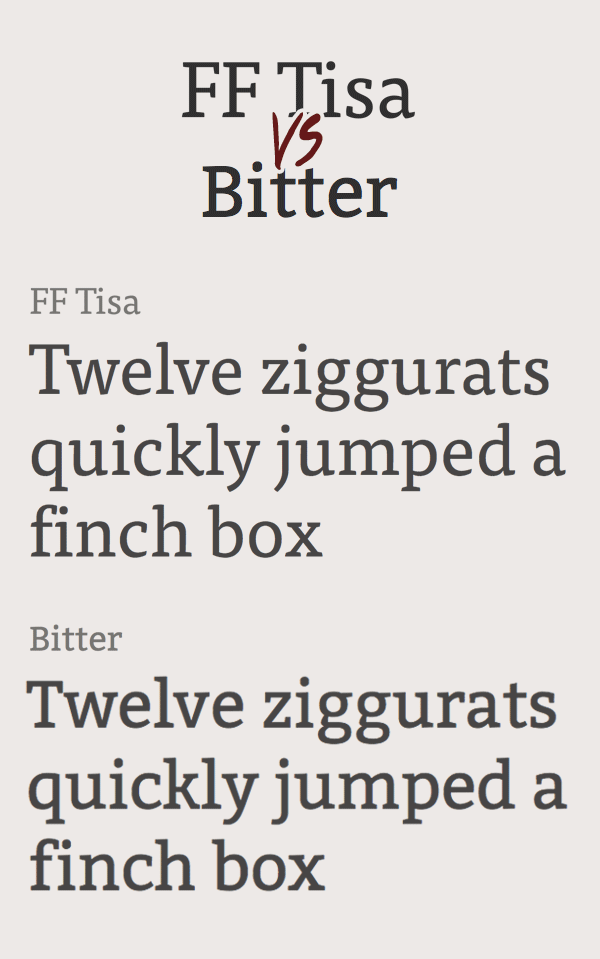
FF Tisa is a popular font with some lovely curved slab serifs which I thought would make it impossible to match with a free font, until I stumbled across Bitter. It ticks all the boxes with it having the same slab-serif style, the double-story ‘g’ and it even mimics the letter ‘k’ almost exactly.
FF Meta vs Merriweather Sans
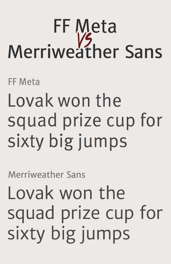
It can be difficult to match the double or single story letters ‘a’ and ‘g’ in a font. Some typefaces use one of each, and even if you find a font with the same style, there’s no guarantee that the bowl of the letter ‘a’ or the ear on the ‘g’ will be the same. However, Merriweather Sans perfectly matches the humanist style of FF Meta with the subtle contrast in its strokes, as well as similarly shaped bowls.
Baskerville vs Libre Baskerville
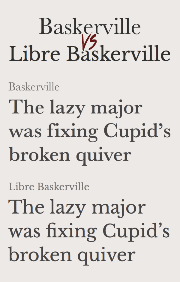
The classic Baskerville is one of the most popular serif typefaces with many spin offs. One free font that is based on Baskerville, as its name suggests, is Libre Baskerville. The normal weight is much thicker than the official Baskerville font, due to the reduction in contrast of Libre Baskerville to make it easier to read on screen. The normal weight does make a good match for the bold variants of the original Baskerville though.
Clarendon vs Ultra
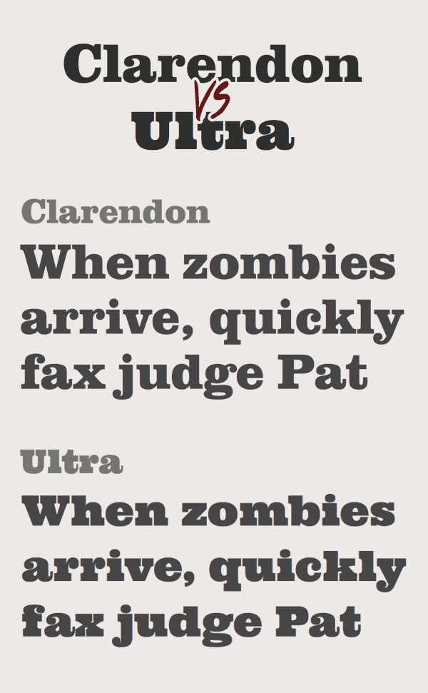
Clarendon comes in a variety of weights, but it’s commonly seen in its Black form to give it a solid presence. The free font Ultra is slightly more overweight as standard, but it makes a good alternative if you need to capture that stylised slab-serif look.
Helvetica Neue vs Work Sans
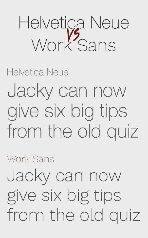
While Clarendon is often seen in Black, Helvetica Neue is almost always seen in its Light or Ultra Light weights. As one of the most iconic fonts of all time imposters can easily be spotted, but Work Sans is a good free alternative that has a similar skinny appearance. There are some major character mismatches, but they actually allow Work Sans to be itself rather than a poser.
Bodoni Poster vs Abril Fatface

I picked Bodoni Poster for this comparison, but Abril Fatface can be a good free alternative for most modern style didone typefaces, the likes of which are often seen in the mastheads of fashion magazines. I actually prefer Abril Fatface over Bodoni Poster in this example, especially those curvy terminals and that cool ligature of the letters ‘f’ and ‘i’.
Frutiger vs Hind
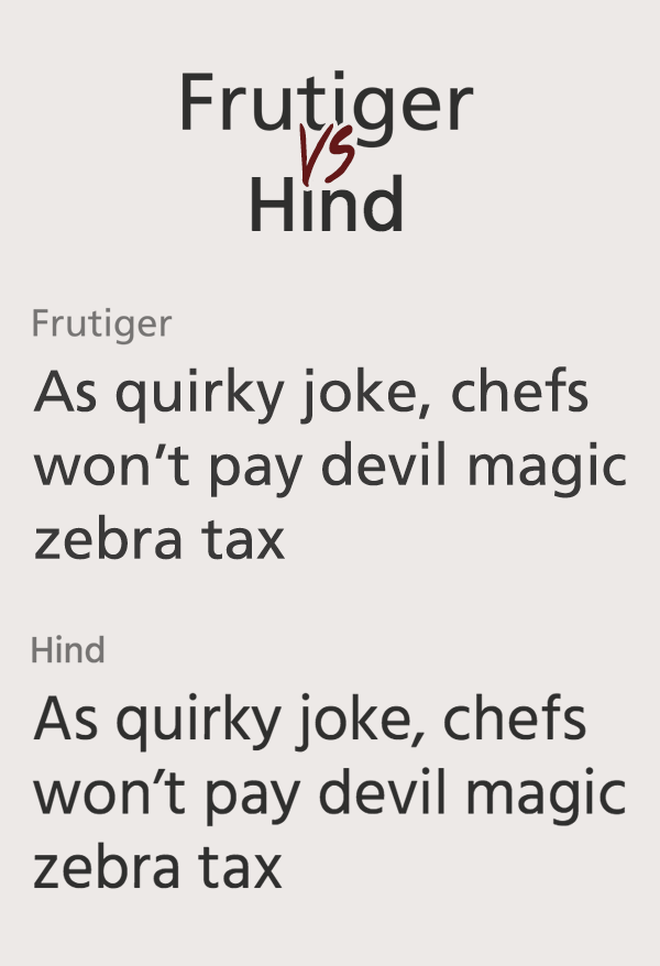
Frutiger is a reserved sans-serif with neat letterforms that works as both large scale signage and body copy. The free font Hind is the perfect alternative that matches each character perfectly with the exception of a slightly taller x-height. Unless these two fonts were placed side by side it would be difficult to tell them apart.
Brandon Grotesque vs Lato
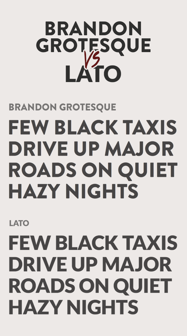
The final comparison I have to present isn’t a great match, but free alternatives of the popular Brandon Grotesque font are highly sought after so I thought I’d try and find a worthy option. The rounded corners of Brandon Grotesque are what makes it so unique, but the free font Lato also features some subtle rounding. In its lowercase form these fonts look nothing alike, but with some modification in Adobe Illustrator to round off the rest of the corners, Lato could prove to be a worthy replacement to the all caps style of Brandon Grotesque.

Hi, your blog design looks very similar to my one. Valuable information and excellent design you got here!
More awesome info – thanks for showing Work Sans, another valuable asset!
Lets ready to rumble!
Cool post Chris – a quick squish of Abril Fatface would make it look like an even closer match of Poster Bodoni don’t you think?
Chris, I must admit that the font jungle is still very mystical to me – as a writer I know that words can make or break a story — in graphic design I am learning that fonts can make or break my story or graphics — your post helped the mystical seem much more manageable. Thanks.
Melanie
Thanks Chris for great info. Always a pain to find the right web font for projects…. thanks for this!
I wonder why duplicate and give another name for it! This also amounts to copying the original font for similar looks!
Great alternatives but…
I was also wondering about the copyrights. What is that? Some fonts look almost identical.
Frutiger / Hind
Hind is a bit wider and the dots are round.
Helvetica Neue / Work Sans
Different ‘g’ and the dots are round.
Is that enough to stay out of trouble as a copy cat?
What a great idea! Super helpful! Thanks Chris.
Very useful, thanks for sharing.
thank you, thank you, … thank you
Good post! One of the best posts on Google Fonts really, provided that 99% of them are shit, (both the posts and the fonts).
Little unknown advice: many of these Google Fonts can be downloaded at http://www.fontsquirrel.com/ for free and used commercially :)
Or just download them directly off Google Fonts… ;)
Scroll all the way down on the font page > click ‘Open [fontname] in Google Fonts’ > select the ones you want > click the down arrow at the top right. > Click ‘.zip file’ in the sentence “Download the font families in your Collection as a .zip file”. That’s the download link.
Just a little tip. :)
Very nice font selection, thanks for the post, it’s very helpful! =)
Each font alternative has enough differences to count as its own rather than just being a knockoff.
As you said, the last match (Brandon Grotesque and Lato) isn’t very close. In the weight shown, I rather prefer the rounded points of the W’s, A’s, V’s, M’s, and N’s within Brandon Grotesque over the shape of Lato in the same weight format. That being said, I’m all for free, and I’ve used Lato, although I’ve never used it as a replacement for Brandon Grotesque.
Chris!
Thanks so much for putting the time for this. Excellent stuff!
Awesome, I’ve been looking for a good Futura alternative. :) ! Thanks!
Great info ! Thanks !
This is super! I couldn’t download the fonts from Google fonts (couldn’t find the download .zip file, although I did click on the upper RH arrow.) I did download the ones that I wanted from fontsquirrel.com
Thanks for the blog -very informative. The comparison was very insightful and relevant to my website site needs. Cheers. -Tim
I love it ;)
The best comparation that i’ve found on web! Great!
Actually, we can find more fonts that seem identical but they are not a complete copycat of the other fonts as even the slightest differences in the stroke, roundness or thickness of the font matter.
Chris, Really hard work.Very helpful. Thanks:)
Great post!
Only if were posted a bit earlier it had saved me time of looking for Josefin Sans, I did found it as a Futura replacement, only after going through 600 Google fonts.
Hello, thanks for this article, very usefull. What’s not said is between PROXIMA NOVA and MONTSERRAT there’s a huge gap actually. Montserrat is very bold, even in it’s “regular” form, while Proxima Nova allow us to play with a real “Regular” font (and Thin, Italic, etc… when Montserrat only propose Regular and Bold).
Try to compare FF Meta with Fira Sans.
Hi Chris,
you really do a great job with this site. I like the spirit of the article.
I think the real free alternative to FF Meta should be Fira Sans, designed by Erik Spiekermann for FirefoxOS:
https://www.google.com/fonts/specimen/Fira+Sans
https://www.mozilla.org/en-US/styleguide/products/firefox-os/typeface/
Thanks for this article. It was very helpfull. Good job!