What’s your dream character? Small and curvy? Tall and strong? Whatever your type, you’ll see the most attractive glyphs in this typographic beauty contest. The ampersand is every typography addict’s favourite ligature, but which font has the best? I searched the world’s font foundries to create a showcase of the most beautiful ampersands, find the one that takes your fancy.
Originally a ligature that combined the letters E and T of the Latin word ‘et’, the ampersand is now a common replacement for the word ‘and’. Its form has evolved over centuries from the more script-like ‘et’ ligature where the letters are clearly visible, to the more stylised character we recognise on our keyboards today. I browsed through 100s of typefaces to find the font with the most unique and flamboyant ampersand designs. Which one is your favourite?
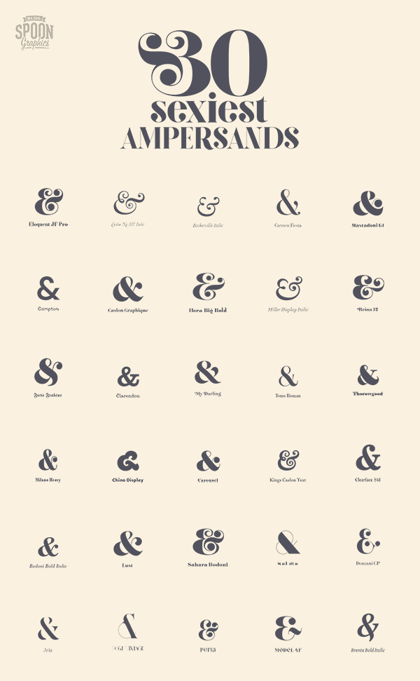
Eloquent JF Pro
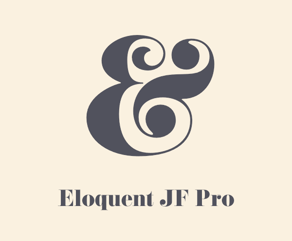
Eloquent is a digital revival of the old classic Pistilli Roman. Many regard Pistilli as having the best ampersand of all time with its elegant swashes. You can actually find a free replica of Pistilli which also contains this alternate ampersand glyph under the character.
Caslon No 337
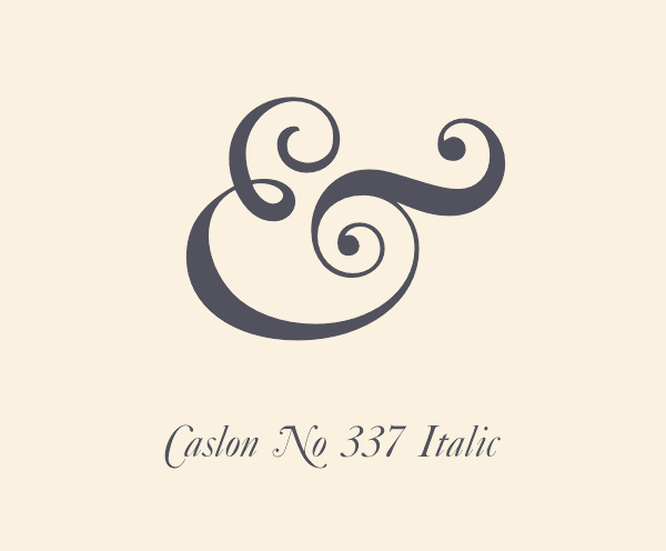
Some of the most elegant ampersands come from the script era of old style typefaces. Caslon is a great example with its flowing swooshes and strokes.
Baskerville Italic
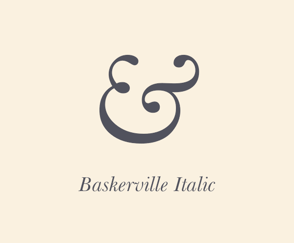
Baskerville Italic is the go-to ampersand when you want to add a touch of class to your designs. All the hipster typographers either use this glyph as their logo, or have it tattooed on their wrist!
Carmen Fiesta
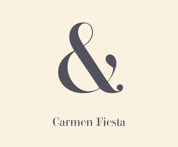
Carmen Fiesta is a display typeface that looks like it has come straight from the circus, but within the glyph set of wild ornaments and fleurons is a pretty ampersand with elegant ball terminals.
Mastadoni
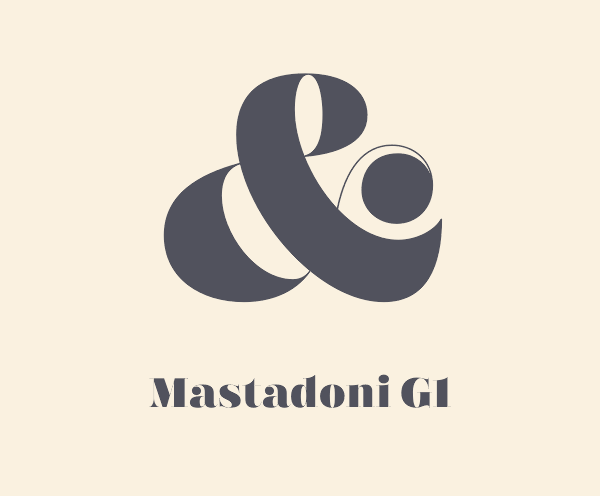
With a name that combines masthead and didone you know that Mastadoni is going to feature some ultra modern characters. Its ampersand has extra high contrast with some sharp swashes. Be sure to also take a peek at its ugly sister in the italic font.
Campton
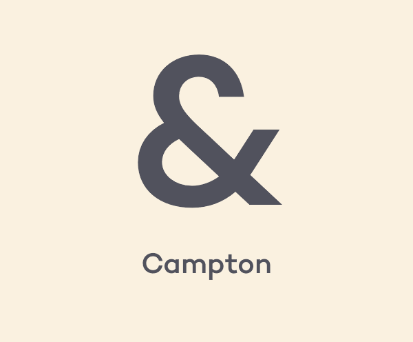
Most of the typefaces in this showcase are serifs, but that’s not to say sans-serifs aren’t beautiful. Campton features a minimalist ampersand with some interesting negative space, almost like a broken heart!
Caslon Graphique
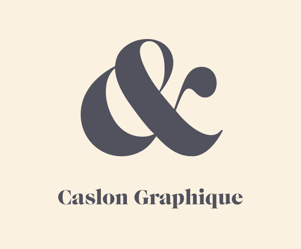
Caslon Graphique is a classic originating from 1725 that was ahead of its time. Does anyone else think this ampersand looks like the witch from Snow White, hunched over and offering a poisoned apple? “Go on, take a bite!”
Hera Big
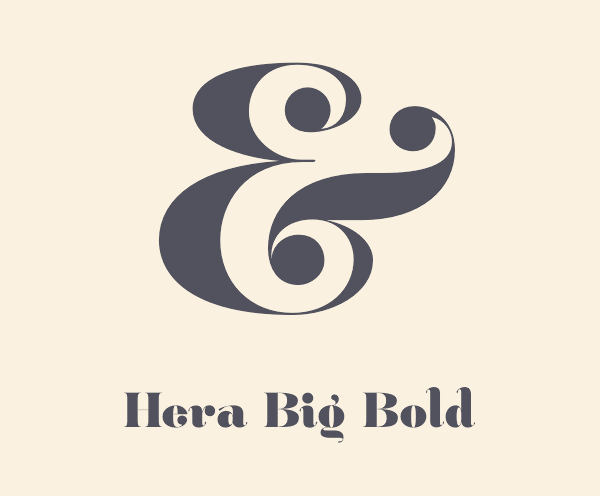
The stylish curves of the Hera Big ampersand look great in all its weights. Bold is shown here, but it also looks gorgeous in ExtraThin.
Miller Display Italic
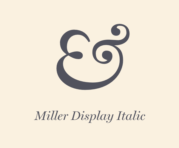
Like Baskerville, this gem of an ampersand can only be found in the Italic fonts of Miller. There’s also a Small Caps variant that tightens up the proportions.
Reina
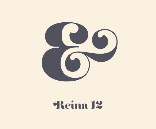
Reina’s ornamental swashes give its ampersand a distinctive appearance compared to the usual ball terminals on modern serifs. Check out the engraved variant that almost confuses the eye with harsh black and white shapes.
Fette Fraktur
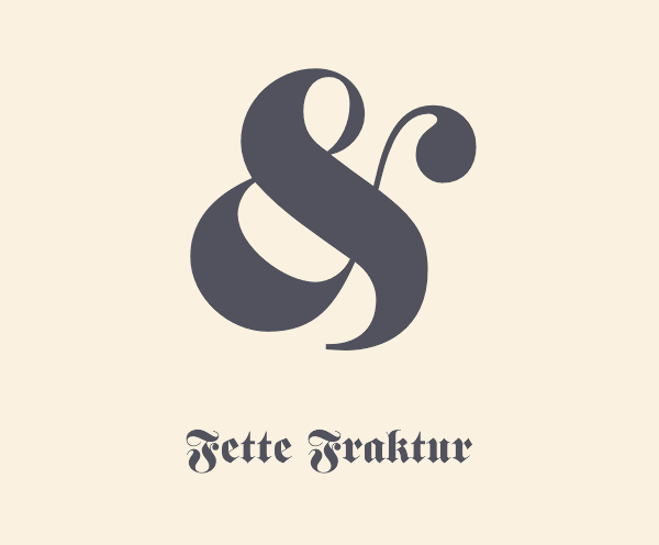
For a scary blackletter typeface Fette Fraktur has quite a camp looking ampersand! The rest of the font is characterised by hard lines and sharp points, but this character proudly strikes a sassy pose.
Clarendon
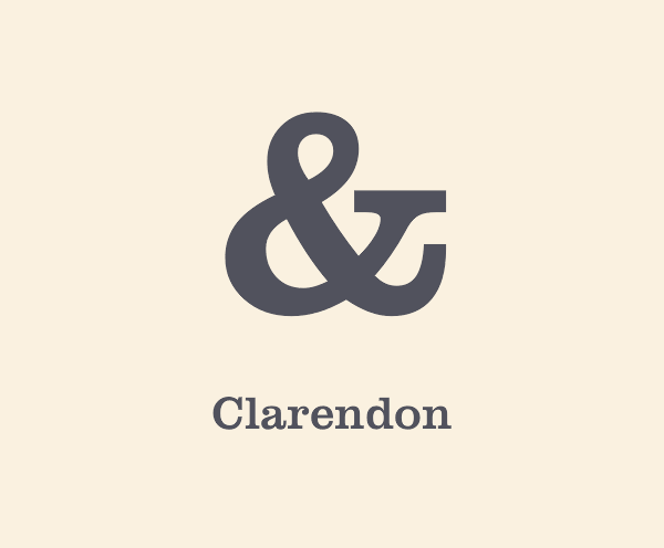
Clarendon’s ampersand has the typographic equivalent of the hollywood jawline with its solid slab serif presence and perfectly balanced measurements.
My Darling
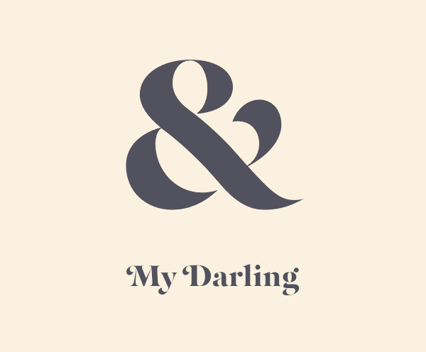
The extremely high contrast of My Darling almost breaks this ampersand up into four separate pieces, but the result is a curvaceous design without a single straight line.
Tom’s Roman
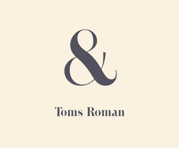
The sophisticated script like appearance of Tom’s Roman sends your eyes wandering as you follow the curves right the way around its body.
Thorowgood
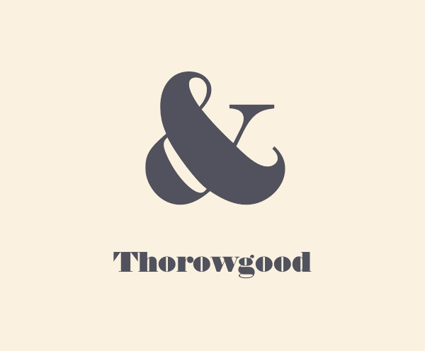
If Thorowgood was in human form it would be breaking the Internet every day with that butt!
Milano
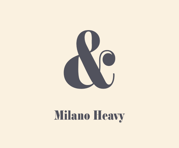
Milano’s ampersand is cute and dainty, but also strong and confident. It has that classic chic style that never goes out of fashion.
Chino Display
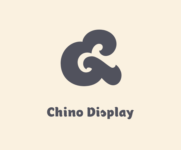
It’s unusual to see the early ‘et’ style ampersand with such a modern style with broad brush strokes, but it works so well with soft and cuddly Chino Display Ultra.
Carousel
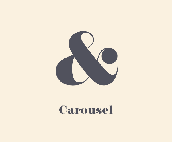
Carousel provides the perfect contrast between broad and thin strokes to give it balanced shape.
Kings Caslon
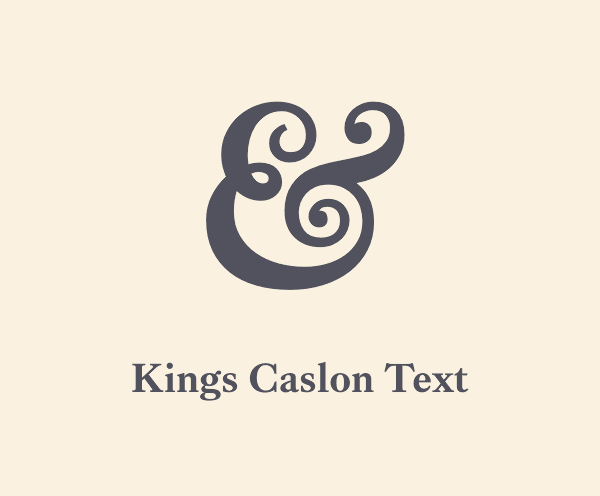
Kings Caslon is a very similar ampersand to the related Caslon No 337 typeface featured above, but its noble roots make it tall and proud.
Clearface
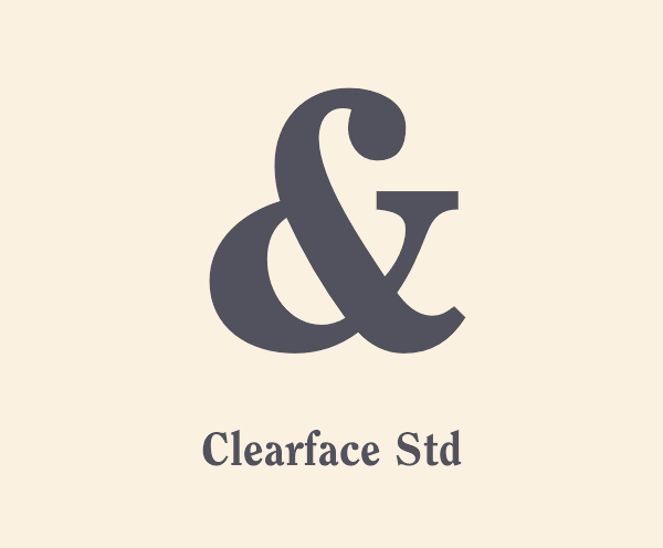
The Clearface ampersand uses a terminal where the others loop to form a bowl. The result is a trendy character that dares to be different.
Bodoni
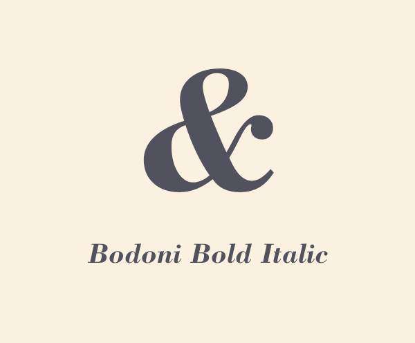
Bodoni is a timeless classic that’s smart and professional in its regular format, but can pull off the casual look in italic.
Lust
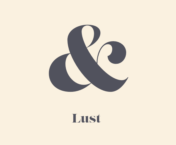
The seductive curves of Lust make it quite a risqué ampersand. Described by its designer as having the leggy body of a Brazilian supermodel.
Sahara Bodini
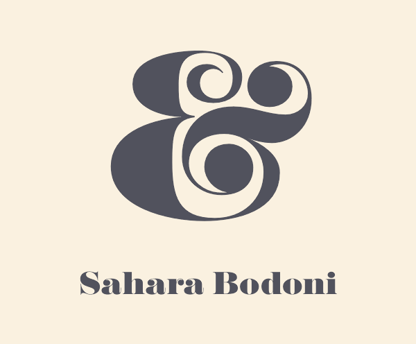
Sahara Bodoni is the Pamela Anderson of the typographic world. This is what happens when you take the naturally beautiful Bodoni and go OTT on the cosmetic surgery.
Manhattan
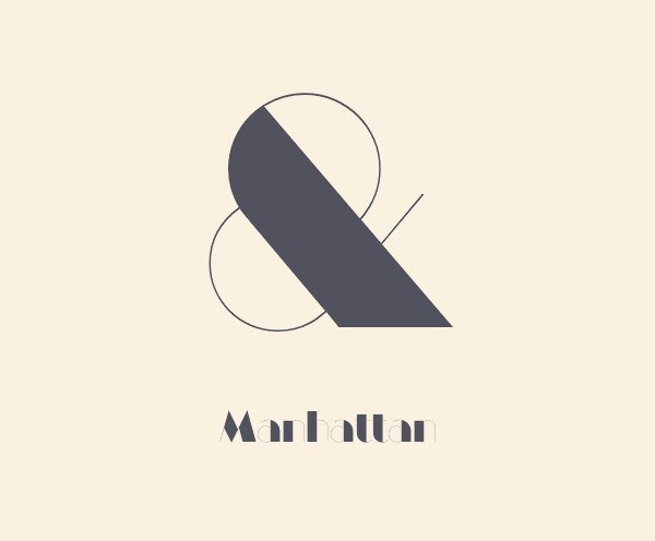
Manhattan’s ampersand is an Art Deco work of art. It prioritises form over function but it’s an interesting sculpture to admire.
Domani CP
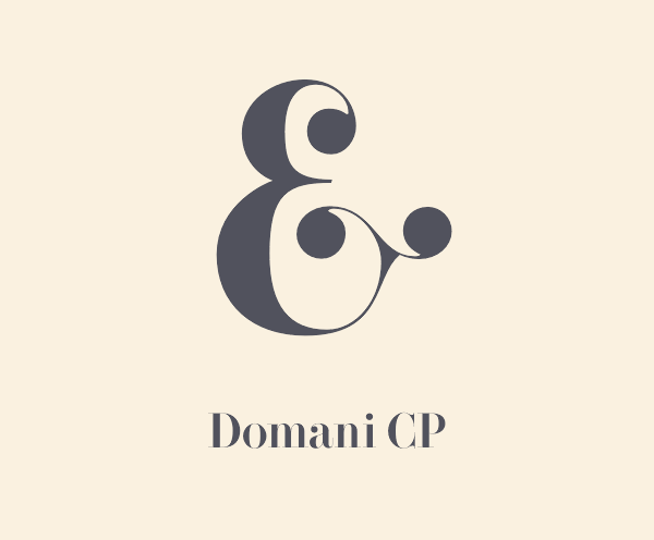
The original ‘et’ ligature can be clearly seen in Domani’s ampersand, which is a strange combination of historic script and didone style.
Avia
Avia is a size zero supermodel ampersand. Incredibly beautiful but so thin it looks like it’s going to break.
Port Vintage
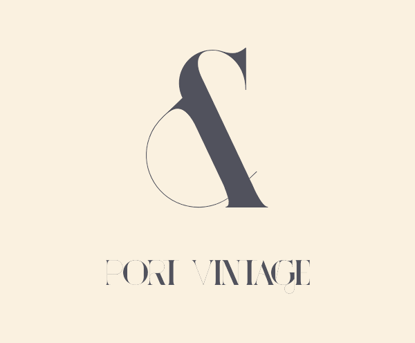
As an experimental didone typeface Port Vintage has multiple experimental ampersands, 7 to be exact. They’re all just as crazy as this one too.
Perla
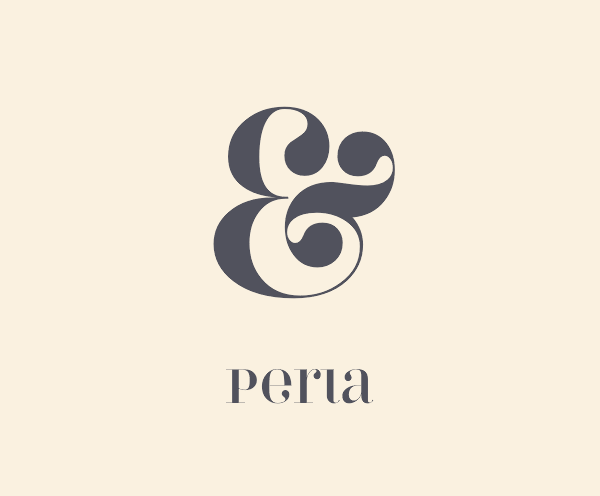
Perla’s ampersand has such thick and luscious curves it creates even more flowing shapes in the negative space.
Model 4F
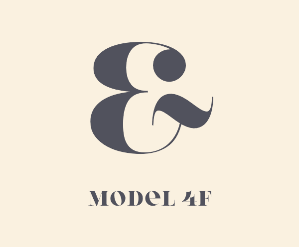
The multi-lingual Model 4F typeface has some extravagant characteristics that gives an exotic foreign appearance.
Brenta
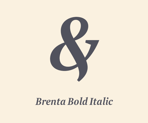
Brenta’s ampersand has a classic style with a prominent serif, but its Italic font’s unusual pose really catches the eye with a leg like descender dangling below the baseline.

Love to see this variety of typographic font designs! I personally like CARMEN because it looks simple and attractive..
When are these fonts coming for sale?
What about sexy question marks?
I have been looking for some sexy ? to use in a type design. Hmmm. Maybe I’ll start by looking at the characters from these fonts.
How can you read my mind so well! This brightens my Monday. It’s not rare for me to poke around through my other fonts looking for a spicier ampersand to drop in my designs when the built-in one just won’t do. Thanks!
Today I’m loving Carmen Fiesta!
Chris,
This is a great post. I have been in this business a long time and it is very interesting to note that certain fonts really have the ability to conjure up memories of specific periods of graphic design. Your blog continues to be a top supplier of information, both how-to practical as well as historical.
Thanks for doing what you do!
Thanks Lon! It also helps me learn new stuff too. I discovered a lot of new fonts from creating this showcase.
It’s a great website to learn and know all about the design and its also nice to get the new touch and I fell good to view this site. Thank you…
I’m surprised that Windsor Light or Windsor Light Condensed isn’t part of this selection. Both have beautiful, sexy, unique ampersands.
Thanks for this post! Can’t decide which one I like best – depends on the subject.
Love the descriptions! So fun to read on their own. Thanks for the great list!
Chris,
I can’t tell you how many times that I’ve gone through my fonts looking for this very thing.
This poster is going up today!
Thanks, buddy!
I love your explanations about the ampersands! You made me look at them in a whole new way! Thanks for the post.
Yes, this post is awesome! I once spent several hours going through all the fonts I own and making a document of all the ampersands. I generally use Baskerville Italic and Bickham Script Fancy but that Kings Caslon just won me over. Thanks for putting this together!
Hi Chris,
Love this, it would be amazing to see a typography design tutorial, you know the ones that feature an inspirational quote taken straight from tumblr. It would be good to see how one would approach this and what things to consider.
Thanks,
Steve.
Hello Chris
CARMEN FIESTA, MILANO….
Just awesome Thanks :)
this a great post
its so useful for me
tnx
Love this ( and all your posts). I am not a designer by training but love design and the & is one of these characters the look so great when printed. I own and run a small DTG and Sublimation print studio and am always playing about with fonts.
Love it…. Keep up the amazing work.
PS if you want some Spoon Graphics Tees printed let me know. ;)
I like Manhattan. I use the font Broadway on my Gand daughter’s dance pictures. I think Manhatten will fit right in. I enjoyed this post. Thanks
Love this! I have a “go to” ampersand that is the lowercase “k” in Wingdings. It’s a beauty.
Thanks for this great post!
Hello Chris ! Thanks for this great post!
Chris,
Thanks for great post. I like Domani. If you rotate it 90 degrees clockwise, you can see a face in it. :-)
Any idea how to get these fonts.
University Roman my Et druthers. FYI, Latin, et per se et, English, and per se and…ampersand.
Myself, like many designers have a thing for ampersands. Maybe it’s because it has a mysterious feel to it or maybe the curves and white space trigger something.
Anyway I have a Pinterest board dedicated to ampersands but will not spam your blog with the link. I’ve put it in the Website field just for you to see.
Thanks for the great post.
Hi, your blog design looks very similar to my one. Valuable information and excellent design you got here!