
It’s every print designer’s dream to work on a project that involves special print effects. Varnishes, fluorescents, foils and embossing are just some examples of cool finishes that can be applied by industrial printing companies, but the added cost makes these projects quite a rarity. If you’re lucky enough to have an adventurous client, or you’re feeling flush and want to splash out on some top quality personal prints, follow along with this guide to learn about the different special print finishes available and how to prepare your print artwork to accommodate them.
The Printing Process
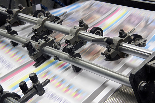
Having your designs professionally printed will involve either digital or offset printing. Digital printing is common for short runs of 500 or less, whereas traditional offset printing is the standard for long runs or large format printing. It is now possible to find digital printers that can supply white & metallic inks and digital spot varnishes, but you’re really going to need a large print project that requires offset printing to have most special print effects available to you.
Typically prints are created using 4 colour CMYK printing, which adds Cyan, Magenta, Yellow & Black inks via plates to build up the complete spectrum of colours available in the CMYK gamut. With offset printing however, more plates can be added to accommodate special inks, or prints can be run through additional machinery to apply special finishes.
Spot UV Varnishes
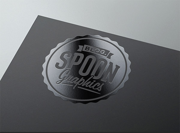
The most popular special print finish is the Spot Varnish. Varnishes are often applied to the whole page to give a shiny or matte finish, but Spot Varnishes use an additional plate to overprint the varnish to specific areas of the design. The term UV relates to the ultraviolet exposure which quickly dries the coating to create super shiny effects.
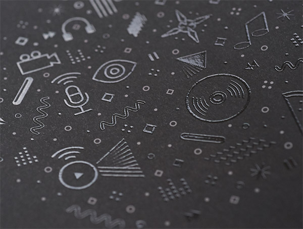
Fluorescent & Metallic Inks
Another example of a special print effect that is applied directly on the press is the use of special inks such as metallics or fluorescents. These inks can be applied with additional plates, or sometimes they can replace one of the standard CMYK plates to keep the cost down. For example a fluorescent yellow ink is commonly used in place of the standard CMYK yellow.
Hot Foil Stamping
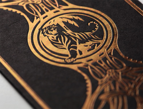
One of the most distinctive special print effects is the hot foil stamp, which is commonly used to create silver or gold highlights and is often combined with embossing for truly luxurious prints. Hot foil stamping is applied post-press and requires extensive setup so it can prove costly, but the results are certainly worth it!
Embossing, Letterpress & Blind Debossing
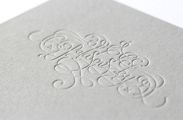
Embossing, debossing and letterpress all involve the indentation of a die onto the paper stock. Embossing creates a raised relief, whereas debossing and letterpress creates a cavity. The difference between debossing and letterpress is the use of ink. Blind Debossing refers to the lack of ink to create a subtle indentation in the paper, whereas letterpress printing is applied with ink. The letterpress indentation was originally a side effect from the printing process, but it is now a sought after style. Blind Embossing and Blind Debossing are also commonly combined with foils to really draw attention to the image.
How To Prepare Your Print Artwork
While all the special print effects result in different finishes, the process of identifying these areas in your designs is the same. All print effects are applied by the printer, so your computer based artwork won’t accurately depict the final result. You will need imagination and good communication with your chosen print company to ensure your prints return with the expected result!
Designate the special finish areas
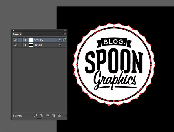
As the designer, you’re in charge of identifying which areas of your design should have a special finish applied. The ‘less is more’ rule is definitely true with special effects. Copy and paste elements onto a new layer, or create additional artwork that will only be applied using a varnish or die onto this separate layer.
Create an identifiable spot color
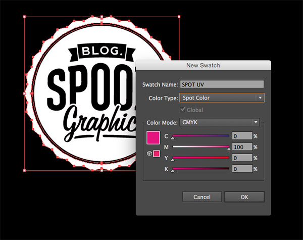
The special areas in your design need to stand out to the printer, so creating a special spot colour swatch will separate these items from the rest of your artwork. In Illustrator or InDesign create a new swatch from the Swatches panel. Give it a descriptive name and change the type to Spot Color, then make the colour 100% Magenta or 100% Black so it clearly stands out in your design.
Set the elements to Overprint
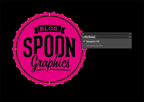
To avoid the special finish elements knocking out the other print plates the elements must be set to Overprint via the Window > Attributes window. This is crucial for spot varnishes that are meant to highlight underlying areas of the design, otherwise the varnish would be applied directly onto the paper.
Save your print file
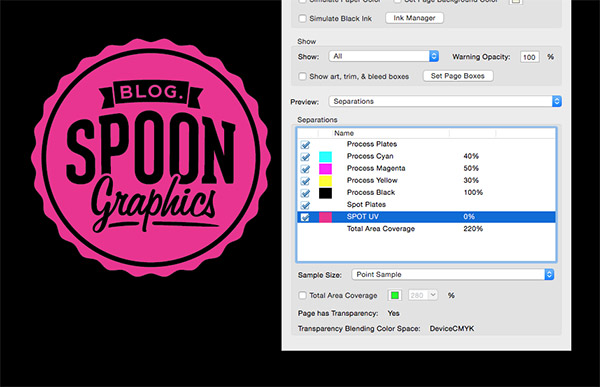
Save your document as a PDF, or package the document in the case of InDesign. You can use Adobe Acrobat’s Output Preview mode to see how the artwork is separated into the different plates and how your special spot colour is clearly listed in the separations list.

Love everything what you mention in this post.. The hot foil stamping is very impressive..
Great post. Useful information. Cheers
Thanks for sharing this.
What if we have to use two spot colors in a gradient fill??? Can we do it in plastic packaging?
Unless you are from “Old School” with a letterpress and or offset printing background, your article’s usefulness is limited …
When film was film over-printing special effects such as metallic, varnish. gold and silver ink requires techniques unknown to desktop operators …
You don’t overprint special (clear or color) effects without knowledge and ability …
My vocation, 36-years, involved offset and letterpress work. Depending on the job, four-color process was not always printed with the same sequence …
Interesting. As Marvin pointed out, old school knowledge is very helpful here. I started with rubber cement and razor blades back in the day. Special effects were always something that required a close working relationship with your printer. In the digital world it is amazing to see how many people really do not understand the printing process, let alone matched colors (such as Pantone) vs. CMYK and how RGB is not a offset print color mode.
I have produced various projects that require foil stamp, embossing and matched colors and still find it very useful to explain what the desired effect is with my printers. Many times the printers internal pre-press department can do it better than me and will make the necessary refinements and adjustments to my files to make it work. Just as they did when they cut rubylith film.
By all means, if you feel you can handle it, go for it but realize that mistakes in this arena can be costly. Don’t be afraid to ask questions. Printers are happy to help as they want to produce the best product they can.
I work for a flexographic printer of packaging film and labels. I agree that the best way to get the look you want is to discuss with the printer what you are trying to achieve. The most frustrating part of our business is the designer who will not accept that there are limitations to what can be reproduced on a press. And while I say that we also have been pushed to do things we didn’t think we could by artists. Communication between artist and printer is key to a successful end result.
Great post, thanks!
I’ve been in the design and publishing business for a long time, going back to the physical paste-up era. It’s amazing how much one can get away without knowing anything about printing and still get a reasonable product.
I have a client (I do the design and layout of her newspaper) that doesn’t know RGB from CMYK, 72dpi from 300). Luckily, she publishes a newspaper and the print is very forgiving of lo-rez images.
My former professor at the local college, asked me one time if he should quit teaching old-style paste-up and I told him, maybe just enough to give the students an appreciation for how far we’ve come.
Anyone want to comp some type?
I’m a Spot Varnish operator and a lot of customers do this wrong. I’m at the end of the print process so I have no input on design but I wish Designers would ask for advice before any printing is done.
From all the printing effects, off course they are specified to the goal. Like hot foil stamping is fit for luxurious theme, letterpress for more personal touch and so on.
Thank you for posting great content!
Thanks for the valuable info. I also did a glossy finish to my business card and created a mockup out of it here http://goo.gl/PXVH7m
I just love each and everyday of my life being a print designer :)
What’s even MORE useful to learn as a designer: Learn how to setup BLEEDS.
A useful article for designers and DIYers and alike.
Having personally been in the print business for nearly 30 years we have seen a rise in popularity of many specialist old school processes in recent years.
Customers are always looking to add value by using different embossing and letterpress techniques to add a third dimension to print work.
Same thing goes for foil blocking. Not only can you use metallic foils etc, but we often use flat colours, black, white and even clear foils to add a real special dimension to a print job.
Consider printers that also use the latest digital Indigo tech from HP. You can now digitally blind emboss and spot varnish on these machines as well as using spot colours such as white ink. This opens up a whole new creative aspect to a print job an we use this every day to create that ‘wow factor’ to our print jobs.
The techniques shown above on how to set up your files pretty much relate to any of the processes above with the exception of embossing. Depending on the complexity of the area to be embossed your printing company will be able o advise you on the best way to set up your files.
For example, if you have a logo that you want to emboss and then de-boss then you will have to create a couple of layers in your file that separate out the different elements so that your printer can see what you’re trying to achieve and then advise you accordingly.
Anybody needing help or advice can contact us directly on the email address attached to our post.
Great article and great effects to print the artwork. I mostly like the embossing effect as it not only looks great but also feels amazing.
Great, informative article! Any information or recommendations for places that can do these specialty prints?
Thanks!
These print designs are awesome! Thanks.
Great design i see a big trend in flat images imerging in the print world
I would love to hear your feedback on the design of http://yesgeek.com