Typography is a complicated subject to learn, but starting with the history of type styles is a great way to gain an understanding of why there’s so many fonts, and why they look so different! Typefaces are divided up into classifications based on the era or characteristics of their design, which helps narrow down your options when choosing a font for your projects. Being able to identify a typeface style can help you make educated design decisions and choose the best font for your work depending on its use. In today’s post I give a brief overview of the main typeface classifications of serif and sans serif fonts that have emerged throughout the history of movable type.
The first fonts
In the middles ages books were hand lettered in the Gothic style that had been developed by scribes, until the invention of the movable type press by Johannes Gutenberg. The first typeface carved by Gutenberg was based on the hand writing style of the time and was used to print the first books in Europe, including the Bible.
Blackletter (aka Gothic) – 1400s
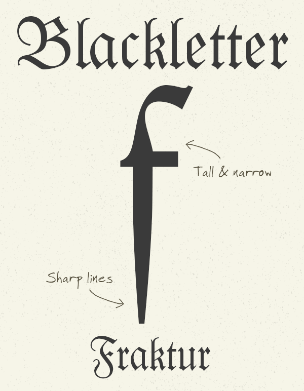
There’s a whole series of subcategories of Blackletter typefaces each with its own characteristics, but they’re all based on the original calligraphic style with tall, narrow letters and sharp angular lines. Fonts such as Gutenberg and Fraktur are popular modern interpretations of the first print typefaces.
Serif fonts
As movable type printing became the standard across Europe different typeface styles were developed, but these early typefaces were still based on early hand written scripts so they retained the characteristics of brush/pen lines and serifs on the entry and exit of each stroke.
Humanist (aka Venetian) – 1400s

In Italy the German blackletter style was soon replaced with typefaces inspired by Roman inscriptions. Still based on hand lettering, these fonts have the characteristics of angled crossbars on the letter ‘e’ and a high stress which relates to how a scribe would hold a pen. Centaur and Jenson are modern fonts in the Humanist style.
Old Style (aka Garalde) – 1500s-1700s
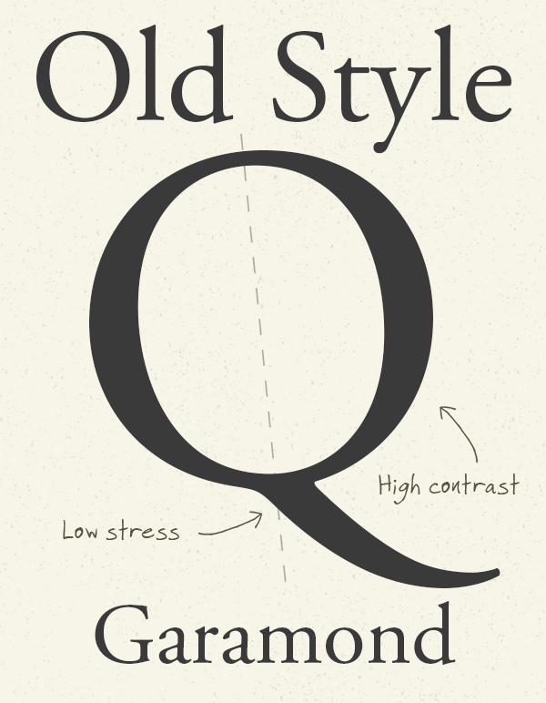
With typefaces now being carved to form printable fonts, typographers began to experiment and design their own type, rather than mimic existing scripts. Fonts such as Garamond and Goudy Old Style are from this era and are characterised with a move towards more upright letters and straighter crossbars compared to previous Humanist typefaces, as well as more variation between thick and thin strokes.
Transitional (aka Realist) – 1700s
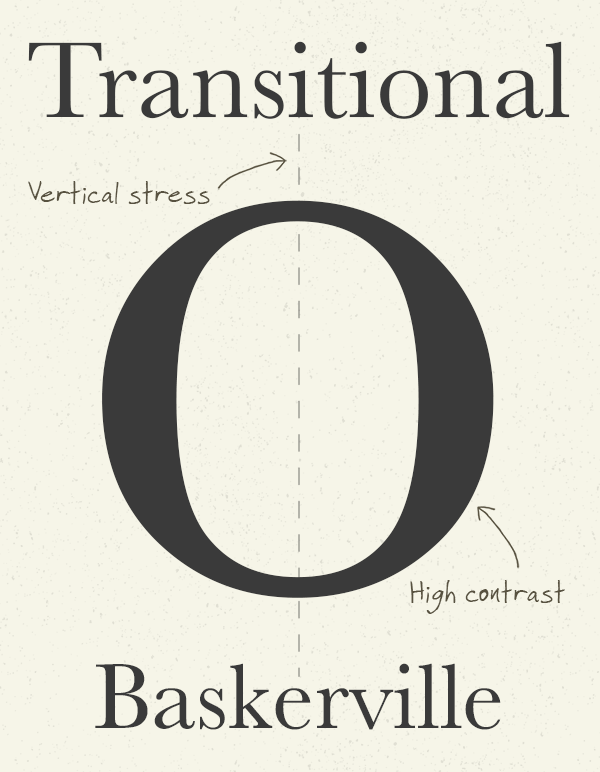
The trend of more upright letters and greater contrast in strokes continued into the Transitional era, which is the period between Old Style and Modern font designs. Transitional fonts such as Baskerville are more elegant with broad strokes becoming much thinner within the character and the stress is now perfectly vertical.
Didone (aka Modern) – 1800s
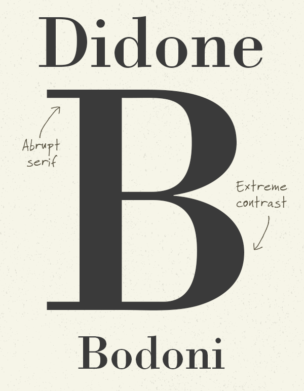
Fonts from the 18th century that took the type design trends to the max were known as Didone or Modern. These typefaces have extreme contrast with broad strokes reducing to thin hairlines, along with unbracketed serifs that abruptly change from thick to thin without a transitional curve. Didot and Bodoni are the two most recognisable Didone typefaces.
Slab (aka Egyptian) – 1900s
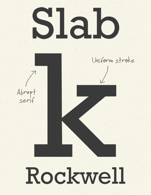
Newspaper headlines and product advertising resulted in more attention grabbing type styles in the 19th century, which lead to typefaces being made more robust to withstand the industrialised printing process. Slab serifs have thick block lines at the end of their stokes. They are sometimes curved as with Clarendon, but most often unbracketed like Rockwell.
Sans-Serif
It’s clear to see the development of serif typeface styles over hundreds of years, but the 19th-20th century saw an explosion of type design where many of the fonts we use today were made. New sans-serif designs stripped away the handwritten characteristics completely to create modern typefaces that were easier to read at longer distances.
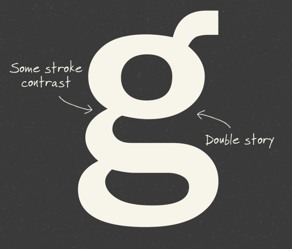
Grotesque (aka Gothic) – early 1900s
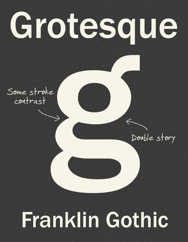
The first sans-serif typefaces were known as grotesque (as in “ugly”), due to their rejection of the elegance of historic serif styles. Some Grotesque fonts have a double-story layout for the letters ‘g’ and ‘a’, as seen in Franklin Gothic. There’s also a little flair left over from the serif era with early grotesques having a little contrast in their strokes.
Neo-Grotesque – late 1900s
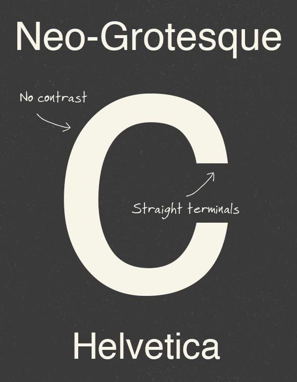
Neo-Grotesque is a sub classification of Grotesque typefaces which refers to the later designs from the 1900s. These fonts completely abandon the traditional characteristics to make them simpler and minimalistic. There’s little or no contrast in the strokes and the terminals are usually perfectly straight, giving them a more geometric appearance. Helvetica and Univers are some of the most popular Neo-Grotesque typefaces.
Humanist – 1900s
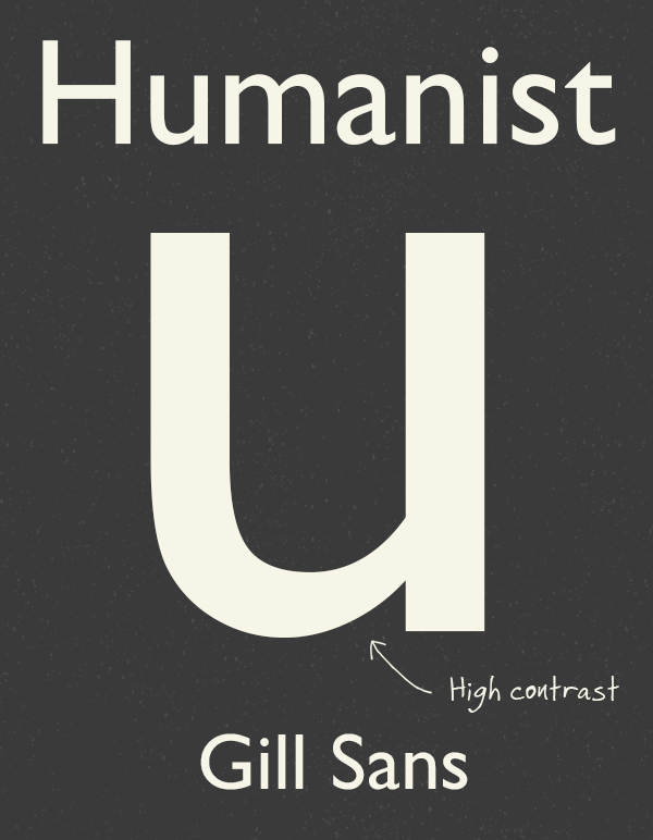
While some typographers were crafting Neo-Grotesque typefaces, others still wanted to retain some elements of “human” writing, so Humanist sans-serif typefaces also emerged in the 1900s. Similar to Humanist serifs, this style includes some stroke modulation to give the letters a friendlier appearance. Gill Sans and Optima are popular Humanist sans-serif fonts.
Geometric – 1900s
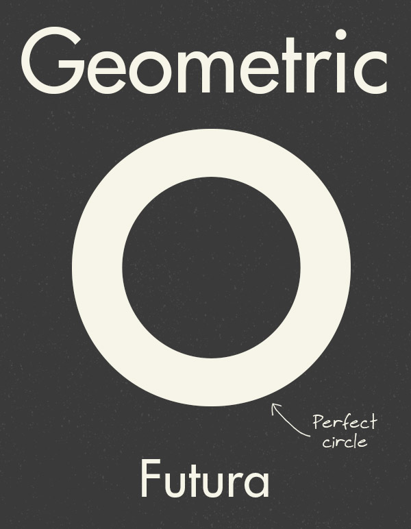
Just like the Modern serifs, Geometric typefaces are the result of taking the design trend to the edge. Geometric fonts go a step further than Neo-Grotesques with their simplicity by basing the letterforms on geometric shapes. These fonts are ultra modern, but their structure makes them awkward to read, especially in lowercase. Futura and Avant Garde are great examples of this style.

It’s so great for you to bring us through this journey of typography history. It’s a really complicated subject to research. While blackletter, serif and san serif are well documented, I wonder if this will be the same case as other styles like script? Seeing different types of script fonts are so popular these days, I’m really interested in them too.
Loved this article! Always enjoy refreshing my knowledge of typographical history. Thanks for putting this together!
Thanks so much for this article! Very interesting and beautifully displayed as always :)
Brilliant overview! Love your blog :) keeps me busy whilst on a break from uni and lets me expand my skills, thank you!
Great article! Very interesting read… thanks!!!
Excellent overview, thank you!
Great synthesis about more than a century of typography history, but it would be useful to know the resources used.
Great post – just a heads up, though – the “o” in Futura is not a perfect circle. Here’s a link to Tobias Frere-Jones’ site where he breaks down type mechanics: http://www.frerejones.com/blog/typeface-mechanics-002/
Thanks Chris !
Indeed Informative …
This is really a helpful note for beginners. I appreciate your effort. Everybody can get a idea about Typography.
Excellent post, learn many useful things
It’s an interesting article easy to read and understand. Thank you very much !
Thanks for putting effort to create such an informative and out of the box article.
This is really great. Thanks for putting it together.
I made the mistake when I started designing logos of not thinking understanding the intricate details of typeography was not that important. That was a big mistake! I’ve seen all my graphic design work improve since studying type, and think it’s really sharpened my ‘design eye’.
A great book I have that’s proven me wrong that I recommend is one called Fonts & Logos by Doyald Young. It’s almost like an entire lives learning, cosolidated into one book.
I wouldn’t use Gill Sans. Google for Eric Gill + pedophile. Or just check wikipedia for Eric Gill.
It’s like wearing Hitlers pullover.
Great article! When I first got into design I remember being fascinated by the history and the effect each font has. I only do design as a hobby though but have been lucky to work with great people who do great design. I will be recommending this article to Hot Rock Printing, the company I’ve been using for my businesses posters and business cards. If anyone needs any design work or inspiration then I recommend giving them a look too: https://hotrockprint.co.uk
Hi Chris!
Great information on type classification, I also made some posters for that matter on my masters degree project. Please check it out and give me a feedback if you like. I really enjoy your blog! Thank you.
https://www.behance.net/gallery/27596577/Type-Classifications-Poster-Series
its very authentic post and very informative it will help us.
playing text in designing isn’t easy. this is great fundamental knowledge for ppl who want to applying text in to their design project. thx criss..