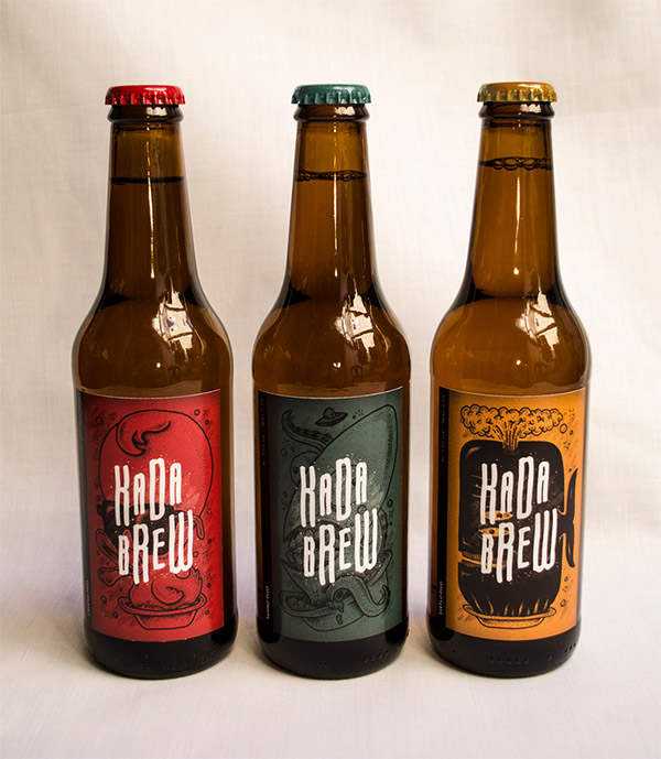
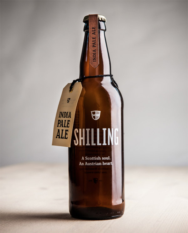
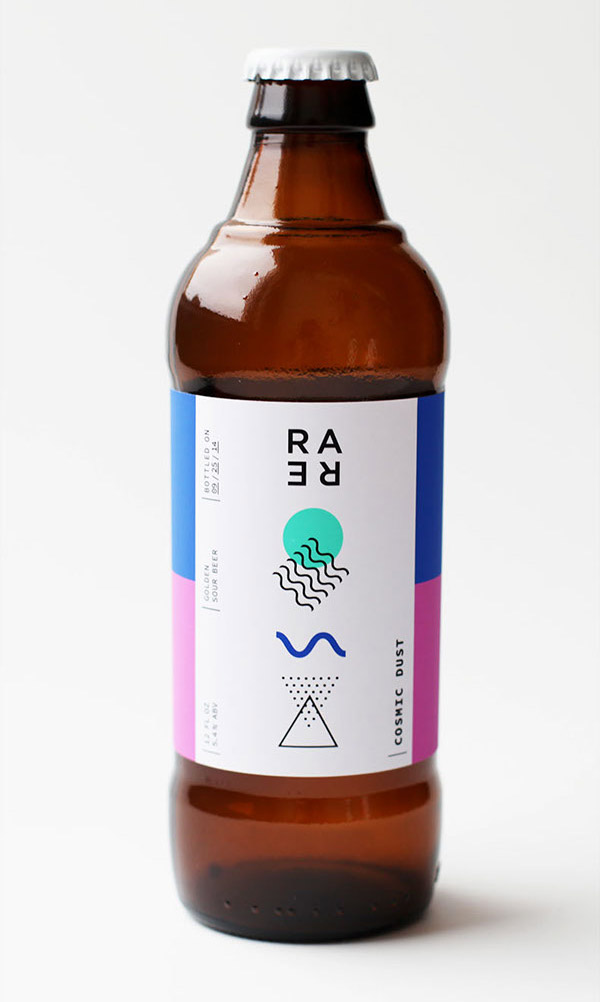
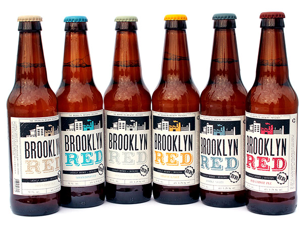
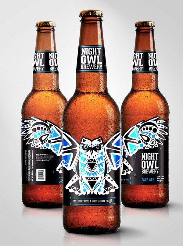
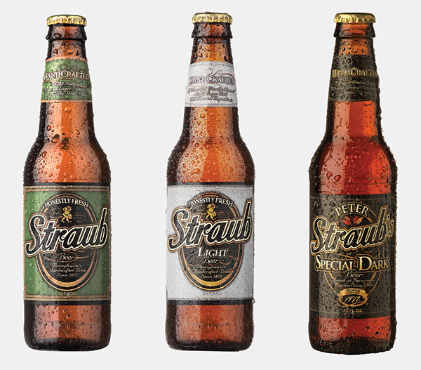
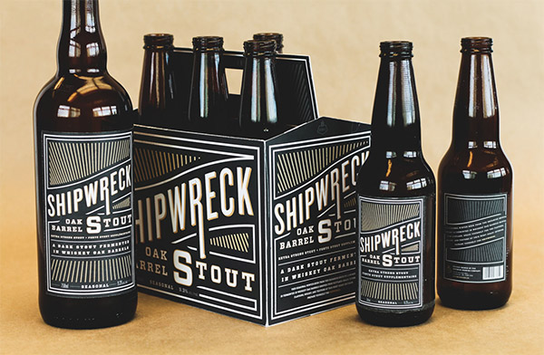
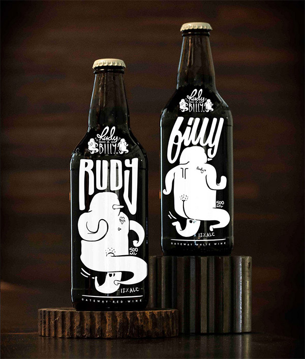
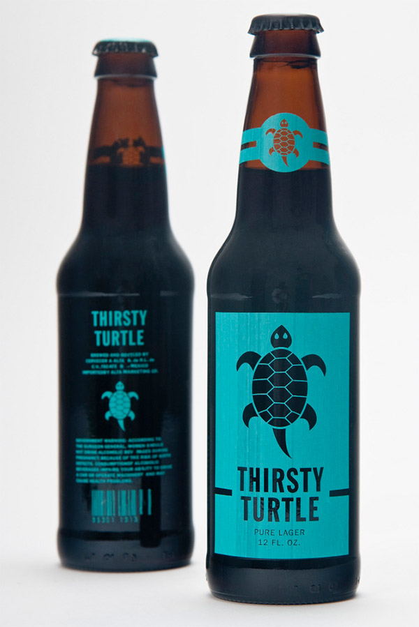
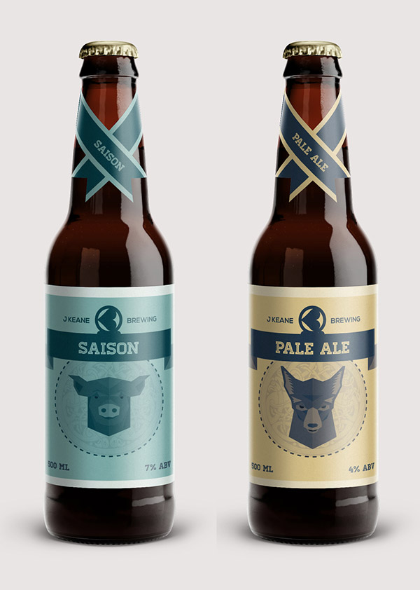
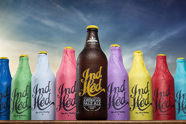
Thanks to the increase in popularity of microbreweries the packaging for craft beers has become a new canvas for designers and illustrators to work their magic. Independent brewers rely on the branding of their product to stand out, which results in some really creative designs for us to enjoy. In today’s post I showcase 30 brilliant beer bottle labels and packaging designs that are full of character, with the kinds of cool lettering and illustrations you just don’t see on the mainstream brands.

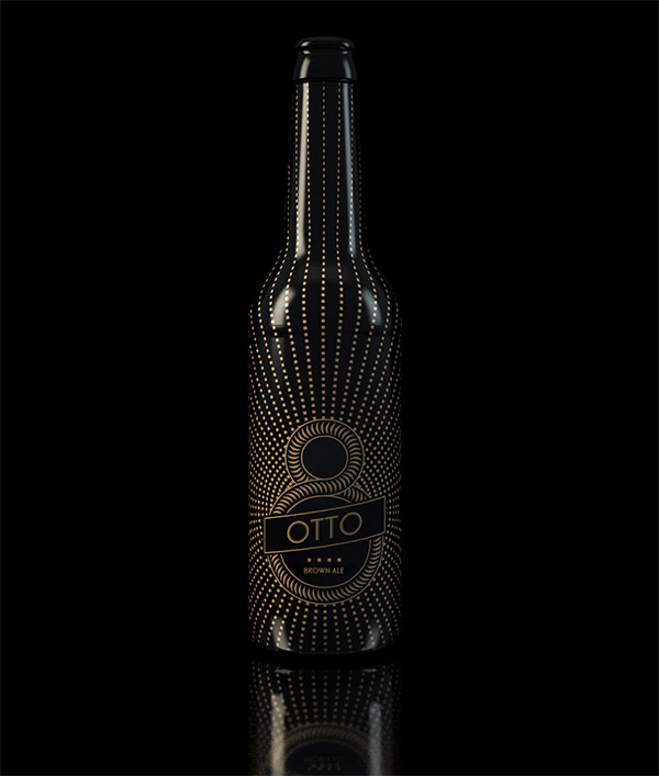
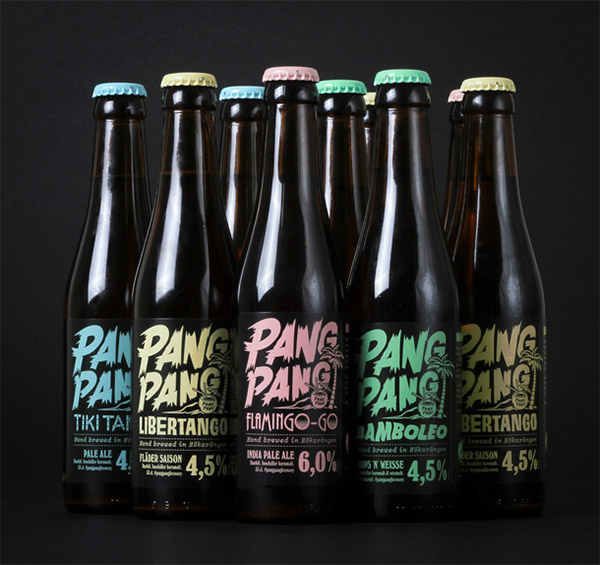
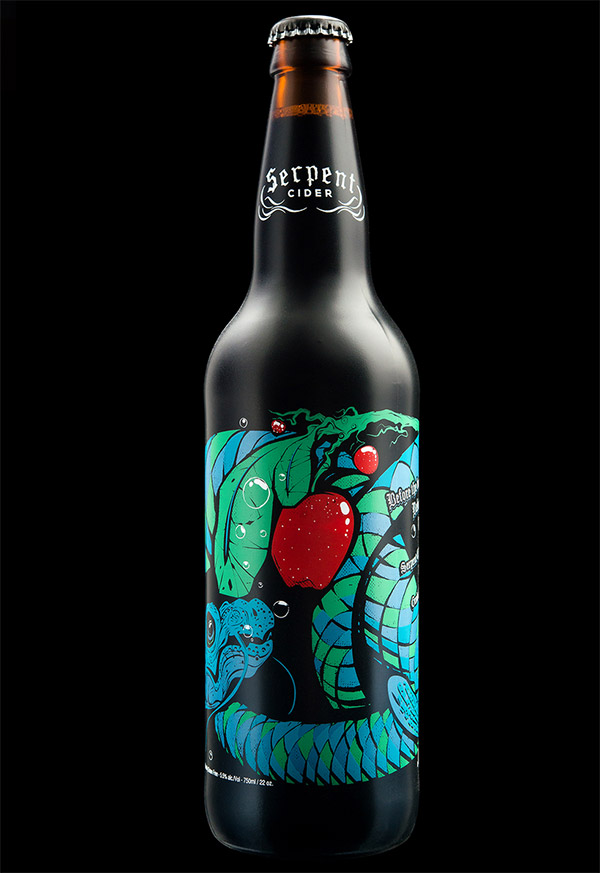
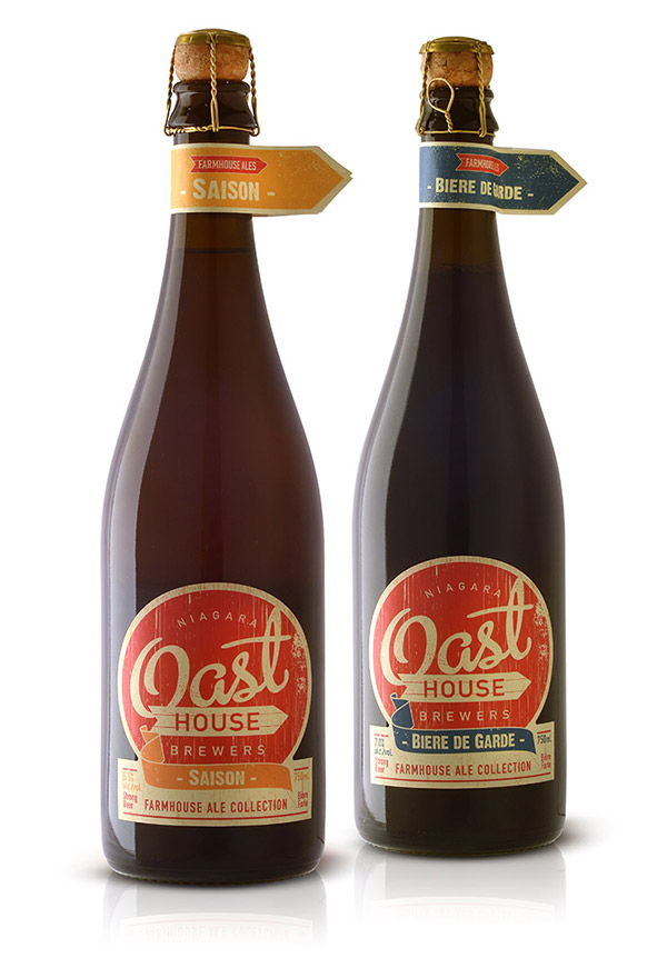

I just Loved the otto beer. So creative and powerful design. all are nice and awesomely designed.
Otto is a really unique design, thanks Saqib.
Thanks for this mouth-wwatering collection Chris.
It often intrigues me when the design for a product is so far removed from expectations that it just doesn’t speak the product.
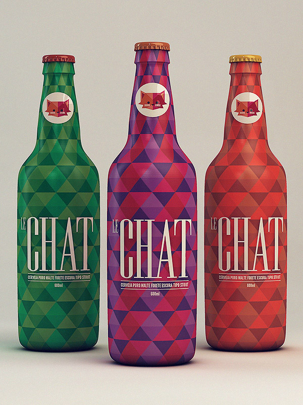
I’m thinking of Le Chat. Apart from the bottle shape it has none of the usual signifiers to anchor it as a beer.
Does this make it clever, unique, special? Or does it present a barrier?
For me the jury is out: it looks great but does it work?
James
That’s an interesting thought James! With how eye catching the Le Chat design is, It would definitely intrigue me to pick it up to have a look.
http://www.bendsource.com/imager/b/original/2298801/325e/BC_Bottles.jpg
Take a look, one of my favorite bottle in my collection, even if it doesn’t look like beer!
Thanks Chris!
Great collection here!
Love this!
Michael
Thanks Michael.
These are great! Lakewood Brewing Co. and Rahr & Sons Brewing Company of the Dallas/Ft. Worth area collaborated and produced one of my favorite bottle designs of 2014.
The bottle: http://beerblog.dallasnews.com/files/2014/08/dfw-collab.png
That really is a fantastic design! It’s awesome when you can put the bottles together to make one cohesive design. Thanks Aaron!
It’s a very interesting collection. You should check “Sovina” bottles, it’s an arthesanal beer from Ponte de Lima, Portugal. They have a really interesting design.
The Sovina bottle design is quite simple, it’s nice! Thanks for sharing, Diana.
Wow… these are all super cool & unique. Makes me thirsty.
It was definitely thirsty work making this post too! :D
This bottle is way more epic than most on your list: http://www.acesbrew.com
Dyllan, I disagree. It’s a nice bottle. Good, clean design, but “way more epic”? I simply just… disagree.
thanks for sharing
No problem Stacy, thanks!
Chris, thank you for these. Lots of great inspiration here. These guys obviously worked hard on these and it shows. I can’t pick a favorite but I will say when I saw the Otto bottle it really struck me. Some of the other designs are much more complex and “cool” so to speak, but something about Otto just makes you go “wow”. Even though, I still don’t think I can say I have a favorite. I’m not sure how my brain reconciles those two thoughts…
Thanks Jeffery. The Otto design is so unique, It’s not a surprise that it stood out to you. :)
creative packaging designs, thanks for sharing
Thanks for sharing your designs they are all pleasant to the eye but Otto and Shipwreck stand out according to me!
Wow! those packaging designs are so awesome, thanks for sharing :)
I work part time in a craft beer pub and concur, craft beer is a revolutionary shift in favour of design. And tastes superb.
Nice round up, Chris. Inspiring!
Great examples of beer packaging design. Keep up the great blog!
World Packaging Design Society
http://www.worldpackagingdesign.com
Nice packaging designs!
Our czech beer Velkopopovický Kozel (Goat) is celebrating 140 year anniversary by using its original labels. Take a look. My favorite is the middle one.
http://www.prazdroj.cz/data/web/novinky-a-tiskove-zpravy/foto-retropack-lahve-1.jpg
Lovely collection of designs, Chris. Thanks for putting these together.
Is anyone else suddenly feeling thirsty?
Yep. Made me thirsty.
Thanks for the love — thrilled to make the list, in such great company. — Cheers!
Creative work such a amazing (y)
Creative collection of design. It is very informative for me. Thanks
Very interesting Designs.
Thanks for providing these unique design…
if your looking for a web designer feel free to message me at http://www.malikcole.weebly.com
These illustrations were very cool!
All those beer bottle graphics are eye catching and interesting. Brilliant as usual.
Both packaging designs are cool