
Eric Gill, Adrian Frutiger and Max Miedinger are names we associate with the classic typefaces designers use on a daily basis. Their font creations are timeless designs that look right at home no matter what century we’re in. This collection of 25 classic fonts is a round up of the best and most popular fonts every designer should own. You can be sure that they will last your whole design career.
Helvetica
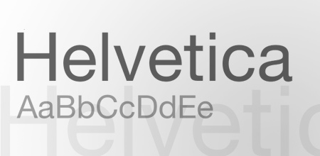
Who hasn’t heard of Helvetica? It’s probably the most recognised classic typeface. Originally designed 1957 by Swiss designer Max Miedinger and Eduard Hoffmann
Bodoni
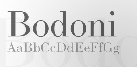
Bodoni is a serif typeface designed by Giambattista Bodoni in 1798. Iconically used for the Goodfellas gangster movie poster.
Clarendon
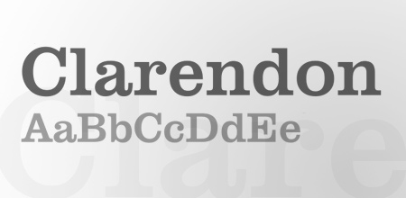
Clarendon is a fantastically fat slab serif, created by Robert Besley in 1845.
Akzidenz Grotesk
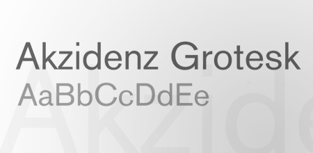
Akzidenz Grotesk was designed in 1896 by the H. Berthold AG type foundry and was used as inspiration in 1957 for the Helvetica typeface.
Avenir
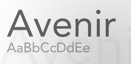
Avenir is a geometric sans-serif typeface designed by Adrian Frutiger (recall the name? He’s also famous for another classic font, I’ll let you guess which one).
FF DIN

FF Din is a relatively new typeface compared to the veterans mentioned so far with it being created in 1995 by Albert-Jan Pool. One of my personal all time favs.
Futura

Futura is another widely used font that can be seen in countless logos. It was originally created in the 1920’s by Paul Renner.
News Gothic

News Gothic was designed by Morris Fuller Benton in 1908, and has the most amazing fact of being the typeface used during the Star Wars opening credits.
Frutiger
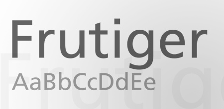
Remember Adrian Frutiger? Needless to say he was also the designer behind the classic Frutiger typeface.
Meta
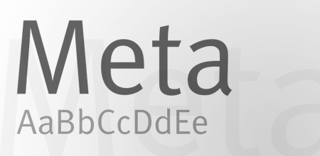
FF Meta is another member of the modern classic collection, designed by Erik Spiekermann in 1986. Meta is another of my personal favourites.
Gill Sans
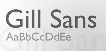
Designed by Eric Gill in 1926, Gill Sans is another widely used font in graphic design. Famous uses include the London Underground signage.
Garamond
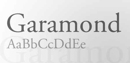
Probably one of the most famous names for serif fonts, Garamond can be found in a number of variations. Overall it’s commonly used for body text in books.
Mrs Eaves
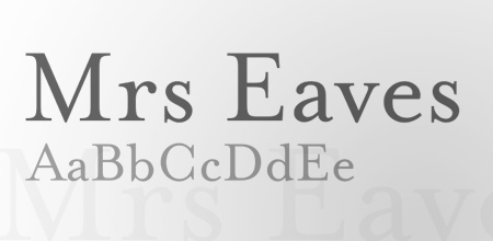
Mrs Eaves is a recent design of a traditional serif typeface style by Zuzana Licko in 1996.
Dax
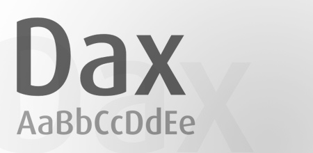
Dax, now famously used for the branding of UPS, was originally created by Hans Reichel.
Myriad
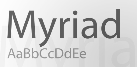
Yes, that one that appears as default in your Adobe apps. Myriad was designed specifically for Adobe by Rober Slimback and Carol Twombly.
VAG Rounded
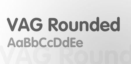
VAG Rounded, aka VAG Rundschrift makes an appearance in countless web2.0 logos, but was originally designed in 1979 as a corporate identity for Volkswagen.
Optima
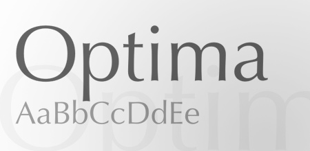
Optima is a German typeface designed by Hermann Zapf. It’s a sans-serif font on a low calorie diet with it’s thinning lines around the letterforms.
Avant Garde
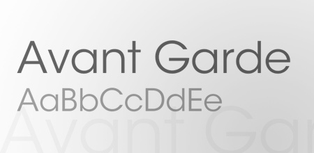
Originally created for the Avant Garde Magazine, the Avant Garde font is now seen in plenty of printed headlines.
Univers

Univers is another classic by Adrian Frutiger. It has typical swiss styling and is often confused with Helvetica, or Akzidenz Grotesk.
Rockwell
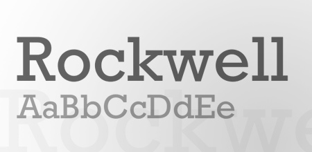
Rockwell is probably the most iconic slab-serif font. Designed by Monotype in 1934 it’s now used in all kinds of designs for an eye grabbing impact.
Minion
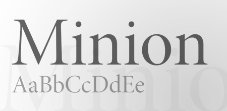
Minion is a popular serif font designed by Robert Slimback in 1990 for Adobe. Cleverly named after the traditional naming system for type sizes.
Sabon
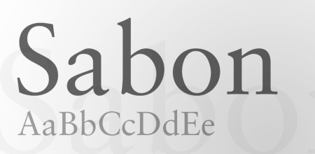
Sabon is another old style serif, this one however was designed by Jan Tschichold in Germany and released by Linotype, Monotype and Stempel in 1967.
Cocon
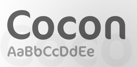
Cocon is the most recent of this collection, designed in 1998 by Evert Bloemsma, Cocon features some cool letterforms with sleek points.
Rotis
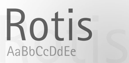
Rotis was built with exceptionally high legibility in mind. Designed by Otl Aicher in 1988.
Bembo
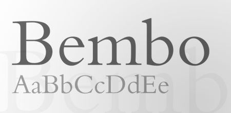
Bembo is one of the most popular typefaces used in books, first printed in 1496 and brought to life for the modern age in 1929.
Have I missed out your favourite?
Add your comment and let us all know your top fonts of all time.

Great post. Awesome choices of fonts
Great list. Rockwell rockz.
Awesome list! Cocon is gorgeous!
Pedantic, I know, but the London Underground font is actually New Johnston, the original of which Eric Gill used as the basis for Gill Sans.
Very true.
Nice bit of trivia there
I think Cocon is wretchedly trendy, and you should have ended with “insert your favorite current font here.”
Helvetica for King!
Cool List!
Nice list Chris – some on there I’ve not used in a while…
Thanks for this list, I gotta invest in some fonts for my new shiny iMac that I got last week! ;D
Din looks pretty solid and cocon looks rather interesting, nice round up, they all look pretty usable.
classic but still eye catching. thanks for share these listed fonts.
I love Din! We use Cocon in a few of our designs as well.
We just posted ‘The Webs Best Designers And Their Favourite Fonts’ blog post which features you Chris! – http://www.unionroom.com/blog/the-webs-best-designers-and-their-favourite-fonts/
Nie collection. Very useful. Thanks
Great list Chris, keep roching………I use Caslon a lot whenever i need a Serif, an addition from my part
Why do you call Minion sans-serif?
Typo / Fingers on autopilot – Post edited
Great post, and a great list. Keep on going!
Nice collection. Thanks
about myriad – it’s opentype version, myriad pro, is the font apple uses in their advertising. i call it the iPod font. useless trivia ftw.
I’m sorry, but someones gotta say it… Comic Sans! ;-)
Please! When you come up with facts in an article, do yourself a favor and have your facts straight. That way, you won’t look like an assface only interested in baiting other assfaces and making money on it. “Ooh, facts!”
Oh, btw: Do a little research on the DIN typeface ;)
Very nice list! Thnx!
If i had to drop down to one font – I would take Rockwell! :) Thankfully I don’t – beautiful variety!
“The only place Avant Garde looks good is in the words Avant Garde.”
— Ed Benguiat
I would have to add Scala and Scala Sans to the list. They aren’t used as much in general design, but they are everywhere in typographic layout.s
wow, really these fonts are sooooo beautiful
What?!? No Garamond? Not ITC’s, Adobe’s, or Monotype’s? /me faints :p
Wooooooooooooo Wooooooooooooooo. This is the Type Police! Put down the mouse! Step away from the Mac! DO NOT attempt to USE the typface ROTIS (especially semi-serif).
It’s a pet hate. Loving the other choices.
Very nice topic!
This is very helpful!
And nice information about of Autor and year creation of Font.
Garamond is my favorite.
May be put a Times New Roman?
Nice post. Enjoyed the bits of trivia. Thanks for the introduction to Din.
I am reassured by the fact that I have ALL of these fonts installed permanently. I think you could mention that Helvetica has been superceded by Helvetica Neue though
=)
Great post man!
Zapfino should be included in my opinion. I personally detest it as a font, but it is so heavily used by non-designers and I think it really stands the test of time in the public eye. Just playing devils advocate.
Great list!
Nice one! Have most of those fonts, they look really great! Got to get the cocon one, looks very sweet!
I personally use Caslon (Adobe Caslon Pro actually) a lot in place of Garamond. It has a bit of a better feel in my opinion. Great list though! Time to go typeface shopping!
This is probably the best article I’ve ever read on this site. Time to go through and make sure I actually have all of these!
Nice post. I have almost all of these, minus Cocon, which is debatable. Nice call with Mrs. Eaves!
Wait, did you sneak in Garamond or was I just blind while reading it? :(
In any case, good list.
Lovely list – thank you for posting…
Err.. Did’nt you forget Lucida Grande? I think it’s evolved as one of the most popularly used fonts on the web of late. It is one of the sleekest typefaces to have originated..
Excellent list. Trade Gothic belongs here too.
Pretty sweet list, I shuddered when I saw Rotis though, it just does nasty things to my insides.
I like the Helvetica and Myrias. I think you may want to add Papyrus too thouhg scence it’s used everywhere. I would think it would be considred in the classic class as well.
I think the Clarendon fonts is good to. I didn’t see to every remember seeing that one before. Overall, good picks.
Clarendon is definitely making a big comeback, it looks especially effective in white on bright block colour.
I probably would’ve ditched Rotis and added Agenda. But that’s personal taste.
Pretty bland list, with some odd choices (Avant Garde, Rotis, Cocon and Dax (which are fine but not very versatile)–hard to believe they should be in any designer’s top 25. But did you really have nothing worthwhile to say about these faces? I shudder to imagine (non-French) designers setting books in Bodoni or AG or, well, anything in Avant Garde.
Great post! I’m a sucker for Dax and Helvetica. Thanks for sharing.
Classic and clean. wait is this a personality test?
No Palantino??
They are gorgeous… hard to pay for freelancer though.
Hey,
Thanks. A lot of very good font ideas for my tech classroom. Regards
I don’t assume these are free? Maybe some, maybe no one?
How much do you have to pay to get all of these?
I’m thrilled to see Mrs. Eaves in there. I recently named it my favorite font ( http://ff.im/5G2Xk ) and I’m glad to see I’m not alone.
I’m always impressed when I see classic fonts that look modern. Superb list.
I also love requiem and copperplate!
Goudy Old Style —> A font that speaks of elegance
Excellent list of fonts! Thx for sharing!
Nice list. All of the best (in my opinion) are on here. Goudy Old Style is excellent too.
Hello Lauren, Need a partner!
Ads2gony.com
lets talk. Daniel
No Georgia Font? Hmmm… Great post by the way.
Dax font is very nice.
Great list… Three additional suggestions to fill out the serif side:
Caslon, Didot, and Baskerville.
thank Tom.
I am agree with you.
I can’t believe you include cocon. Dax was a bit of a stretch, in my opinion, but cocon was too far. Don’t get me wrong, both seem well made and I could imagine using them given the right situation but cocon especially just lacks the general usefulness of the others. Otherwise, nice list. Probably my most used fonts would come from this list.
Great Collection. Thank you :) Univers is beautyfull.
Where’s Comic Sans? only joking. News Gothic is my personal favourite.
Thanks for the list. I use many of these fonts already, and I’m hoping to use the rest of them at some point. The only font I might add is Georgia.
You cannot say Adrian Frutiger was the designer behind Frutiger. He still is! Last year he turned 80, but he is still well and creative.
Great list ! Anyway, even if not the most beautiful, don’t you think that Courier should take place here ?
Thanks for a well written article. I enjoyed reading the history of the different fonts.
Very nice! Good to see my faves on here – Helvetica, Univers, Rockwell and Garamond.
Garamond is still one of my favourites. Optima is a very nice font as well.
Thanks!
Great list and love your site design!
thx
Why isn’t papyrus in this list?!
(I’m kidding)
Bella lista, manca UNIVERS
How can you have a list of classics without TRAJAN? Thanks for starting the discussion!
Good list. However, Gill Sans, great font though it is, is not the London Underground font. That’s P22 London Underground, designed by Edward Johnston and Richard Kegler in 1916. More info here: http://www.identifont.com/show?1YL
lol i was gonna mention comic sans too :)
FF DIN is actually based on DIN 1451, which was designed in the early 20th century. Albert-Jan Pool did an incredible job expanding and updating the typeface, but to say it was created in 1995 is a little misleading. Just wanted to add that, otherwise a solid list. I actually had a professor at University that used Helvetica and Univers exclusively.
I used to love Gill Sans, but I don’t think it’s a very attractive face anymore. Several characters (Capital R, lowercase a, italicized lowecase p) I really don’t like. And what’s with the superscript dot in Gill Sans Ultra Bold? I guess it has it’s uses, just not a typeface I gravitate towards.
I love all the fonts, they are definitely the best basic fonts to use, remember the days everyone used Times Roman as a default aaaaaaaaaaaahhhhh! that was scary
Nice list, Meta is definitely high on my personal list
Gill is Gill, and then there’s P22s London Underground.
Great, compact list of many all-time favorites. I’d like to add that the DIN font is used for the Autobahn signs in Germany. That said I think another classic that is becoming more and more popular could be Interstate, inspired by the US highway signage. I think it’s more of a classic than Cocon, which I’ve never heard of before. I think it would make a nice logotype sometime, though. So, thank you for pointing it out.
I would also include Formata in the classics.
good list, but Garamond should be included. Franklin Gothic, too.
A lot of classic typefaces by a lot of classic designers! Some of my favourites included…which I’m very pleased about…including Gill Sans.
Also a very good way to remind even the typographers of us, what great fonts there are out there that have been around along time – that have stood the test of time and proved that they are the best.
Perhaps the only other I’d include is Century Gothic – me and that typeface have history!
This is an amazing list, thanks for sharing.
You missed 5 :)
30 Essential Typefaces for A Lifetime (Paperback)
by Joshua Berger
Every time I find myself hating a design I’ve put together for a business card, logo, brochure, etc, I always change the font first and it seems to change the dynamic of the entire project.
It usually preserves my sanity as well!
I’ve used this link in my own blog, http://rockstarcarlene.com, because I think it’s a strong article that deserves attention.
You have a fantastic blog for designers! I appreciate your taking the time to put this together for us.
Thanks, Chris!
Futura?
excelente post
congratulations
very nice post man congratulations but i think the best font is Dim right?
but i think also that you should add more funny fonts especially comical fonts
Some great choices.
*If* I could make one change, I would swap out Mrs Eaves for Caslon.
:)
UPS actually uses a font they call “UPS Sans”, though it is certainly a rip off of Dax.
where is comic sans?))
Great list! If I could add one font to the list, it would be Georgia.
Thanks for sharing. Cheers!
Great collection fo timeless fonts, thanks for sharing them.
Great collection Chris! Loved the choices you made here.
Great Post Chris…
That made me search back for fonts I did have that I wasnt using. DIN is is one of those lost fonts that is now part of my FAV folder now…
You can never go wrong with classics…
I would replace
* Mrs Eaves with Kepler (Robert Slimbach) for the incredible breadth of the font.
* Do we really need Avant Garde, Avenir, AND Futura?
* VAG Rundschrift with Helvetica Rounded for versatility.
* Cocon with … c’mon, Cocon? How about Porcelain or PrintError :) ?
* I’d replace Myriad with something with a bit more style, like Syntax (Hans Eduard Meier 1968); besides no one wants to see something designed with Adobe’s default application font.
* And I would have to include a script face such as Snell Roundhand (Mathew Carter, 1964).
* Finally, I can’t live without Carta, Bundesbahn Pi, and Zapf Dingbats.
Very nice article, Garamond is still my favourite web safe font. I would prefer to see a comparison of these fonts though with true web save fonts. Typography has really come into its own in recent years but to get a great design out of just websafe fonts aswell is the key I think. Especially since the SEO wave is still gong strong and not dried up yet.
i think Gotham HTF could be in the list. :)
sorry, i’m here again… i forgot to say that DIN is awful, in my opinion. :)
Great post! One of the fonts that I am particularly fond of is the entire Oregon family, which comes in a number of different weights and styles.
I like Segoe Script
Timless classics…Avenir, Futura, Myriad, Avant Garde…love those fonts.
What about Trade Gothic and Lubalin?
I prefer ITC Lubalin Graph to Rockwell.
What about Gotham? That typeface is built for the long run. If you’re including DIN (which is one of the best IMO), Gotham has to make the list.
I don’t know if Cocon is “classic”. It’s nice, but I am not sure where it stands on that list.
@wlodi good call on trade gothic, trade gothic and bembo are both fonts that i use a lot!
Fabulous Collection….
Really they are Classic…..
FF DIN may be drawn quite recently, but it is closely based on DIN 1451, a German standard typeface since 1936.
yeah i was about to point this out. din is a very old typeface, and is the official typeface of the german road system (its their version of the interstate typeface, and has been such for quite some time).
you should probably correct that one…
Hello, slight( well pretty big) typo, the London Underground font is actually Johnston Underground Font ( designed b Edward Johnston) the current version was modified in the 70’s and is now called New Johnston). Gill sans is based/inspired by this.
Gill Sans was designed for London and North Eastern Railway.
cheers
martin
I heartily disagree with this list. There’s only 3 fonts here that will “last a whole design career”. Futura, Gill Sans and Garamond. I never use Helvetica unless someone tells me to anymore, because while it is very poplar and well designed, and despite being sans serif – it feels old; especially compared to the elegance of Futura. The last 12 fonts in this list are a waste of time. Most of those are terrible for anything but headlines, and Rockwell always needs to be hand-kerned no matter what software I’m using. I used to think Myriad was an “OK” font, but nothing I would use over-abundantly, however, Adobe has changed that and I now despise it because they made it the default font in their apps.
Ha, Tim uses Garamond to this day??? Hello! The 90s ended almost 20 years ago. DAY-TED.
Ziggy, learn your math. But you are straight on right with your comment.
Amazing stuff, slightly shocked not to see “Trajan Pro”. I would of also added “Advent”
@Ziggy: Ummm, yeah you might want to learn your math better.
Also, most of these fonts are dated, hence my above comment on this entire list.
I can’t agree with Avant Garde’s status as a classic font. Futura is far superior. Adobe’s foolish inclusion of Avant Garde in the 35 original “standard” fonts installed on PostScript systems is the only reason for its success.
meta serif !!!!!
Good list. What about those fonts designed for specific reasons – these are prmarily print fonts. Georgia is a wonderful font – amazingly designed for web by mattes carter then “given” to the world via mircosoft. A great piece of work by matt carter ( the man behind verdana a font similar to centuary bell but obviously web based). Lets not forget the different mediums we are privileged to design for. I do like print but honour the other mediums. Good work – good first effort.
this has great archival value for me. most fonts are good looking and can be used for a lot of things. thanks for sharing!
so usefull information
thank you!
@ tim. I think everyone who reads your comments has now formed an opinion of you as a designer. If you are not a designer then that makes perfect sense because to call fonts such as Avant Garde, VAG, Univers and Rockweel a ‘waste of time’ reveals how little you know about typography and design in general.
Your comment that Helvetica feels ‘old’ merely hightlights your design ability, not this timeless, and peerless, typeface.
Maybe you should branch out a little more, look around at what other designers are doing before limiting yourself to 3 typefaces.
A good selection, but in my opinion Avant Garde is (just about) ok for headlines but an absolute nightmare for body text.
But clients seem to love it….
….personally, I reckon it all goes back to the good old days of the Letraset catalogue. Show the book to a client who’s complaining about the designer’s choice of typeface (as they do, along with the size of their logo always being to small) and Avant Guarde was the one they would always, absolutely select 100% of the time. Probably because they couldn’t be bothered to read past the options starting with “A”…
It hasn’t been unknown for me to substitute Futura in its place when I got back to my studio – and the clients never noticed! ;-)
Almost a perfect list! Well done. Having used type in all it’s configurations over the past 40 years – from hot metal, to cold type to digital – the only omission that immediately comes to mind is Hermann Zapf’s Palatino. Since I am obviously older than dirt, I would probably swap one of the newer fonts in your list with this old time favorite.
perfect lis, thanks i found somthing to use.
I really like the Dax font.
Century Gothic, its beautiful when used well!