This post was originally published in 2008
The tips and techniques explained may be outdated.
The shiny and glossy image of 'Web 2.0' is right at home when it comes to icons. Follow this Adobe Illustrator tutorial to create a scalable vector Instant Messaging style icon with the impression of a glossy and semi-translucent surface.

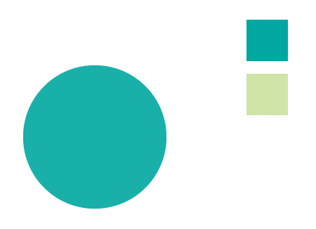
Open up Illustrator and draw a circle on the artboard (Hold Shift to constrain).
Also, pick out two colours of your choice and either add them to the Swatches palette or draw a couple of boxes to one side.
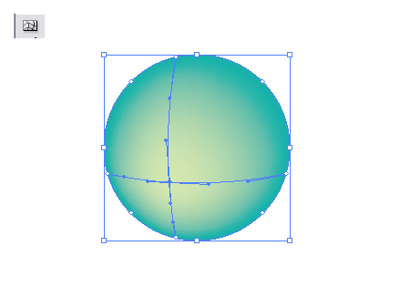
With the circle still selected choose the Gradient Mesh tool and click once slightly off center within the circle. Select the lighter shade of the two colours recently picked through the saved swatch or colour picker.
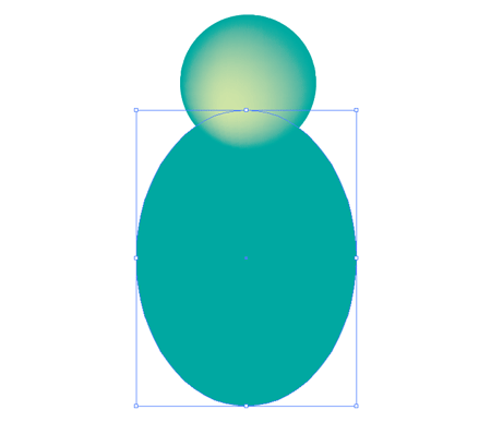
Back with the circle tool draw a larger oval as the body of the icon.
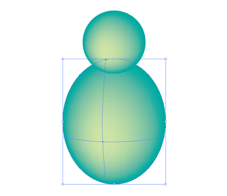
Repeat the process of adding a lighter shade with the Gradient Mesh tool.
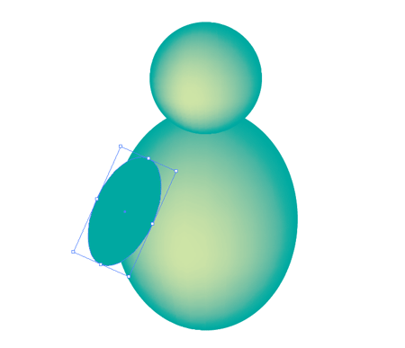
Draw yet another oval to represent an arm, rotate and position the shape to one side of the body.
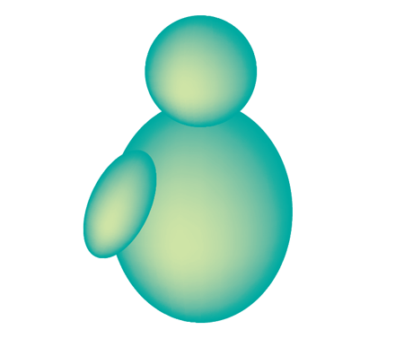
Add another selection with the Gradient Mesh tool.
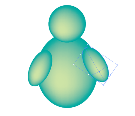
Copy and Paste the arm, rotate and position the new arm to the opposite side of the body.

Press CTRL+SHIFT+[ to send the new arm to the back of the objects.
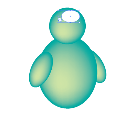
Draw two small white ovals as reflective highlights on the head of the icon.

Set these two highlights to 20% Opacity to give a subtle effect.
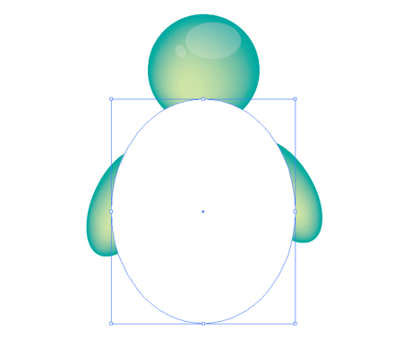
Accurately draw another circle over the body of the icon. Why not just copy and paste the body shape? The reason is the Gradient Mesh points cause problems with the Pathfinder at a later stage. An alternative solution would be to manually delete out the mesh points with the Direct Selection Tool.
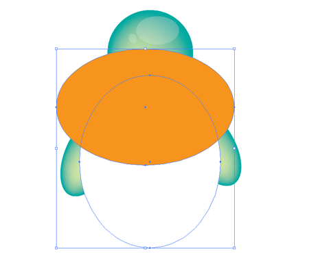
Draw another circle as a temporary tool for use with the pathfinder, pay attention to generating a smooth curve across the body of the icon.
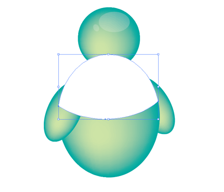
With both objects selection choose the Intersect Shape Area option from the Pathfinder and Expand.
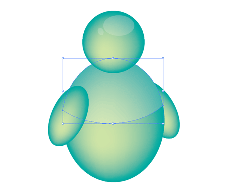
Press CTRL+[ to send the object back until it lays underneath the arm and head but still about the body shapes.
Set the highlight to 20% Opacity.
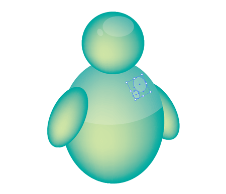
Draw two more subtle reflections on the body with the same 20% white fill.
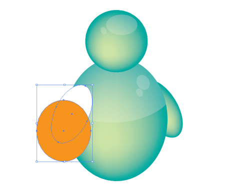
Repeat the process of drawing an identical shape, this time over the arm of the icon.
Draw another temporary shape, again following the contour of the underlying shape.
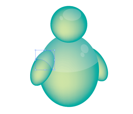
With both arm objects selected use the Subtract From Shape Area option from the Pathfinder and Expand.
Set the new highlight to 20% Opacity.

Select the head, arms and body objects and change the Opacity to 95% to give a slight translucent appearance.
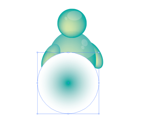
Draw a final circle filled with a gradient from the colour of your choice through to white.
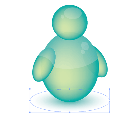
Squash down this shape using the handle of the bounding box and position at the bottom of the stack using the CTRL+SHIFT+[ command. Set this object to Multiply for use on different coloured backgrounds.

An Instant Messaging icon just doesn't look right on it's own, duplicate the icon at least once to represent the social aspect of IM. Change the colours of the new icon through the Filter > Colors > Adjust Colors option or manually select the mesh points with the Direct Selection Tool and add a new colour swatch.


Man those guys are fat what have they been eating! Great tutorial!
NICE!! just the tutorial i was looking for!! THANKS
REALLY NICE LOVE IT!!
By the way does anyone know another tutorial similar to this with other icons e.i Apple (mac) or Internet Explorer or Quicktime??? or just any
THANK EVERY1’s
i love your turtorial!
Interesting tutorial. I will feature this tutorial to my blog at the end of this month ;)
Keep up the good work man!
Good job on the translucency! Looks like you could touch them and they would jiggle like Jello.
Woa, I love this site ! don’t ever change ;-)
Uaaaau, I’ve learn something new today :)
Thx!!!
I loevs reading tutorials, and this one is very easy to follow. Good work
Hey!! this messenger just rocks..i just tried it and I tell you it looks way too clean and awesome..thanx for the tips on how to make your objects look more clean..!!!
thanx once again.
Great tutorials, thank you for sharing
Good Stuff, Thanks for sharing, Great Tutorial.
Keep it up!
Nice and easy tutorial.
Cool! Just what I was Lookin for.
Thanks for charing! Great site.
Its a great site. Nice that u have shared some good work
I love it! I tried it already and the result is beautiful!
From 1 to 10 I give it 20!
Nice technique to achieve the excellent effect….!!! Thanks for sharing…
nice tutorial, i learned many things from this tutorial
awesome tutorials…real easy to ctach up…thanks a lot….its of great use….
In CS3 the Filter/Colors/Adjust Colors has moved under Edit/Edit Colors/Recolor Artwork.
Awesome work!
very helpful tutorial,easy to learn.
Great tutorial thanks
Great tutorials, thanks for publishing.. I liked it!
very coooooool and nice post…………to learn mesh tool