This post was originally published in 2008
The tips and techniques explained may be outdated.
A personal project I'm currently working on with a developer friend is a website called myNiteLife. As part of the overall design process one of the first jobs of the project was to develop a logo and brand for the website, follow this step by step documentation of the whole process of the logo design from conception to completion.
Background information:
The whole idea behind myNiteLife is to provide an online organizer and planner for our local city of Sheffield's nightlife, where bars, restaurants and clubs amongst other venues are listed along with user reviews and ratings. Also, the site includes a planner based on a map of the city, where users can plan a route between venues and send out party arrangements to their friends.
With this information in mind, the brand should relate to the audience of 18-40 and express the fun, sexy and nocturnal aspects of city nightlife.
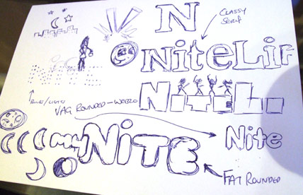
As always, the first stage of the process was to scribble down some ideas and drafts. The original ideas sketched out included the use of spotlights, rounded typefaces, dancing silhouettes, moon shapes and classy serif typfaces.
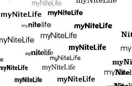
I then booted up Adobe Illustrator to test out a range of type treatments, ranging from thin and modern sans-serif to sexy and classy serifs.
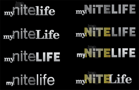
The next stage was to develop various choices of type into draft logo concepts, basing some ideas on the initial thoughts doodled out in the sketches. Planning ahead to the website I knew that a fairly dark colour scheme would be used, therefore I developed the logos on a black background to make sure they looked their best.
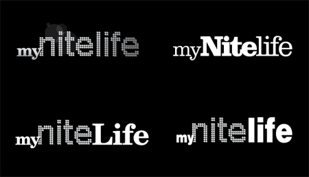
Continuous ideas and concepts developed the logo into four possible concepts, these were then sent to a few friends for their thoughts.
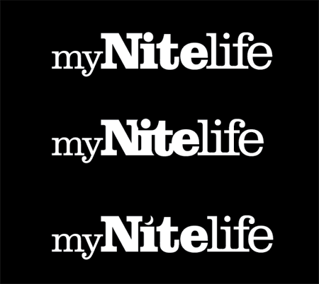
The chosen version was the entirely slab-serif based logo, this was then concentrated on and tweaked slightly into two new versions. The first tweak was to test out the logo with tighter kerning making the letters butt into each other and the second was to swap the dot on the letter 'I' for a crescent moon to represent the night time element.
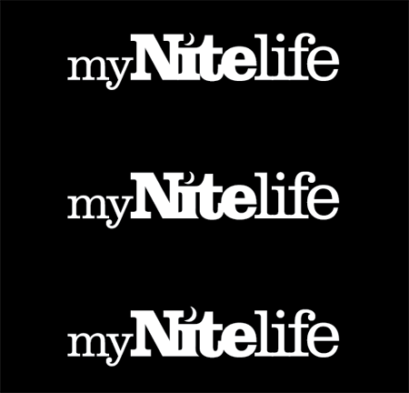
The tight kerning gave the logo a more modern and attractive appearance but made the letter 'I' interfere with the capital 'N'. Combining this with the use of the crescent moon was a perfect solution.
One other issue was the slight interference with the letter 'I' and the letter 't', experiments were made to knock out part of the letter with a flowing curve following the line of the 't'. This helps solve the problem and adds a little designerish touch!
The complete logo design was then complete, shown in it's barebones mono state before being treated to colour and subtle effects.
The Making of the myNiteLife Logo
Now you've seen my personal development thoughts behind the logo, I thought it would be great to show the techniques used in Adobe Illustrator to create the final logo from scratch.
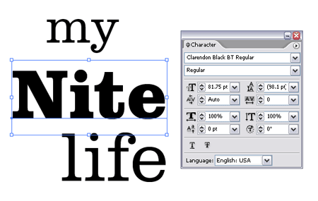
First off, the wording 'my', 'nite' and 'life' were typed out and set in the chosen font of Clarendon, making use of both light and black variations.
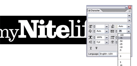
The tight kerning was quickly applied by choosing the -75 option from within the character palette.
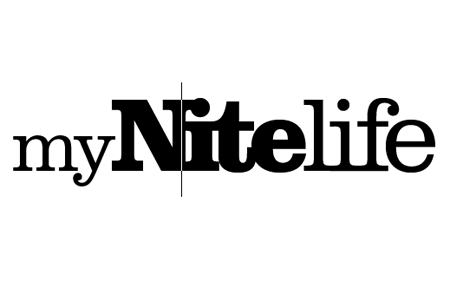
Additional kerning adjustments were made to individual letters, ensuring that all characters overlapped slightly. This was done by using the ALT key along with the left and right cursor keys.
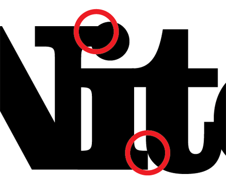
As mentioned previously, this causes unwanted interference with some characters, the solutions of which were to add the pretty curve along the letter 'I' and swap the dot for a crescent moon.
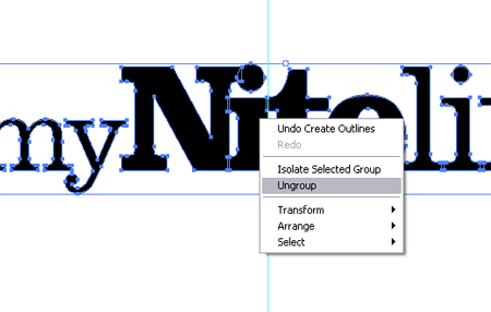
The line of type was converted to outlines (Type > Create Outlines) to make each letter an editable shape. These were then ungrouped to enable access to the letters individually.
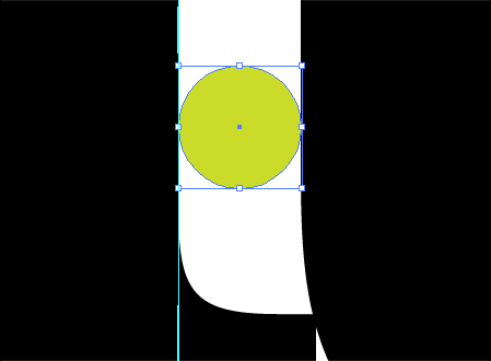
A temporary circle was used as a tool to measure the gap between the letters 'I' and 't'.
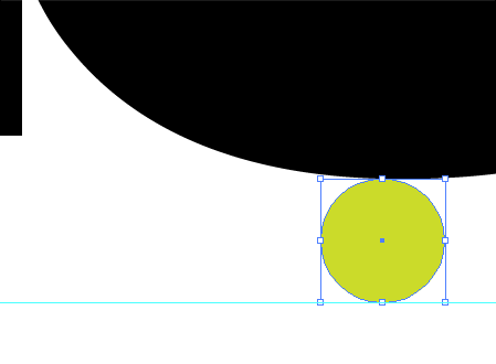
The same tool was used to plot a guide at the same distance from the bottom of the letter 't'.
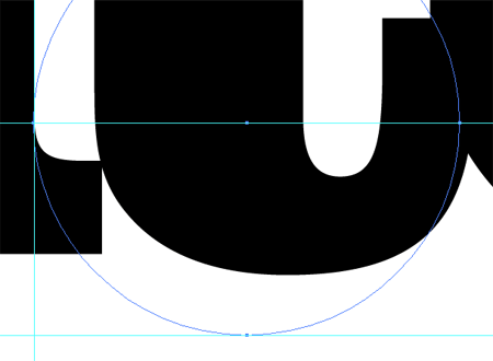
A third guide was added to the lowest most part of the straight edge of the letter 'I'. Using all three guides a larger circle was drawn which resulted in an accurate curve that followed parallel to the outline of the letter 't'.
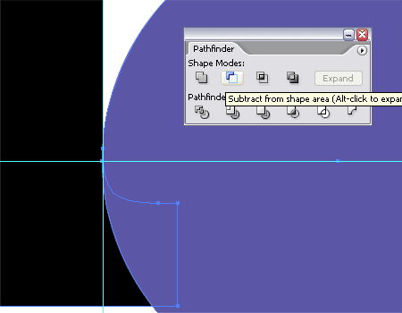
Using this new circle along with the Subtract from Shape Area option from the Pathfinder tool enabled the excess section of the letter 'I' to be chopped out.
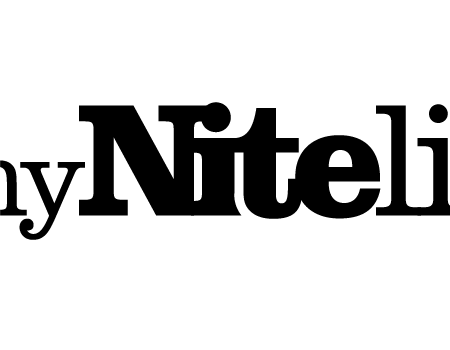
The resulting shape of the letter 'I' I think gives a slightly more unique characteristic to the logo.
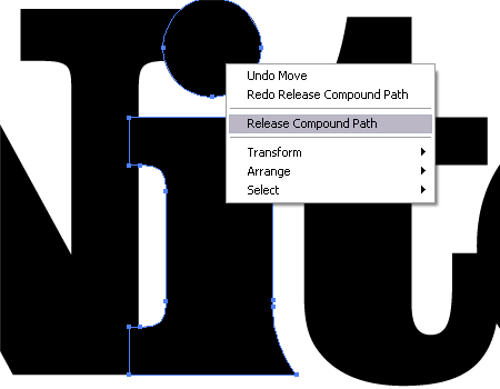
The final fix to the logo was to add the crescent moon shape to relate to the night aspect of the brand. To edit the letter 'I' the Compound Path was released to separate the shape into two pieces.
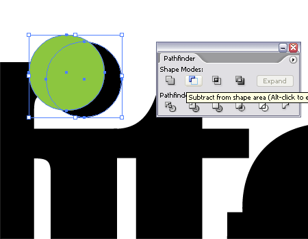
The dot was scaled up to give more of a visual impression, then a temporary circle was used to knock out an area of the shape to give the crescent shape.
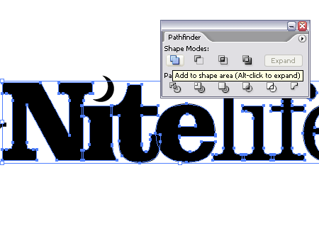
The only remaining step was to clean up the logo by combining all the individual letter shapes into one complete object using the Add to Shape Area from the Pathfinder tool.

With the logo being generated in the mono state it could then be given some sprucing up with colour and slight visual effects. The colour purple was chosen for the brand to relate to the sexy and classy image that the myNiteLife site was to portray, and also gives a nice deep colour to represent the colours associated with dusk.
Love it or hate it? I’d be happy to hear your thoughts in the comments.


Nice logo :)
Love it. :)
a real working-process :)
– thankyou!
Love it too!
Great post, I love how you have broken down your process for us to see! (And I really dig the final logo, too.) Thanks for sharing!
Nice post Chris. I use a similar process, thanks for breaking it down!
Excellent article. Logo design has always been something I wanted to really work on – this is just another great article to add to the toolbox.
I’ve really enjoyed these tutorials. As primarily a video editor, I am fairly new to this form of design. I’m in the process of trying to figure out a brand for myself and I appreciate the time you put into making this information available.
Hey Chris,
Great to see some sketching, and excellent choice of typeface. Clarendon is one of my favourite font families.
I wonder what it’d be like with ‘my’ the same size as ‘life’.
It looks amazing, nice work. Particularly love it on that purple background, really adds something to it :) Good job!
Terrific. Simple and elegant. I really need to improve my Illustrator skills, it really seems like the best choice for these kinds of designs.
Very nice and detailed tutorial, You must be an expert of your field…Great Work.
On the purple background, it looks perfect! I renew my appreciation for logo design with every step. Thanks!
The purple has it – brilliant
Awesome once again. Do you use a pen tablet at all?
Beautiful looking logo there, and a good tutorial of how you got there.
Great logo design and really useful tutorial.
It’s great to see that you start off with pen/pencil and paper first, that’s the way good design should be done, ideas before technique. It shows that you are thinking about communicating the essence of the business you are creating the logo for rather than just doodling and designing for designs sake.
Great tutorial and logo!
It´s similar to my work process.
But my clients always ask for 3 options.
Awesome tutorial and even better logo!!!
love how you modified the fonts to fit in nicely with each other. gives it that refined, finished look. the crescent moon shape is the kicker that really gives it personality.
i bet the client loved it.
Love the logo and the tutorial!!
It is great to see another’s approach to logo design and it is interesting to see that your approach is similar to my own.
Usually during the logo design process, other ideas/elements will come to mind so I end up with more variations than the client asks for.
Anyway, the “myNiteLife” has a great look and feel………Super job!!!!!
Not bad.
Hello from a fellow Sheffielder! The logo looks great, but I’m looking forward to the release of the MyNightlife project even more :)
Yeah, real nice work!
logo design can be really difficult, i think you made a really good job of it, good information as well thanks. good luck with the site
Max | Design Shard
:) simplicity, awesome!
I think it was awesome, and I’d love to see a final compilation of the company’s collaterals altogether so that we could get a better view of just how the logo fits into play.
I will say this, though – the N’s serif sticks a little too far into the negative space on the moon, and that ruins it a little for me.. as in, if you drew a circular path from the bottom of the moon around clockwise up to the top, the N would break that path.
Lovely work, though!
Very nice logo. When I was looking at your process of creating a logo, it was like looking at my own process of creating one.
The steps are pretty much the same, from paper skecthes, to the extensive typo testing, etc.
very nice work.
I like it, particularly the purple in the final graphic.
Love it!
all that drawing you did and didnt use the good ones….
Very nice! Love to see how it was born :-)
Nice work. Thanks for sharing your process. It’s always good to see how other designers work.
Great article. At first I wasn’t sure if the crescent worked or not, but I think it’s a necessary feature, nicely done.
Thanks so much for sharing
Very nice indeed, thanks for sharing.
you rocks!
You have done a good job in breaking out the design process. I love the fact that you started with sketches but would love to have heard more from you about brain storming design ideas and at least some market testing. Overall you have done a really nice job and the logo is well brandable.
Love the logo and the whole process! Thanks for sharing!
Excellent as always. Thank you.
You guys rocks.
As usual, excellent tutorials.
Cheers
Nice tutorial, thnx for sharing
keeo it up…..
Really great tutorial, really informative, particularly bits like the ‘temp circle’, techniques like that are invaluable.
Lovely tutorial, super!!!
Love it, especially the colours.
really really great. i love how you made that logo ;)
Very nice explaination of such important aspects that are considerable in the Logo Design process. Also with some great inspirations for the people who really want to know how to design a logo.
Great effect. Perfectly and simple logo.
Yeah, this tut make my day. Very beautiful effect! Thanks for the advices!
Very cool! I’m also primarily a video editor so it was nice to get a glimpse into someone else’s process