This post was originally published in 2007
The tips and techniques explained may be outdated.
There are a couple of options that can catch you out in Illustrator; have you ever had the problem where you scale up an object but the strokes don't get any bigger? Or vice versa where you scale down your object but the strokes stay huge leaving your design all out of proportion and looking just plain ugly?!
If you are experiencing this, you'll be glad to know there is a quick and simple fix right in the preferences panel…

So just to reiterate, you have an object such as the smiley face above, but when you go to scale it up or down the strokes and/or effects do not, leaving it all out of proportion.
The fix to this problem is a simple four clicks:

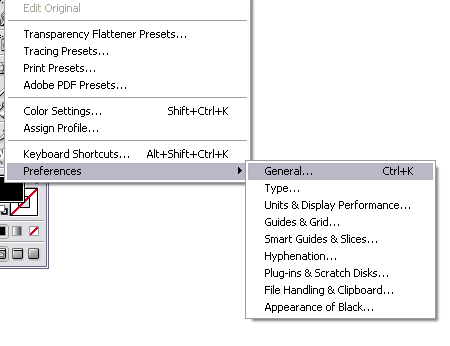
Go to Edit > Preferences > General or press CTRL / CMD + K.

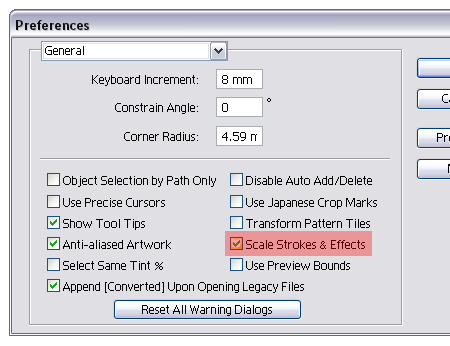
In the preferences window simply click the 'Scale Strokes and Effects' checkbox.

Click OK, and as by magic your strokes now scale in proportion to the rest of your design! Easy.


A very cool tip. I’m going to enable that option now.
aye that’s an important tip to know alright, i’m surprised that option is not set by default, it must be very confusing and frustrating for new users.
Oh. My. God! I had always assumed that this was just the way it is. I had no idea that you could actually get it to scale images! Awesome.
BTW – great blog. I stumbled it about a week ago and it’s nice to find an Illustrator tutorial site where the tutorials are actually useful. I’ve added your RSS to my reader :)
U can allso just double click the scaling tool, and check “Scale Strokes and Effects” on/off. But still same effect, but might be faster…?
Thanks for this tip. I’m a bit new to Illustrator and this always frustrates me. Nice to see a solution.
That’s an awesome tip! I’ve always had trouble with the stroke thing.
By the way, here’s another problem I faced when trying to enlarge an image. Sometimes after dragging it bigger, I noticed that I can’t change the stroke thickness anymore, and the alignment auto-changes to the middle when it was originally in the inside, and I can’t change it back. Is this a common problem?
This is use full! I always did like Select the object with stroke, Object>Expand and then scaled it but this is easier! Thanks
Fantastic top tip!
Such a simple single click setting that makes all the difference… magic. Thanks!
great tip! I just switched from freehand to illustraor. Was so confused when the strokes did not scale togther with my objects. Was looking for the answer to this and got to your page via google. A big thank you!
tips like this are why I love the internets. thanks so much for pre-empting an hours long search.
Good & useful tip
thx , really helped me
oh god..
ALLELUJAAAAAA
YOU RESOLVE MY PROBLEM!
IIIIIIIH-YAAAAAA
hey…its really nice tip…thanx a lot for sharing with us…this will really help me to design….thanx…joe
Thanks for that, I was working recently and was very worried when my strokes dint scale. Now it wont be a problem.!
Thankyou very much! Such a simple thing but I have never known it was there and your the first place that mentions it.
hi!
thank you for this!!!
i had soooo much trouble sorting it out! but now its all gd!
I learned something today :-) That had always blown my mind and it’s a simple fix. Thanks.
Thanks, very nice.
This was really what i needed..for the past few weeks my boss keeps asking for old logos..big and small..and i always had to remake them..cuz the stroke wud go too much..
but not anymore..Whew!! Thanx once again..
Please do keep them coming
Wow! Thanks! I’ve been introduced to Illustrator about one year ago, and if I knew this tip, it would have fixed so many problems… Like so many others, I just assumed this is the way it will stay; But thanks to you, so many future issues are instantly solved forever!
Again, thanks very much for posting this here. ^_~
I have been using illustrator since 2001 and never figured this thing out.. so easy, so quick. 7 years of horror! ;-D
I thought no solutions for that.THANX
Thanks for the help, from Peru. You helped me a lot. Easy to find this post via google.
This page saved me about an hours worth of hassle, maybe longer. Thanks!
It helps to solve my assignment problem.
Thanks! :D
This is GREAT! I’m not new to graphic design work, but I seriously need to improve my Illustrator skills — and this whole stroke scaling thing was really making me angry!
Without this preference checked, strokes on text get ugly even when doing outlined text “the clean way” (identical set of stroked text a layer behind the layer of unstroked text).
Thanks for showing me the way!