This post was originally published in 2010
The tips and techniques explained may be outdated.
Follow this step by step walkthough of the design process for my recent gothic typography design. We’ll be customising a blackletter font with various black and white elements and creating a range of tones with detailed linework to create a cool gothic style design that would be right at home as a logo for a heavy metal band or dark apparel brand.
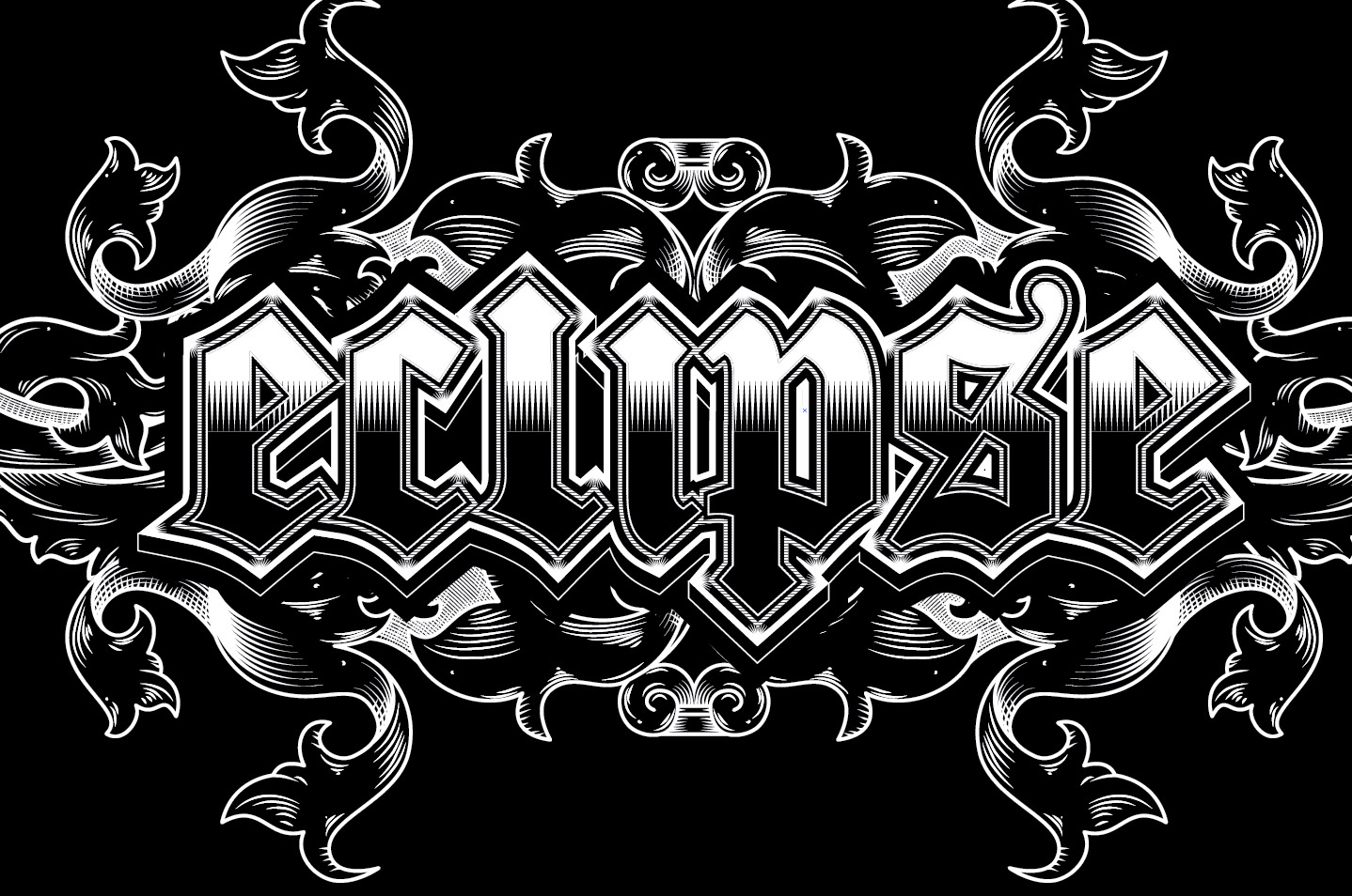
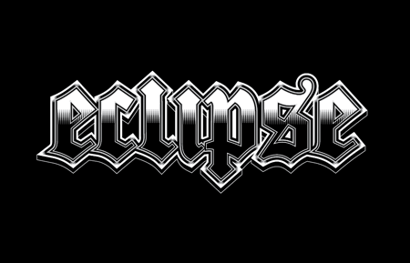
The ‘Eclipse’ design (no Twilight jokes, please!) is made up of a series of outlines around the type, combined with various tiny details to add shading to the text. These shading elements include a series of closely packed sharp triangles and a spread of horizontal lines.
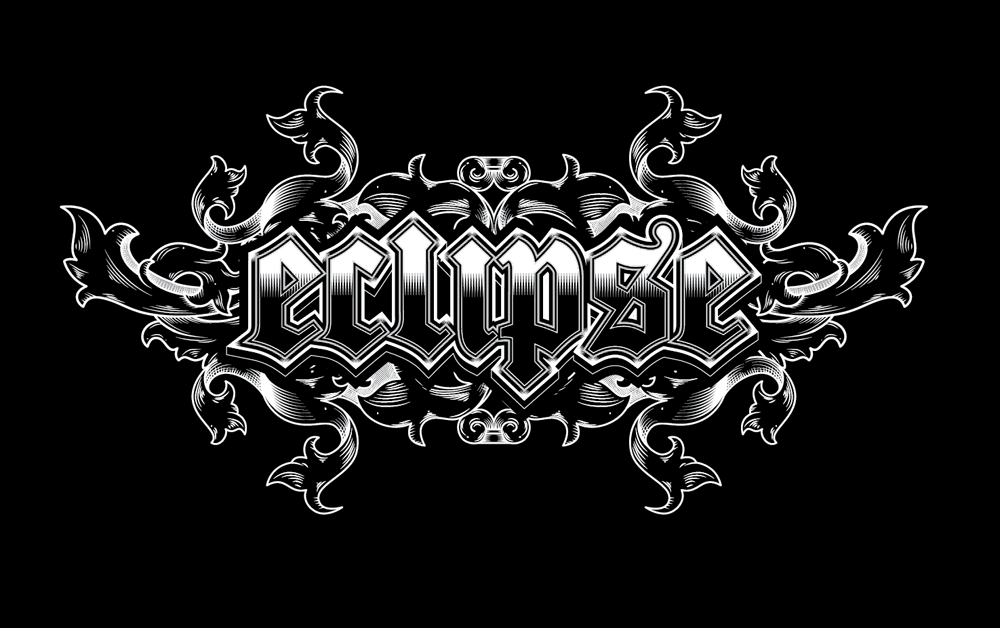
View full size gothic typography design
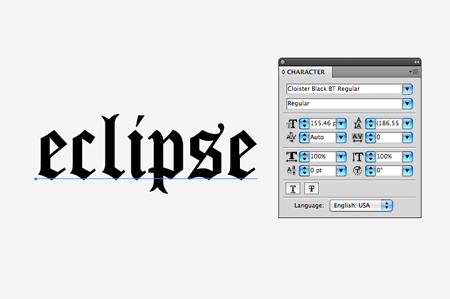
Open up Illustrator and type out your band name / apparel brand / random word of choice in a suitable blackletter style font. Here I’m using the font named Cloister Black as it includes some nice sharp angles and a cool looking traditional ‘S’.
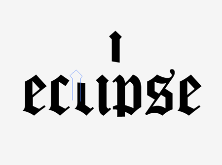
I wasn’t too keen on the tails on the letters ‘L’ and ‘P’, so one of the first steps for me was to customise the type by copying a selection from the letter ‘I’ and using it as a replacement ascender/descender. Convert the font to outlines using the shortcut CMD+Shift+O so edits can be made.
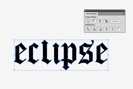
Once all the type customisations are made, Merge all the elements together using the Pathfinder tool.
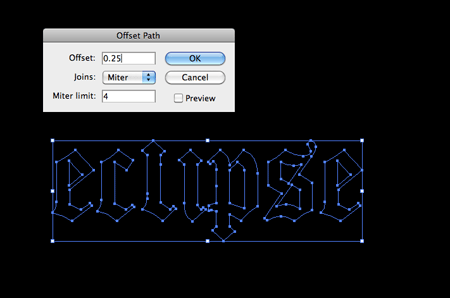
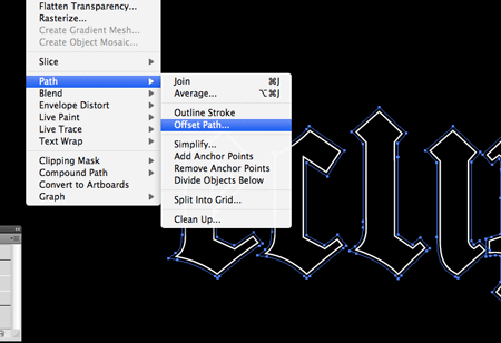
Draw a large black rectangle across the artboard to use as a background on a new layer and lock it in place. With the text selected, go to Object > Path > Offset Path. Enter 0.25mm in the options window.
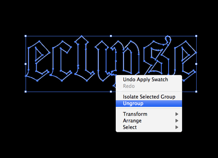
Right click and Ungroup the two text elements then add a white fill to the newly created outline.
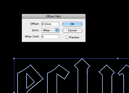
Select the outlining shape then go to Object > Path > Offset Path, this time enter 0.75mm in the options window. Fill this outline with black.
With the newly created black outline still selected make another Offset Path of 1mm and fill it with white.
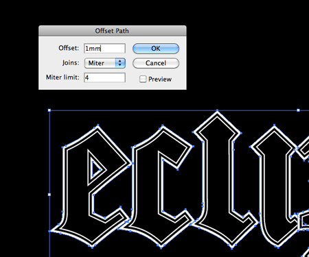
Make yet another offset path using the largest outline, this time use a 1mm setting.
Fill this largest outline with a white swatch. These outlines alone are already giving the type a cool Guitar Hero style effect.
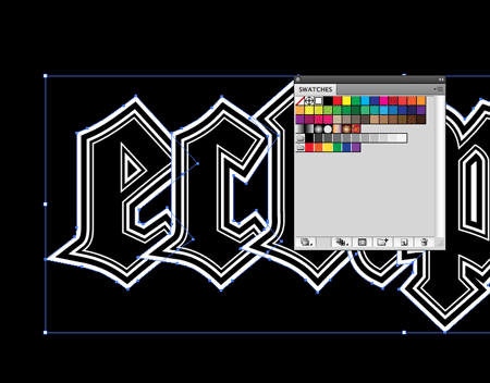
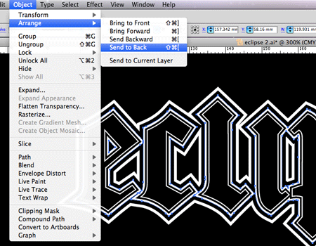
Each letter’s outline currently overlaps the previous letter, which looks a little ugly. Select all the shapes that make up the largest outline and Merge them with the Pathfinder. Send these items to the back (CMD+Shift+[).
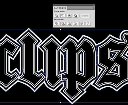
Repeat the process, but this time with the next outline. Select and merge together all the black outlines to convert them into one shape. Send it to the back, then up one level (CMD+]) to sit above the outer white outline.
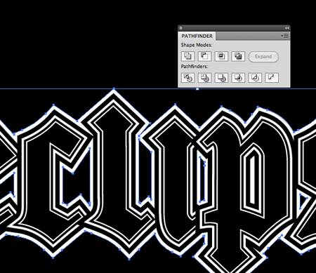
Select the next thin white outline and merge them all together. Send the merged item to the back then bring it back into the correct level using the CMD+[ shortcut.
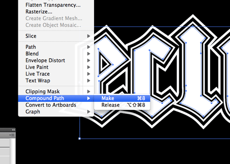
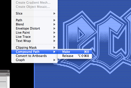
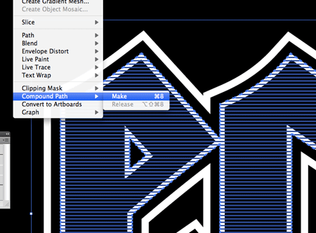
Select all the original letters from the centre of the design, copy and paste in front (CMD+F). Give them a white fill, then go to Object > Compound Path > Make.
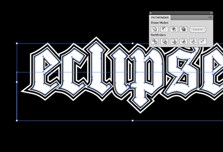
Draw a clear rectangle covering the lower half of the text and use this along with the Subtract option from the Pathfinder to trim down the white text.
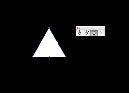
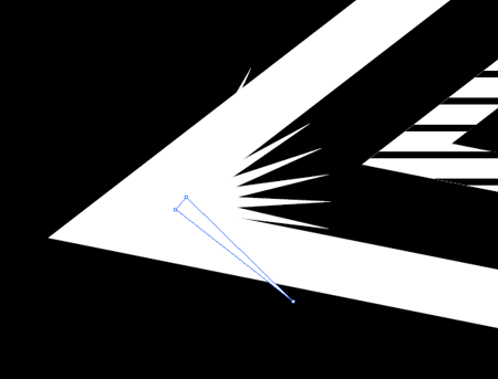
Elsewhere on the document use the Star tool to draw a triangle. Press the downwards cursor key while dragging the shape to lower the number of points. Remove the bezier points from the centre of each line with the Pen tool.
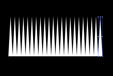
Select and nudge the two side points inwards to make the triangle thinner, then move the upper point vertically to stretch it out. Hold Alt and Shift while dragging the triangle to the side to make a duplicate, then continuously press the shortcut CMD+D to repeat the transformation until you have a series of repeating shapes.
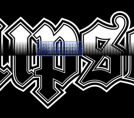
Make a Compound Path out of the triangles, then make copies and position them over each letter where the white and black shapes meet in the centre.
Working on each letter individually, make a copy of the original black letter, send it to the top (CMD+Shift+]) and use this as a tool to trim to the triangles to size using the Pathfinder Intersect option.
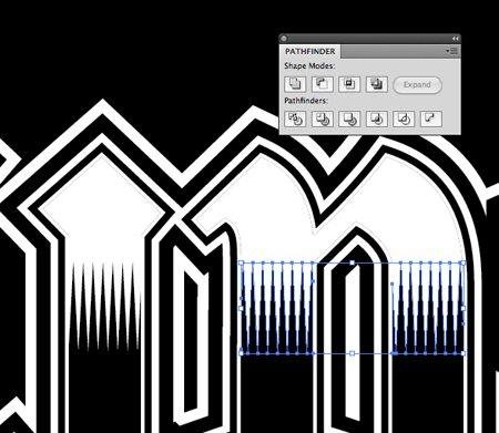
Continue making copies of each subsequent letter and trim down the triangles so they sit perfectly inside the letter outlines.
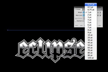
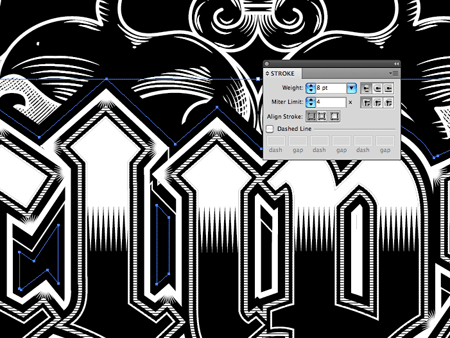
Draw a horizontal line on the artboard and give it a 0.25pt black stroke. Make sure it’s longer than the design itself.
With the line selected hold Alt and press the downward cursor key. Continuously press CMD+D to repeat this transformation until you have a series of lines larger than the text.
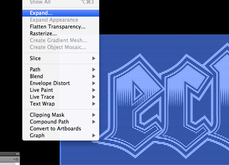
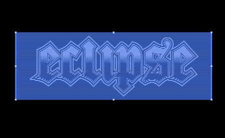
Draw a selection over all the lines and go to Object > Expand. Select just the stroke setting in the options box.
Make a Compound Path out of the series of lines by going to Object > Compound Path > Make.
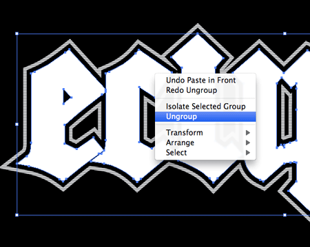
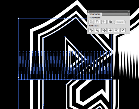
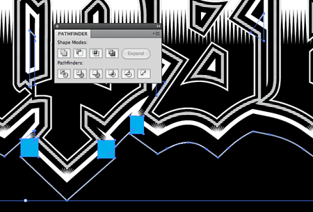
To trim the lines down so they fit inside the text we’ll need to create a duplicate of one of the outline shapes. Bring this item to the top and Ungroup the objects. Make a Compound Path of all these letter shapes.
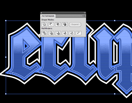
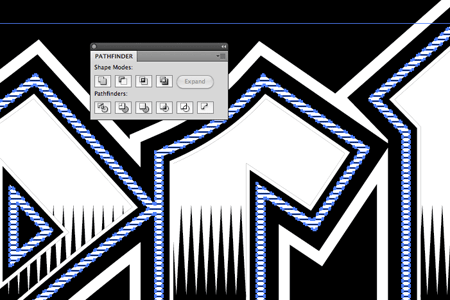
With the series of lines and the duplicated letter outlines selected, click the Intersect option from the Pathfinder palette.
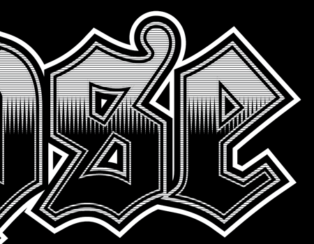
The lines have been trimmed so they fit within the text, but we don’t want them to fill the centre of the text.
Make a copy of the inner letters and make a Compound Path. Ungroup the series of lines and make another Compound Path out of these objects.
Use the Pathfinder once again, but this time choose the Subtract option in order to punch out the letters from the linework so they fit exactly into the confines of the outline.
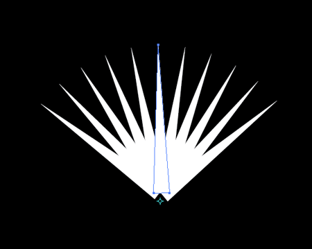
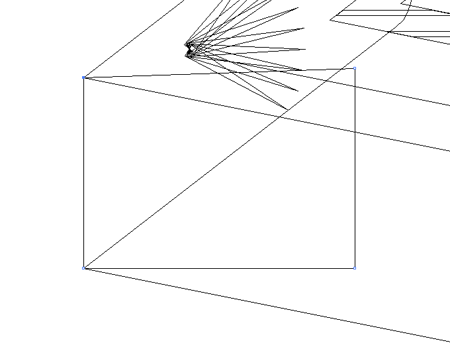
Elsewhere on the artboard use a duplicate of the small triangle to create a radial flare with the Rotate tool. Set the pivot point at the bottom and drag a copy using the Alt key. Make duplicates using the CMD+D shortcut.
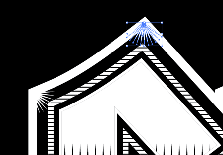
Make copies of this group of radial triangles and position them across the design wherever there’s a concave corner.
Go back through the design with a crazy zoom level to check for any overlapping points. Delete out such shapes using the Direct Selection Tool.
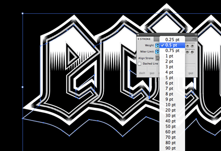
Make a Copy (CMD+C) and Paste Behind (CMD+B) a duplicate of the outer outline. Nudge this shape downwards vertically then switch the fill to black and give it a 0.5pt white stroke.
In order to finish off the three dimensional appearance, some areas of the duplicated outline need filling. Toggle outline mode (CMD+Y) and zoom right in. Use the Pen tool to draw gap filling shapes between the relevant points.
Select all the newly created gap filling shapes along with the black and white outline and merge them together with the Pathfinder tool.
This leaves the actual typographic portion of the design complete. The detailed linework does a great job of adding shading and tone to the design, while the little flares on each corner give a shiny/sparkly effect – All without the use of gradients or colours.
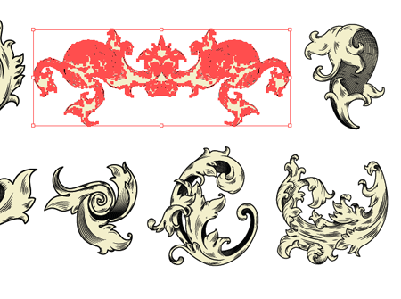
To finish off the design, download some accompanying ornamental elements. This particular vector pack is courtesy of WeGraphics and is available for download in the Access All Areas section.
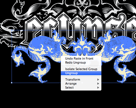
Ungroup the vector elements in order to change the linework to white and switch the inner fill from yellow to black to match the rest of the design.
Add an additional stroke to the black outline to give the text prominence against the detail of the ornamental elements.
Combined with the ornamental elements the typographic design looks great. The vectors really enhance the gothic style and disguise the text a little to make the design a tad more abstract.

Look’s realy awesome! Thanks for the great tutorial!
good work chris
Thanks for the tutorial. STumbled :P
Nice tutorial! It is awsome!
Looks great! Your work is so inspiring!
I did the exact thing a couple of weeks ago for a t shirt, great minds think alike?
Awesume tut! I need to use the offset more. :) Thanks for sharing!
Found this on twitter, excellent tutorial.
Great technique, nice tutorial. Thanks for sharing Chris
Chris, you outdid yourself again my friend. Excellent tut and very detailed. Have a great holiday buddy!
Great tutorial, good use of the pathfinder tools! If you create a triangle with the hexagon tool, it will draw it with just 3 points.
Best
Graphik
lol, what would we do with out we Graphics :P
Great tutorial, thanks!
yeah!.. and I just learned that we really have to pay attention to details..
The work is just outstanding, I have made it just couple of min ago its relay good
Love this tutorial, Chris! I wouldn’t have approached this task in this way, but I’ve got to admit that your way is better.
Hey Chris,
Good stuff again? & it sounds great buddy. I really love it & inspired of the amazing design works made by. It gives the effective & useful notes in detail with clear practices which are simple to know & easy to follow.
Thank you so much for this nice sharing. Keep on posting good things. Congrats.
Excellent tutorial man!
I flip through your blog once or twice a week, and I see a lot of stuff that inspires me to try, but today was the first tutorial I will go home and try step by step! This looks fantastic and will look awesome with some ambigrams! Very cool tutorial!
Very good. Thanks for the tutorial.
Very useful tutorial. Thanks for the share.
I like all above fonts style & designed…brilliant!
Nice tut, thanks for sharing. Anyone who wants this font don’t pay this ridiculous price, just go to http://www.dafont.com/Cloister-Black.Font and download it for free!
I’m a noob to illustrator so still learning some things, but wanted to ask about the offset path steps. That’s where I’m hung up. I select the text and do the offset path step but then it says to ungroup the two text elements, I don’t get that option, any ideas on what I could be doing wrong? I only get “Group” as an option. So it’s almost as if it’s not making a second element. Now I can go through and manually select the offset path, but I keep missing certain parts and have to redo it.
Help?