This post was originally published in 2011
The tips and techniques explained may be outdated.
In today’s tutorial we’re going to look at creating a colorful ribbon graphic. Despite being a typical logo style icon, we don’t have a live client for this particular design. The tutorial is aimed towards giving you insight into actually making the cool graphic as oppsed to the full logo design process. We’ll use various tools and techniques in Adobe Illustrator to create a great looking vector based design complete with subtle gradients and shading.
![]()
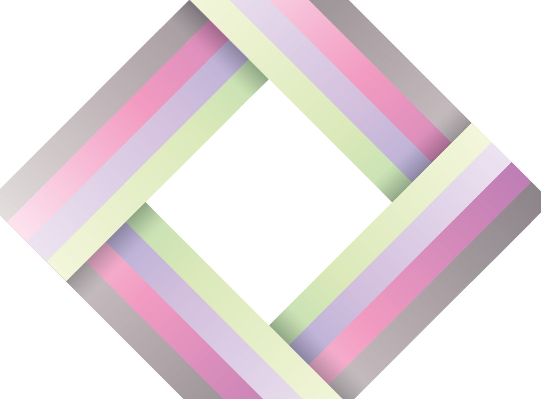
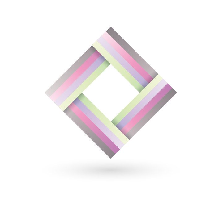
The logo style graphic we’ll be creating is made up of four colourfully striped ribbon style elements. The four pieces are interweaved to create a kind of pseudo Penrose Stairs type illustration. The addition of subtle gradients and shadows really helps bring the design to life by adding depth and a third dimension.
View the full size ribbon logo design
![]()
Create a new document in Adobe Illustrator and draw four squares on the artboard. Give each one a colour fill to create a simple colour palette. Here I’ve picked out a green, lilac, pink and grey colour.
![]()
Select the rectangle tool and click on the artboard. In the options window enter the dimensions of 5x5mm.
![]()
Copy the square (CMD+C) then paste in front (CMD+F). Hit enter on the keyboard to bring up the Move command and enter 5mm in the Horizontal field. Repeatedly press CMD+F and CMD+D to repeat these steps three more times.
![]()
Give each of the squares a colour fill according to the palette then stretch them by dragging the lower most handle vertically while holding Shift.
![]()
Hold the Shift key while rotating the object to 45 degrees. Copy and paste duplicates and carefully rotate and position them to form a square.
![]()
For the final shape we want one end to be tucked under the previous shape, but the other end over the top of the next shape. Shorten down shape and create the full edge from two pieces.
![]()
Carefully align the two pieces to give the impression of a single line, but send the last piece to the top of the stack with the CMD+Shift+] shortcut.
![]()
Toggle on Outline mode (CMD+Y) and zoom in to check the alignment of the elements. Make any necessary tweaks to overlap the lines exactly.
![]()
Make duplicates of the four colour swatches, then replace the fills with gradients. Colour pick samples from the original swatch, but adjust the gradient handles with light and darker tones.
![]()
Select all the objects with the same colour fill then use the Eyedropper tool to switch the solid colour for the gradient. Repeat this process for all four colours.
![]()
All the gradients are currently flowing horizontally, but we can adjust the angle manually with the Gradient tool. Select all the shapes on one edge then click and drag to set the gradient angle.
![]()
The subtle gradients are already bringing the design to life in comparison to the flat solid colours.
![]()
Elsewhere on the artboard create a rectangle at the dimensions of 20x5mm.
![]()
Give this new rectangle a gradient fill from black to transparent, then adjust the Transparency to Multiply at 30%.
![]()
Copy, rotate and position this new rectangle carefully into place where each edge intersects the next to create subtle shadows. This will help add depth and a touch of realism.
![]()
Use the same black to transparent fill to create a circle, but change the gradient from linear to radial.
![]()
Squash this circle down then position it underneath the main logo graphic to give the impression of a three dimensional scene. The logo now seems to be floating in space rather than being sat on a flat surface.
![]()
Our colourful ribbon graphic is now complete. Even though we didn’t have a live client for this project, hopefully the Illustrator tips and techniques will help you create great looking vector logos designs for your future clients.

This is very stylish, the colour spectrum you are using is very nice! Thanks :)
Once again a very well written guide. I even picked up a few tips along the way, such as using the Outline mode to properly align objects, and the fact that you can line up gradients on several objects at the same time without changing the colors of the gradients.
Just thought I’d share my creation based on my own logo colors. http://i.imgur.com/SIgyf.png
Thanks again, Chris!
Very stylish and impressive…..
Simple and effective, I like it!
Neat n simple!
TFS
I love simple but detailed design. Nice one.
Nice tutorial on ribbon graphic. Its simple but descriptive and resourceful.
Thanks for sharing..
Amazing..!!
Stylish, simple and sweet design. Thanks for sharing.
Thanks for another great tutorial. Helps out with my lack of illustrator understanding!
Good graphic tips for Illustrator! Another tip: Markzware FlightCheck can preflight, collect and package Adobe Illustrator files.
nice one pal.great one….;)
Amazing tut very simple,yet very artistic :)
thumbs up!
tnx for the good lesson
An elegant and easy to follow tutorial, thanks for posting!
You make this look easy! That’s just the type of thing you may want to do when designing a new business card. Do you have any tips on the best format to present to your local printer?
thx for great post, Simple and effective
Really neat tutorial. Two little suggestions:
The rectangles for the drop-shadow aren’t necessary. You could group the 4 regarding stripes and lay an new fill on it. Then apply a gradient and set it to multiply 30%. So you could easily change the size of the shadow.
You could also scale the underlying stripes up to the border of the overlaying rectangle.
Is there not an easier way to align the shapes on top of each other? I found doing it manually a bit fiddly and imprecise.
Good tutorial though, very easy and a great looking result :-)
Simple is always better in my vision. It looks like a rainbow and i like it.
This is nice, and a clear tutorial. I just hope this actual mark isn’t going to be popping up as a logo all over the web!
Nice Tut Chris,
Good balance of colour – and gradients is always something I never find intuitive when using Illustrator.
Many Thanks,
Darren.
wow simple and beauty…great work Chris
thanks for share your steps
Did you see this? Who is the author? I shold guess…
http://www.cornerofart.com/2011/07/21/how-to-create-a-colorful-logo-style-ribbon-graphic/
GJ Chris! ;)
Thanks for sharing such useful information… I think this is really a very nice post. Thanks for the great content!
http://www.bestflightstoantigua.co.uk/