
This post was originally published in 2008
The tips and techniques explained may be outdated.
Continuing from a recent tutorial, Create a Vibrant Blog Design in Adobe Photoshop, we'll now look at taking the concept and implementing it into an actual webpage constructed in xhtml and css. By exporting the imagery from Photoshop and coding up the page we'll produce a working example of the overall blog design.

At the end of the last tutorial, we had created a complete mockup of the front page including overall layout, colour and design, proposed typography and sample content. Now it's time to review the concept and plan out which elements can be created in pure xhtml and css, and which parts require the use of images.
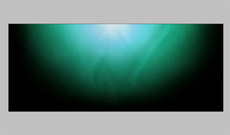
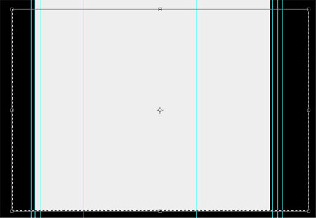
The first element to be exported is the large background. All other layers are hidden and a large selection of the document is exported through the Save for Web and Devices option.
On first impressions it's easy to think that such a large image is going to be too large in filesize for website design, but in actual fact the outcome is only 30kb with optimised jpeg compression, balancing between image quality and overall file weight.
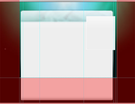
The main content area is then exported, making another large selection including the whole centre panel along with the visual effects such as shadow and transparent border effect. The upper sidebar is also included in this area due to the complex use of transparency
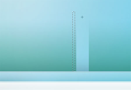
To allow the webpage to expand vertically, a section of the lower content area is exported that will repeat vertically.
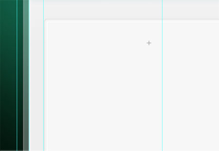
To finish off the layout of the webpage the footer area is exported, a selection around the image is made that matches the overall width and includes the grey gradient of the graphic.
In order to export the sidebar, the main content area is temporarily stretched vertically.
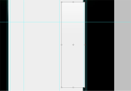
Because the concept makes use of individual sidebar sections the graphic will make use of two images – an upper section that is long enough to accommodate more than the sections will ever be realistically, and a small bottom section that crops off the long section into the individual panels. This is a similar approach to the sliding doors techniques used on menus.
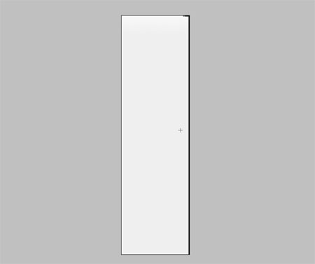
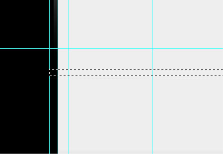
The long slip is exported, including the transparency effects of the border in the selection.
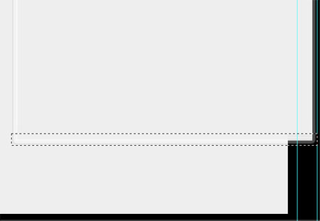
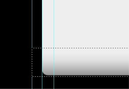
Next up is the thin bottom section that finished off the sidebar section.
A thin slip is exported from the menu background, this is another image than can be repeated horizontally depending on the length of the menu text. The transparency of PNG files is taken advantage of here to allow the menu to be overlaid on the varied colours of the background.
The individual post areas on the concept use the same border effects as the sidebar, but because they don't overlap onto the background and don't have any complex transparency they will be made purely with css.
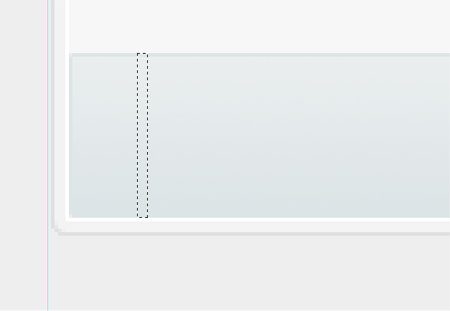
The lower section of the content panels however use a slight blue gradient, this can simply be exported as a thin strip that will be repeated horizontally.
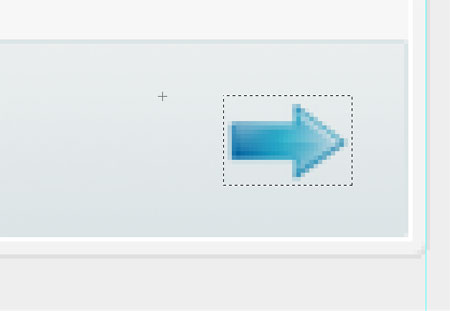
The little comment bubble, arrow, rss and email icons are then individually exported along with the blog logo.
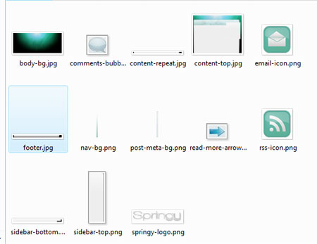
The complete concept has now been separated into individual images, a total of 13 images will make up the page, five of which are layout specific. The complete size of the combined images comes to 95kb, which even for the minority still on dial up will soon download when viewing the webpage.
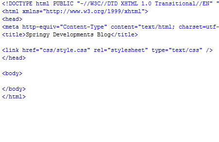
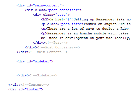
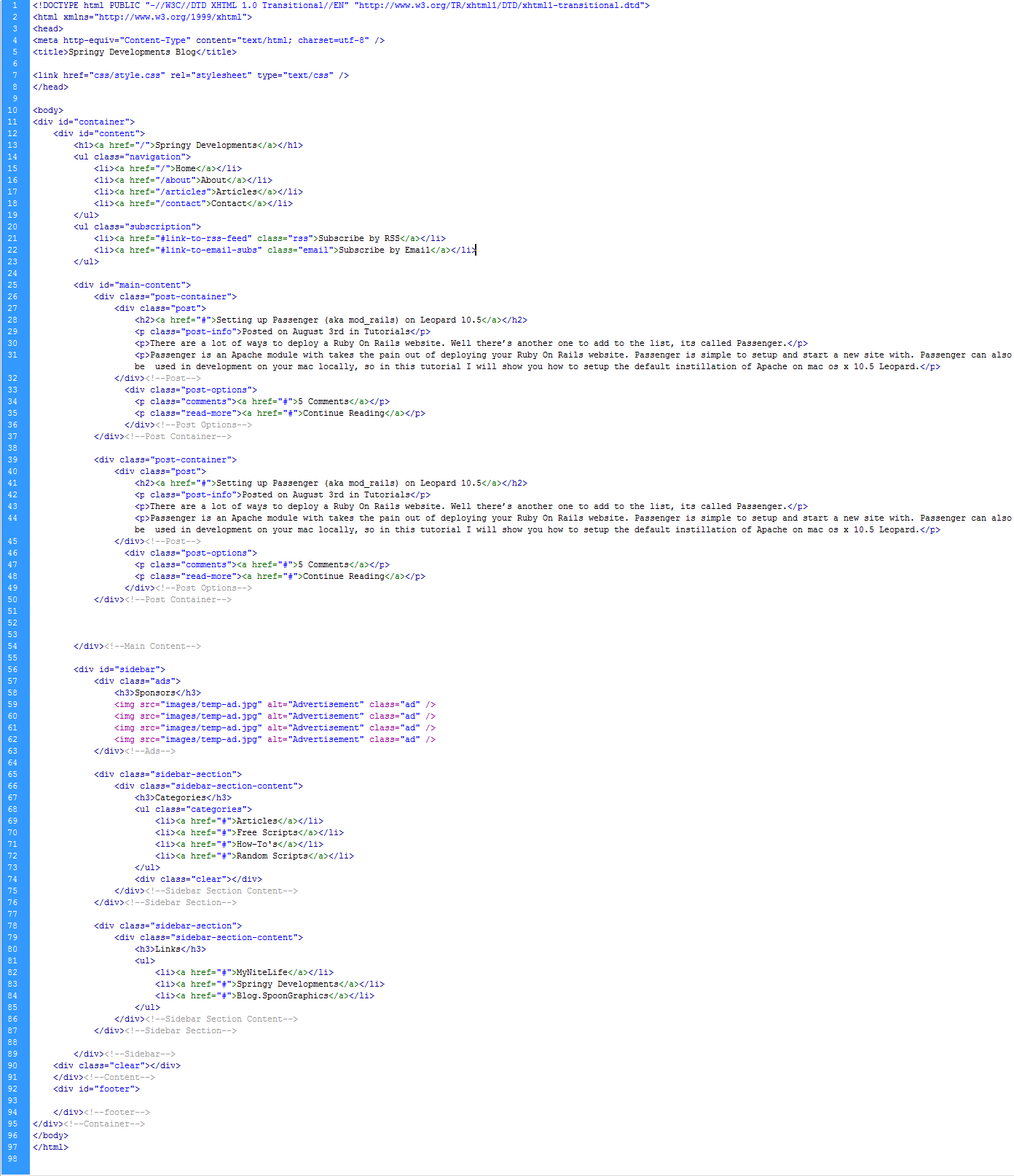
A html webpage is setup to contain the structure of the layout. A separate css style sheet is linked from the document which will include visual rules for the design.
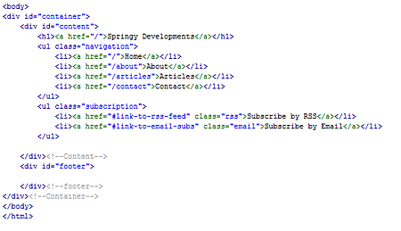
A div with an id of container is added which will allow the content to be centred and one of the backgrounds to be fixed to. Remember we also have a thin background image that will repeat vertically, until CSS3 is more widely supported a second div is required to place this image onto.
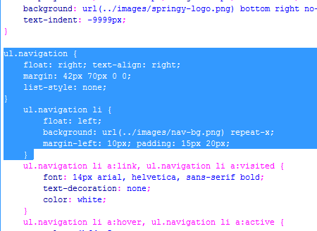
A H1 tag is used to state the website name, and will also be the base for the logo. The upper navigation and rss/email subscription options are laid out as unordered lists.
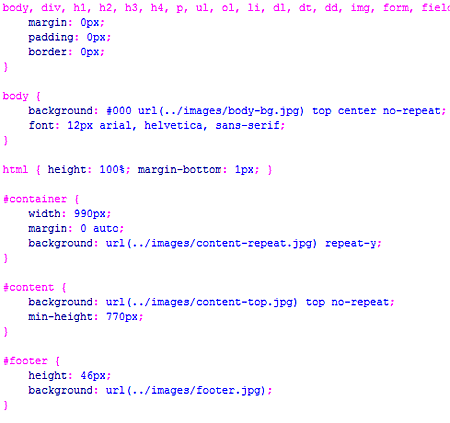
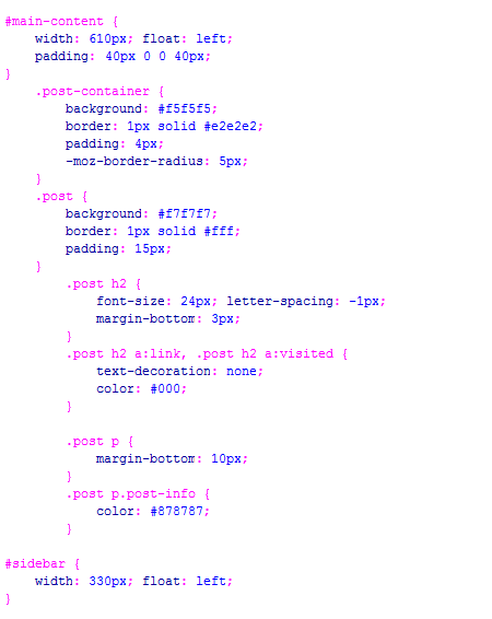
The CSS for the layout of the page is then written, starting with a reset to remove any browser defaults. The large background image is attached to the body and global font style setup. The container, content and footer divs are also styled with the appropriate background images.
Continuing with the CSS styling, the code for the design of the individual elements is then added, setting up the header one and unordered lists to display the appropriate images and colours.
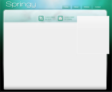
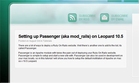
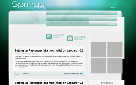
With this initial coding in place the html can be previewed in the browser, so far the layout is displayed centrally on the page with logo and navigation in place.
Next up is to flesh out the post snippets, using a container around the post will allow the styling of the panel as we mentioned earlier, instead of using images.
CSS styling for this section of the page adds the colours and border to the panel and sets up the styling of the post title and paragraph text. With the site being related to web development, the majority of the viewers are likely to be Firefox users, this means we can use the moz-border-radius to display rounded corners on the panel as per the original concept. For other browsers this will simply degrade to a square corner.
Testing this in the browser then shows this styling for real, showing how the use of CSS background color and border can recreate the original effect from Photoshop.
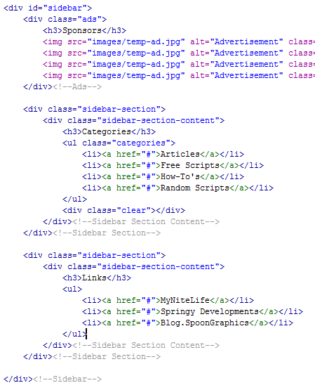
The html structure for the sidebar is then laid out, using a container on the sidebar sections allows the use of the two background images that make up the sliding doors technique for the expanding of the sidebar content.
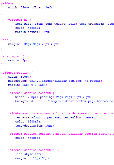
More CSS styling is added to manipulate the html elements, customising the sizing, colour and typography.
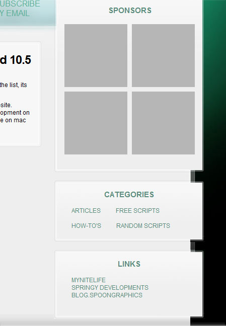
The sidebar styling can then be seen in the browser, notice how the long image used for the sidebar sections is cropped shorter depending on the length of the content within them.
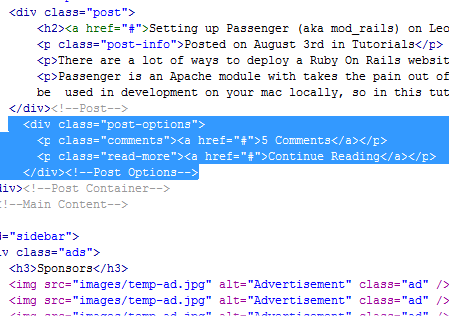
Next up is to quickly go back to the post snippet and add the read more option and comments information.
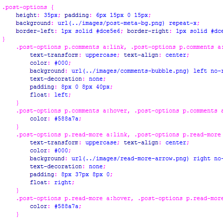
Styling for these elements is then added, using specific classes on the two paragraphs allows the comment bubble and read more arrow icons to be added as background images.
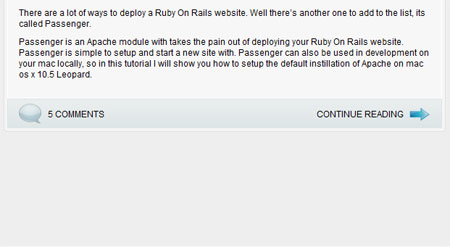
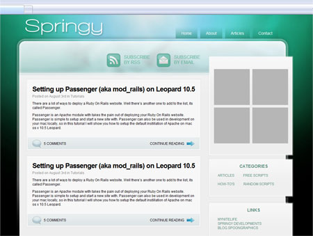
The panel is then complete and viewable in the browser, the repeating of the thin background image gives the impression of a solid panel on which the text is set.
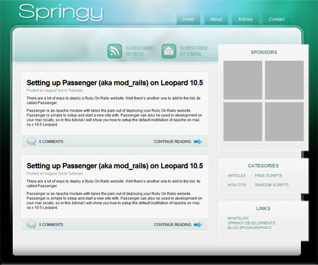
The overall layout is then complete, although still in concept stages the page can now be viewed in the browser in order to gain a feel of how it will display at varied resolutions as well as simulating the hover effects of the links.
As always with web design, once the site is created the work never stops there. Testing in Firefox, Opera and Safari went without issue, however Internet Explorer had other intentions.
A few modifications to the CSS styling soon ironed out the problems. Changing the styling of the navigation from an inline block to it's default block format and adjusting the floating did the job.
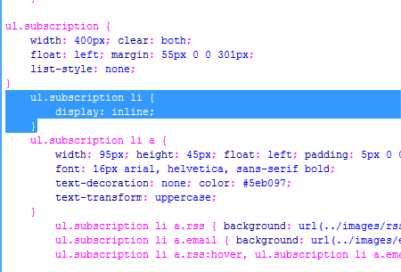
The subscription options seemed to be suffering from the stepping problem as commonly experienced in IE, this is simply fixed by adding display: inline to the list items.
Soon after implementing these changes the site was back to normal and ready for construction as a WordPress theme, where a little more styling will be required to cover the generated coding and of course, the inner page with comment area.
While it would have been nice to explain every line of code in more detail, the article would have lasted forever and probably become quite repetitive. Hopefully by viewing the complete html and css you'll be able to see how each element is constructed. Check out the completed webpage.
That was absolutely an awesome tutorial… just what I was looking for. Hopefully I can figure things out now. Thanks a ton.
Great Tutorial! Must have taken you ages. I dont think i have the patience to do a tut like that! :)
comment first,
great tutorial..
Really nice articles!!!
Is there a chance that you will post the source material for the images?
As a technical web developer, the webpart I could understand. But the design in photoshop is less evident to me.
Regards,
Mark
congratulations, awesome and simple tutorial very helpful…
Cheers
This was a brilliant tutorial. Great work!
Nice work, thanks for the time you put into this tutorial, it’ll be a great help.
-Michael
This is a great set of tutorials! Is there a possibility that you will be showing us the steps of converting this theme to WordPress?
Excellent tut.
Really good, got a mention on my blog too.
http://69dots.com/archives/1117
How wonderful! I have been enjoying your site immensely since I discovered it last week and now I love it even more.
A question about one detail: What particular variable makes the background header image stay lined up with the content when the browser window gets resized?
Know what I mean?
Man I’m actually learning css right now. I come from a table based design structure. this couldn’t have come at a better time. It’s mind bottleing…it bottles my mind.
@ellie
I think I know what your question means.
The Body has the background set to “center top” so this will resize with the browser, as it stays centered.
Also the #content div also has the green gradient background set to “top” and because the containing div is centered hence the “margin: 0 auto” it will also be centered in the browser regardless of width.
Hope this helps.
Thanks so much Fitz! That’s exactly the help I needed. I was having troubles getting the shorthand “top centers” to have any effect, but once I isolated them on separate lines it worked perfectly. :)
tHANKS Again for another awesome tutorial./ I’ll spread the word.
@ellie
Thats ok, glad I could help.
nice one:)a continuation of the last tuts:)great work Bro!!!
Ronald
This would have to be one of the best photoshop to XHTML/CSS tutorials I have ever found, seriously.
If only I had such a tutorial when I was starting out with Photoshopping designs to XHTML and CSS.
Dwayne.
http://probablysucks.com
Thanks alot. Your given detail tutorial helped me alot in some of my problems in photoshop designing
Awesome guides (part 1 and 2). Are you going to continue on to the next step of actually encorporating a blogging system’s structure into it? Like making wordpress/blogger etc work with this layout?
Keep up the awesome work.
Thanks for all the comments, I’m glad the article helped out!
Also many thanks to Fitz for helping out with Ellie’s question, it’s great how the design community shares their knowledge with others.
Producing a WordPress theme may be an article sometime in the future, I’ll have to go back and take a few screenshots of the process to make part 3.
Nice script on the completed webpage (ie blocker), we really needs to get ie6 out of the web.
And great tutorial to.
Excellent article !
Chris, I noticed that you use the empty div method to clear your floats. I also used to, frustratingly, use the same method in all of my designs to clear those pesky floats. But, I always hated placing additional markup for presentation only, especially an empty div. I’m now using the clearfloat method using the pseudo-class, :after, which comes with its own set of frustrations. Just curious to know where you stand on either method.
@Copy112 Many thanks to CSS-Tricks for the great little script: http://css-tricks.com/ie-6-blocker-script/
@Erik For me the clear div method has become routine and I’ve not thought a lot of it for a while. I’ll have to look further into the :after technique, previously the compatibility with older browsers was what put me off but now the likes of IE6 are being phased out across the industry it might be a good alternative. Thanks for the reminder!
Another way to get Firefox to contain the floats its to set overflow hidden on the containing element, this will force Firefox to display the float properly while not affecting IE.
For example:
Firefox would not contain the floats properly so by doing this:
.product-header {
overflow:hidden;
}
Then the floats work as expected.
Hope this helps
Matt
oh, this second part for me is very useful, I’ll be returning to go this through too..:) thanks! :)
I use inline css to build up the structure. I have problems with pixel in internet explorer 6 but ok with 7. But my point is i used inline css to build the skeleton
Great tutorial. Thanks for share
Keep up the good work !
This is awesome… thanks for the time for posting this tutorial. It really helps me a lot.
A great tutorial for both the design and coding elements. The 2nd part is hugely helpful, for me at least.
Thanks.
Rachel
AllWebDesignResources.com
It an awesome example for psd to css, got some good tips. nice work
excelente!!!, muy bueno!!!
i have bookmarked this for future reference, thanks
Nice Article!
Really awesome tutorial.
I created a PhotoShop mockup aswell, and I was wondering if any of you could help me on how to encode it in XHTML & CSS.
This is an image of how the MockUp looks:
http://img401.imageshack.us/img401/9923/hnnuncopyui4.jpg
wow really helpfull. will add this to tuotrial section in our website at http://www.httpartist.com/beta/tutorial.html
thanks for your tutorial. Very nice and helfull.
This was a great tutorial that would give a great help!! thank u:)
I have a question, does this tutorial applies to blogspot xml templates? if not how can i make it applicable?
Tracked back to from here: http://www.presidiacreative.com/the-most-helpful-psd-to-xhtml-and-css-tutorials/