This post was originally published in 2010
The tips and techniques explained may be outdated.
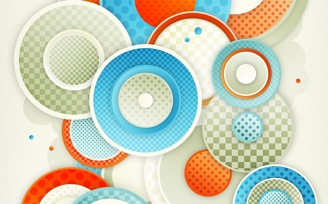
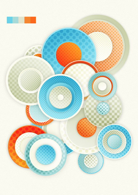
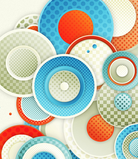
I’ve just finished up another little digital art experiment where I set out to build something cool and abstract out of Photoshop patterns and simple shapes. Follow this walkthrough as I take you through the steps I took to recreate this detailed design with nothing more than gradient and pattern effects.
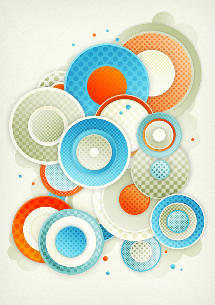
The design itself is made up of a range of concentric circles, with each group varying in size. Each circle is given a base colour from 6 core swatches, then gradients and pattern fills add detail and depth.
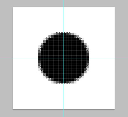
Before getting into the main design, we’ll need to create our pattern fills. In my design I’ve used a dotted pattern and a repeating square pattern, but there’s many more possibilities to explore. Create a Photoshop document at 40x40px and zoom right in. Position guides to mark the centre of the document, then draw a circle. Hold Alt and drag outwards from the centre to ensure it’s aligned perfectly.
Hold ALT while clicking the dragging the circle to make a duplicate. Move this duplicate so that the centre of the circle sits exactly on the corner of the canvas.
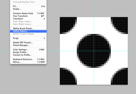
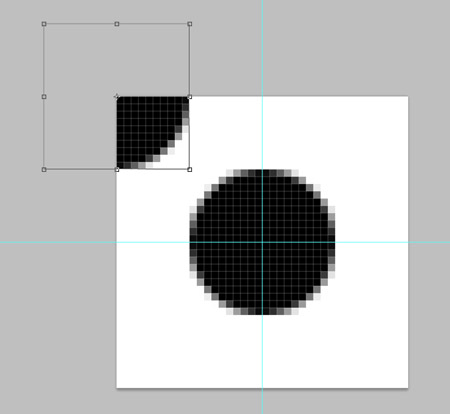
Make three more copies and move each one to the remaining corners of the canvas. Then go to Edit > Define Pattern.
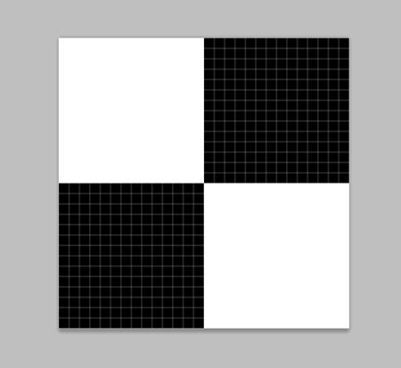
Create a new document, but this time draw two black squares that take up a quarter of the canvas. Define this graphic as a pattern.
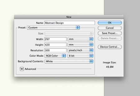
Let’s get to work on the overall piece of artwork. Create a new document at your desired artwork size. I’m creating an A3 poster at 300dpi.
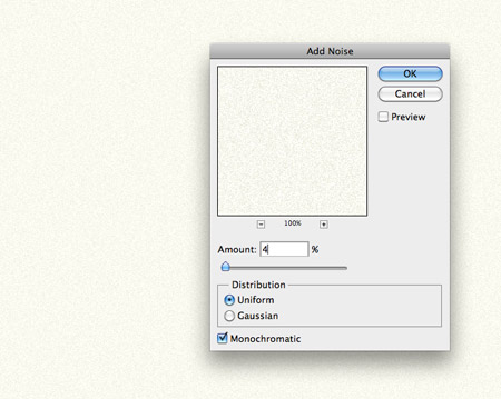
Fill the background with a light colour swatch, then go to Filter > Noise > Add Noise to rough up the clean canvas with some texture.
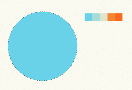
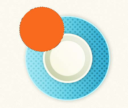
Import a suitable colour palette, this particular one is sourced from ColourLovers. Draw your first circle on the canvas and fill with one of your colour swatches.
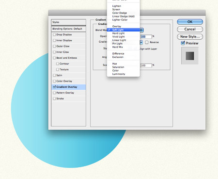
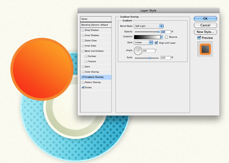
Double click the circle’s layer in the Layer Palette to access the layer style options. Add a Gradient Overlay, leave the default black to white fill, but change the blending mode to Soft Light. This will allow the black and white to interact with the underlying colour to give lighter and darker tones.
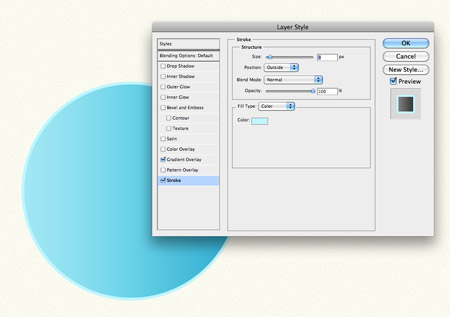
Add a Stroke to the circle, using a lighter blue colour picked from the canvas. Keep the position to the outside, but adjust the size according to your personal preference.
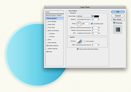
Next, add a subtle Drop Shadow. Adjust the Distance to zero, but increase the Size until the shadow spans beyond the stroke. Tune down the Opacity to maintain a subtle shading effect.
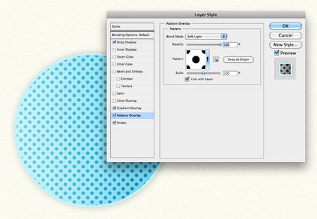
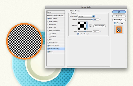
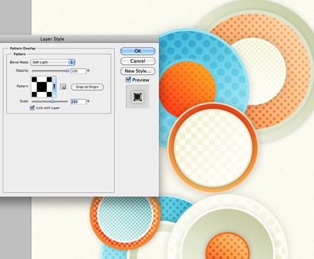
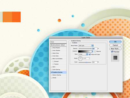
Add some detail to the shape by giving it a Pattern Overlay. Choose one of your pattern swatches from the drop down menu and change the blend mode to Soft Light.
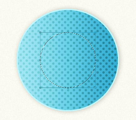
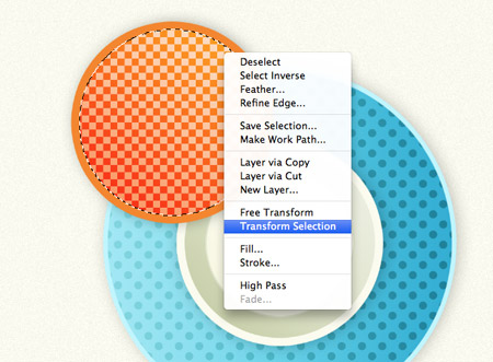
Hold CMD/CTRL while clicking on the layer thumbnail of the circle to load the selection, then with the Marquee Tool selected, right click and choose Transform Selection. Scale down the selection while holding Alt and Shift.
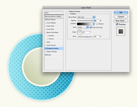
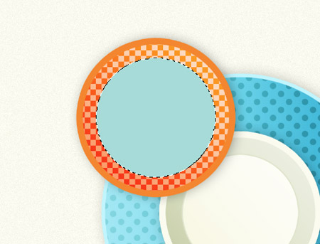
Give this smaller circle a fill using one of the other swatches from the colour palette, then continue to add the various layer styles, including Gradient Overlay, Stroke and Drop Shadow.
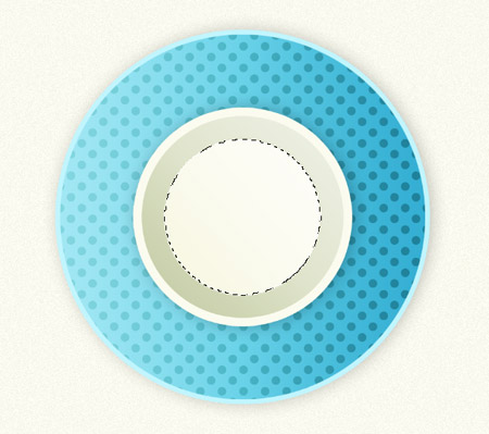
Load the selection of this smaller circle, then scale down the selection even more. Fill this circle with another colour swatch and add the layer styles.
Group the collection of circles together, then start work on the next. Use a contrasting colour from the palette to fill a new circular selection.
Add the Gradient Overlay, Stroke and Drop Shadow to the circle to give that illusion of depth and dimension. Randomly change the direction of the gradient fills between circles so each one runs in a different direction.
Instead of a circular pattern, this time add the square repeating fill.
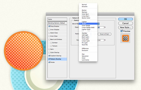
Change the blending mode to Screen to allow the orange tones to interact with the pattern. Adjust the opacity to tone down any harsh contrast.
Load the selection of this new circle from the layers palette, then right click and Transform Selection.
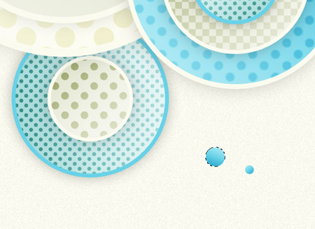
A light blue is used on the smaller circle, then the range of layer styles are added to mix up the design with various details and patterns.
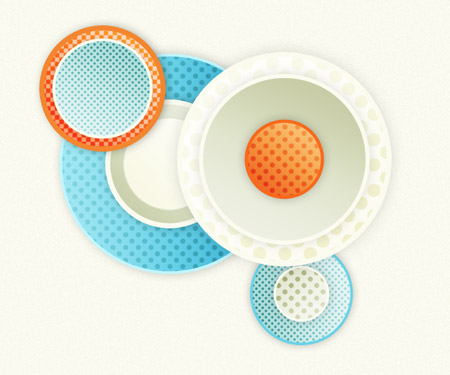
Continue the step by step process of drawing circles, filling and adding layer styles until the design begins to take shape. Overlap groups of circles of varying sizes to fill out the canvas.
Although we’re only using two pattern fills, you can mix up the appearance by adjusting the scale of the fill to give a larger pattern effect, or a tighter and more detailed smaller pattern.
Lots of circles later and design is beginning to develop multiple layers. Overlap the groups so each circle masks and hides another for more visual interest.
Draw a few basic circles of various sizes and fill them with the blue swatch along with the gradient fill.
Scatter a few orange circles across the design and give the same gradient fill. These smaller particles help add yet more detail to the design.
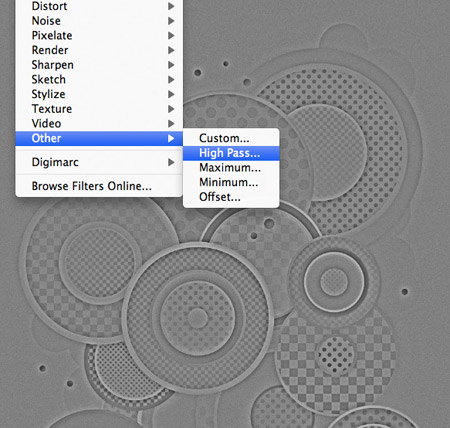
Select all (CMD+A), then press CMD+Shift+C to Copy Merged. Paste this clipping onto a layer at the very top of the layer palette, then go to Filter > Other > High Pass. Adjust the slider so the details become visible from the grey noise.
Change this grey layer to Color Burn at 35% to allow the High Pass highlights to interact with the original colours of the design, giving much more vibrancy. Add a layer mask and erase out random sections with a soft brush to give the design variances in tone and colour.
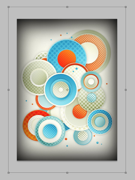
A good old vignette will finish off the design nicely. Draw a frame with a soft black brush, then scale it up so the soft edges just creep onto the canvas. Change the blending mode to Multiply at 15%.
Finally, grab the Elliptical Marquee tool and draw some circular selections on a layer at the bottom of the layer stack. Keep the Shift key held to continuously add to the selection.
Fill the selection with a swatch from the colour palette, then use the Dodge and Burn tools to lighten and darken the shapes. Reduce the opacity to around 50%.
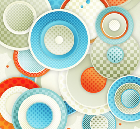
The final design is simply made up of basic circles, with nothing more than gradients, shadows and pattern fills, but together they combine to create a cool looking abstract piece of artwork.
it very simple tuts….. nice
Can all this be done in illustrator so that the pattern is totally scaleable?
Good article.
I can’t see why not. Although the shadows might slow down Illustrator quite a bit as old AI renders them as ‘raster effects’
So fresh!!!
Nice work Mr Spooner.
Very nice !
really beautiful and helping me to create my twitter background. thanks for sharing
Really Nice and very useful tutorial
Great tutorial, very helpful, thanks for putting together.
Great tut as always Chris. Simple techniques creating an impressive final outcome.
wow, amazing results from such a simple concept and easy to follow too. great job… thank you or this, looking forward to the next one.
Very clean, fresh and easy tutorial … as always, Chris! Thanks for sharing.
Very helpful tutorial. Once again you make things easy! thanks again for the great tuts.
great design and very well written tutorial,
keep up the good work chris!
always a fan :)
Great Tutorial Again,
All your tut’s have been very useful for my uni work.
Thanks a lot!
Bravo !!
http://www.viviencormier.fr/le-blog/
Lovely tutorial Chris as always. Wonderful design and easy to follow instructions.
Love the effect. Thanks for sharing!
This is so awesome! This is my favorite place to play when my freelance work is done. :)
Amanda
Awesome tut Crhis thanks!
Always like this, simple, clear but great. Really thanks Chris. Just knowing that defining new pattern is the same as new brush, never care about it before :lol:
Another great tutorial, Chris! I always love the abstract designs you come up with – the color palette is beautiful and the overall composition when completed is always fantastic. Thanks again for sharing!
Great one. I really like the patterns, I think I’m going to use it to my band’s posters as well. Thanks.
i really love this tutorial! i’m going to try this when i get home later. thanks so much! ^_^
Very nice!
rly great tut =) i tried it at work ;P and the result looks amazing ;) Thanks a bunch for all your awesome tutorials!!!!
This is a great tutorial. I’ve just finished creating a background using the same effects.
Great post
I’m just starting out with the whole graphics world, so this is really a great article on how to make patterns in photoshop! I’ll be following this tonight for sure! It looks great by the way… It’s so simple, yet so complex at the same time! I love it!
Great little article, lots of fun tricks. I have been playing with the new paint tools in CS5, good start but isn’t Fractal_Painter…YET:)
In a country where be a graphic designer could be hard and impossible, your tutorials always hep me to be the ONE int all the sea of graphics designers, i always thank you to take the time and patience to make this possible. Come to Perú sometime, your inspiration will regenarate.
Pretty Stuff!
Chris you’re da man!
thank you so much for the kind efforts of bringing us these great tuts…cant wait for the next one to come
: )
excellent,please advise me I want to be a graphic designer , I think I ve little talent .
Great one. I really like the patterns, I think I’m going to use it to my band’s posters as well. Thanks.
will be saving this one and using it over the summer for a photoshop class I teach to high school kids. Very nice!
woooow
your king ^^
thanX man
simple, clean, nice…tut
wow wow.. very nice and easy to follow tutorial. thanks buddy!
Awesome simple abstract tutorial. Really nice work
Wow… very nice tutorial. Exceptionally well written… Thanks
Can you make the same tutorial but for illustrator? Thanks!
How do you import a color palette from colour lovers or any other place? is it .aco or .ase?
really nice tutorial, thanks
Circe
It looks really nice i like the pattern and the colors too!
nice designs and good use of colours.
Im new to this site I’ve read most articles on this site and very impressed. I could learn from this site.
Abstract design is very hard for in graphics.
But they are wonderful!
Thanks you again for all..
AWESOME!!!!!!