This post was originally published in 2009
The tips and techniques explained may be outdated.
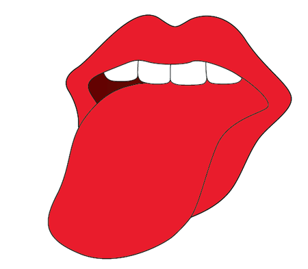
The bright red Rolling Stones tongue and lips logo is a graphic design icon, and has been a pop culture fav for years! I don’t think you can beat it, so we’ll not create a direct copy of the original in this tut. Instead, let’s take a look at drawing our own Stones inspired tongue graphic, starting with a quick pencil sketch and finishing with a vector based graphic in Adobe Illustrator.

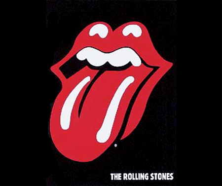
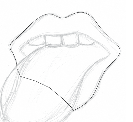
Start work with pencil and paper, use the original Rolling Stones logo as inspiration and follow the rough lines and shapes to produce a similar drawing.
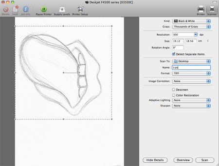
Warm up your scanner and digitise your sketch. Save the scan to your desktop.
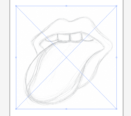
Open up Adobe Illustrator and go to File > Place. Position the sketch on the artboard, lower the transparency then press CMD+2 to lock the item in place.
Begin tracing each element of the sketch with the Pen tool. Use just a black stroke to visualise the paths on screen. Aim to use large Bezier curves to maintain a smooth outline without any harsh angles. When the path moves onto a different element, such as the tongue, simply close the path with a few rough lines. Once the tongue shape is filled with colour, this rough line won’t be seen.
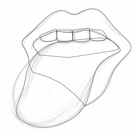
Trace around the outlines of every other element to give separate shapes for the lips, tongue, mouth opening and each tooth.
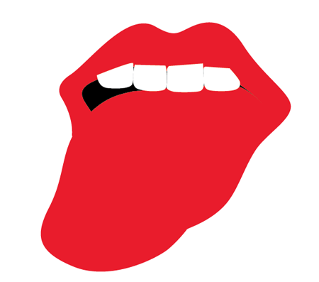
Fill each shape with a relevant colour, so use red for the lips and tongue, black for the mouth opening and white for the teeth.
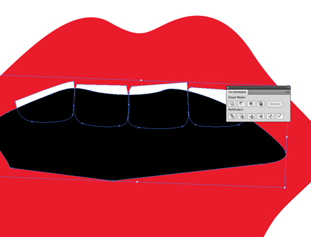
Notice how the teeth use rough outlines on the upper edges? These will need cropping down to fit under the lips. Duplicate the mouth opening shape, and press CMD+Shift+] to send it to the top. Group all the teeth together then use the Intersect Shape Area option from the Pathfinder palette to trim the teeth to size.
Select all the objects and add a black stroke. The original doesn’t make use of outlines, but we’re going a style of our own!
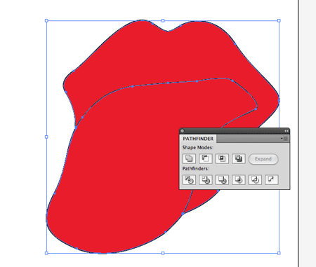
Duplicate the lips and tongue and send them to the top of the stack using the CMD+Shift+] shortcut. Use the Add to Shape Area option from the Pathfinder palette to merge them together.
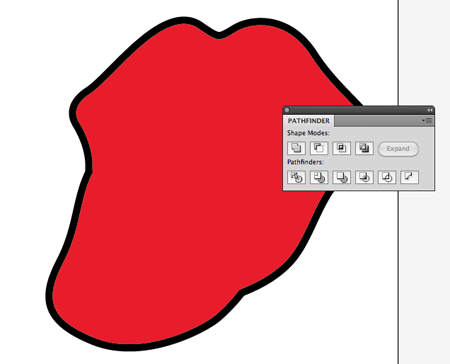
Next, add a large black 11pt stroke to the shape. Align the stroke to the outside using the tiny icons in the Stroke palette. Press CMD+Shift+[ to send the shape back to the bottom of the stack.
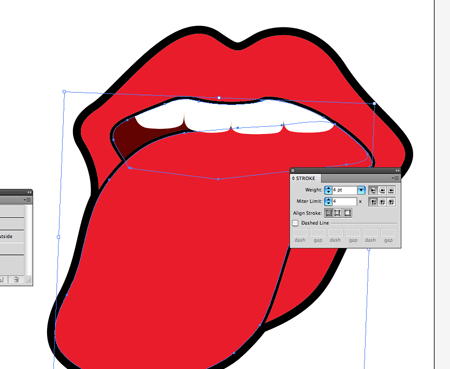
Select the tongue and mouth graphics and increase their stroke size to 6pt. Also align these to the outside.
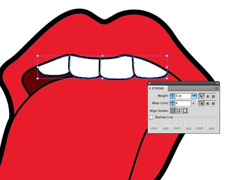
Then, select all the teeth graphics and increase the stoke to 3pt. This variation of stroke weights is a popular technique in Illustration.
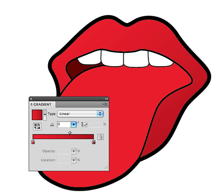
Begin creating a variation of tone by adding a Linear Gradient across the lips, select a bright red and a slightly darker red swatch.
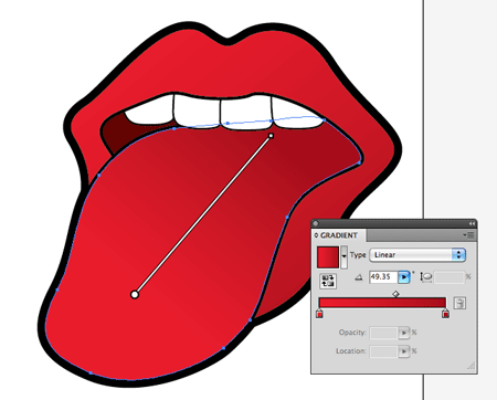
Add the same gradient fill to the tongue, adjust the direction to flow diagonally across the tongue, ranging from the shadows inside the mouth to the lighter tip.
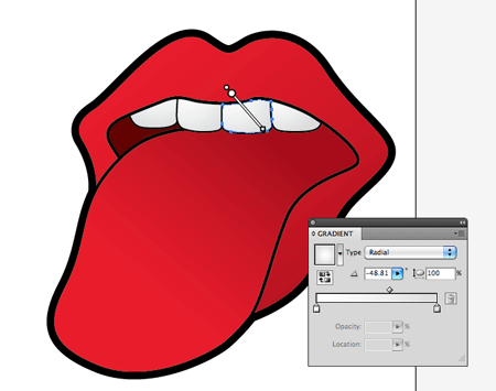
Add a subtle white to grey gradient on each tooth. A radial gradient works well to give a rounded appearance.
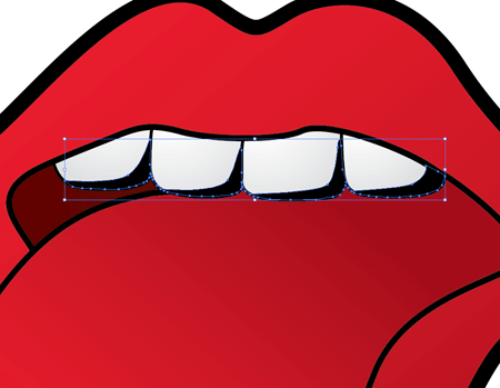
Grab the pen tool and draw the outlines of some shading on the teeth. Pay close attention to the smooth curves across the teeth, then roughly complete the path while keeping within the black stroke line.
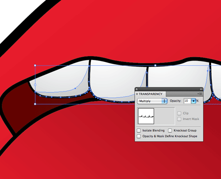
Change the blending mode of the black shading to Multiply and drop the opacity right down to 10%.
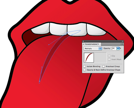
Next use the Pen tool to draw a shape representing the centre line of the tongue. Fill this with a dark red, change the blending mode to Multiply and adjust to 45% transparency. Use the shortcut CMD+[ repeatedly to alter the stacking order so that it sits below the teeth.
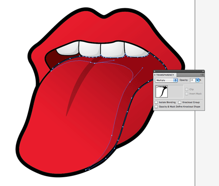
Continue with the Pen tool and draw a large area of shading around the inside of the mouth and down the underside of the tongue. Follow the contour of the tongue when near the centre line to give the impression of a shaped surface. Once again, fill with black, switch to Multiply and drop to 10% transparency.
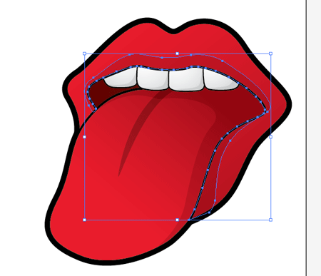
Add some final shading to the lips, following the underside of the top lip and creating a shadow from the tongue. Remember with all shading to pay attention to the visible lines across the graphics, but quickly close out the paths by roughly clicking within the black stroke lines.
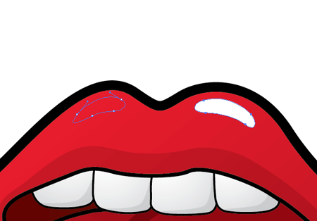
On the top lip, draw a couple of round highlights with the Pen tool. Fill with white and scale into place.
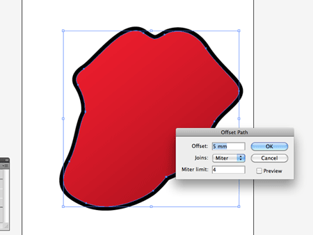
Select the whole outline shape and duplicate. Send the copy to the top and clear out the stroke. Go to Object > Path > Offset Path and enter 5mm in the options.
With the new expanded shape selected, add a white fill and subtle grey outline. Send this object to the bottom of the stack (CMD+Shift+[).
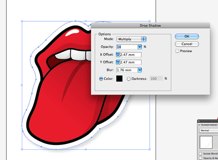
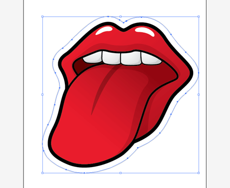
Add a finishing touch by generating a Drop Shadow on the white outline. Go to Effect > Stylize > Drop Shadow. Alter the opacity to 14% and click Ok.
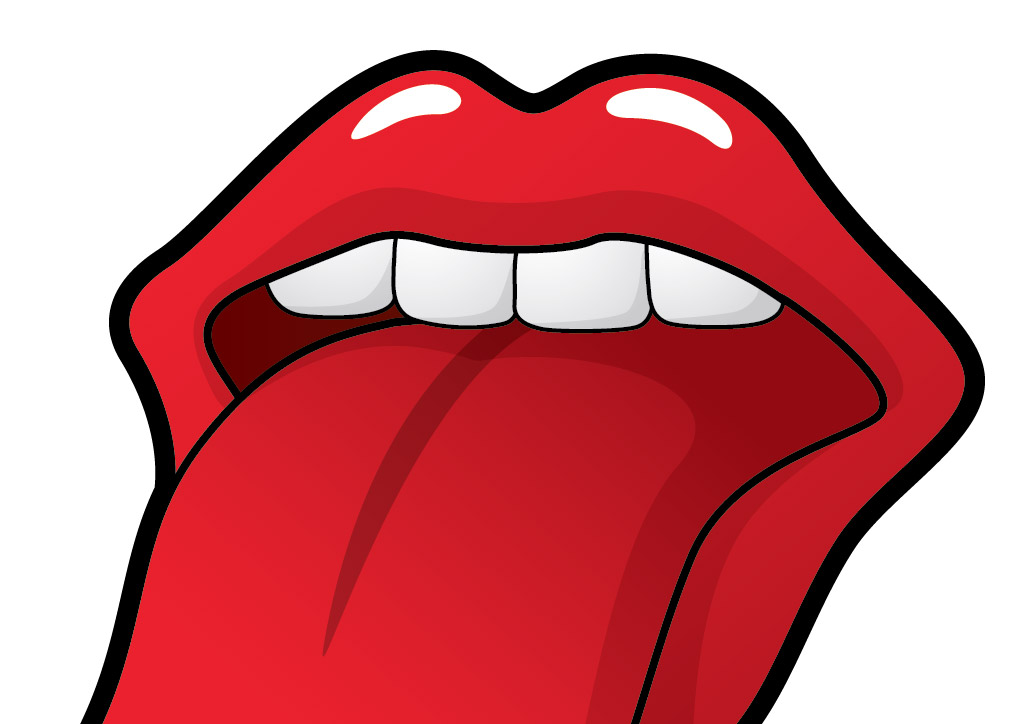
The final graphic has plenty of impact and depth with the varied outline widths, the gradient fills and the shadows and highlights. All techniques that can also be used on any illustration project, whether it’s an icon, a character or a recreation of a famous rock band’s logo!

Nice tutorial.
Wow, great tutorial! Ur, blog is my favorite)
WoW!! AMAZING Chris!! [-_-]
This is incredible Chris! You’ve done well to adapt such an iconic image yet make it look so artistic and fresh! I can see this on a grungy/artistic website design (copyright permitting).
As always: Brilliant tut! Thanks for sharing.
Good job Chris. I really like the final look. It’s so clean. The lines are sharp and crisp.
yummy!
Great tutorial, and a lot of fun. Thanks.
This one is definitely better! They’re both cartoonish but the rolling stones one is more exaggerated..love the subtle details of this!
Hey that was a really nice post… I work in a website designing company and have quite a good knowledge of Adobe Illustrator and I appreciate the post a lot…
Awesome tutorial! Wouldnt mind giving this a go just to say i did it!! :D
Why? It’s been done before. Next are you going to do an apple?
You know what, I actually prefer that tongue compared to the original Stones one! Well done it looks great.
Nice and simple, I like it.
anybody know how to save as a JPG or PNG from Inkscape?
Wow that’s Awesome! Thanks Chris
Wow!
So cute! ^^
It seems like a tongue in a mouth XD
Good job! ;)
Great tutorial Chris. Outcome looks amazing!
It`s a great tut! Nice job!
Cool ! What a tutorial you have created keep it up it will help to all of designer,Thanks again.
OMG! You are spilling the beans!
You are like a magician revealing his secrets.
Oh well…
Great tutorial Chris. Outcome looks amazing!
Sweet! Wish I had a dollar for every time I drew the Stones logo as a kid!
Nice image, simple and easy to follow
l like this, and want to create same one, just been bookmarked now.
Love it, really fun to make, refining and refining the easy skills and tacking on the difficult ones.
i thought i was the symbol for starburst candy.
Look at madmediamonkey.com
It’s cool.
like it