This post was originally published in 2010
The tips and techniques explained may be outdated.
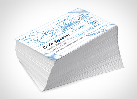
There’s nothing more unique to your creative talent than a series of your own doodles and sketches. Let’s use the good old doodle to represent our design services by combining quick and fun doodles with a print ready business card design. We’ll be drawing our doodles directly in Illustrator, and using the application’s print abilities to set up our business card document with the correct margins and bleed to build a complete print-ready PDF document.
The design we’ll be building calls upon some random ideas for the topic of your doodles. How about a stick-man battle or a cow abducting UFO for the focal point of your business card?
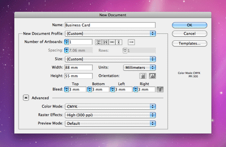
Start work by opening up Adobe Illustrator. Version CS4 took a step forward with its ability to easily create print documents, with new In-Design esque features for setting up bleed automatically. The business card size I’m familiar with is 88x55mm, but this may vary depending on your printer of choice. Enter 3mm into the Bleed options to allow Illustrator to set up your document. Also remember to ensure you’re using the CMYK colour mode for print. It’s also worth noting that folks from the USA will more than likely want to switch to the more common metrics of inches, as opposed to Millimeters.
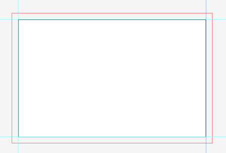
Illustrator has kindly positioned a red guide to let you know where your bleed boundaries are, as well as the black outline showing where the final card boundaries will be. You’ll also want to add your own ‘safe margin’, so that none of the important elements of your design appear too close to the edge. Drag four guides onto the artboard and line them up with the document boundaries.
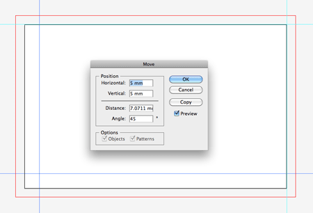
Right click and unlock the guides. Select the left and bottom guides and hit enter. Input 5mm into the Horizontal and Vertical options then press OK. This will move the guides 5mm into the document, leaving a margin to work towards.
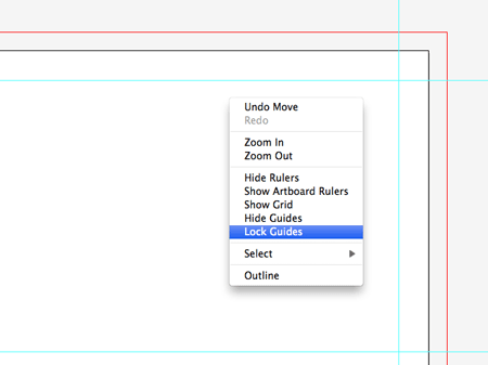
Repeat the process for the top and right guides, but this time enter -5mm so they are moved negatively. Right click and lock the guides to avoid accidentally adjusting them
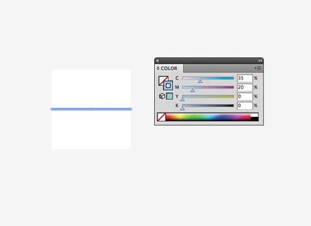
A typical background you might find behind a doodle would be the ruled pattern from a notepad. We’ll recreate that pattern recreate a similar lined background to our business card. Draw a square with a white fill, then select the upper most edge with the Direct Selection tool. Press CMD+C to copy and CMD+F to paste in place, then move the path downwards towards the center of the square. Add a blue stroke at 0.5pt with the colour c35,m20,y0,k0.
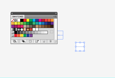
Select the two objects and group together, then drag them into the swatches palette to create a new pattern swatch. This swatch will repeat when it’s added as a fill.
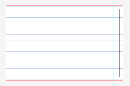
Draw a rectangle onto the artboard and align it exactly with the bleed margins. Add the pattern swatch as its fill colour.
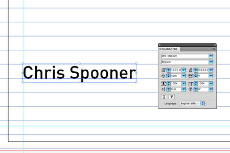
No business card would be complete without contact details, so we’ll add these first. Type out your name in your favourite font (mine is DIN). Align the text up with both the ruled background pattern and the left guide that identifies the safe-area.
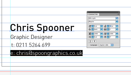
Finish off entering your contact details and adjust the line-height to match the height of the ruled lines. You might want to use a variation of type sizes, but remember to avoid point sizes less than 6 to maintain legibility on the printed card.
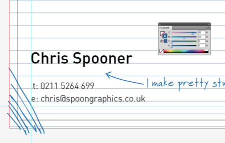
Now let’s get creative and decorate this boring business card! Use the Paintbrush tool and select a small round brush from the Brushes palette. Choose a typical ink-like colour such as c45,m35,y0,k0 for the stroke colour and begin doodling on your card design. Make sure any sketch lines that extend beyond the edges of the card also span across the bleed area.
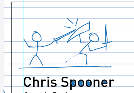
There are no rules when it comes to doodling. Draw whatever comes to mind, for me it was a stick-man battle scene.
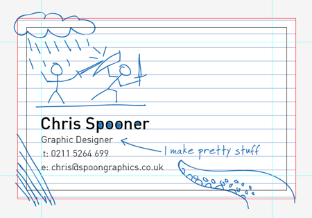
Don’t worry if your lines aren’t overly accurate, it’s only a quick and fun doodle after all. Just remember to extend your lines beyond the bleed edges.
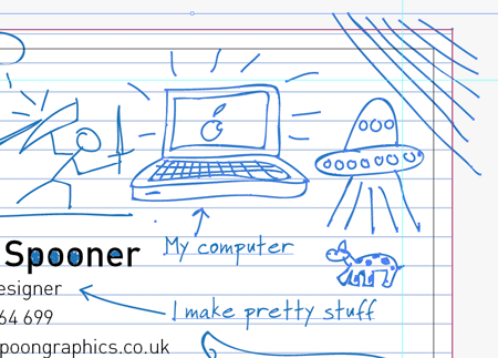
Fill up any empty space with a random doodle, soon you’ll be left with the coolest business card design on the planet.
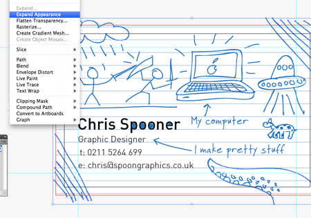
Press CMD+A to select all your objects, then go to Object > Expand Appearance. This will convert all those strokes into solid shapes.
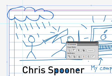
Draw a temporary rectangle that fits into the bleed area. Leave the rectangle without a fill or stroke. Select all the doodle lines that extend beyond the edges of the bleed area along with the temporary rectangle. Click the Crop option from within the Pathfinder palette.
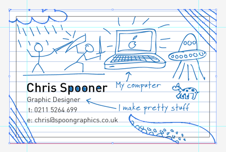
All the elements should now have been clipped down to size and fit neatly within the business card bleed dimensions.
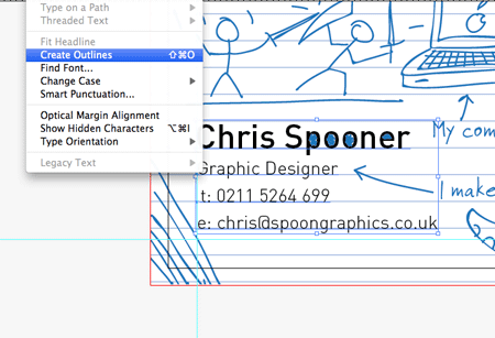
Select all your text elements then go to Type > Create Outlines. Just like the Expand Appearance menu converted strokes to shapes, Create Outlines converts text to solid shapes, this will prevent any font related issues with your print file.
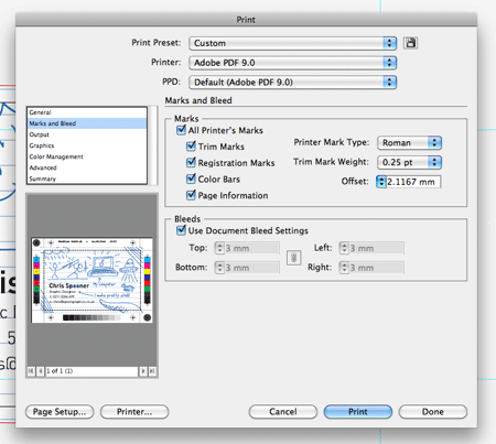
Go to File > Print to bring up the print options. Select Adobe PDF from the Print drop down, select Custom for the Media Size, then select the Marks and Bleed option and add all printer’s marks.
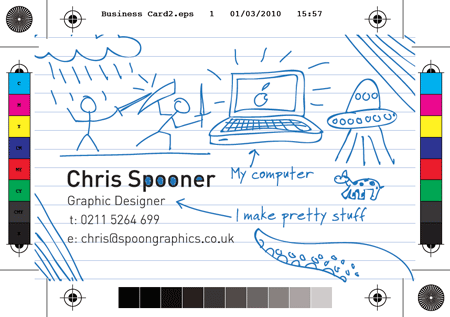
Illustrator will then export a print ready PDF file that’s ready to send off to your printer of choice.
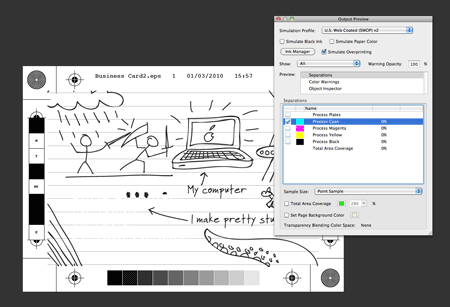
Before sending off your file, you might want to double check your ink coverage and number of plates your design will use. In Adobe Acrobat Pro, go to Advanced > Print Production > Output Preview. In the following options panel you can toggle each of the CMYK plates to ensure your colours have exported as expected. Your text and linework will look their best with just one or two colour plates being used. The more plates a colour swatch uses, the higher the risk of mis-registration and blurred lines. In the screenshot notice how all the doodles use the Cyan plate, but the text is invisible, this is because the text only uses the Black (K) plate.
A few days later your freshly printed cards will be in your hands and you’ll be the coolest designer on the planet.



Brilliant. I am curious in the brush settings. I have been trying to make use of my Bamboo Fun and somehow I do not end up making perfect illustrations or doodles ( it is not a flaw in my drawing since I am good at sketching and drawing). Too less precision and breaks! Is this something of the device or some setting in Illustrator?
If you double click either the brush or pencil tools in Illustrator there’s some options that may help.
I also use a Bamboo Fun, it’s a great entry level tablet but it only has half the sensitivity of say the Intuos 3.
It seems so easy… Really nice
really nice! I doodle a lot but never thought of putting on my business card!
Great simple tutorial Chris, bookmarked for future round-ups! :)
Awesome tutorial Chris.
Keep up the great work.
BTW SpoonGraphics was featured on Creativeoverflow for 30 Blogs you have to Subscribe to.
Cheers mate
Thanks for the feature!
Pretty cool, I like doodle-styled stuff. Thanks for tut!
Yh it looks really good. Keep it up.
woW! Never knew about positioning guides so easy. Great tut, ‘m gonna try now. :)
You can basically treat guides as you would a normal object, it’s great!
Also try creating a rectangle or circle, then right clicking and selecting Make Guides – Another a handy trick.
I simply loved this tutorial, being a web designer I have rather little experience with the proper preparation of a design for print.
This tutorial featured a lot of essential information.
Haha, great tutorial, thanks! Really simple and easy to understand. :)
Awesome cards :) I really like your doodle style Chris! :)
Excellent !! :-)
LOL. Very creative!
Alternatively, you could print out the white card with the details and notepad lines then doodle each one individually when you give them to people.
Great tutorial. I’ve bookmarked it for future use. I really like the use of the doodles in a business card.
that’s so simple and easy to like! i follow your blog closely Chris! good work.
Great wee tutorial Chris, I was actually going to make business cars with a similar theme, so this helps me a little.
Definitely one to refer back to in the future!!
thanks dude!
:)
Creative tutorial…….
That’s a great post. It definitely would be an unique look that most people haven’t seen. I would be curious to see a potential clients reaction to such a card.
Thanks for the great post.
Great tut Chris – Thanks :)
Great post! I really enjoyed your business carda!
Thanks!
Neat little tutorial – so simply too! thanks
So fun!
I really like it.
Oh, these are super sweet! I like how you colored in the “pooe” part of your name hahaha..something so simple yet incredibly creative!
I was wondering, can we get a more extended version of the whole printing processes? I dont think I’ve ever come across anything like it
That’s superfun! It reminds me of this web comic: http://bit.ly/azjILd
Hi! I’m a developer and not a designer so I’ve got a couple of questions:
* Why do you need bleed from the printer marks, what are the dotted circles (top-left & bottom-right), and what are the four cross hairs used for? I can guess the grey lines are for cutting the cards after printing.
* Aren’t multiple copies of business cards printed on a single sheet before being cut out? Does Illustrator help with creating multiple copies per sheet?
* How can the doodle strokes be made to appear realistic? Draw them with a brush and they look too crude and unnatural. Draw them with a pen tool and the ends seem too perfect to be realistic. Should blur be used for doodles?
Nitin,
I’m a designer and not a developer, so I hope I can answer your questions in an understandable way. :)
• The reason for bleeding your artwork beyond the crop marks is to allow room for error (in this case, paper shifting) when the cards are being cut. The cross hairs and circles are used by the press operators as targets to make sure that their color passes are in registration.
• Business cards are indeed run in multiples, but in many cases the printing company will “gang” your cards with the cards of other customers, and so only need one copy. If you’re using a local printer who is running yours alone, ask how many “up” they’ll be run, on what size sheet, and with how much bleed. You can then use the Duplicate function to meet those specs.
• I have the same question. My best success has been to doodle “analog” style and then scan my drawings in.
Great responses by Wink.
The only question left is the realism of the doodles. Other than doodling old-school style on paper and scanning in the results, maybe play around with the pressure settings if you have a Wacom tablet?
I love how business cards have taken a creative turn. Even though the example was for a designer, which made sense to have a fun card, these days you see creative cards in every industry. Good tutorial.
You’re always so great at creating characters in Illustrator. Awesome job!
Very cool! So different from any business cards I have seen :)
Wow wow wow….simplicity rocks…i love this…thanks Chris
Very funny chris. =) Keep work!
Thx
simple but ingenious!
Great Tutorial Chris!! I like sketches ;)
A really great tutorial again Chris. Really inspired me to try and make my own set of cards! Not sure how I could doodle for SEO but I will certainly try ;)
Great tutorial Chris!
I am curious as to how you created the *pile of cards* graphic or did you get them printed then take a photo.
Was just going to ask the same question :)
This is an awesome tutorial. Definitely one that I am going to save for future reference. I love the hand drawn style, no matter what it’s on – websites, business cards, tshirts, ect. So this is right up my ally :)
Excellent job…
Great tutorial!
Another great tutorial from Mr Spooner!
I thought it would be worth mentioning though for everyone just to check with their printer before adding all the crop and registration marks.
I’m in Australia and every printer i have ever worked with absolutely HATE it when designers add every mark under the sun onto their artwork.
Most modern computerised print workflow systems add the marks themselves, so it just adds time when the prepress have to remove them all.
Great tutorial, thanks. First I came in here looking for the Driving tuition business card tutorial you did a while back, and behold! a fresh, new business card tutorial!
Thanks for making such things as margin, bleed, etc. a breeze to understand.
Hahah, this is awesome. I’ve been trying to read more design blogs lately so I can learn how to put some personality into my design (I play it safe way too much.) Your blog is oozing with your personality, and I love it!
But you know Mac doesn’t have “My Computer” :P
Great tutorial, the pre pres tips were especially helpful and I like the way your doodle business card design came out!
Chris, super!
Simple and original business card.
Respect.
Thank you for the tutorial.
Lovely!.. :)
Awesome ideas! This is actually a cool design if you are bit tired of looking at the old fashioned business card. It brings a whole new life and it is fun to look at.
Thanks for the tutorial by the way.
It´s super nice man, i think u r a super creative guy, keep on sharing.
xcellent and fun stuff, BTW
very funny & i wanted to know more about you ;-) i saw your business card at http://www.frauhaselmayer.com!
Thanks soisses, I found Something inspired via your link.:-)
nice design, keep up the good work!
Very creative & fun idea!
Awesome work Chris. Very original…I love it!
awesome tuts
Nice article! Just got my bussinescards in the mail last week.. In all of my wisdom, I decided to handdraw on all of them.. A fun but long process.
Check them out, If you like!
http://pixelkaiju.tumblr.com/post/445738700
http://pixelkaiju.tumblr.com/post/450878898
Awsome card and and a very good tutorial. Thanks for the Intuos tip !
It is quite creative although the rectangle shape is a bit too conventional and limiting. Another tutorial perhaps with custom shapes? I think that will suit the nature of your doodle business card.
Coolest idea! I love it! Thank you so much for sharing this tutorial. I’ll design one for my pastries..doodle style! =)
I am a very beginner designer and I’m wondering how you make your sketches so detailed and smooth looking. I can’t do it using the mouse. Is there any alternatives to make it easier to make these sketches?
Great idea, very usefull :)
You really are the coolest designer on the planet :-) great idea!
Nice men !
Muy Buen TutoriaL
If I knew as much as you do about designing I could do so much. The business card looks great!
You actually do pretty stuff :)