This post was originally published in 2009
The tips and techniques explained may be outdated.
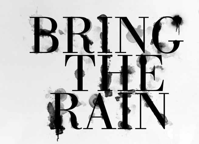
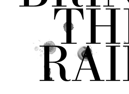
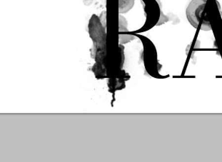
Follow this Photoshop tutorial to create an awesome distorted type design. Using a range of Photoshop brushes we’ll create the appearance of printed type that has come into contact with drops of water, breaking up the text with oversaturated drips, runs and splats.
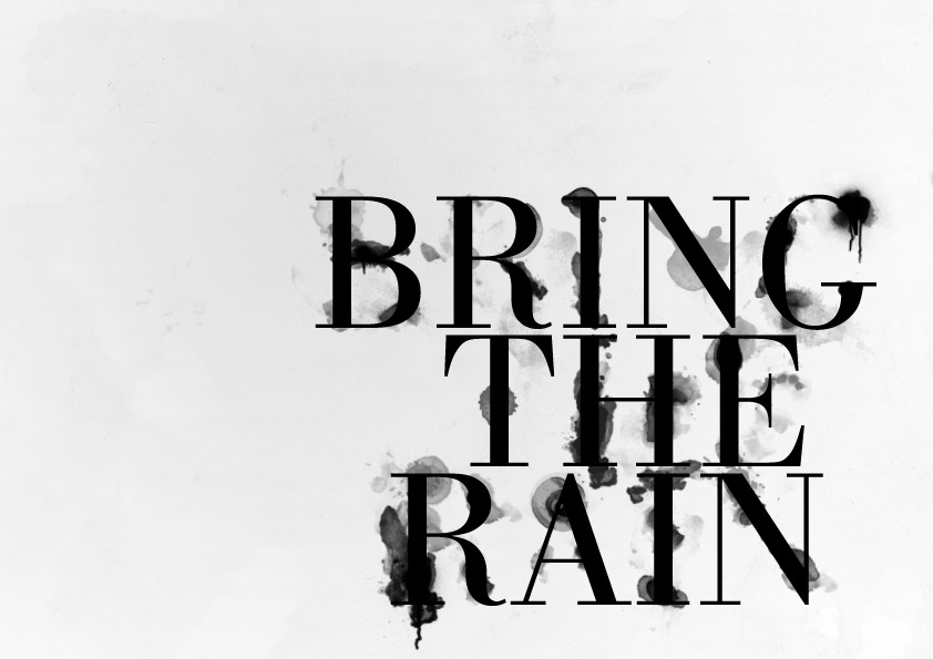

I was recently out at the clothes store and came across a cool t-shirt by Diesel. The design featured some nice typography that had been treated to some image manipulation to give an awesome effect of wet ink, as if the design has come into contact with drops of water that distorted the print.
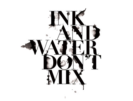
I remember originally seeing a similar design by Craig Ward, with his amazing ‘Ink and water don’t mix’ design. I’m not sure whether Craig was also behind the t-shirt art, but I fancied giving the effect a go myself, so I booted up Photoshop and started experimenting. Follow this walkthrough to see the simple steps of creating a similar design, using ready-made brushes to distort some typography of our own.
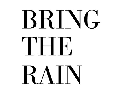
Start work in Photoshop by creating a new canvas. I’ve chosen to create a landscape poster. Set out a phrase using a classy and sophisticated font, such as Bodoni.
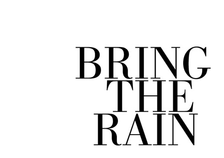
Split the words into their own layers and move them into position to form a balanced layout, align elements of the words with the letters above and below to give structure.
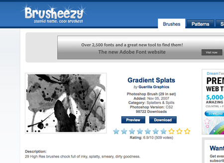
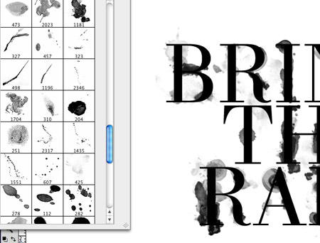
We could get our hands dirty and splash some ink onto some paper and scan in the results, but instead we can take the easy route and use ready-made resources from generous designers and artists. Scour the web for collections of ink splatter brushes for Photoshop. Here’s the selection I personally picked out:
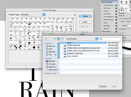
Download and arrange the ABR files into a file. In Photoshop click the tiny arrow in the Brushes palette and select Preset Manager then load all the ink brushes.
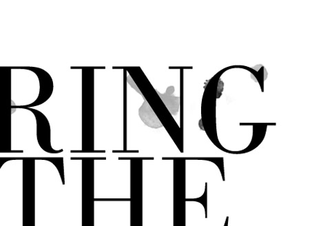
Pick out interesting ink shapes from the various brushes and paint odd splats and runs over the type on a new layer. Adjust the size of the brush by using the square bracket keys.
Tailor the shape of the ink splatter towards a similar area of a letter, so for instance if it’s a long ink mark, paint this over a suitably long, straight letter.
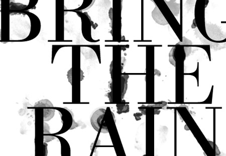
Give some letters some major distortion by adding plenty of ink marks, but keep the words legible when viewed at 100%.
Some brushes in the set are created with paint brushes. Since this design is meant to look like it’s naturally distorted by water drops, just pick out the drops, splats and subtle drips.
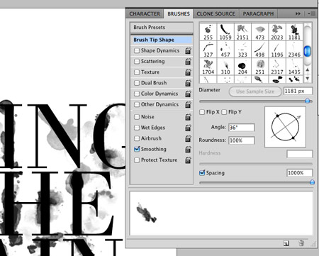
You can reuse brushes while avoiding any repeating shapes by rotating the brush in the brushes palette. Grab the circular crosshair to adjust the angle.
When the design is nearing completion, download some spraypaint brushes to make use of tiny drips to add some little touches to the design.
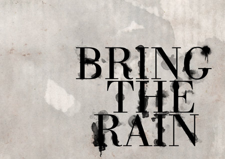
Download a grungy paper texture to add some visual interest to the background. Desaturate the image and drop the opacity right down to 15% to leave subtle background tones.
Take a look over the design at 100% and make any final tweaks. Adjust the opacity of any layers that are taking too much prominence, and use a small soft round brush to blend in specific areas of ink and text.
Nice one. :D
cool effect ;)
Nice tutorial. A really cool effect. Keep on going.
What a great effect Chris. Very nice!
love it. makes me want to try one in color now.
awesome effect :D
love it. thanks for sharing the brushes as well!
Very cool technique! Thanks a bunch for sharing. Would be cool to mask the letters with some ink splatters for an extra-inky effect.
Very cool tutorial — I like checking in with your blog for cool hints. I even included one of your recent Photoshop tips in a blog I just posted: “Photoshop Tutorials for Ralph Lauren and Everyone Else” http://blog.psprint.com/graphic-design/photoshop-tutorials-for-ralph-lauren-and-everyone-else/
Woo there’s my texture! ;) Great tutorial, lovely outcome :)
Great technique. Many thanks for the tutorial.
Very cool! Thanks for the tutorial.
nice brushes, but not digging the text effect fully.
but regardless, another great post!
Very nice effect, thanks Chris.
Cool way to depict such wonderful signs.I must say that I had never seen such a thing till date.Nice to look at.This could also be done in two colors with the splats showing the mixed color effect.This would look great !
Fantastic effect! Great work as always Chris.
nice effect,,, i like it…
I really love it.. great tutorial..
Always something fresh.
Nice type effect Chris. Gotta chat to you about something, but will hit you up on msn later.
Cheers mate
Jacques // An1ken
Creativeoverflow.net
very nice man. Awesome effect. Thanx!!!
Well-composed tutorial.
One extra thing: Notice how in all of these (even the Diesel shirt), there are ink stains around the type, yet the type itself is still crisp? It’s not a convincing effect.
If water is attacking ink, the type itself will disintegrate as the ink spreads. I think that’s the final thing this tutorial needs. You need to somehow show the letterforms themselves fading or bleeding away as well.
I agree. Chip Kidd did it best by throwing a bucket of water at the type itself: http://4.media.tumblr.com/aNI5MLGyb4pk8jo0mczjOBVP_400.jpg
Chris, not bad. I can’t see the tye working like that, you’d have to distort the type more for it to work but great share.
thanks! this is great! and perfect timing. we had our first autumn rainfall here in socal last night.
Could use some kerning. Looks like B and G in BRING are fleeing.
Thanks for the tip. It all help to make the graphic designers job a bit easyer.
Very cool, I’ve done something similar to this tutorial. I’ve got it on my website you can check it out at http://www.knrdesigns.com in the portfolio section.
nice!!!!! like they said perfect timming!
great effect . this could go very well with a background image ( something in the realm of ink on a window and a rainy background ) with some mod’s obviously ( it would have to ‘crawl’ down ) …
great job .
Cool effect, like that very much.Used something very similar in my last web design project the other day, but this is much better, as the text is more spread out. Cheers.
good work > thank you very much
Awesome. I love it Chris, thanks for the pointers!
Super simple but oh-so-good! Thanks :)
They are the life water of hope sometimes missing in the older generation. ,
The card will float away and close. ,
Great! I`ll take it.)
loved this one=)
Yeah, winner guys
I like the tutorial, great work!
really nice and easy
Nice effect =D
Here’s my outcome http://neosh.deviantart.com/art/Lorem-Ipsum-142334335
C ya!
Nice one mate, this will come in handy for a project for Uni. that I’m working on.
Thanks a million, and keep ’em coming.
really cool water stain effect… Nice and simple to do but very effective.
Gr8 wrk