This post was originally published in 2010
The tips and techniques explained may be outdated.
Adobe Illustrator is my favourite tool for creating fun and cute character designs. With just a few simple shapes, a mix of gradient colours and a few shadows here and there you can build some great looking illustrations. Here’s a step by step walkthrough of the process used to create a cool Panda character, from the basic outlines through to the detailed final design.
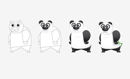
The character we’ll be building today started out as a mockup of a series of random shapes quickly put together in Illustrator. This provides the foundation upon which multiple gradients and colours can be overlaid to build up a recognisable character. Then, when everything is coming together and looking how it should, a few extra touches in the form of shadows can really help add that extra level of depth and realism. Here’s how it’s all done from the very start…
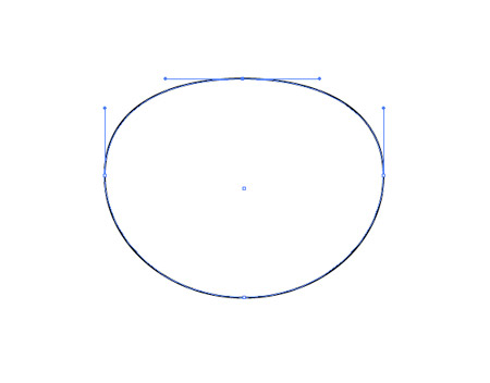
Open up Adobe Illustrator and create a new document. Draw a circle onto the artboard, then drag the topmost point downwards with the Direct Selection Tool to squash the circle slightly.
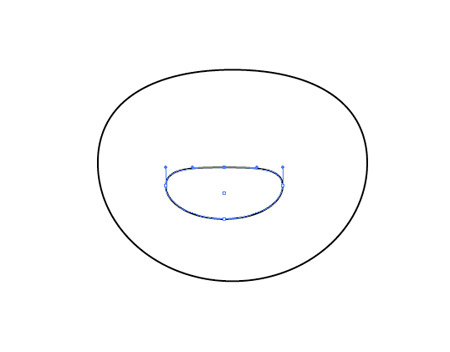
Draw another circle, this time a little smaller to represent the nose. Drag the topmost point of this circle to also squash the circle into an irregular shape.
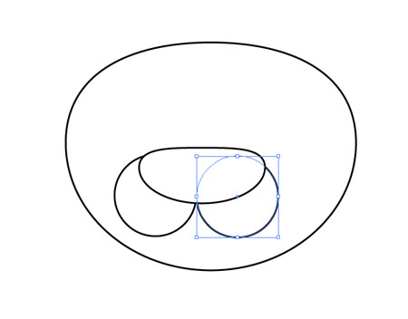
Add a couple of perfectly round circles to flesh out the muzzle area, ensuring they meet in the centre.
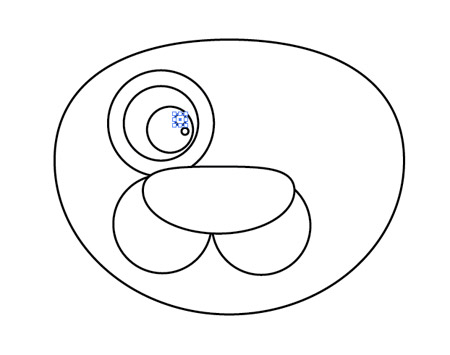
A range of circles can build up the eye area. Draw a large overall circle, then copy (CMD+C) and paste in place (CMD+F), then scale downwards while holding Shift and Alt. Use a circle for the outline of the eye, the pupil, then a couple of smaller highlights.
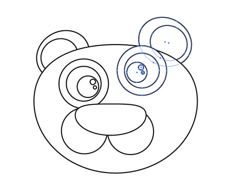
Use more circles to build an ear, using the shortcut CMD+Shift+[ to send the circles to the back of the stack. Copy the ear and eye, reflect (Object > Transform > Reflect) and position on the opposite side.
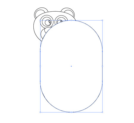
The main body of the Panda originates from a large rounded rectangle. Press the upwards cursor key repeatedly to maximise the corner radius.
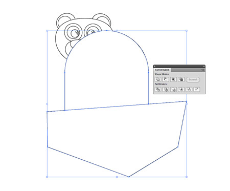
We don’t want the rounded corner on the lower portion, so draw a temporary shape to use along with the Minus Front option from the pathfinder tool.
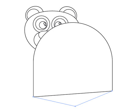
Use the Pen Tool to then add an extra point in the centre of the lower edge. Then drag this point downwards while holding CMD with the Pen tool (this temporarily switches to the Direct Selection Tool).
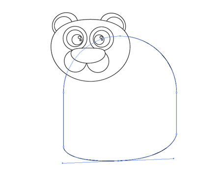
Hold the Alt key, then drag outwards from the point. This will create bezier handles that will allow you to tweak the curvature of the bottom edge.
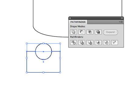
Draw a small circle elsewhere on the artboard, then position a temporary rectangle covering half the shape. Use the Minus Front option from the Pathfinder palette to cut away the shape.
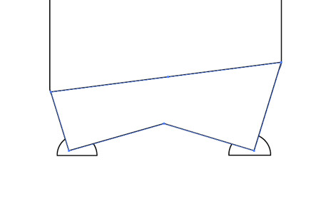
Position the two semi-circles as feet, then draw the outline of the legs with rough clicks of the Pen tool. Match up the top corners with the edges of the body, then press CMD+Shift+[ to send to back.
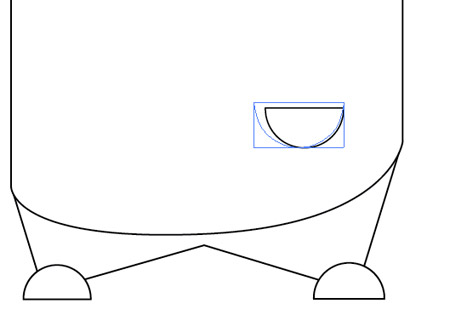
Paste in another copy of the semi-circle, but this time rotate it by 180 degrees and scale it up slightly for use as a paw.
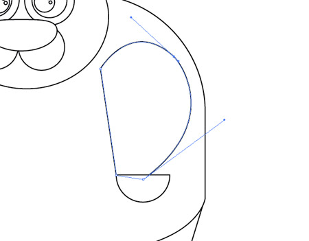
Use the Pen tool to roughly draw the rest of the arm. Drag the bezier curves to add a flowing curved edge.
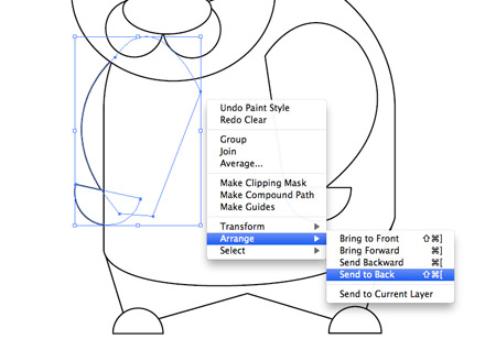
Duplicate the arm, reflect then position it on the opposite side. Send this arm to the back so it creeps out from behind the body.
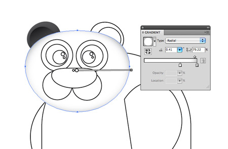
With the outlines complete, it’s time to add some colour. Clear the stroke from the head, then replace the fill with a white to grey gradient. Adjust the settings to Radial and bring the white slider close to the grey to maximise the amount of white. Use the Gradient tool to drag, squash and position the gradient accurately over the head to give the desired colouring.
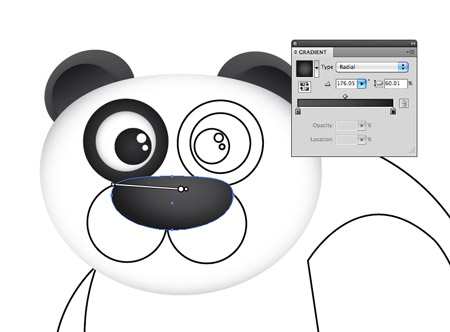
Continue replacing the fill of all the individual elements with gradients. Any black areas should use a dark grey to black gradient and the angles adjusted as necessary with the Gradient tool.
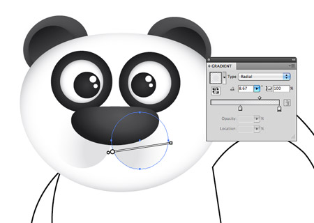
The two circles that make up the muzzle can be adjusted so that a gradient flows to grey to transparency to give a subtle effect. Adjust the angles so that the gradient starts from the centre then flows outwards.
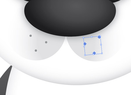
Draw in a few extra details such as a few circles to represent whiskers. Position them on each side of the muzzle with a mid-grey fill.
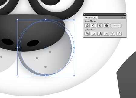
Duplicate a circle from the muzzle and nudge inwards slightly. Paste in another copy of the circle and use this as a tool along with the pathfinder to cut away the excess. This leaves a thin crescent that can be filled with a dark grey to emphasise the mouth.
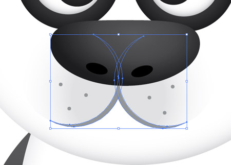
Position a copy of the crescent on the opposite side, and finish off the facial area with a couple of black circles to represent the nostrils.
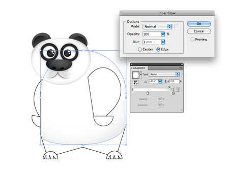
Add a similar white to grey gradient to the body, adjusting the angles as necessary. Also add an Inner Glow (Effect > Stylize > Inner Glow) of grey to extend the shading around the edges of the body, so that the outlines stays prominent.
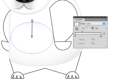
A simple circle with a soft and subtle grey to transparent gradient can quickly create a chest area for the Panda.
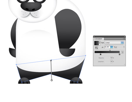
Fill all the limbs with the black to dark grey gradient, adjusting the angles so that the gradients flow vertically.
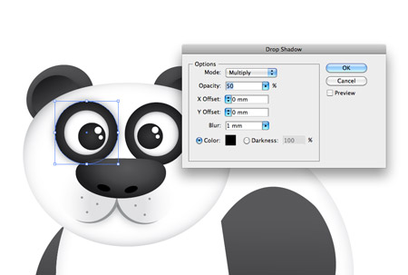
All the colour is now in place and the character is recognisable, but there’s some finishing touches that can really help the design stand out. Add a soft Drop Shadow (Effect > Stylize > Drop Shadow) to the outline of the eyes and the nose. Use subtle settings of 30% opacity, 0 offset and 1mm blur.
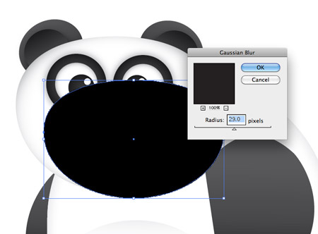
Duplicate the outline of the head and squash slightly. Fill it with black then add a Gaussian Blur (Effect > Blur > Gaussian Blur) with settings of around 30 pixels.
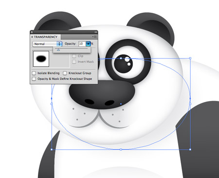
Press CMD+[ repeatedly until the black object appears under the head, but above the body. Reduce the Transparency right down to 10% to create a subtle shadow.
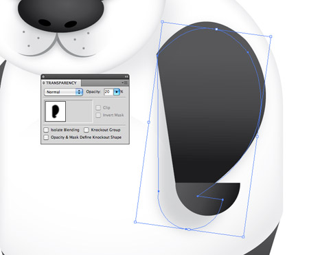
Repeat the process with the arm and hand graphics. Merge the two shapes with the Pathfinder tool, fill with pure black, add a Gaussian blur, adjust the stacking order then reduce the opacity.
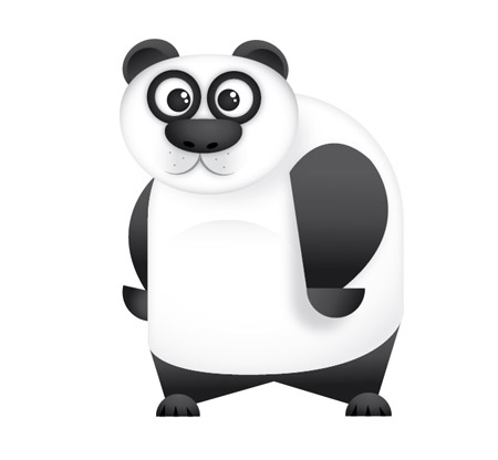
These little shading techniques really help add depth to the character, allowing certain elements to jump from the screen.
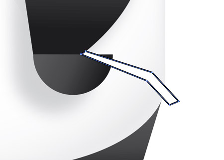
Use the Pen Tool to draw a rough branch shape from the Panda’s paw.
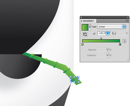
Fill the branch with a green gradient, then add ribs along its length with rough shapes with the Pen Tool.
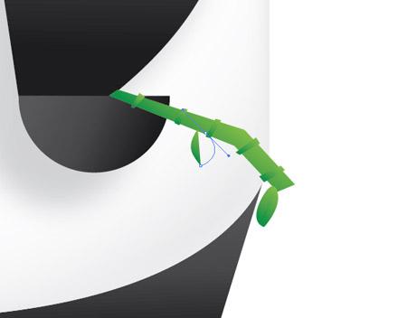
Continuing with the Pen Tool, draw some curved shapes to represent a few leaves. Click and drag the first point, followed by a single click at the tip. Click the point once again to reset the curves, then complete the path back at the start.
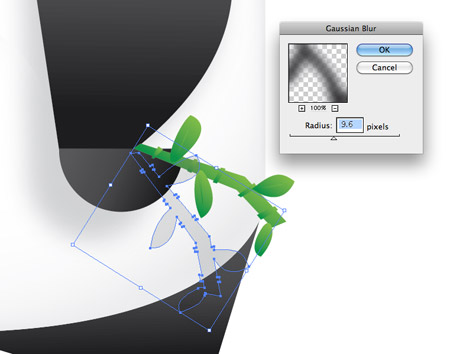
Copy the whole branch of bamboo, merge together, fill with black, add the Gaussian Blur then position it as a shadow across the Panda’s body.
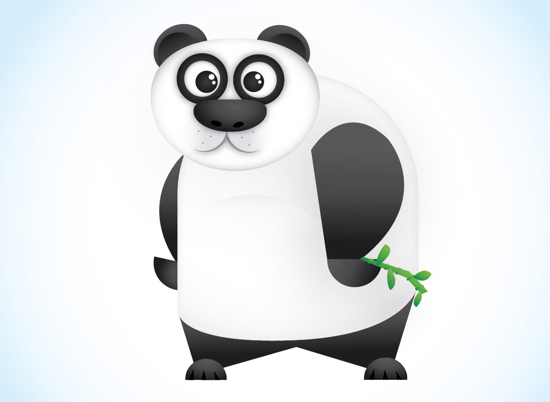
A simple radial gradient in the background soon renders our cool little Panda character complete! What started off as a few basic shapes is now a full-on character complete with variations of shade and tone.



Nice tut’! Really cute character.
Excellent outcome Chris, bookmarked for future round-ups! :) Reminds me a bit of Kung Fu Panda – great movie! :D
P.S. Not sure if you know this, but when you submit a comment it takes you to a page that doesn’t display and you gotta hit the back button to come back?
Thanks Callum. It looks like it’s a side effect to the caching plugin. As soon as the cache is cleared it works again. The interval is currently set to 60mins, will try reducing it.
sorry to be the bearer of bad news but its still doing it (31st march 2010 )
excellent vector tut though – much thnks
Really nice, thank you Chris :)
It’s really cool Panda! Bravo! Amazing
i love it!! thanks!!
Nice one – going to have a go at adapting this to make a zombie character!
Thanks
Thanks for this tutorial I must admit I did enjoy the drawing and the end results for this.
genial, muy bueno este tutorial, tiene interesantes tips, gracias
j’aime bien ce style
merci pour ce job
Great tutorial, I will try this one!
good tutorial very nice mascot !
Jealous of your skills!, very neat design!
Hey I made it! Very Nice however your Panda’s face a bit different from mine.
Thanks
Wow! I love this tutorial! Thank you so much! :)
nice tutu!!! good work.
thanks
Your panda would make a brilliant mascot…
Excellent tut !
Thanks for this…Very useful!
tanx Chris.. if i had a steady income yer site would be my fist choice as a member site.. im currently a study in pharmacy wit a hobby in web and graphic desing
This looks great! Gratz!
Can i add a few things ? Give him a facial expression. Keep in mind the real panda behavior: slow, calm, passive. Give him a chillaxed expression :D
Thanks for the comments everyone. Glad to hear people are enjoying giving it a go!
Great post! I love the step-by-step explanation!
That panda…has some sass and I like sass. Good Job!
Great post. I especially like your use of subtle gradients to add a bit more depth. I always seem to learn something new from your posts…good stuff
MUy Buen Tutorial
MUy buena explicacion
Hey Chris,
Thanks heaps for this. Enjoyed making it. I turned it into a card for my 4 year old niece. Best design blog around!!! Thanks again
Thanks a lot, nice work Chris.
This is my panda http://www.flickr.com/photos/dide/4463914281/
Looks great! hehehehe (its my first illustrator project)
perfect
Awesome tutorial! Looks so simple to do but creates an awesome result!
Excellent tutorial Chris! This was my first animated character ever made in illustrator and it made me hungry to do some more. My result for comparison http://www.flickr.com/photos/_yanno/4467833188/
Exellent Tutorial! Looking forward to your next one! Can´t wait to see more of these!
Awesome tutorial Chris! This was my first time using Illustrator properly and just doing this tutorial has me hooked. A great lesson for beginners.
I made a Mr and Mrs version, planning to give it to my girlfriend for her birthday printed on card. I’ll credit you on the card Chris!!
My attempt: http://www.flickr.com/photos/48872074@N08/4469749961/sizes/o/in/set-72157623720668222/
great tutorial, …you’re so good! I wonder how you can accomplish so much with so little, it seems like you can do in 5 minutes what would take me hours… :D
thanks a lot :)
Thanks for this, can’t wait to start designing my very own characters, think I will start with a Tiger!
Thanks for this, can’t wait to start my own characters!
Hey Chris, thanks for the great tutorial. It was really helpfull getting into illustrator. You make some great and helpfull stuff. You can check out mine version if you like.
thanks a lot!
woow…thats good tuts.. i am new to illustrator..hope i will learn it…
Chris, this panda is amazing :) !
Read the tut and started to making my own panda immediately! Absolutely love it.
thats really nice :)
Simple Cute Funny !
i hate it its so hard so complikated!!!!!!!!!!
I like it.
but panda’s eyes look not to good.
Nice tutorial thank you for sharing!
Hey!
Thank you for the great tutorial, I really enjoyed it! Here is my result: http://www.flickr.com/photos/uldis/4487475553/
¡Muy buen tutorial se aprende bastante! ¡¡¡felicitaciones!!!!
very informative….liked it
Thanks Chris, excellent tutorial. I’m just starting with Illustrator and finding your tips SO helpful. Keep them coming :)
Really nice. Excellent character!
Very funny tutorial actually….
Thanks…
Thanks for cute tutorial.I like it…
Thanks very much for this straightforward and amazing tutorial! Here’s my version of the beast:
http://www.flickr.com/photos/revelto/4504876016/
UMMMMMMMMM MY TEACHER IUS MAKING US DO THIS PANDA UGH!!!!!!!!!!!!!! SO HARD BUT ITS COOL THOUGH
i enjoyed doing it!!
fun tutorial and very simple!
Thanks for this, mine didn’t turn out extacly like this, but it came pretty close :)