The Art & Design Inspiration fix pulls together a collection of my favourite graphical images that I’ve come across over the past week to give you a fix of creative inspiration. This week we have designs from Brian Yap, Rich, Leonardo D’Aubeterre, Shebid and Jorge Lawerta.


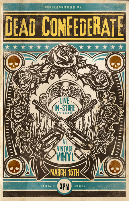
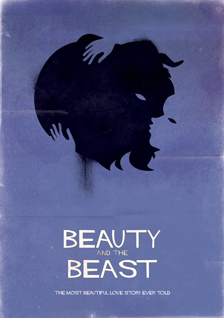

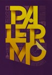
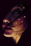

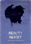

The beauty and the beast poster is awesome!
Love the BnB one!
Yeh its too cool
:)
wow!!! impressive)
I really like the effect on Buenos Aires Neighbourhoods
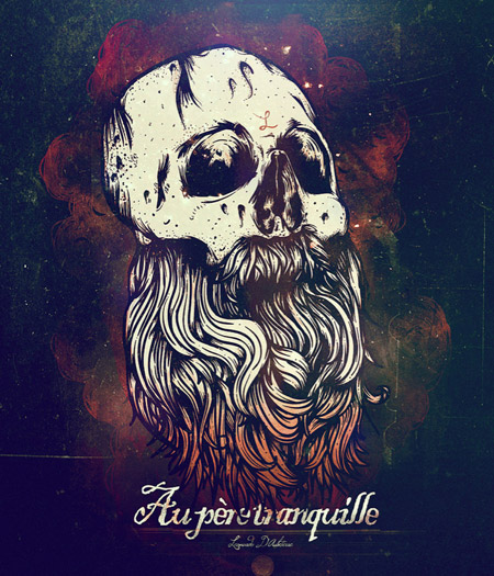
I love the Dead Confederate and Au pere tranquille posters.
Ah! Nothing beats a distressed and grunged-up dead confederate. And I really like the way the color bleeds into the beard in Au pere. Au right!
Hermosos diseños sin duda!!!! saludos
Really cool! I love how they mixed textures on the last picture and the visual impression that it’s made in 3D. :)
The Lawerta poster is the one for me as it has that subtle 3D folded paper effect. It fills the canvas and makes you interact with it as you end up turning your head this way and that to read the background text.
Beauty & the Beast reminds of the Esperanza Center logo which looks really fab.
All the logos are saying different stories surely try put these logos for upcoming projects
Buenos Aires Neighbourhoods is the simply amazing! i like it!
You completed certain fine points there. I did a search on the subject matter and found mainly people will agree with your blog.