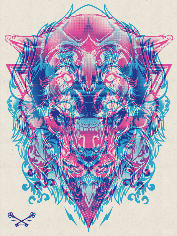
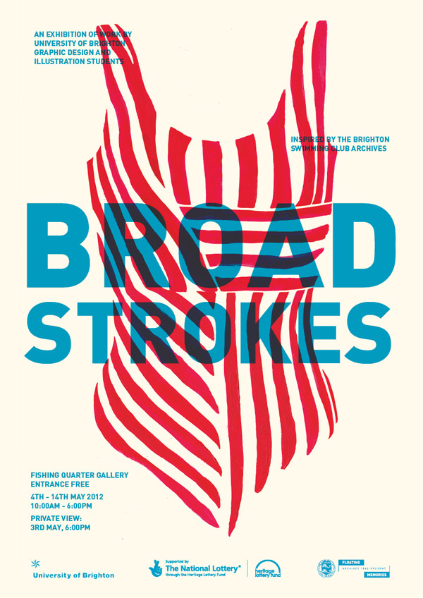
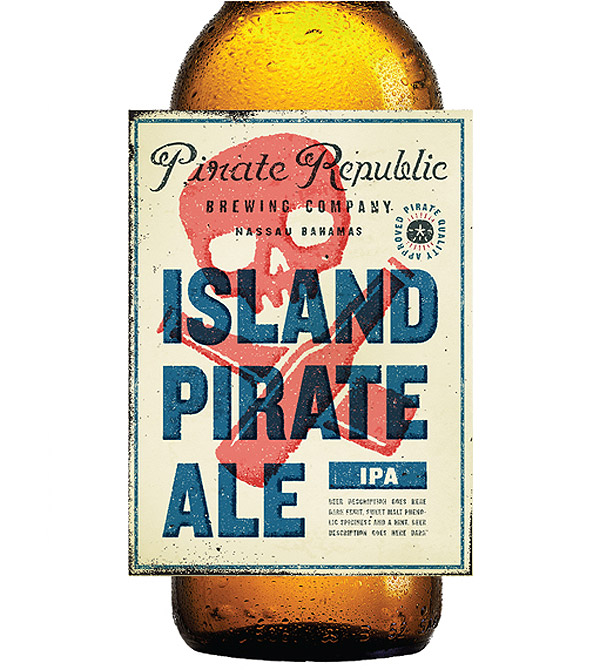
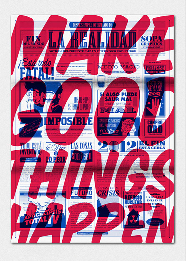
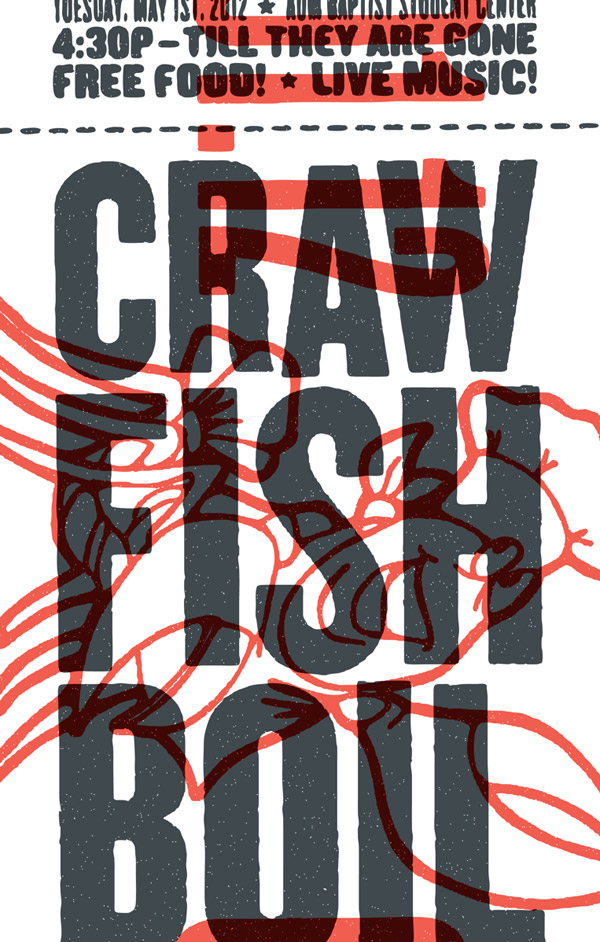
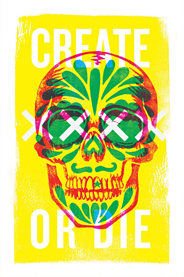
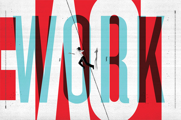
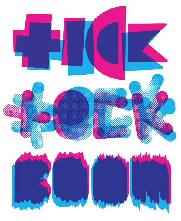
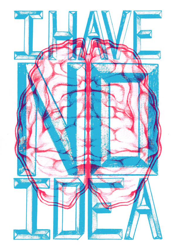
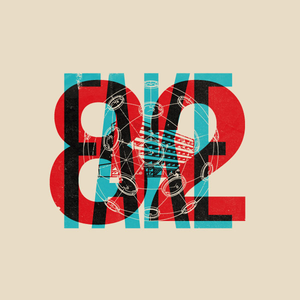
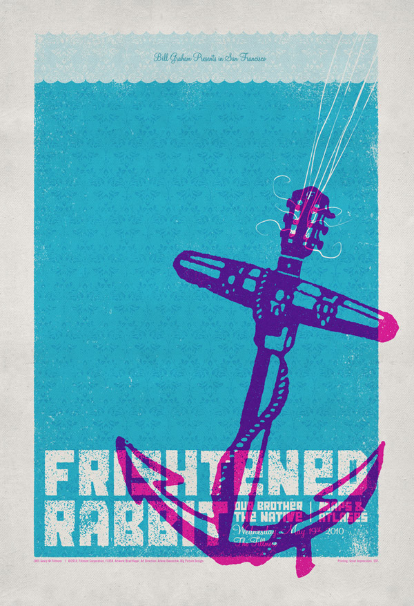
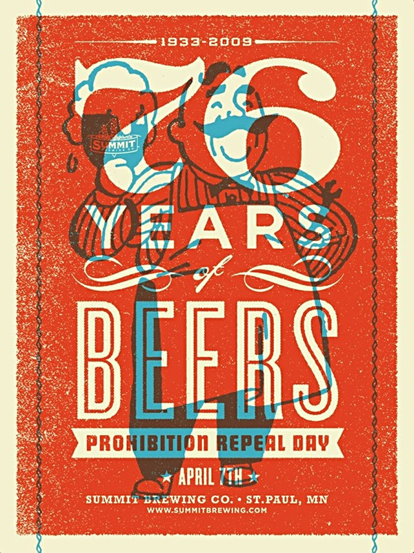
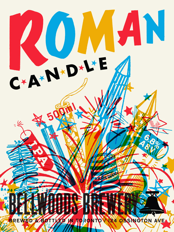
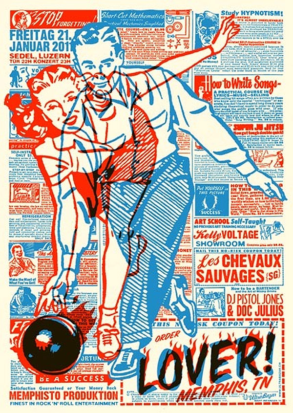
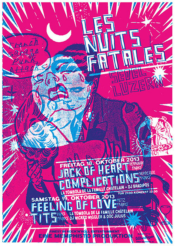
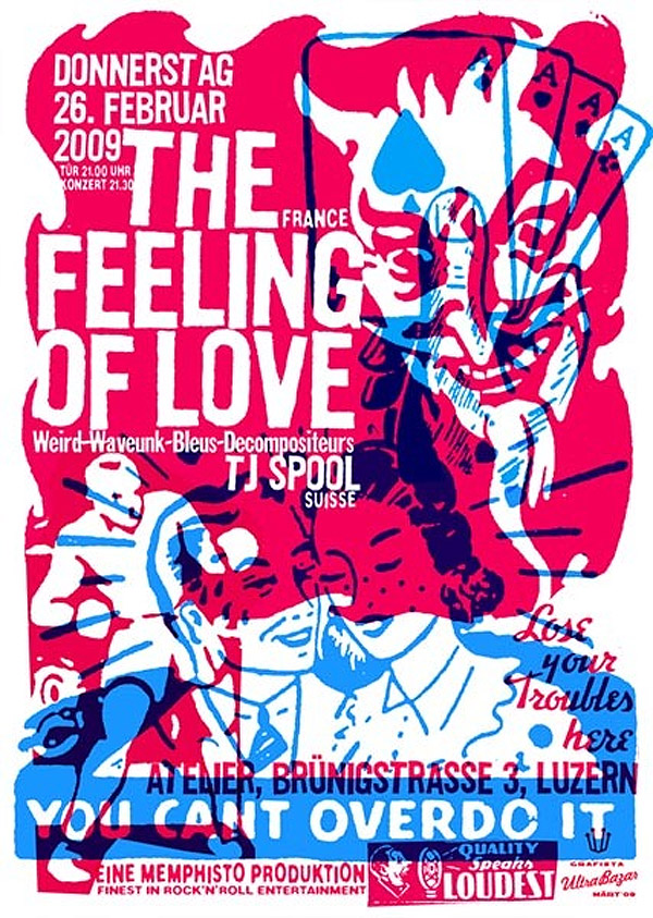
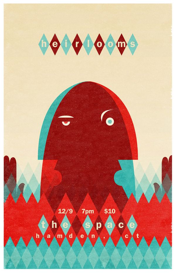
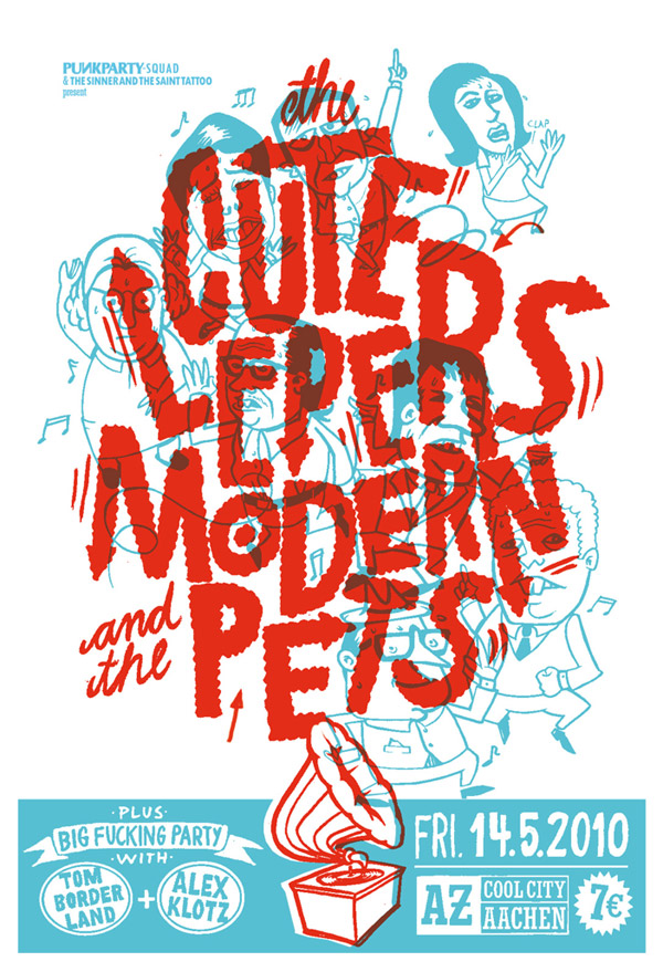
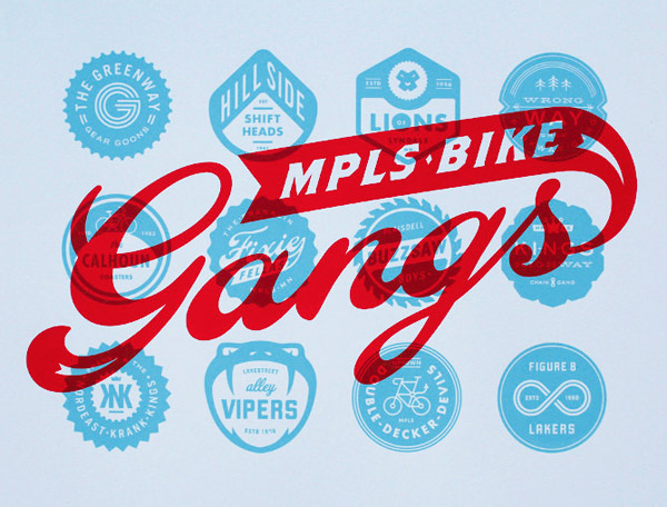
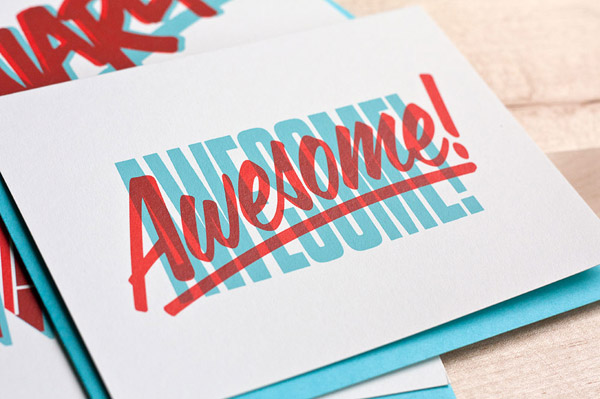
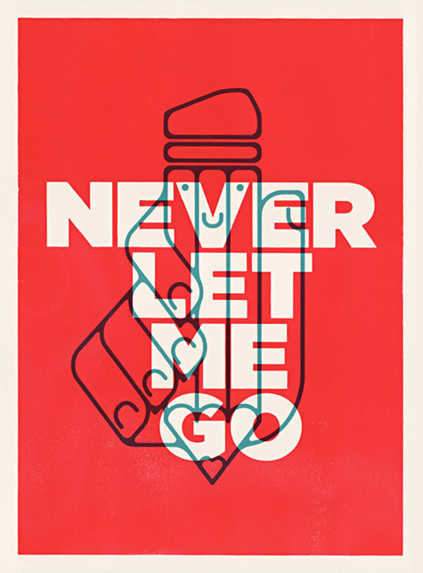
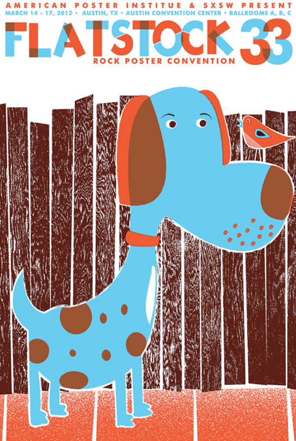
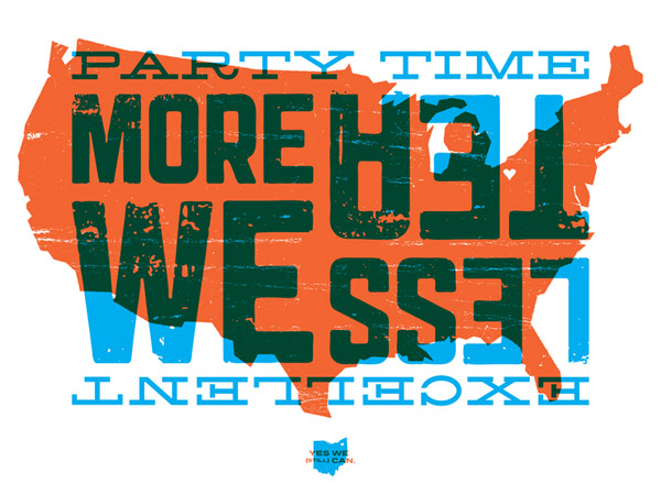
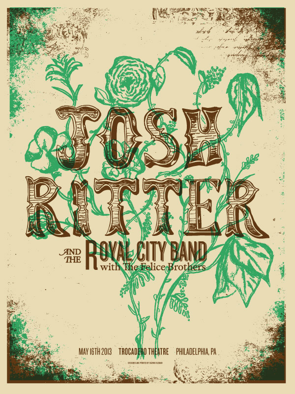
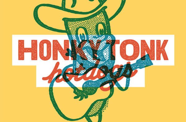
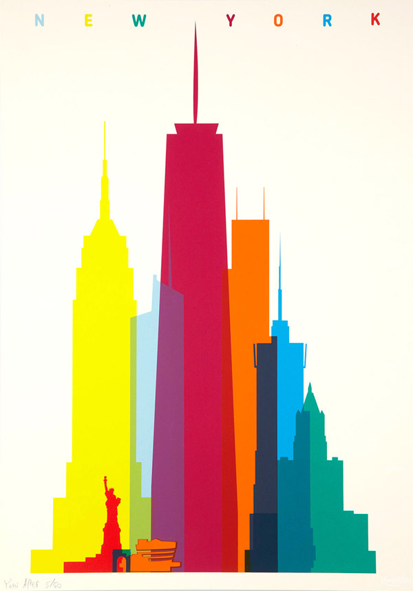
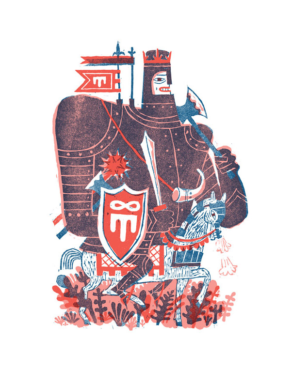
Classic printing techniques such as screen printing rely on old school techniques to mix inks to form a colourful design. One of those methods is to directly overprint two colours on top of each other as a subtractive mix to provide additional hues alongside the primary ink colours. Typically this effect is produced at the printing stage, but similar effects can be replicated digitally in Photoshop and Illustrator. This showcase features 30 fantastic designs where the classic overprint effect is prominently used, resulting in interesting blends of text and images.


So many epic designs. I really admire MARK WEAVER as a artist, he is a legend.
“Typically this effect is produced at the printing stage, but similar effects can be replicated digitally in Photoshop and Illustrator.”
Please tell me how to fake it!
The quickest and easiest way is to use the Darken or Multiply blending modes on your overlaid art.
Tanx!
A wicked collection Chris:-)
Wow! these are really great! – reminds me of my ‘old school’ days in the printing industry – old is new again :)
One thing I would like to point out is that when overlaying two halftones, it is more effective if the screening is done at different angles. ie. 45deg. for the most prominent colour and 75deg. for the other.
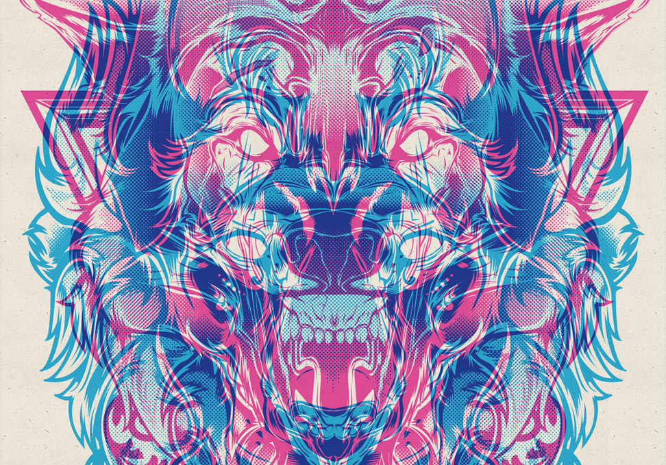
Otherwise you get ‘clashing’ (moire effect). It would be interesting to see the cyan, magenta wolf & lion with this taken into consideration.
Nevertheless, cool designs.
Cheers, Steve.
Great blog! I loved the designs you posted, they’re very simple with an edge. Thanks for sharing!
Chris, another awesome post.
I always love seeing your inspirational posts – they’re usually a bit more colorful than most blogs’ posts like this one. :)
Remember being impressed by Morning Breath when they emerged
Remember being enthused by Morning breath when they emerged. Never quite got around to exploring the how too. Your post has re ignited the interest, not sure why I didn’t try this earlier. Another trick in the bag!
Thanks Chris.
Nice article and great blog
oh man!!! this is awesome!!!
I have to say thank you Chris. I found after a time, looking for interesting design on the net, you’d always keep turning up…so I thought, “What am I doing?, I need to subscribe” ….and this, being the first email…..just makes me so glad I did. Nice one mate. Excellent stuff as always. Cheers.
Chris these are amazing designs! Your Blog is the first one that I have come across that really feeds my “I want to know MORE” hunger. I am looking forward to your future post and this has to be the most valuable subscription I have ever made!
creative work :)
Very impressive designs. Thx for sharing, I’ll keep some of those posters for future usage.
This is some amazing selection of pieces. I should do one similar to the Shape of Cities for my city, Nairobi.
Very cool and inspiring!!! Thanks!
Your Blog by far has been the best that I have seen that I can remember!!