I recently received a great tutorial suggestion from a reader named Alix, who asked if I could show how to make a vintage style logo design in a similar style to the fighting T-Shirts over at Roots of Fight. I’ve produced a few vintage logo tutorials in the past, but since I’m a big fan of this design style, I’m always happy to play around with that kind of artwork! Follow along with today’s tutorial to create a distressed type based logo design in Adobe Illustrator. We’ll apply a range of adjustments to form the layout using fonts, then finish the artwork with texturing to achieve the aged look.
![]()
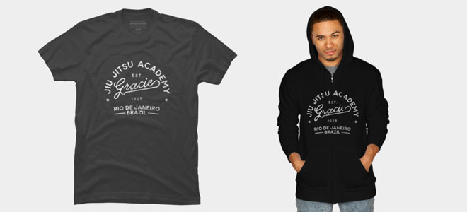
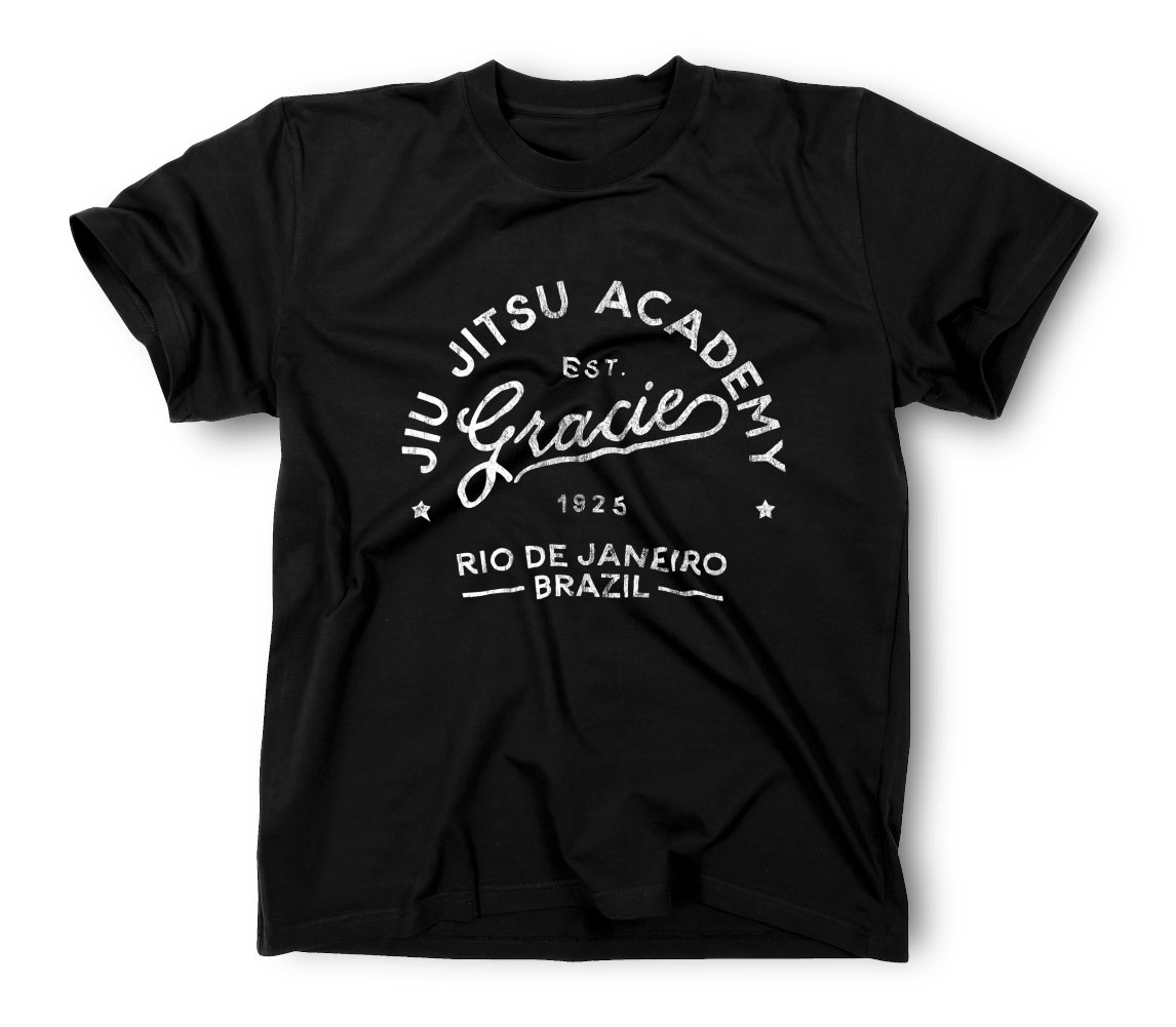
To complement the fighting theme of those Boxing and MMA T-Shirt designs cited by Alix, I’ve created a design based on Gracie Jiu Jitsu. Whilst this kind of vintage style has a hand lettered look, we’ll use display fonts to form our design, with some adjustments in Adobe Illustrator to produce the layout. We’ll then give the artwork the old t-shirt look with my free “Washed & Worn” textures.
![]()
Working with fonts rather than lettering by hand makes composing the layout so much easier and gives you the ability to edit or change the wording if you ever needed to. I’ll be using the fantastic font named Bloomsbury, which is a Script, Sans and Serif typeface with a hand drawn style. Not only do these fonts perfectly complement each other, the script variant also includes some great flourishes to decorate your design. If you like the look of this font, you can purchase it for $16. Create a new document in Adobe Illustrator and set out your fonts as text elements.
![]()
Hold the ALT key and drag the script font to make a copy. Edit the contents to spell the word ‘Gracie’. Select just the last letter and choose one of the alternative glyphs to apply a cool underline.
![]()
Go to Object > Transform > Shear and select the Vertical option. Edit the Shear Angle to -10° to flow the text in an upwards direction.
![]()
Select the Ellipse tool from the toolbar and draw a circle around the text. Nudge it roughly central to the text, then clear out the default fill and stroke.
![]()
Select the Type on a Path Tool from under the Type Tool’s menu, then click on the circle path to set a passage of text around its circumference.
![]()
Use the Eyedropper tool to quickly convert the default placeholder text to the Bloomsbury Sans font.
![]()
Edit the wording to ‘Jiu Jitsu Academy’, then alter the tracking to 50 from the Character panel and set the paragraph style to center.
![]()
Activate the Direct Selection Tool, then click and drag the middle handle of the Type on a Path element to reposition the text centrally. If you have Smart Guides turned on (View > Smart Guides), you’ll see a pink guide appear when the alignment is perfectly vertical.
![]()
Edit the font size so the wording spans from one side of the circle to the other, then move the whole circle downwards to better compose the layout.
![]()
Select the Star tool and draw a small shape underneath the lettering. Hold ALT and Shift while dragging a copy to the other side, then select them both and make a Group.
![]()
Hold the Shift key and select the Type on a Path circle, then release Shift and give the circle and extra click to make it the key object. Click the Horizontal Align Center button to align the stars up centrally, without moving the key object out of place.
![]()
Make a copy of the Bloomsbury Sans font element and edit its wording to EST. Decrease its size and set the tracking to 200. Position this text element in the empty space between the two other text elements.
![]()
Drag a duplicate of the text and change the wording to 1925. Hold Shift and select both the smaller text elements and the circular Type on a Path. Make the circle the key object and align everything up centrally.
![]()
Make another copy of the Bloomsbury Sans font. Change the wording to Rio de Janeiro Brazil, edit the tracking to 50 and set the leading to suit. Make any kerning adjustments by placing the cursor between the relevant letters, then use the ALT key and Cursor Keys to adjust the spacing.
![]()
Use the CMD+R shortcut to display the document rulers (if they aren’t active already), then drag out guides aligned to each side of the word Gracie. Scale and position the Rio de Janeiro text within the layout.
![]()
To add a couple of decorative lines, we can use the letter I of the Bloomsbury font so it matches the same irregular, hand drawn style. Right click and select Create Outlines to convert this letter into a shape.
![]()
Rotate the shape by 90° and stretch it to fit between the guide and the word Brazil. Make a copy for the other side.
![]()
Another way to create interesting layouts is to use Illustrator’s Envelope Distort feature. Select the Rio text and the two lines, then go to Object > Envelope Distort > Make With Warp. Change the settings to Arc at 10%.
![]()
Draw a selection around all the elements that form the logo and drag a copy to one side. We’ll convert the final design into shapes, so it’s useful to retain an editable copy just in case you need to make any changes.
![]()
Select all the elements of the original again, then go to Object > Expand. This will convert all the text to shapes and permanently apply the Envelope Distort effect.
![]()
Since the letters of the script font overlap, merge them all into one continuous outline using the Unite button from the Pathfinder panel.
![]()
The script font is also quite smooth, whereas the sans font has an irregular outline. We can add a similar effect using the Effect > Distort & Transform > Roughen filter. Change the settings to Smooth, Absolute, then set the Detail to 30 and experiment with a small value for the Size, which will depend on the overall size of your artwork.
![]()
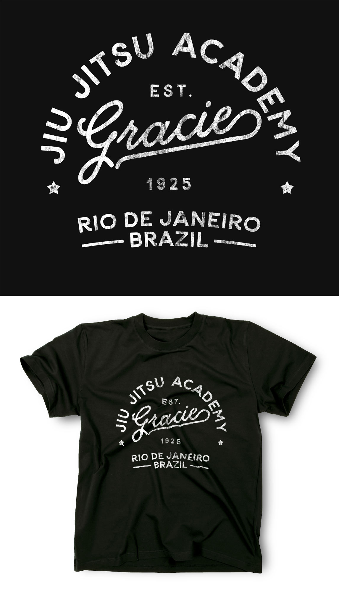
Select all the elements of your logo design and Group them together. The graphic looks great, but some texturing will really finish off the vintage style.
![]()
Click the Make Mask button in the Transparency panel to apply an Opacity Mask to the artwork. Click on the square thumbnail on the right to activate the mask.
![]()
Open one of my “Washed & Worn” textures and paste it into the mask. Scale the texture down to cover the artwork. Click on the thumbnail on the left to exit out of mask mode.
![]()
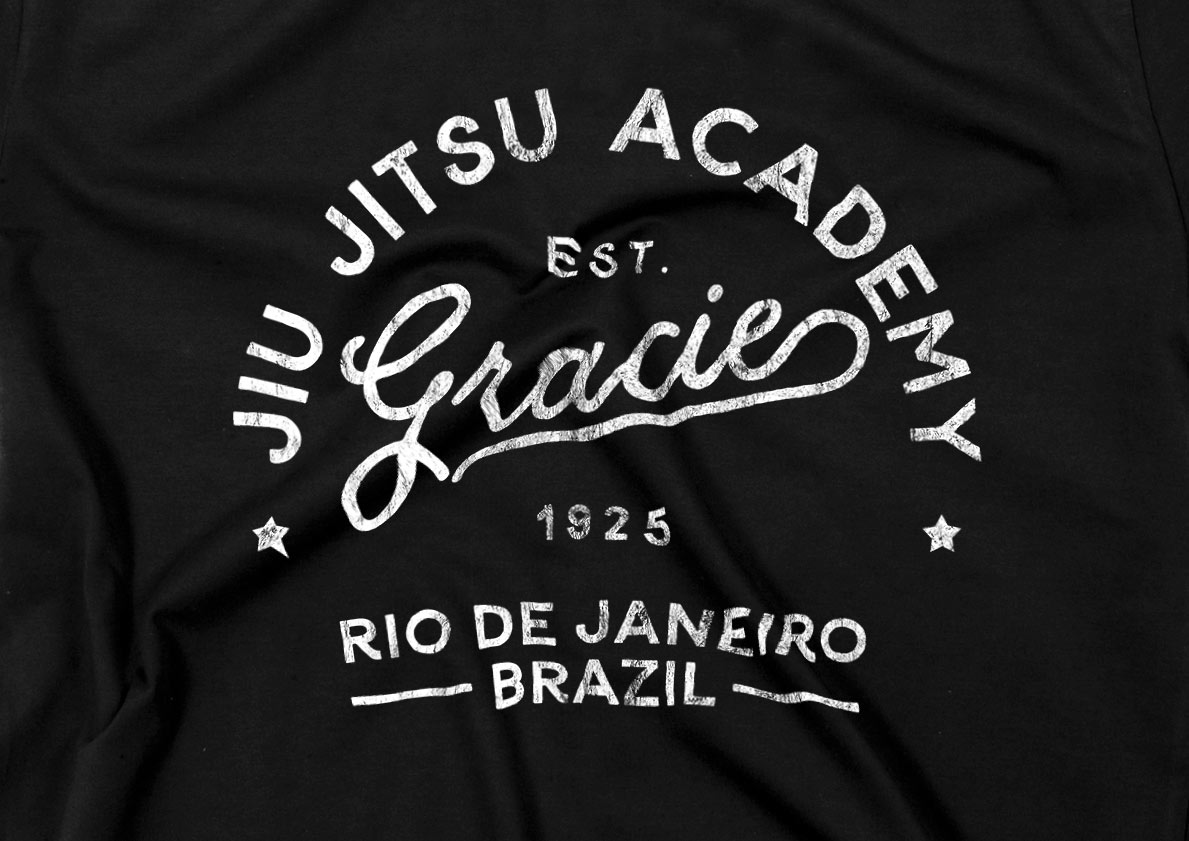
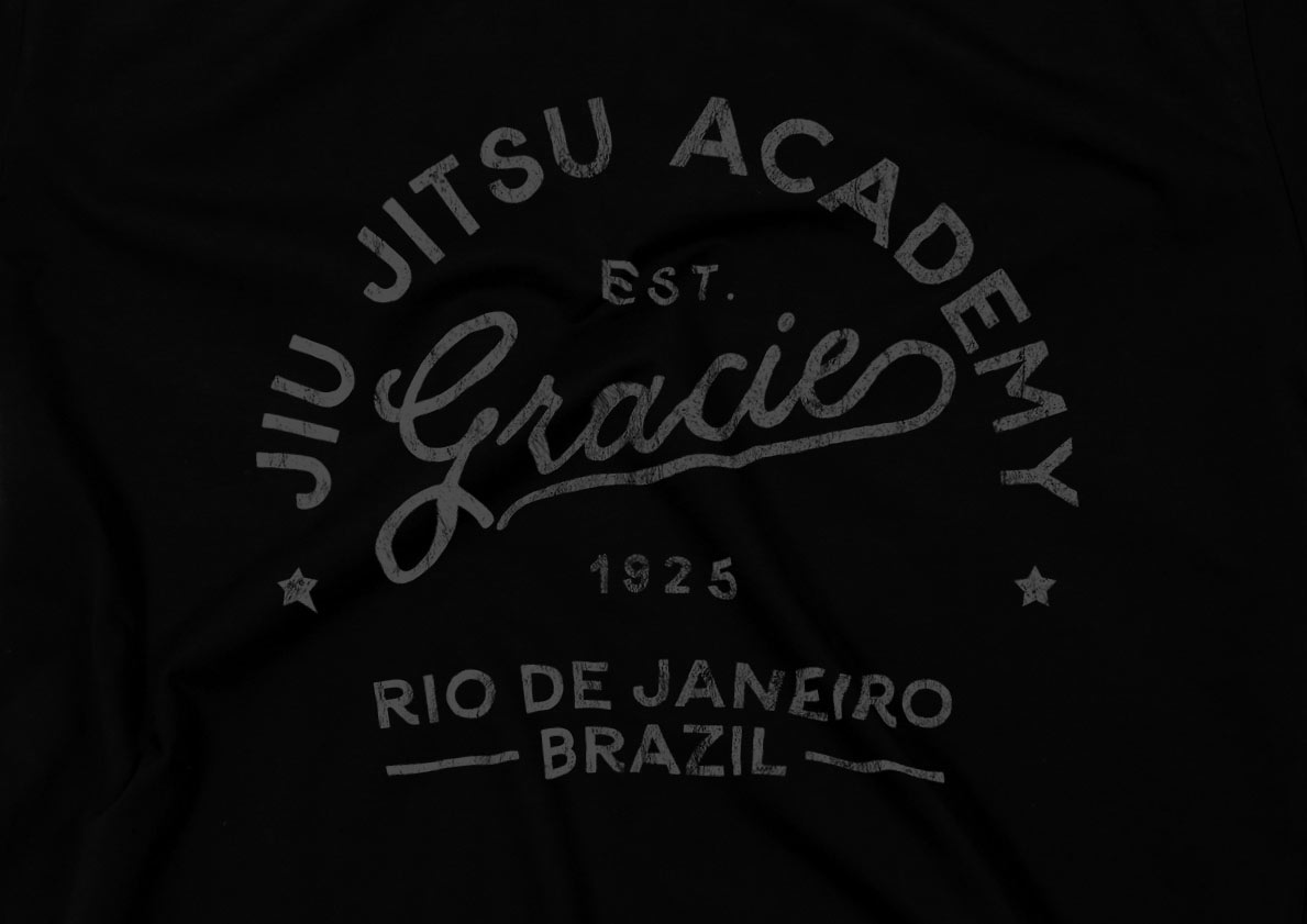
The final logo design looks great with a textured appearance that gives the artwork an aged and distressed look. Apply different fills to change the colour for different applications. The mask will erase the textured areas to allow the background to show through.
Love this design? Get the T-shirt!


Got everything up till pasting a texture onto the mask. How exactly do I do this “Open one of my “Washed & Worn” textures and paste it into the mask.”?? Everything I’ve tried doesn’t result. I’m really confused by the open part and then the paste part…
Really fantastic thank you Chris
Always thankful.. I didn’t know how to distress my artwork using the https://blog.spoongraphics.co.uk/freebies/9-free-washed-worn-aged-t-shirt-effect-textures textures
Thank YOU, Chris! I always love learning a new, improved way of doing things. Kudos!
THX!!!! <3
Beautiful work Chris :)
fun
It really hepls a lot. Following this tutorial, I was pleasantly surprised to find the tools that were not used before , THANKS!
Wooo! Very nice ,good work Chris.
OLDIES YAY
Wow this is so awesome I love vintage designs <3
Very dope! Thank you so much Chris.