
This post was originally published in 2009
The tips and techniques explained may be outdated.
With Twitter quickly becoming the hottest site to be seen on, everyone wants to stand out from the crowd. There has already been a range of quality designs showcased on various sites, which has shown an emergence of trends such as the ‘sidebar’. Let’s take a look at some of the best practices around Twitter background design and get to work creating our own.
We all recognise the default blue Twitter background right? It’s not a bad design, it’s clean and trendy but it doesn’t stand out when the majority of Twitter users also have the same look. Furthermore, if you’re keen to achieve more followers, removing this background would probably help out by showing that you’re an active user, or if you’re tweeting on behalf of your company or service, it helps prove that you’re not a spammer.
Generally speaking, there are three main approaches when it comes to creating your Twitter background (other than a boring solid colour!):
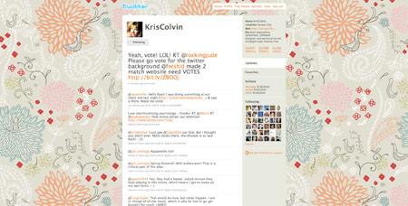
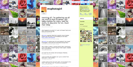
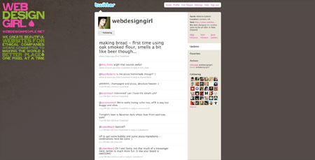
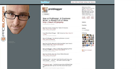
1. Repeating Background Pattern
The repeating background pattern is the age old website background effect, create a repeating graphic and upload the file to your account. The main advantage is that a repeating pattern will work at any monitor resolution. Examples:
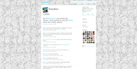
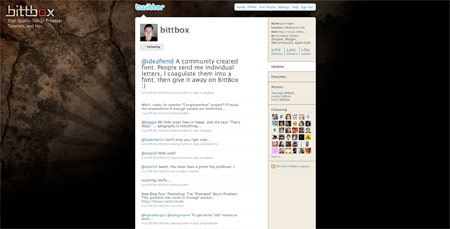
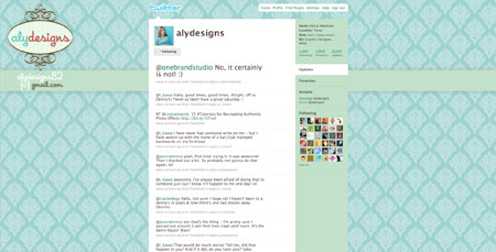
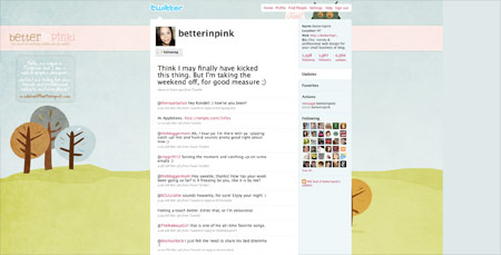
2. Background Graphic Fading to Colour
Using a single graphic on your profile can help add some visual interest, in order to allow this to work at higher resolutions the image is faded out so that it blends into a single colour, which is then specified as the background color. Examples:
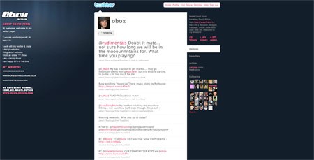
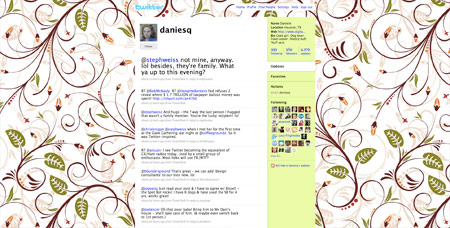
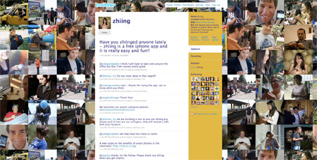
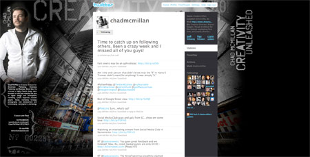
3. Extra Large Background Graphic
The third general approach to Twitter backgrounds is the use of an exceptionally large background image that fills the whole screen. While this approach gives the widest options in terms of visual creativity, it does bring up the issues of image file size and the fact that the image will inevitably cut off on a certain monitor resolution. Examples:
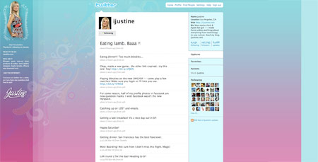
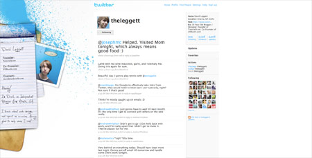
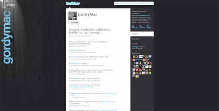
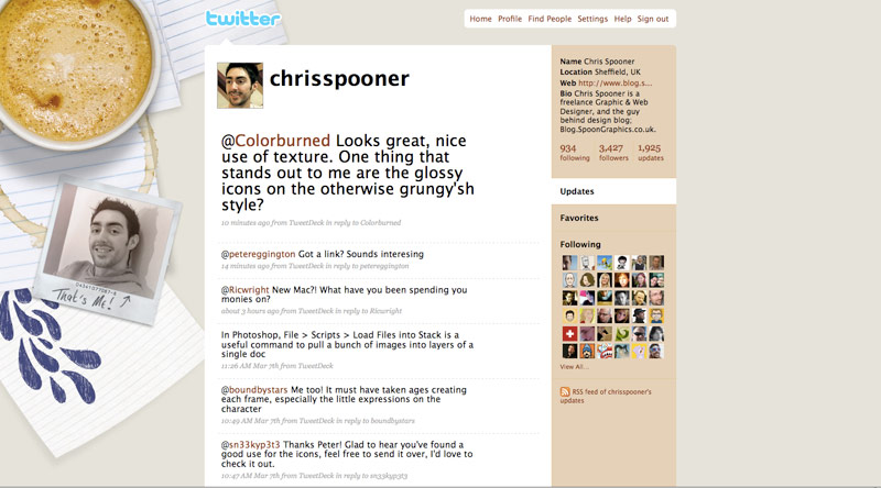
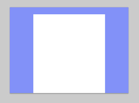
Sidebar or No Sidebar?
One trend that has emerged from the creativity behind Twitter background designs is the use of a sidebar. The sidebar is an area of screen real estate that is put to use to display additional information about the user, such as large profile image, bio and lists of websites and other social networks. Due to the lack of space on 1024×768 resolution monitors, profiles using the sidebar approach usually only accommodate 1280×1024 upwards, with anything less simply being hidden by the main Twitter website content.
I’ve put together a handy template so you can visualise how your theme is going to look on the popular resoluitons of 1024×768, 1280×1024, 1680×1050 and 2000×1920. Open up the PSD and place your design under the Template folder.
Let’s Design Our Own
Given the information so far, let’s design ourselves a cool and creative Twitter background. In order to accommodate the majority of users, and to minimise loading times, we’ll go ahead with option two from above and use a graphic along with a background colour.
Open up Twiter-BG-Template.psd into Photoshop. We’ll settle for accommodating 1280×1024 and upwards primarily, with anything smaller simply seeing less of the design.
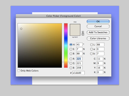
Choose a solid colour for the background, I’m choosing a warm grey. Fill the background layer using Option/Alt + Backspace.
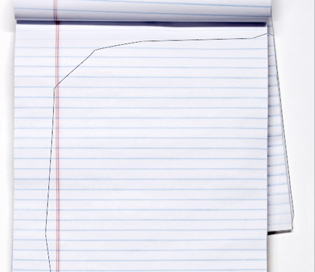
Download a lined paper resource from SXC and open it up into Photoshop, cut out a section of the paper using the Pen Tool.
Paste in the paper resource into the main document, scale and position according to the blue template layer.
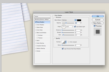
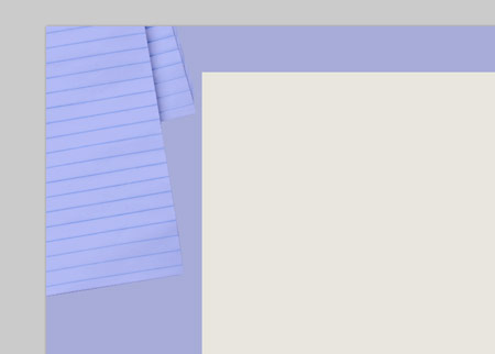
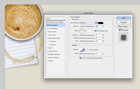
Add some realism to the paper by adding a Drop Shadow, use very subtle options to recreate how the light would naturally fall on the paper.
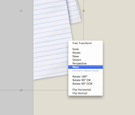
Right click on the Drop Shadow effect from the Layers palette and select Create Layer, then press CMD+T and Warp to distort the shadow.
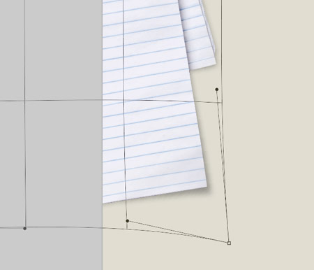
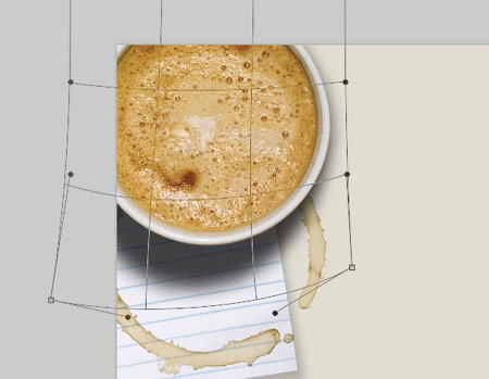
Drag out the corner point of the Warp filter to stretch the shadow, this helps give the appearance of a slightly raised corner.
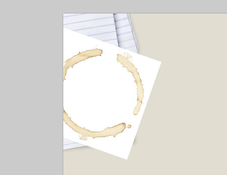
Paste in this coffee cup stain into the document and scale into position. Set the blend mode to Multiply to render the white areas transparent.

Open this image of a coffee cup into a new document, create a mask around the cup and cut out the main object.
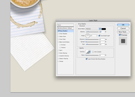
Paste in the cup and position to the upper left corner, add a soft Drop Shadow.
The tall cup would cast a much larger shadow in real life, so create a layer from the Drop Shadow and use the Warp settings to stretch out the shadow, adding much more realism. Drop the opacity to avoid the shadow taking focus in the design.
Place in another element of lined paper, cut it down to size, rotate and position into place. Add another very soft drop shadow to give realism.
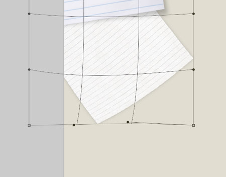
Transform the page with the Warp setting to curve the bottom corner upwards.
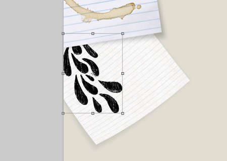
Scan and paste in some doodles onto the page, rotate and scale them into place so that they appear from under the upper stack of paper.
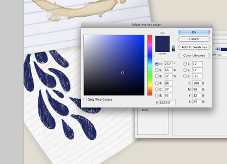
In the blending options, add a dark blue Color Overlay to give the impression of a ballpoint pen drawing.
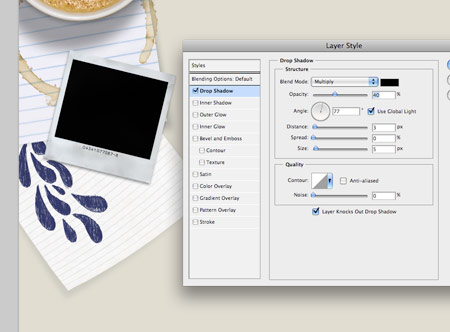
Download a photograph of an old blank Polaroid, place the image into the design and add a subtle Drop Shadow.
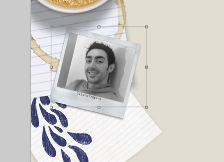
Open up a photograph of yourself and place it into the Polaroid area. Use a mask to cut away the excess.
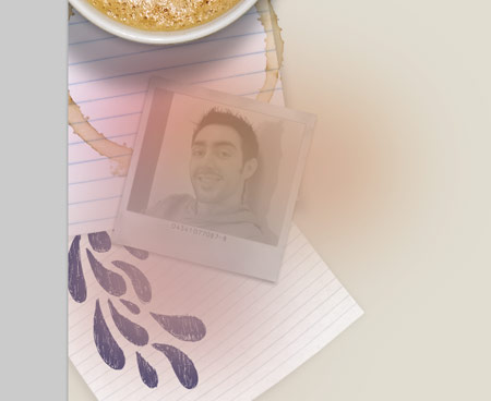
Paint some blobs of yellow and magenta over the photograph, then change the blending mode to Color. CMD click on the photograph’s mask and crop down the colours. This adds a slight effect to the image to give a vintage appearance.

Write out a personal message onto the lower portion of the Polaroid using the brush tool, or a pre-made handwriting font.

Check over the design for any last tweaks, pay attention to how the objects lay in relation to the template.
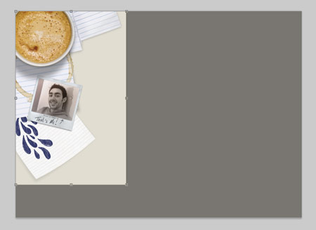
Crop down the image to accommodate just the graphic elements, the rest is just a flat colour that can be reproduced in the Twitter settings.
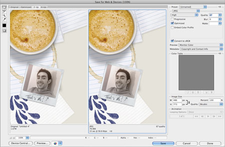
Save the image for Web, adjust the JPEG compression to balance between overall file size and image quality.
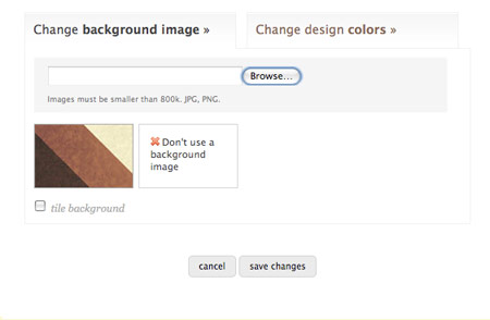
Log in to your Twitter profile and head to the Design tab. Browse for your background image and upload it to the server.
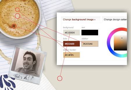
Next, change the theme colours to match the overall design. Sample areas from the image to ensure the palette matches. The most important option is the background, making sure it is exactly the same hex code as the image for a smooth transition.

With the design now complete head over to your profile to check out the theme for real. If you liked this article, come and say hello to me on Twitter.

Nice article Chris – Really complete. My Twitter account (http://twitter.com/marcofolio) is using option #2 (Background Graphic Fading to Colour).
Coincidence that you used that polaroid image van stock-xchng – I also used it in my next jQuery tutorial that I’ll place later online today ;) . “Great minds think alike”
Keep up the good work!
Haha definitely, I’ll be checking out your jQuery tut, sounds interesting!
Nice tute Chris. Once again, something out of the norm!
thank you. inspired me to create one.. :D
Brilliant.
Thank you,
JJ
Thanks for the great info.. I use the repeating background from a photo I took this past summer using the great sunset sky and the side bar to show off my links..
Take a peek… and/or add meas one of your tweeple
Tim Golden
http://twitter.com/goldeneye
Chris
Great stuff as usual, even though you didn’t show my twitter background as an example. ;)
– Cal
Thanks Calvin, I’ll have to remember your background for any upcoming roundups ;-)
Nice tutorial, very thorough — your blog is awesome, keep crankin’ it out… Thanks.
good work! nice details :)
Nice tut man, something different again! It reminds me, I really have to get round to improving mine, it really doesn’t say much about me as a designer!
Nice tutorial. Thanks.
Great tutorial.. My twitpage background needs help Maybe i can do something. You give me hope.
What a great tutorial, am going to try this out.
Nice work on this. I like the step by step and the option is probably the best. Although I have found that solid backgrounds can look different in Safari and FF2 or 3. Is this an issue or does Twitter resolve this for you. Nice work.
cool tutorial!!!!!!!!!!!! good idea!
Hey Chris! I’ve been thinking about doing my own background for twitter, and this definitively made that idea started to happen, thanks mate :)
Hmm not 100% sure the design community requires such a spoonfed tutorial on something so basic. I do however like how it’s structured and would certainly help a non technie. Cheers
I appreciated it…”spoonfed” to one may be “elightening” to another.
Oh wow, thanks for featuring my background! Had a look on here for some inspiration but I might leave it now :)
Love your new background btw!
Great tutorial as usual Chris. Thanks!
Great tutorial, Chris. Thank you for including me in the round-up.
I love your background Chris. Fantastic. Some great examples too. Cheers
i think i have a pretty cool / cute / fun background on twitter, too. http://twitter.com/weblaureate
let me know what you think
Thanks for the info. A “how-to” for Chi.mp would be awesome as well. Please….
awesome. will come in handy
How is it mine? Is it bad? http://tinyurl.com/c78cnc
Great post, I am currently designing twitter backgrounds for the twitter users at Distilled and your handy tips will certainly come in useful. I particularly like the vertical positioning of the gordymac copy, this allows the whole word to be viewed even if not much of the background is visible on a particular persons screen.
Nice tips.
@3drockz
Great article. I like how you matched the twitter colors to the coffee. Amazing.
Great tutorial! Thanks for using my bg as an example, although this tutorial totally makes me want to change it all up again. :) Twitter backgrounds are great fun!
Great article and tutorial. I think it’s time for a twitbackground update.
Really great work. you have inspired me to create a new background image for my twitter account… keep updating me.. @anjuls
THANK YOU for this valuable article. Had I known, perhaps I would have done my background differently? http://twitter.com/ginaleekim
Thanks for the step-by-step. Very informative.
Nicely written, will recommend this to those who ask me about backgrounds… Do have a look at mine as well :) @cheth
You should take a look at http://twitart.com, they have done a lot of cool designs, including mine.
Nice work on this. Very useful. Thanks
This is exactly what I was looking for, Thanks Chris. I am just getting my feet wet in twitter.
thanks – just asking around yesterday how to do this!
Great tutorial…
Thanks
Hello Chris, thanks a lot it’s help to improve mine.
More simple than yours
http://twitter.com/gregoirenoyelle/
I arrived on your blog by clicking on a link posted by Mashable on Twitter. I’m so pleased to have found out about you. This is an example of how effective Twitter is in promoting people to audiences who might never otherwise have come across them. Keep up the good work.
What if you don’t have photoshop? Other apps work too?
Wicked article dude. Love the outcome!
@shannon
You should be able to use any graphic design software to create a cool background for Twitter.
Great info — Thanks a bunch! I now feel like an “expert!”
Okay call me knowledgestuoid but I do not know how to get from here (photoshop) to upload and replace my twitter background. Can you add those instructions for us not in the know? Thanks!
Check out http://twitter.com/pallian
good job!
http://twitter.com/gr8pixel
Chris, spot on with this post mate. Well done and thank you for including me in the collection.
Hey Chris, looks great – one thing to consider is my mistake of designing my twitter background on my 24inch widescreen then looking on my 15inch laptop and it didn’t work quite so well – everything kind of getting stuck behind the main twitter panel…
Great stuff though, cheers!
http://twitter.com/markinlich
I love your tool! Can’t wait to get started on my Own Custom background!!
Good stuff!!
You really know what you’re doing! Thanks for the tutorial and thanks for that template. That thing will come in handy for sure.
Thanks, good tut.
Fave it.
Thanks a bunch! As usual great quality tut.
Brilliant. Thanks for the tutorial, gonna give it a go :)!
Nice tutorial, Chris!
I’ve recently just finished re-designing my own Twitter background too although found getting it uploaded succesfully was the hardest part! Maybe one day I can make it into well chosen lists though, such as above ;)
Alex | Zen Elements
Thanks Chris, perfect timing, I was just starting to look into this.
you just reminded me to redesign my twitter background!
thanks for the nice post.. :)
very well explained tutorial. It’s very good , twitter doesn’t give more options to optimize profile, it’s enough already and interesting to see how people find solutions to this background situation :)
thanks for the great tutorial. a very appealing design. greetings from cologne.
I can hardly wait to make a background, I’m inspired. thanks for the template! It’s just what I was looking for.
Thank you for the info! It was very helpful when redesigning my background. Do you have any specific thoughts on file size? My outputed file is @185k .. what is considered acceptable for today’s download speeds?
I admit I didn’t put much thought into my background other than to use one of my fave photos. You’ve given me food for thought, thanks.
I didnt even KNOW you could change the background… Im pretty new to twitter… but you inspired me.. using your template I turned my homepage into a refrigerator with promo material all over it… lol.. I need work
david_m_beach
I love this! I’ve been thinking of redesigning my twitter background, but now I’m definitely going to. Thanks! =)
Awesome stuff-
This is quite educational and informative, I will definitely be using the lesson learnt to spice up my Twitter background.
Nice blog by the way :)
Cool, I will also Try this stuff in my twitter page , thanks for the tutorial
Impressive…though I’m not used to photoshop. CorelDraw X3 seems to be suitable for me. I’ll use CorelDraw X3 and see what I come up with…hopefully!
Simple but nice. Have to design my twitter background too….. ;)
Awwwwweeesooooomeeeeeee…
Thank you for the nice tutorial. I’m looking for a new Twitterlook, and now i have it. :-)
Great stuff.
I’ll definitely have to revamp my page after seeing these examples. Thanks for the template, it will come in handy!
Great template you put together. Thanks for that. Cheers!
Thorough and usable tips as usual, Chris. Thanks for this!
Chris,
This is great stuff. I’m sure there will be a lot of clones of your background on Twitter. Liked the sampling of colors in image to match palette.
Regards,
Bill
nice post . tanks for sharing. regard
What’s most aggravating is that it can be really difficult to predict how your background will appear on a variety of resolutions. It’ll even vary depending upon the viewer’s browser app & settings. Many of the best backgrounds end up being mostly obscured by Twitter’s panels.
So it seems like you really just have about an inch or so of the leftmost portion of the screen to work with if you want to be reasonably sure that your design won’t get stomped all over.
http://www.twitter.com/robodaniel
I must admit I don’t have any skills in webdesign, but your tuto allow me to create a better background for my twitter page!
thanks & greetings from France
I think I love you. Let’s move in together.
Thanks Chris! I’ve just started to use Twitter and this was great to find :)
Awesome! Me likey!
hey thanks for the inspiring background tutorial, check mine on twiter :)
Muito bom mesmo, bastante completo, e me ajudou bastante para fazer o design do meu background do meu twitter.
Great quick tutorial. detailed and straight to the point. Now I need to redo my Twitter background
A lot of inspiration found here, thinking to make me a new twitter background either :)
Thank you so much for the great tutorial. I was just thinking about a new background the other day. Great inspiration :)
Fantabulous. Thank you so much for sharing this. I am going to give it a whirl! (now the question remains…is it blond proof.)
is there an optimised size for tha background image if you use an Extra Large Background Graphic?
Love the creativity and the simplicity of explaining. Will go right now and try. You inspired me!
Thanks for this info. keep up the good work
How cool is that?!!. I will have to give this a go when I decide to have a new background. Thanks for the tutorial.
great tutorial…also, here’s another great showcase of well designed twitter profiles, and you are showcased there ;)
http://dropthedigibomb.com/2009/20-creative-twitter-designs-and-what-makes-them-cool/
Thanks Chris, it’s one useful tutorial and extra PSD file too! Lovin’ it! :)
Twitter backgrounds are cool, nice tutorial… :-D
Hi !
Thanks for this tutorial,
Can I use it for my personnal website ?
Excuse for my bad english but I’m french ;)
Bye
Nice tutorial, thanks!