This post was originally published in 2011
The tips and techniques explained may be outdated.
I recently stumbled across the new branding for the Canadian Olympic Team, which then reminded me of my recent abstract geometric poster design tutorials, so I decided to combine my technique with the idea of creating a patriotic design with a similar mosaic effect. Follow this step by step Illustrator tutorial to create a colourful abstract text effect made up of lots of tessellating mosaic elements.

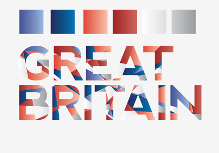
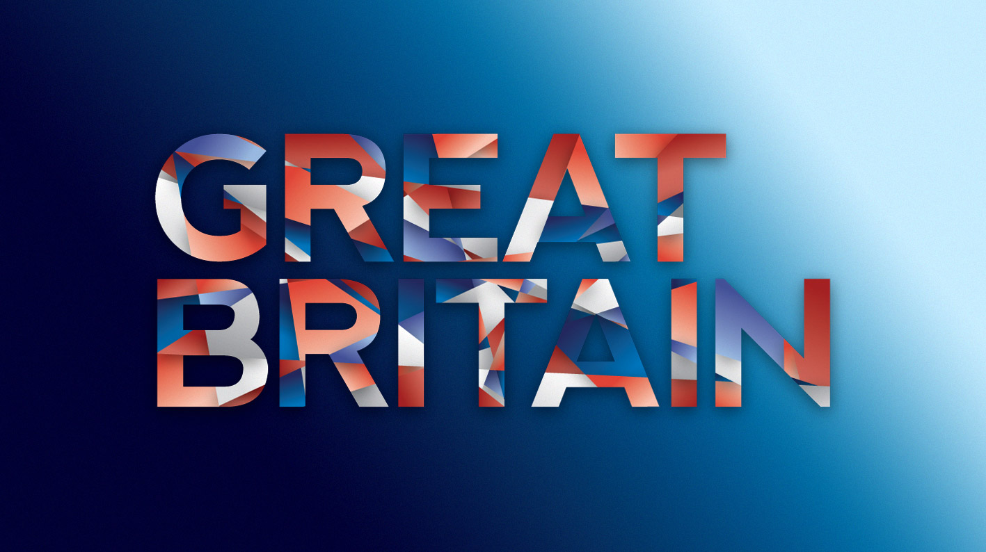
The original design that spurred this idea was based on the country of Canada, so for my own design I’ll base it on the text Great Britain. The dividing lines across the text follow the crude angles of the Union Jack design and two shades of each colour are used to add a range of tone.
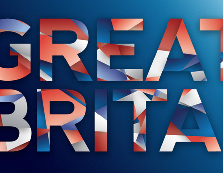
View the full size text effect design
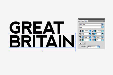
Open up Adobe Illustrator and type out the wording of your choice. Here I’m using the free yet pretty cool Nevis font.
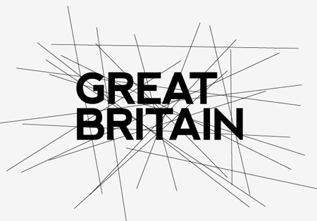
Select the Line tool and begin drawing intersecting lines across the text. The Union Jack’s angles all cross in the centre, but for The Stars and Stripes you might want to use more horizontal lines with minimal vertical lines. Otherwise, if you’re creating a generic design, just go mad!
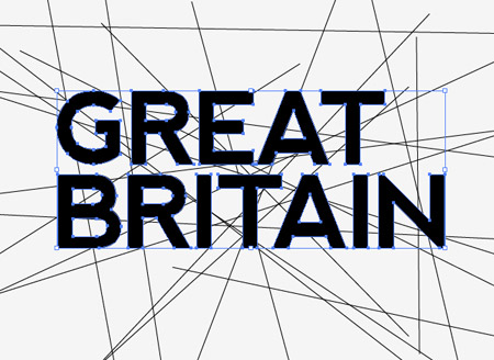
Select both text elements and convert them to outlines by pressing CMD+Shift+O. Then create a Compound Path using the shortcut CMD+8.
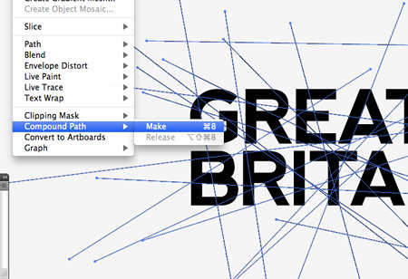
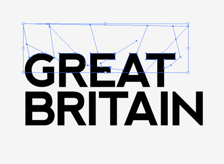
Draw a selection over the whole design, shift-click the words to remove them from the selection then make a Compound Path of all the lines.
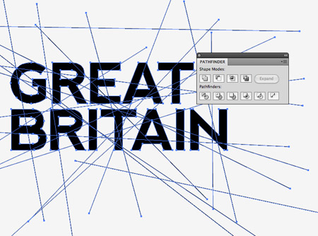
Select both the lines and the text then click the Divide option from the Pathfinder palette. This will make cuts through the text wherever a lines passes over it.
Right click and select Ungroup, then select and delete the excess linework from around the eges of the wording.
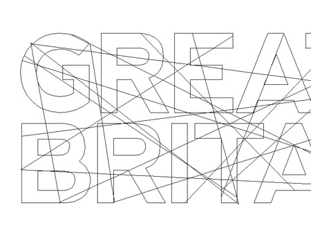
Toggle on Outline Mode (CMD+Y) to see the otherwise invisible linework that is still present between each letter. Go through and delete anything outside of the letter outlines.
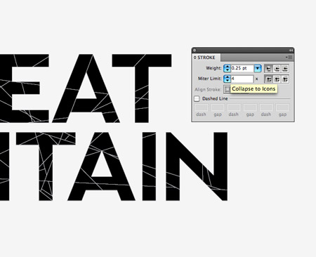
Give everything a thin 0.25pt white stroke to make each individual mosaic shape visible. If there are any really tiny shapes, merge them with their neighbours using the Pathfinder tool to create larger objects.
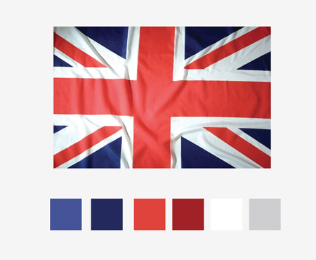
Use the colour picker to select light and dark tones of each colour in the flag. Here I’m using a photograph of the Union Jack.
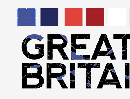
Randomly select shapes across the design while holding the Shift key then replace their fills using the Eyedropper tool on the first colour swatch.
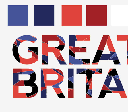
Continue the process with each colour in the palette, selecting random shapes from the mosaic until the majority of the design has a blue, red or white fill.
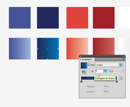
The flat colours look a little… flat, so make a duplicate and use the base colour to create gradients flowing to a lighter tone.
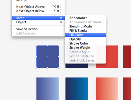
Select the first flat colour swatch then go to Select > Same > Fill Colour. Click the new gradient swatch with the Eyedropper tool to replace all the fills.
Repeat the process of replacing colours until the whole design is made up of gradient fills. The gradients really help bring the design to life with added depth over the flat colours.
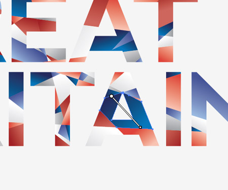
Currently all the gradients are flowing in the same direction, so go through and adjust the angle of each shape with the Gradient tool to add variety to the design.
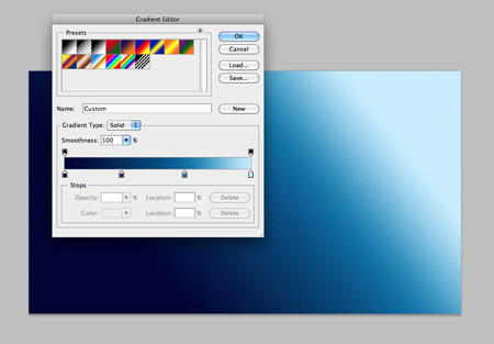
Switch over to Adobe Photoshop to finish off the design. There’s nothing we can’t do in Illustrator, but Photoshop tends to handle effects such as noise and shadows a little better. Fill the background with a cool blue gradient to harmonise with the blues in the text effect.
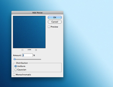
Add a touch of Noise using the Filter > Noise > Add Noise menu option. Just 2% will add enough to create a subtle noise texture.
Paste in the text effect design from Adobe Illustrator and give it a subtle Drop Shadow using Photoshop’s layer style effects.
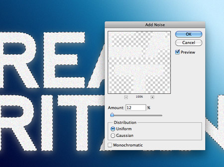
CMD-Click the layer thumbnail of the text to load the selection and fill a new layer with white. Add a Noise filter of around 12% to this layer.
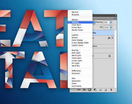
Change the blending mode of the noise layer to Multiply to render the white area transparent, then reduce the opacity until the noise provides a subtle texture to the text.
This finishes off our abstract geometric mosaic style text effect. The intersecting lines really makes for a cool looking design while the colours and gradients help lift the text from the screen.

I’m having the same problem as Andre and adehazril, I dont know what happend…
Awesome. I can see this technique working with the colors of any national flag for a neat effect. I’ll store it away for later.
Fantastic. The Pathfinder tool is what separates the players from the posers. Solid work with gradients, too.
Thank you. Very wonderful.I don’ t know how I express my appreciation.I made a link not only for English users but also Japanese.
Thank you for this inspiration. – It’s amazing how these simple steps produce such an output.
I’m having the same issue as the rest, pathfinder keeps giving me an error. am using CS5, not sure if something has changes from previous versions?
Another technique I learn today. Thanks Mr Spooner!
Simple tutorial and great result!
Man, I’m Brazilian and I always see your blog. It’s great!
Impressive effect and not so much work to do it. Like this :)
Dam… you so F** awesome. Your tutorials have always something new and inspired! Great mosaic and ty 4 sharing your work..its always a nice boost of inspiration!! keep it going. cheers!
This looks awesome! going to give this ago later
awsome…, i like your inspiring stuffs..
thx..
i knew it was gonna be simple but i always learn a few things throughout the process. thanks mr. spooner!
That looks pretty cool! Thanks for the tutorial.
Nice result.
You might want to look at scriptographer, it has a incredibly awesome script to randomly color objects without having to do “by hand” object after object. You choose a color range, or as you did a definite swatch… et voilà ^__^
http://scriptographer.org/scripts/general-scripts/rando-color
Loving it! It is very Chris Spooner like, I will have a go at making an “Australia” version :)
Great tutorial, Chris!
But I’m having the same problem as Andre. I can’t intersect the font and the line. Can you help?
Brilliant! I loved this tutorial Chris!
Great tutorial! And also a good spot by Aaron! Thanks for sharing
Nice tut Chris. I just don’t understand why – when I try and intersect the two compound paths – Illustrator tells me “filter produced no results. Please select two overlapping paths”. Can you believe it!. So weird… Any thoughts?
I’m having the same issue. Not sure why either.
same problem here …
I’m equally stuck…
I used the Divide under the pathfinder menu. Gave me the same result.
Thanks Aaron :) working good…
I’ve got the same problem but, tried Divide as suggested above and it works.
Sorry guys this was my error – I don’t know why I wrote Intersect in the post as it was indeed the Divide option that was required. Thanks to Aaron for sharing the fix