We’re going to take inspiration from 19th century typography for today’s vintage text effect tutorial. We’ll use Adobe Illustrator to add detailed decorations to a basic word to transform it into a beautiful piece of engraved typography. The process makes use of lots of useful Illustrator techniques, such as offset path, blends and the Pathfinder tool. Follow along to give your text and logos the old west type treatment.

The text effect we’ll be producing in this tutorial takes inspiration from typography of the 1800s. Type would often be given a three dimensional appearance and shading would be produced with detailed lines as part of the engraving process. We can use those characteristics to replicate the effect in vector format, using Illustrator’s powerful tools to manipulate the shape of the letters.
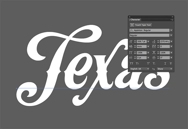
Open up Adobe Illustrator and type out your logo wording in a cool vintage style typeface. I’m using the beautiful Appleton font that I picked up from a recent fonts deal. Give the text a white fill.
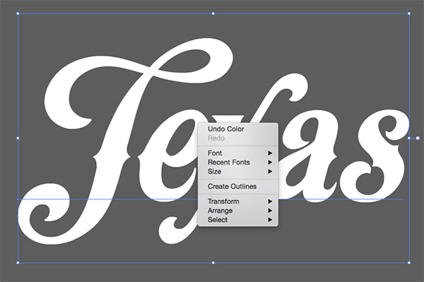
Illustrator is most powerful when you’re working with solid shapes. Right click and select Create Outlines to permanently convert the text into paths.
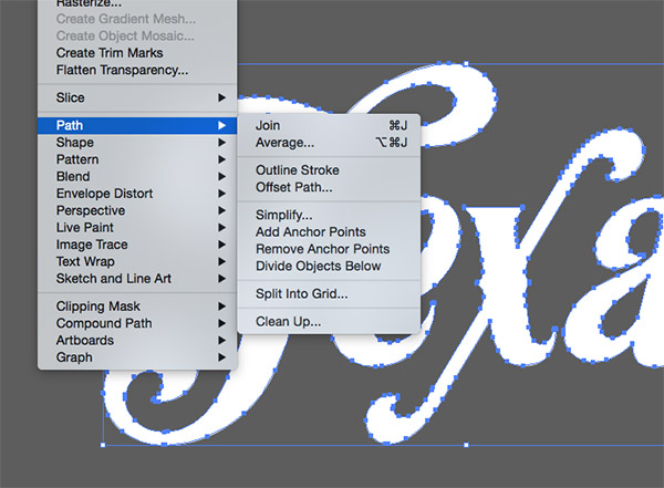
One way to add an outline to the text would be to apply a stroke, but a quicker technique to create a solid outline is to go to Object > Path > Offset Path. Enter 2mm in the options, then give the new outline a black fill.
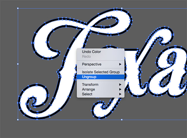
Offset paths are always grouped with the original shape, so select the text, right click and select Ungroup from the menu.
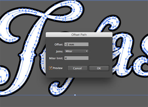
Select all the original text letters while holding Shift, then add another offset path. This time enter -2mm to create a new path inside the text.
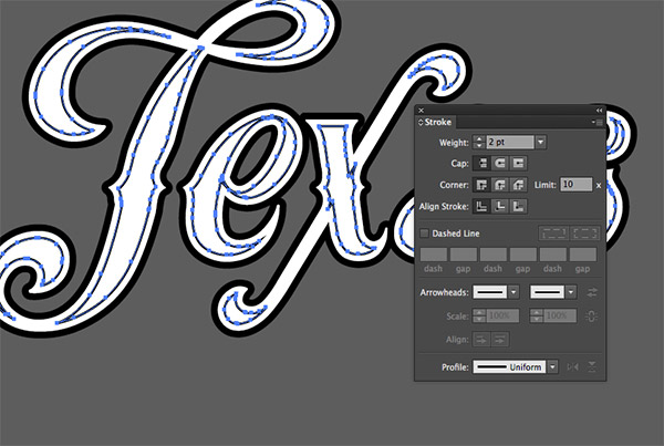
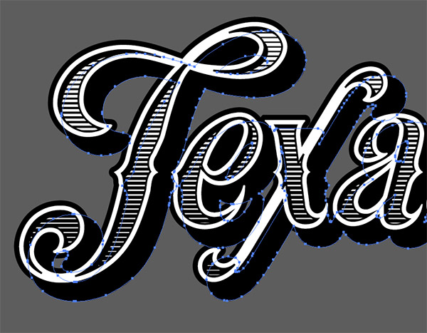
Give this new inset path a 2pt black stroke. You can see how this path creates a series of decorative shapes that we can use to replicate the characteristics of vintage type.
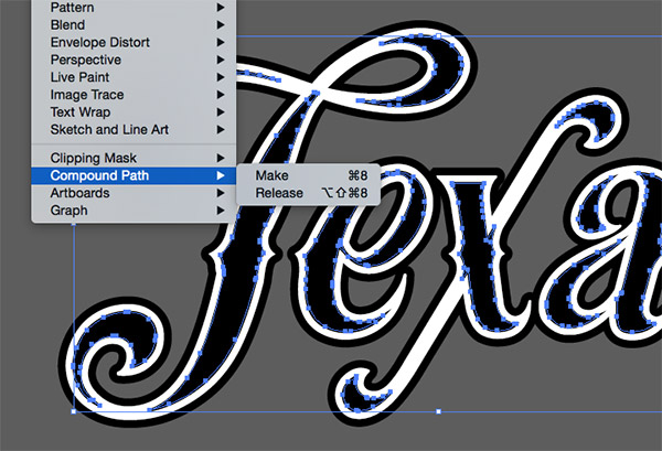
Press CMD+C to Copy the inset stroke shapes, then press CMD+F to paste in a duplicate. Switch the black stroke to a fill, then go to Object > Compound Path > Make.
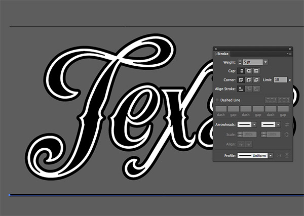
Select the Line tool and draw a 1pt horizontal line above the text. Hold the Alt key to drag a duplicate of the line underneath the text, then increase the stroke weight of this line to 5pt.
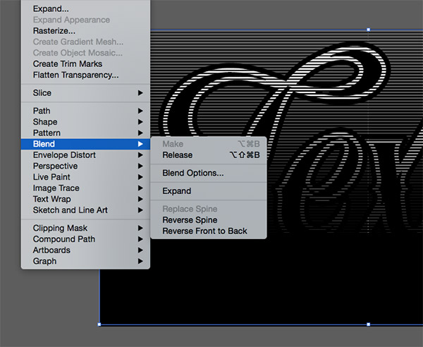
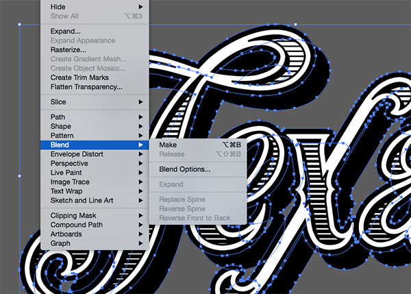
With both lines selected, head to Object > Blend > Make, then go directly back to Object > Blend > Blend Options.
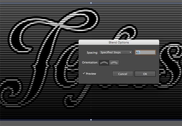
In the Blend Options panel, change the dropdown menu to Specified Steps, then alter the number to produce a series of nicely spaced lines.
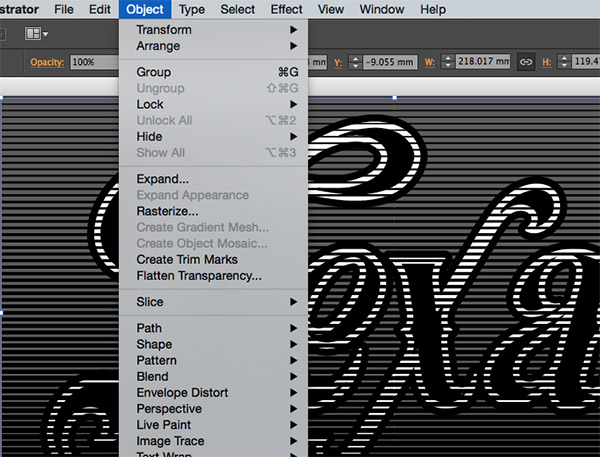
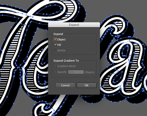
The blended lines will need to be converted so we can work with them. Go to Object > Expand to firstly convert the object into a series of strokes.
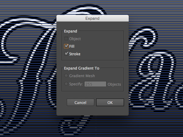
Head back to Object > Expand and hit OK again to convert the strokes into solid rectangle shapes.
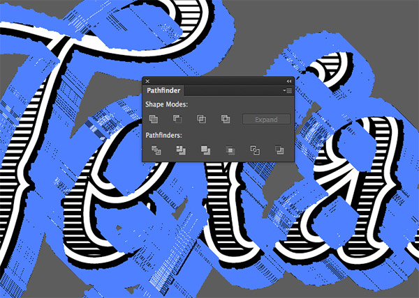
Right click and select Ungroup to break apart the collection of rectangles, followed by the shortcut CMD+8 (or Object > Compound Path > Make), so they will cooperate when they’re used with the Pathfinder tool.
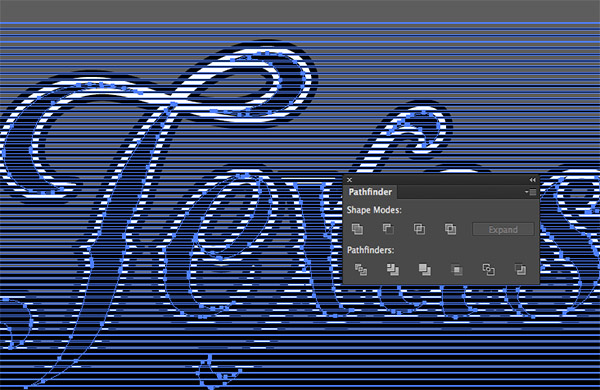
Carefully select the black inset shapes we created earlier and press CMD+C to copy them to the clipboard. Add the new collection of lines to the selection, then click the Intersect option from the Pathfinder window to clip the lines to fit within the inset shapes.
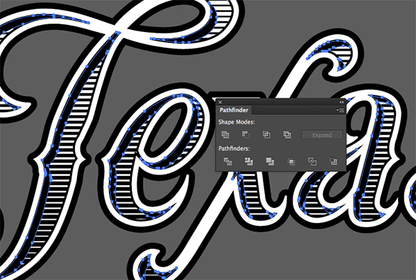
Paste in two sets of those black filled inset shapes using the shortcut CMD+F, then nudge the top set down and right a few times using the keyboard cursor keys. Select both sets then click the Minus Front option from the Pathfinder panel to trim them to size and create an inner shadow effect.
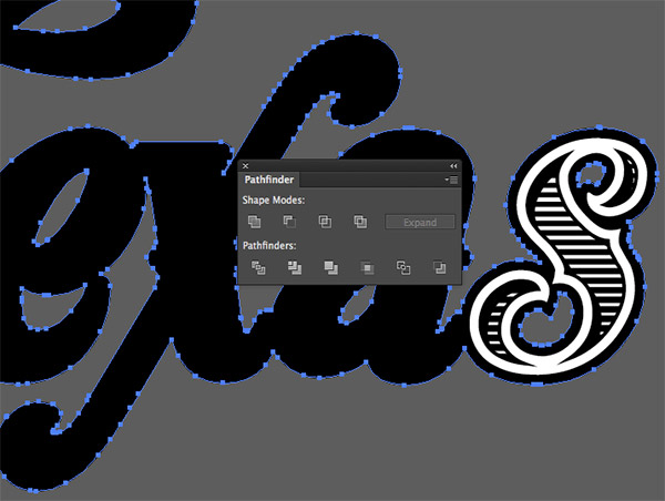
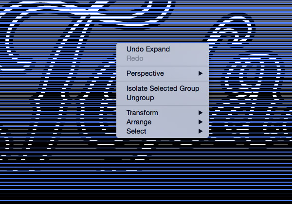
Hold Shift and select all of the main outline shapes. Click the Unite option from the Pathfinder panel to merge them together. This might affect the stacking order, so hit CMD+Shift+[ to send them to the back.
Press CMD+C to copy this outline shape, then press CMD+B to Paste Behind. Hold Shift and nudge the duplicate down and right to form a drop shadow effect.
With both outline shapes selected, go to Object > Blend > Make. The existing settings should create a smooth transition between the two shapes, filling in any gaps.
Convert this blend effect by going to Object > Expand. The blend is made from lots of instances of this shape, so it might be a little CPU intensive.
Immediately Unite these shapes using the Pathfinder tool to blend all the individual pieces into one shape.
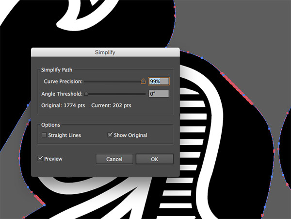
The outline path of this shape might need tidying up a little to remove some of those unnecessary points. Go to Object > Path > Simplify and enter 99% for the Curve Precision. This will retain the shape of the path but will dramatically reduce the number of points.
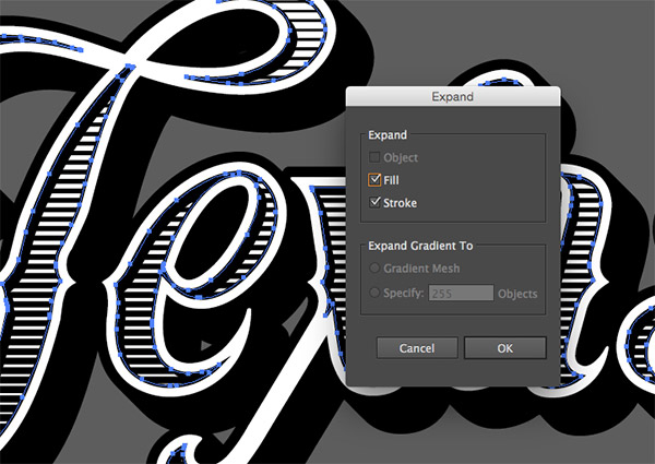
All of our logo/typography is made of solid shapes, with the exception of the inset strokes. Zoom in and carefully select them all while holding the Shift key, then go to Object > Expand.
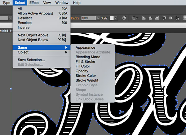
We can now easily change the colour scheme of the text by selecting a black shape, then going to Select > Same > Fill Color. All the black elements can now be given a different colour fill.
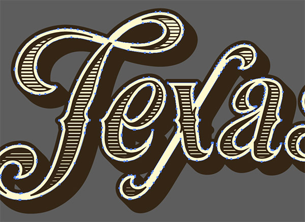
Select a white element and go to Select > Same > Fill Color to change the fill of all the other elements.
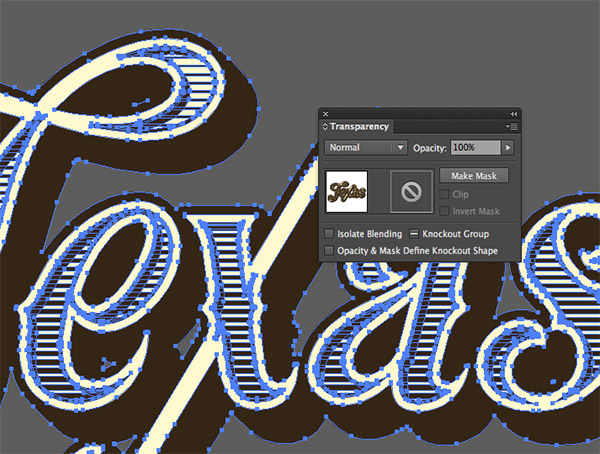
No vintage style design would be complete without some texturing! Draw a selection around all the elements and press CMD+G to Group them. In the Transparency panel click the Make Mask button, then select the thumbnail on the right to activate the mask.

Download my Vector Dust & Scratches Textures and paste one of the textures into the mask. Scale it to size and give it a black fill. Click on the left thumbnail to exit out of mask mode to see the texturing in full effect.
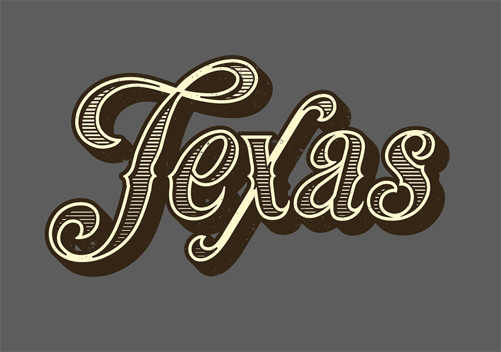
The final result really captures the characteristics of 19th century vintage type, especially the inset effect with the blended lines. It’s great how that inset path intersects itself to naturally produce a series of decorative shapes that flow perfectly within the text outline.
Love this design? Get the t-shirt!


It works well until I try to intersect and then it says there are no overlapping paths even when both sets are clearly selected. I’ll keep trying to hide everything else to try and get only those objects available.
Lost in “Select both sets then click the Minus Front option from the Pathfinder panel to trim them to size and create an inner shadow effect.”
Sorry, I could not follow this, it is too complicated.
Which step are you stuck on Jusuf?
If you’re new to Illustrator, here’s one of my older tutorials that I wrote specifically for beginners: http://spoon.graphics/1PkYwas
Hopefully this will talk you through some of the techniques used in this text effect, but in more detail.
I am not a beginner in Illustrator at all have been using it professionally for a decade. But when I start with the Appellton font as you describe the cutout inside the E is blown out on the first step of offsetting path, and it gets worse from there …
After a week of trying I finally got it. Thanks. : )
Hi Chris,
You made an excellent post on it. Your presentation design is excellent.
Thanks for sharing !
This is an excellent tutorial, in every detail, the way you explain it is great and much easier to make than what it looks, I think once I follow the steps it will be quite easy to replicate. I wonder if the same effect could be achieved by using only the appearance panel and keep it as an style, it might be a difficult challenge, but I think it can be made with patience.
Thank you Marta! Some of the steps could have been done with the Appearance panel, but other effects, especially those that involve the Pathfinder, mean this exact style has to be made manually.
Here’s an older tutorial that does focus purely on the Appearances panel: http://spoon.graphics/1IJgqnj
Hi Chris! Great tutorial as always, look forward to giving this one a go soon!
Thanks Douglas
I’d love to see your result. Feel free to send me a preview on Twitter.
Thank you so much !
I really wish and hope you are earning money as you teach, and share this knowledge, this is very helpful and may God bless you for that!
followed step by step and got the results, not quite there yet because of the measurements, have to adjust them, but looks great! A step forward for a small designer :)
Thanks!
Hi Chris, I’m really enjoying jumping back into Illustrator – your tutorials are informative and eye-opening. I recently went through your lesson on giving a vector image a print-making effect (turtle picture), which involved a lot of clipping paths if I remember… This tutorial opened up the world of masks for me (I’ve only used them in Photoshop till now). Tell me; are there occasions when you would choose to use the opacity mask over and above a clipping path texture? And why? Thanks again, Fiona
This is just amazing to see the great tutorial.. Each and every step define in a simple way to follow.. No doubt you’r the best in your job chris!!
Another great tutorial man! I’ve been looking a long time for design tips / tricks.
Thanks!
I was looking for it, a lot of work to be wound, thank you.
Thanks, Chris. Very clear instructions, even as a long time user of Illustrator, I can always learn something new.
I have read many articles on your blog – each one is more interesting than the other… meanwhile my work remains undone :)
Chris do you have magic in your hands? :P
Great tutorial as always!
Hi Chris, I am already skilled to create such stuff but thank you for a detailed tutorial.
I always learn something new from you.
Btw nice use of blend.
Great article, I was looking for such technique and now this is just what I need! Perfect !!
LOVE it Chris – SERIOUS Creativity. Thank you for Sharing.
Hi Chris, this is a very nice tutorial and educational. I hope there are more new tutorials later on because it is very helpful. Perfect!
I am a design student and have been wanting to follow this tutorial since you posted it. Just knocked it out and absolutely love it. I love your work and will be a all access member very soon.
Thanks.. Got it right on second try..
Hi Sir! I could follow your tutorial but in the typeface ‘Texas’ I’m having a problem with letter “e”. In the step after stroking the text then adding another offset path in -2mm to create a new path inside the text, the letter e looks distorted. I’m doing it all over again yet it still looks the same. Oh why so? Thank you!
I’ve been waiting for this one, awesome tutorial!
Thanks Travis, I’m glad to hear you enjoyed it!
Oh, this is awesome!! Thank you so much!