
This post was originally published in 2007
The tips and techniques explained may be outdated.
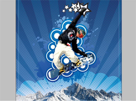
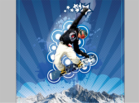
I recently completed an experimental personal design project where a piece of digital artwork was created by combining pixel and vector elements. During the process of it's production I captured screenshots and jotted down notes to present the course of the creation as a full blown walkthrough/tutorial.
There are plenty of useful little tutorials on the net explaining the use of a single tool, but rarely do you find a more complex explanation on how designer's pull together a completed project. Here you will find a step by step guide of how MY techniques were put to use to make this Snowboarder artwork.
Due to the length and large number of images the tutorial is split into two sections, the first of which here will cover the manipulation of the base photographs, and introducing the first few vector elements. Subscribe to the RSS Feed or register for Email Updates to be notified of the second part which will cover the addition of more vector elements and how the finishing touches are added.

The project makes use of both Adobe Photoshop and Adobe Illustrator to create and combine the different elements. Also a collection of resources was gathered which includes stock photography from StockXchng and vector graphics from GoMedia and Vecteezy. As well as some resources I already had stored in my personal toolbox!
The first step on this project was to sketch out a rough plan, this idea in particular was pretty clear in my head already but a quick drawing was produced to keep as a reference.
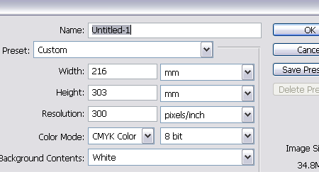
Once you have your plan and idea in mind, open up Adobe Photoshop and setup your document. Here I'm using a 300dpi CMYK A4 layout with an additional 3mm bleed just in case I decide to have it professionally printed at a later stage.
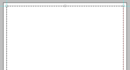
Bearing in mind the bleed that the document has, set up guides to accommodate the trim area and enough margin around the edges.
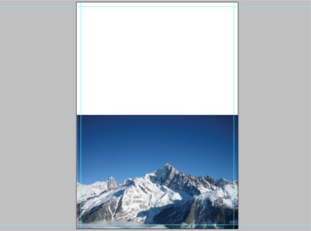
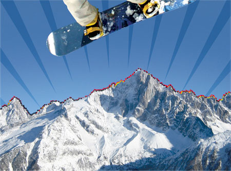
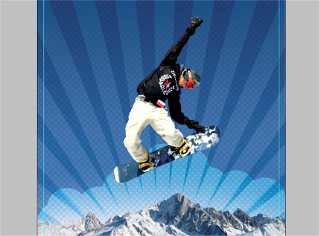
The main background image is of a range of snowy mountains from StockXchng, align this to the bottom of the document.
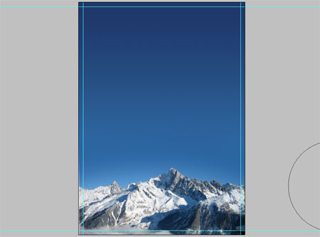
Select light and dark blue areas from the picture and add a gradient to extend the sky to the top of the document.
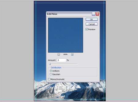
Due to the size of the document slight banding is appearing, to remedy this add a 2-3% amount of noise.
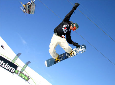
After a lot of searching the main subject was also found on StockXchng, the Snowboarder image was downloaded and brought into Photoshop.
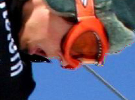
Using the Pen Tool zoom right into the subject and draw an outlining path, this is probably the most time consuming method of 'cutting out' a picture but is also the most accurate.
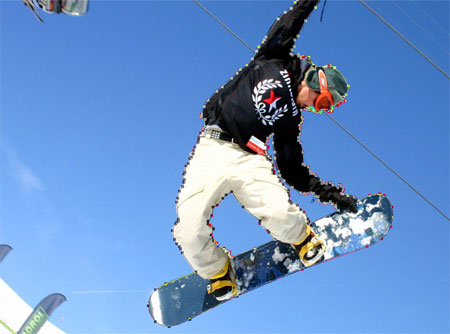
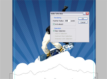
Make selections from your Paths using a half pixel feather to remove the sharp edges. Paste the Snowboarder into your main document.
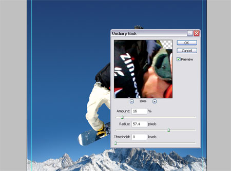
Now is a good opportunity to make any slight correcting adjustments such as Levels, Curves and Sharpness to match the image to it's surroundings.
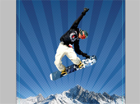
Vector Shape One – Radial Lines
Swap over to Adobe Illustrator to create the first of the vector graphics. These will be a set of radial lines to sit in the background of the main artwork.
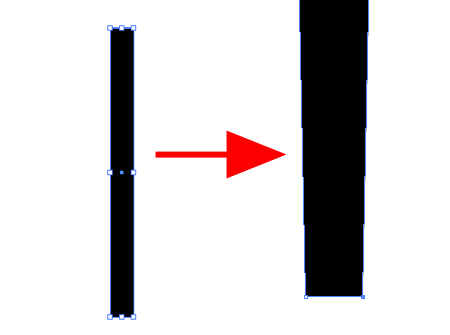
Draw a rectangle on the artboard, then using the Direct Selection Tool pull together the bottom two points.
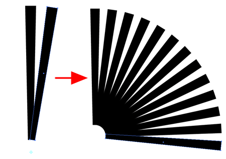
Copy and Paste the shape and rotate slightly using the Rotate Tool with the pivot placed underneath the shape.
Pressing CTRL/CMD + D will repeat repeat the last action allowing you to quickly paste (CTRL/CMD + F) and rotate multiple instances by alternating between the two shortcut keys. This will eventually make up the set of radial lines as shown.
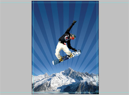
Paste the radial lines into the document above the mountains layer but underneath the snowboarder.
To remove the overlap over the mountains draw a clipping path with the Pen Tool following the contours of the mountain tops. Save this Path for later as we will be using it again, double click the Path in the Paths palette and enter a name.
The mountains layer looks quite flat so add some funky halftone texture by duplicating the layer and going to Filter > Pixelate > Halftone.
Enter 30px minimum diameter and 45 in each of the channels.
Set this layer to Soft Light at 20%.
Make a selection from the Mountains Path and delete out the section from the halftone layer.
Vector Shape Two – Circular Blobs
Switch over to Adobe Illustrator again to create the next vector element.
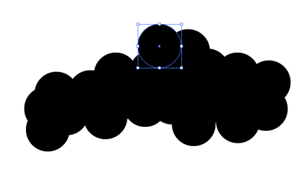
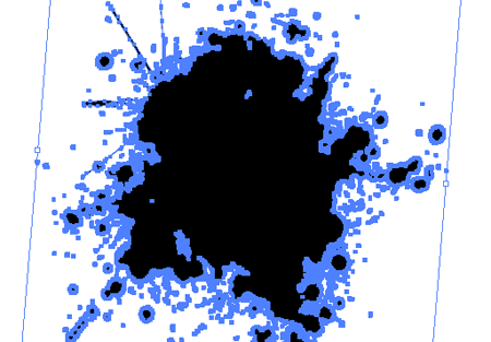
Draw a circle whilst holding Shift, then copy and paste this circle multiple times overlapping each to create a large blobby area.
Select all and fill with white, then paste into the Photoshop document.
Make a selection from the Mountains Path once again, and delete out the area.
Change the blending mode to Overlay.
Vector Shape Three – Trendy Circles
In a previous post I presented a selection of Trendy Circles for free download, head over and download the freebie and open up in Adobe Illustrator.
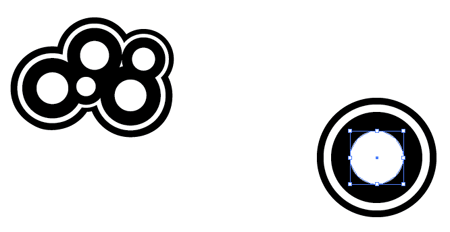
Select a style of Trendy Circle that takes your fancy and copy the group.
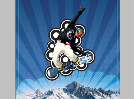
Paste in multiple groups of Trendy Circles to fill the area behind the snowboarder.
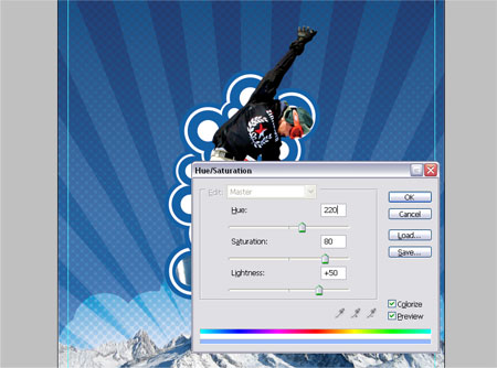
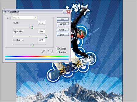
Go to Image > Adjustments > Hue/Saturation or shortcut with CTRL/CMD + U and adjust the colour settings as shown to match the Trendy Circles with the scheme of the artwork.
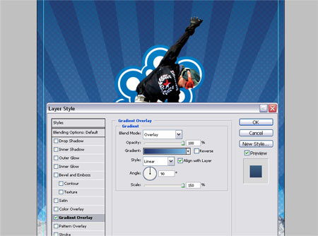
Add a little extra visual impact by adding a Gradient Overlay in the Layer Styles, ranging from a dark to a light blue vertically across the circles.
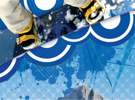
Open up a vector splatter from the resources collection, change the fill colour to white and paste into the Photoshop document under the Trendy Circles.
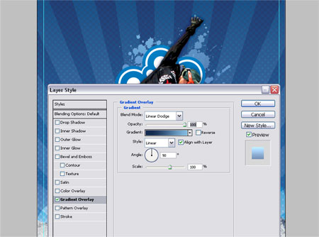
Repeat the Hue and Saturation adjustment to the splatter and add another gradient overlay to the layer.
Delete out the Mountains Path selection from the splatter layer.
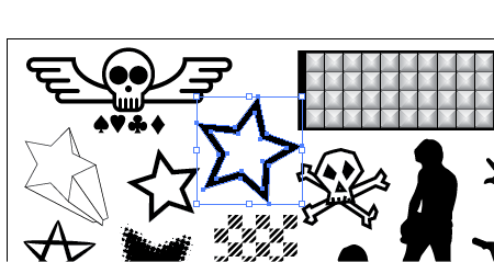
Open up the Punk Vector Pack and copy the star shape.
Paste this shape into the Photoshop document multiple times and scale each star down to create a small trail behind the boarder's hand.
Adjust the Hue and Saturation to add a complementing dark blue colour from the Snowboard.
Vector Shape Four – Whispy Lines
Back into Illustrator again to produce another vector element, draw a small circle on the artboard.
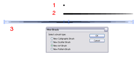
Using the Direct Selection Tool drag the left and right points individually outwards to create the shape seen in figure 3.
With this shape still selected click the New icon in the Brushes Palette and select the New Art Brush option.
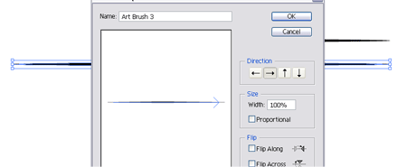
Ensure the direction is running along the width of the shape in the options window.
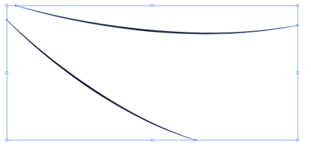
Draw a slightly curved Path and apply the new brush. Copy and paste the path and rotate it slightly and place underneath the previous.
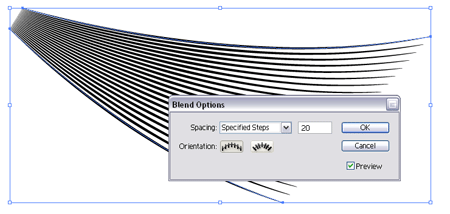
Select both of the paths and go to Object > Blend > Blend Options. Setup the Spacing to Specified Steps and enter 20. Go back into Object > Blend and select Make.
Convert the shape to white and paste into the Photoshop document, position a couple flaring out from underneath the Snowboarder. Set the layer style to Soft Light.
Zoom into the bottom of the Trendy Circles and draw a path following their contours, make a selection from this to delete the overlapping Whispy Lines.
END OF PART ONE
That’s all for now, go back and make any minor adjustments and check back soon or subscribe for the next steps, where we will continue creating and adding vector elements to the design.

Wow this couldn’t have come at a better time for me and the result looks great.
Can’t wait for the second part!
Awesome tutorial yet again! Anticipating part II!
Great tutorial. I got some good ideas just skimming this. Great use of the bringing the vector shapes in.This is a style of artwork I really like.
Here is a link to a tutorial GoMedia did for Computer Arts Magazine
I haven’t read the whole tutorial yet. But it looks like their using some vector art with pixel art. Only you have to download the pdf. Unfortunatley their tuts are only available as downloads.
Thanks for the tutorial. Good job.
Thanks for sharing!
This is just great. Thank you. :) Looking forward to part two.
I’ve started to experiment with vector/raster illustrations too and I want to know why you choose to assemble everything in photoshop as opposed to illustrator?
Does it give you any advantage? I havent used vector at all in photoshop. Are the edibility of the shapes still as good if they were in illustrator?
And great piece by the way.
this was a great tutorial. you should make more like this one.
Excellent tut. Lot’s of depth, yet, easy to follow! Thanks for sharing!
Cool tut, but why wouldn’t you just create a star in Illustrator? Just as easy and I’m guessing you already have the program open at this point.
top Tutorial!!!!!!!!!!!!
Thx you very much for that…
greez siousu
Waiting for the next part ;)
Great tutorial, I will -definitely- be using this!
Hi
What kind of sowftware should I use to create this?? Im beginner indeed?! :D
This site truly blows my mind, makes me wanna delete photoshop and leave the designing to you hehe (j/k)
Where do You go for tutorials, articles on photoshop/illustrator ?
Thanks for this great tuts ;)
wow thank you
it’s wonderful !!!
Very in-depth. Thanks a lot!
way too cool buddy, nice tutorial! and thanks for the tips too
thats all………!!!
Thanks for the tutorial! is A+ Is a excellent example to do a trendy multilayered, detail rich design.
That’s all pretty cool. Unfortunately I don’t have the patience or time for any of it.
Hi! could you please explain this…
“Using the Pen Tool zoom right into the subject and draw an outlining path, this is probably the most time consuming method of ‘cutting out’ a picture but is also the most accurate.”
well what im usually do is use magnetic lasso tool + masking to cut out a picture.
Thanks for the comments everyone.
@Derek – One advantage to assembling in Photoshop is its better layering facilities, it seems to be tailored more towards compiling images. There is the feature to import your objects as Smart Objects which preserves their “vectorness” but I usually rasterize them once they are placed into position.
@Shabith – If you are comfortable with the Magnetic Lasso tool then that’s fine. There are multiple methods of clipping out an image each with their own pros and cons, I pesonally tend to find the Pen Tool the most accurate although the most time consuming!
That awesome!! I wish I could do great pictures like that!!
Your art looks great, but it appears this page has some problems. There’s a great deal of blank space at the top of the page (viewing in IE 6).
I noticed that as well, guy above me :( But it doesn’t take anything away from the awesome article!
Loooks all to much like the gomedia one !! even the snowboarder is the same !, background and the shapes is changed, but coooome on,
IE6 bug fixed – turned out to be the link to Computer Arts in the comments which was a little too long for the content area!
@Brent, believe it or not I didn’t see the GoMedia version until after I completed my post, you will notice at the beginning of my article that I found the snowboarder from SXC.hu then continued to clip it out – it would have saved me some time if I had found the already trimmed out version by GoMedia on Computer Arts haha!
wahuu!
semplicemente stupendo! sei un genio.
“thanks for this tutorial”
Amazing!!!!
coOOol thanks for sharing your knowledge with us mate!
Great combination and excellent finish !
muchas gracias,
un muy buen trabajo!
THis is one of the best tutorials I’ve seen lately! Thanks!
That’s all pretty cool.
OMG…i`m dying by reading your tut. It is fantastic, awesome and unbelievable. I`m Graphic Designer too but when I see what you have done in this tutorial i rather be a countryman.
Thank you very much for sharing…
Thanks. Really helpful tutorial. I always wondered how artist to these kind of graphics. Now I know. :)
Great tutorial! Really cool final product, and it was cool to see the process. Though this is a somewhat overused style, you’ve executed it great, and made it interesting. Thanks for the tutorial, and all the other random cool stuff on your site!
Awesome tutorial! Thanks!
-Quan
http://www.doggieoutfitter.com
wow, amazing tutorial… I really like it, thanks for sharing.
Wonderful!
This is really a brilliant work. Thanks for sharing.
Awesome tutorial, great stuff thanks
How do you have the gradient blend into the background and
not tile on step four?
Very nice tutorial.
Great!! thnks from argentina
Just a quick note: There is a much better and faster way other than using the pen tool to cut things out, which involves masking the image you want to cut. this works best in RGB mode.
1. find the channel that has the highest contrast.
2. Duplicate the channel (this step is important!).
3. On the duplicated channel, blow out the whites and blacks using Levels, Curves, Brightness and Contrast, Burning and Dodging, etc. Be careful not to go too far or you will loose some fine details and your masking won’t look believable.
4. Once you’re satisfied, command/control click the thumbnail representing the channel, return all channels to RGB, go to the layer containing the subject you want cut out, then add a layer mask.
–At first the masking might look shaky, but adjust the mask using Filter<Other<maximum, minimum, or custom. You can also use the Gaussian Blur tool, but use that with caution. All these filters must be used on the MASK, not the LAYER. That part is important, too.
I have used this technique many times. It’s tedious, but it shaves hours and hours off tracing around objects, and it does a really good job of grabbing tiny details like fabric and hair. Hope it helps!
Hey Pickl
Thanks for posting up your technique, I’ve also been playing around with the Alpha Channels recently and have to agree, it does make life much easier in some cases!
Chris
Great that tut !!! THANK YOU !!!
WOW !!! this is amazing
very good job
hello Chris!
sorry if it’s a stupid question but how do you “Select light and dark blue areas from the picture and add a gradient to extend the sky to the top of the document”? on your screenshots it seems that you don’t even extend but stretch the sky out to cover the whole page…
thanks,
stasia
it was found
great job boy
can’t i learn more about it
cause am a beginner
please send to my email please