The eagle eyed amongst you might have noticed a revamp of the design specific bookmarking site DesignBump.com. John Campbell recently got in touch to ask if I’d be interested in helping out with the redesign. Being a site I’d been subscribed to since its launch I jumped at the opportunity. Here’s an overview of my design process for the project.
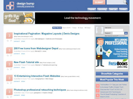
The Old DesignBump
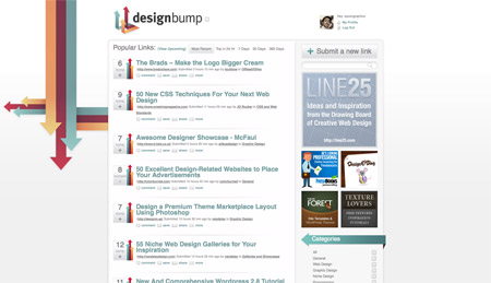
The New DesignBump
DesignBump is a social bookmarking website aimed purely at the design and web community. It’s an extremely handy place to find both great new design content and to submit your own articles for votes. With DesignBump being one of my favourite sites, it was a pleasure to help out with the rebranding.
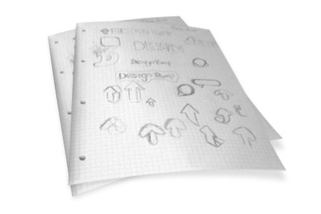
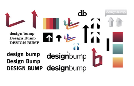
After checking out my work, John chose me specifically to work on his designs and gave me complete creative freedom (He’s a nice guy like that!). This allowed me to really go to town on the sketching process to develop an overhaul of DesignBump as if it was a site of my own. Since its launch the site has always used an arrow as part of its image, which fits in well with the nature of bumping an article up until it reaches the front page of the website. With this in mind I continued to draw out the logo concepts and looked for a unique way to display the arrows as some kind of graphical mark.
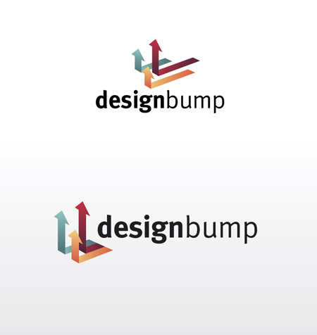
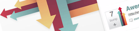
My final concept for the logo mark was the combination of three arrows flowing along a plane, each one changes direction and points upwards with some reaching higher than others. This metaphor translates to articles submission process on the website: An article is submitted and plods along in the upcoming section until it acquires enough votes, it then takes off and is promoted to the front page, resulting in some articles gaining higher votes than others.
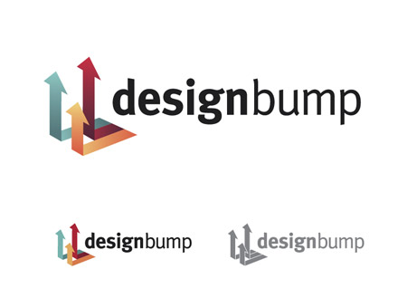
A unique colour scheme was then chosen, and subtle effects added to the graphic to really spice it up and add depth. This added dimension does a great job in lifting the logo from the screen.
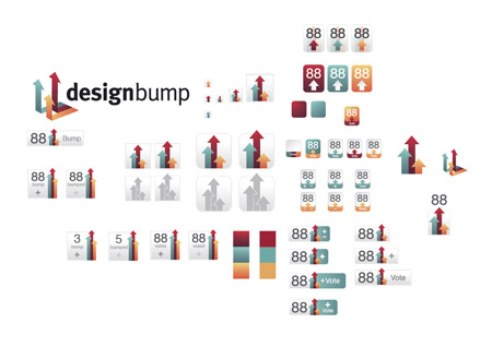
The project then moved onto the development of various icons and voting buttons. A range of graphics were developed to gain a feel for the shapes and dimensions, and how the colours could be incorporated to tie the icons in with the overall theme.
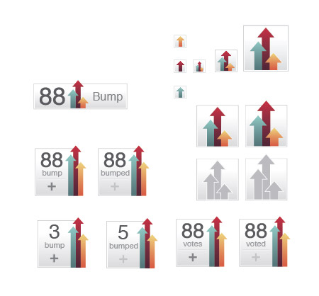
I narrowed down the design to the subtle grey button with the vertical arrows, which was then recreated in various sizes and includes everything from the 16px icons to the complete voting button.
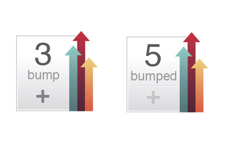
The final voting button is a design I’m really happy with, it captures the branding of DesignBump with the coloured arrows and provides recognition when placed on various websites. The little 1px lines and subtle touches also help add depth to the graphic. The overall idea is to make it something that looks cool sat at the bottom of your blog posts.
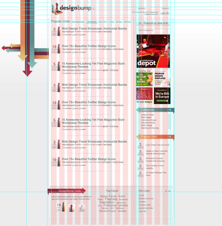
The website design was created with a basic theme of white and subtle grey shadows, spread across a layout that adhered strictly to an underlying grid. A splash of the red, green and orange colours were added to the design in various places to draw attention to specific areas.
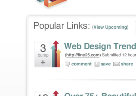
The voting buttons really came to life when listed alongside their stories on the homepage. A range of mini icons were also developed to spice up the various user tools.
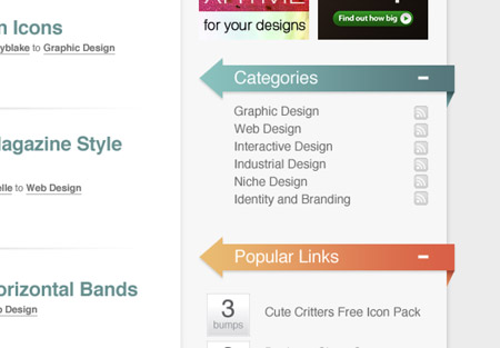
A good example of how the three colours were implemented into the website is in the sidebar, where the three main titles of the various sections alternate between red, green and orange.
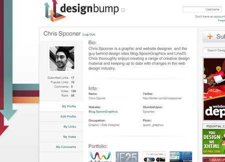
Once the homepage design was complete, the layout was tweaked to accommodate the new user profiles. The page was split up further according to the grid, creating a new left sidebar to house the user info and profile navigation tabs.
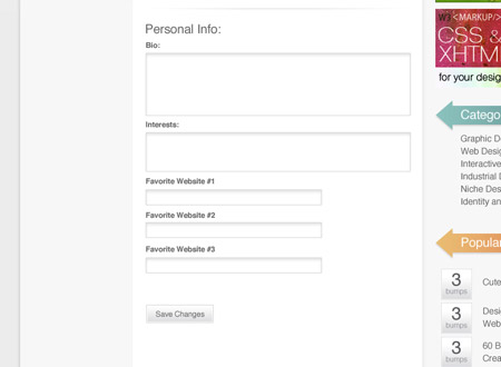
To finish off the design, a consistent style for the form inputs and buttons was developed, this should make it easy for the styles to be continued across the whole site, bringing all the elements together.
With the main graphic design all done and dusted, it was time to send John a bunch of PSDs. He then had the fun job of coding up the new image and plumb it all into the DesignBump engine.
Overall a hugely enjoyable project, and it was a pleasure working with John. I’m looking forward to seeing DesignBump develop as a primary source for design news. Remember to head over and create a profile, you can also add voting buttons to your own site!
the new design is so sweet.
One of my favourite projects of yours, Chris, definitely. Very well done.
Wow, I wish I could design like you man, my websites suck because of the lame designs ]=
Atleast you are here to give me help with tutorials though =D
nice design though… so sleek
I really love the new design of designbump is really awesome, when i saw it first time i barely tough you made it but, when i see your interview in designbump blog, I was Impressed, because is completely your style.
I knew when I stumbled upon it that it was somehow inspired by your work, now I know why =)
thank you for sharing this !
I’ve only recently found out that your responsible for the redesign and I must say that you did a fantastic job. The new design really has made Design Bump my favourite bookmarking service. It also inspired me to work on a new “submit and promote article” area on my blog.
Congratulations Chris and thanks for the insight. FYI I bumped this post.
I love this kind of article, you can really see what goes through the designer’s head, and learn from the whole process :)
One thing thought.. it extremely hard to tell if you’ve bumped a link or not :[
wohoo~
nice :D loves the arrows.
Congratulation Chris.
You push the design to a very high level man !
Now, I know why you’re so recognized by the design community.
Great work, great post ;)
Great work on the redesign Chris, I love the voting buttons and logo. Thanks for sharing the process.
Yep, very nice, good work!
didnt know it was you who made the redesign.looking great!!! :)congrats on the job well done Chris :)
Design Bump’s new design is great and this post provides an interesting insight into its creation, from paper to browser. Love it!
Thank you for the great article. I was thoroughly impressed with your workflow and thought process. The new design looks awesome.
Cheers Chris fo coming up with such a creative redesign …and yes, the arrows are the best part. Keep it up!!
It looks excellent. Very strong design.
I don’t know if it’s worth noting – “description” is spelt wrong on submit a link. Just a heads up!
?
Really interesting post. I really like the new designbump style. The colors palette is great
Hey Chris,
I noticied the new DesignBump design and absolutely loved it at first glance. You did an incredible job, really!
Thanks for sharing the behind the scene process. It’s always interesting to read the article about your working process. And the new DesignBump design is absolutely better! =D
really cool stuff! I love the simplicity yet absolute effectiveness of the logo, and the arrow elements carried throughout the design.. :D
Nice one Chris!!!
I absolutely love it – a jobe well done!
I really, really like that design, the Artwork is impressive as usual! I really like the arrows on the logo!
this is ROCKN’ROLL!
phenomenal, especially the color scheme and new logo.
A+
What a great demo of your work process.
very inspirational I am ready to start designing now..
thanks!
—
Thanks & Regards
Noel from nopun.com
a professional graphic design studio
WAO! really great design job here! How long it took to make this project?
Like somebody said up here, it has your style.
Thanks for sharing the process!
Perfect – really love the design!
It’s a wonderful site in a awesome look! Love it too :)
I love finding out more about websites and how they were built, very interesting topic. Thanks for sharing your wise insight
The design is awesome Chris and the colours fantastic, I could look at it all day! Thank you so much for sharing.
Really great job! Thanks for shearing the process!!
Also thanks for your tutorials!!
It’s always really educational to hear about other designers and the process they use. Thanks!
Absolutely fantastic new design of Design Bump – no doubt about that! I have included your blog on one of the Top 100 Blogs on my site Mr. Chris Spooner!
Check it out the following:
http://kpobuddy.wordpress.com/2009/07/22/top-class-100-blogs-for-website-designers-and-web-developers/
Wow. You did the redesign :) Very nice. I was wondering who did it. It’s almost candy like ;)
that’s nice you have very deeply information about Design Dump. good
Very Nice design :)
Well done Chris, You are the man. Keep up the fantastic work!! I knew someone awesome had to have done DesignBump’s Redesign ;)
Talk about talent. You have talent AND vision.
The redesign is more appealing and gives a feeling that the site is being bumped UP. Great redesign!
very nice job! it looks amazing.
Very, very cool Chris. I saw the redesign last week but had no idea that it was your work! Awesome job :)
DesignBump is awesome Chris, well done. Designmoo gives it’s official stamp of approval. MOOOOOOO
Really love the icons. You did a great job without losing the integrity of the old site and incorporating more appealing calls to actions. Great overall design.
Fantastic work, the new look is great!
I noticed the updated design last week while submitting a post of mine.
Glad to get more details on it’s refresh.
Great job.
Awesome design Chris. You’ve got a gift dude.
Well done Chris, a huge improvement indeed! I like how the identity works across the whole site, buttons and all.
The only nitpick I can pick out of the whole identity is that the wallpaper on the home page, the arrows go down? Doesn’t this go against the grain of the whole bump idea? Anyway, that’s just something small I noticed – it’s a great redesign and some of your best work in my opinion.
Great design! Thanks for the insight into this project
Hi Chris,
Great design. You rock!
i liked the logo fo designbump
Insights like this are invaluable, Thanks.
n1 work Chris…
Which Font did you use with this logo?
I hadn’t noticed DB before the re-design and was surprised to find you were the creative genius behind it all. Very nice work Chris. :)
Good work Chris, You should be very pleased with this, great colours, layout etc. and really conveys your design style. If only every client could give you the freedom that DB did.
I’m always interested in seeing your latest ideas.
interresting.
hello nice job, Chris
you always creates and presents the awesome technique also ur design style is outstanding and always give me an inspirations so thax for brings ur experience to share with other people.
regards
Kanya
Amazing DesignBump redesign. I was admiring it a few days ago, and had no idea it was you behind it, Chris. Great job, the colour scheme is excellent, I must say 10/10, ★★★★★ and a free beer for that one ;)
Very good looking design! I like the cleanness of it. The logo is perfect. Because of this design I signed up at Design Bump. :)
Great redesign Chris. I knew OF Design Bump before, but always used Digg. Now that I’ve seen that your genius is behind the design, I’ve turned now to DB for inspiration as well.
Thanks, keep up the good work.
Hey. I knew your colour scheme reminded me of something :-)
http://www.colourlovers.com/palette/694737/Thought_Provoking
Great article and design mate, well done!
pretty cool .. if u r free these days and interested in design a cms pm me ..
Very nice work, i love it. Which Font did you use for the logo?
I just started a web design certificate and the instructor called up DB as a resource for us to use. When it popped on the projector I thought, “That reminds me a lot of Chris Spooner.” :) More than I thought! Good work.
nice work sir. :lol:
I loved the new colour scheme!